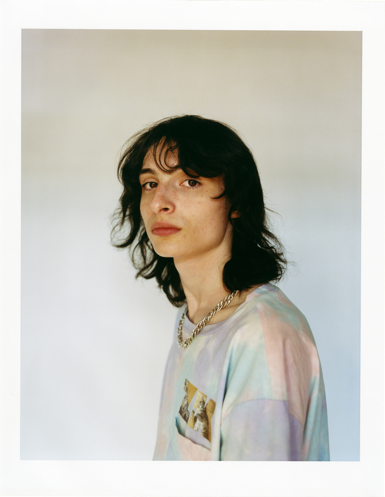
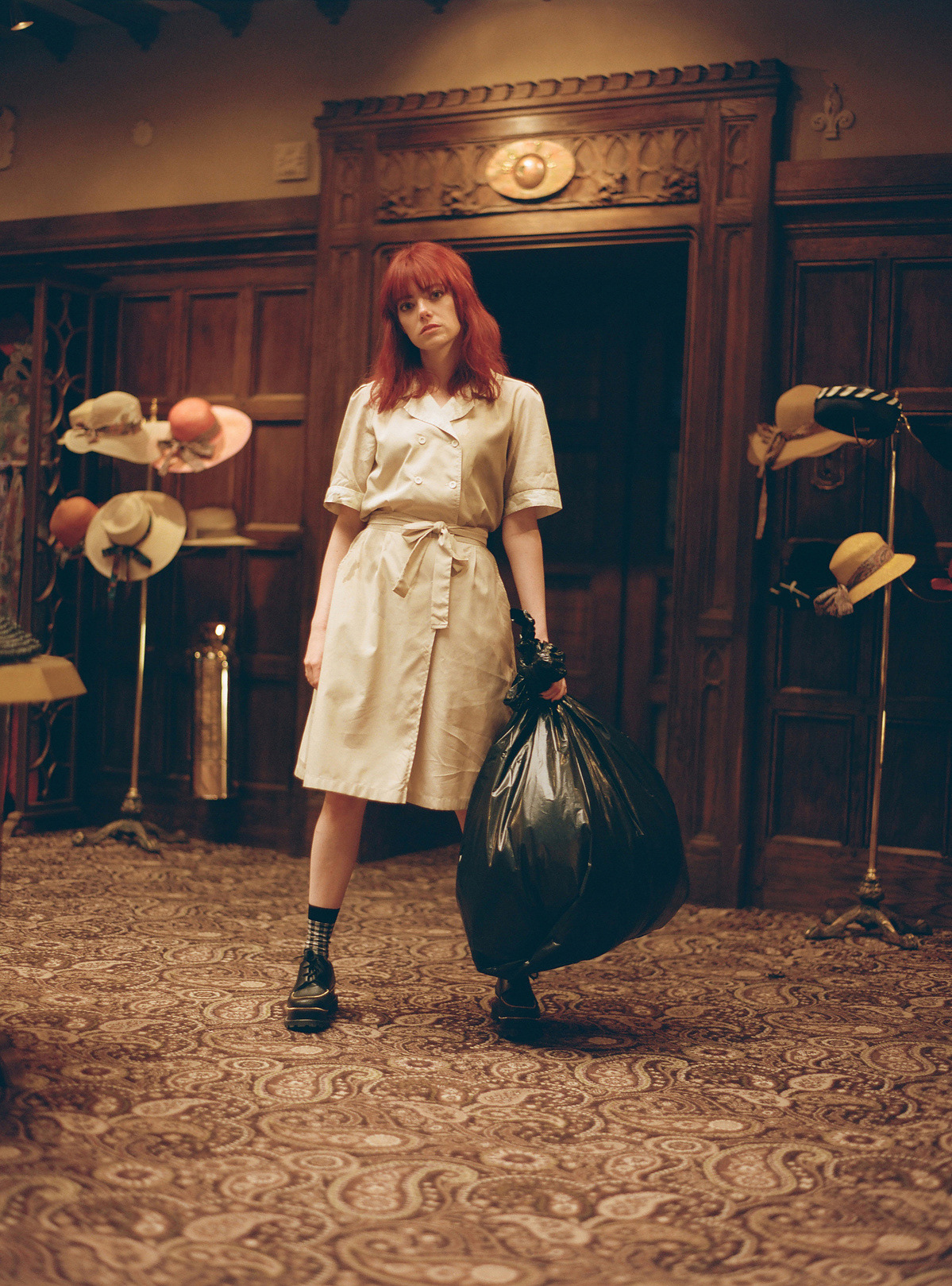
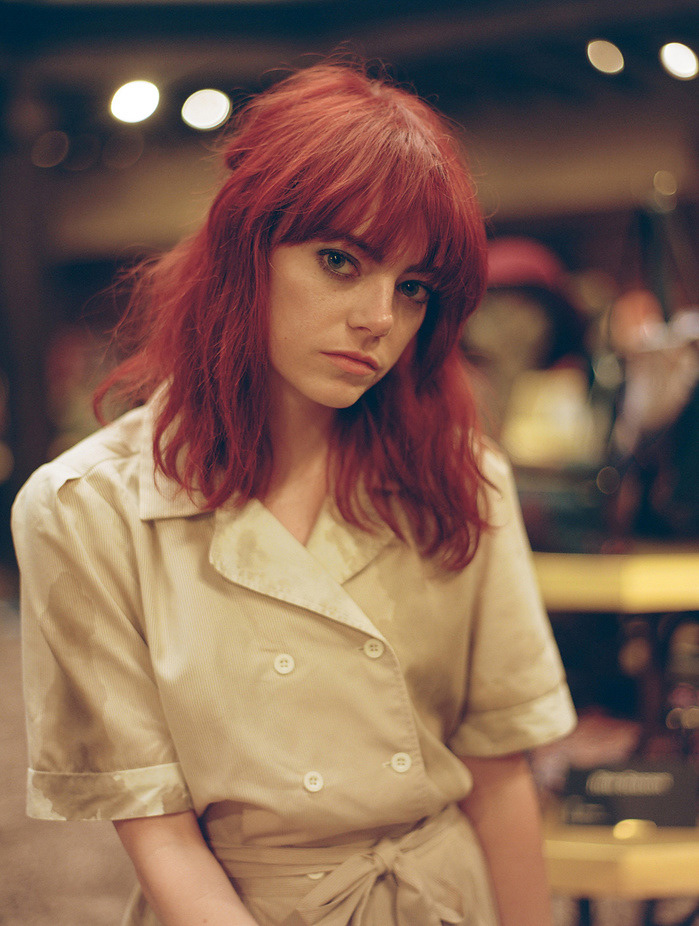
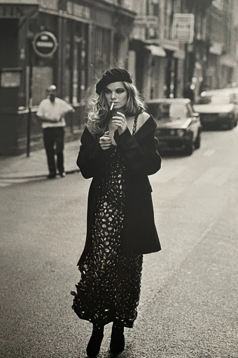
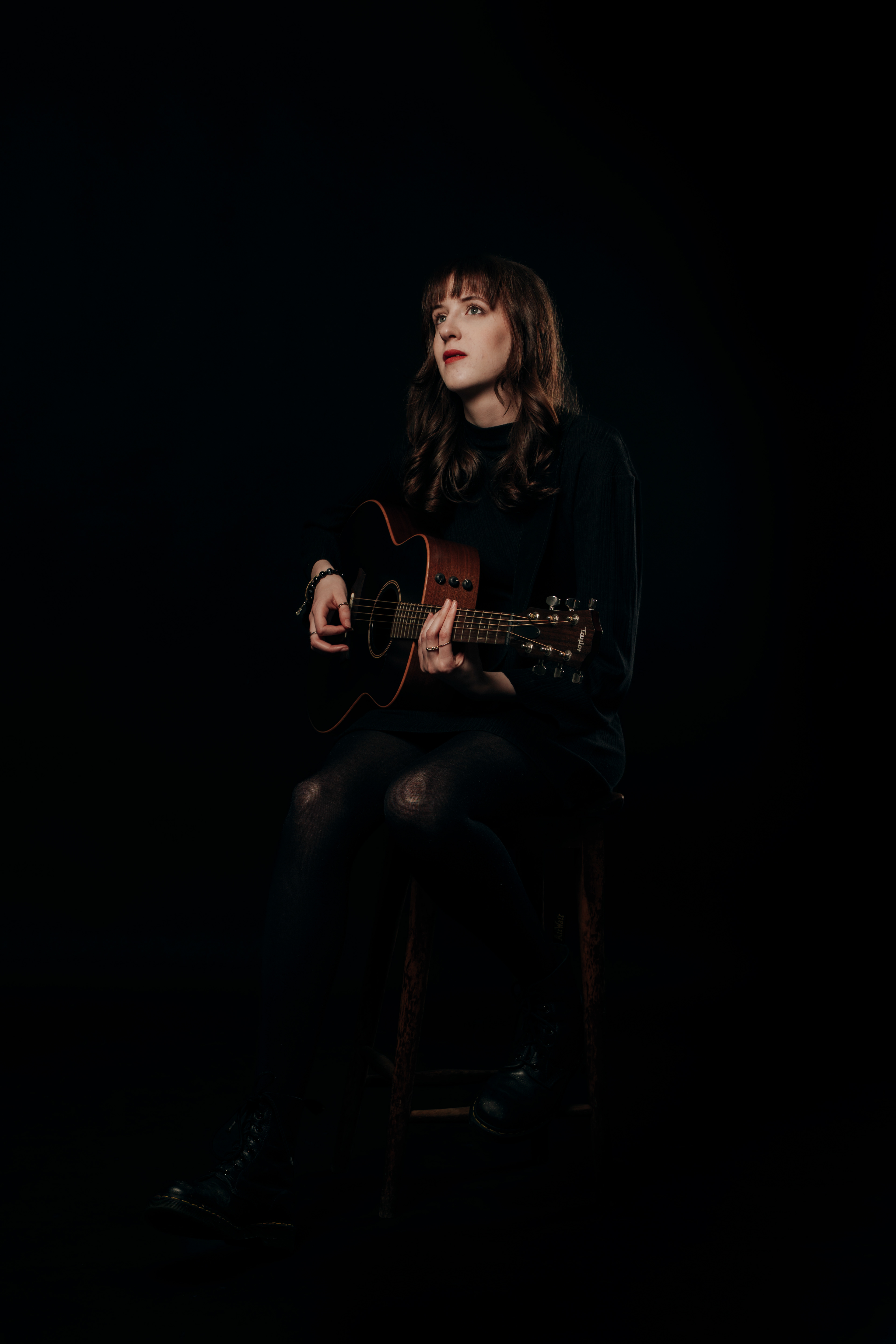
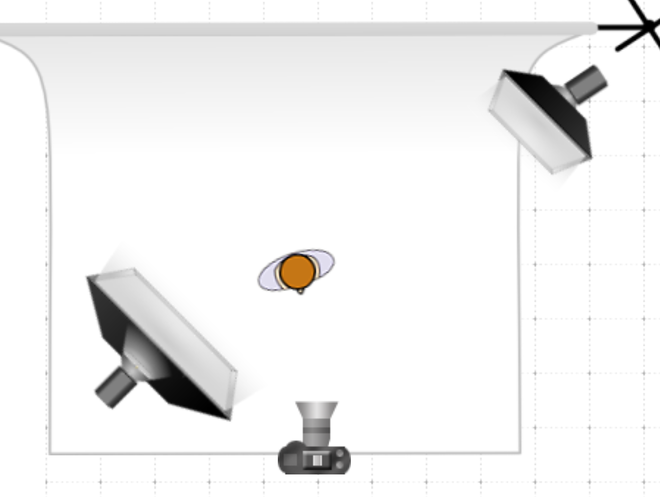
4.2.25- Today we were re-inducted into the studio and showed how to connect the camera and set up the lights, as well as fire safety. with the brief I am thinking about getting musicians and bands into the studio to make album covers for them. I may also lean into the tableau vivant by recreating popular album covers.
Artist Research
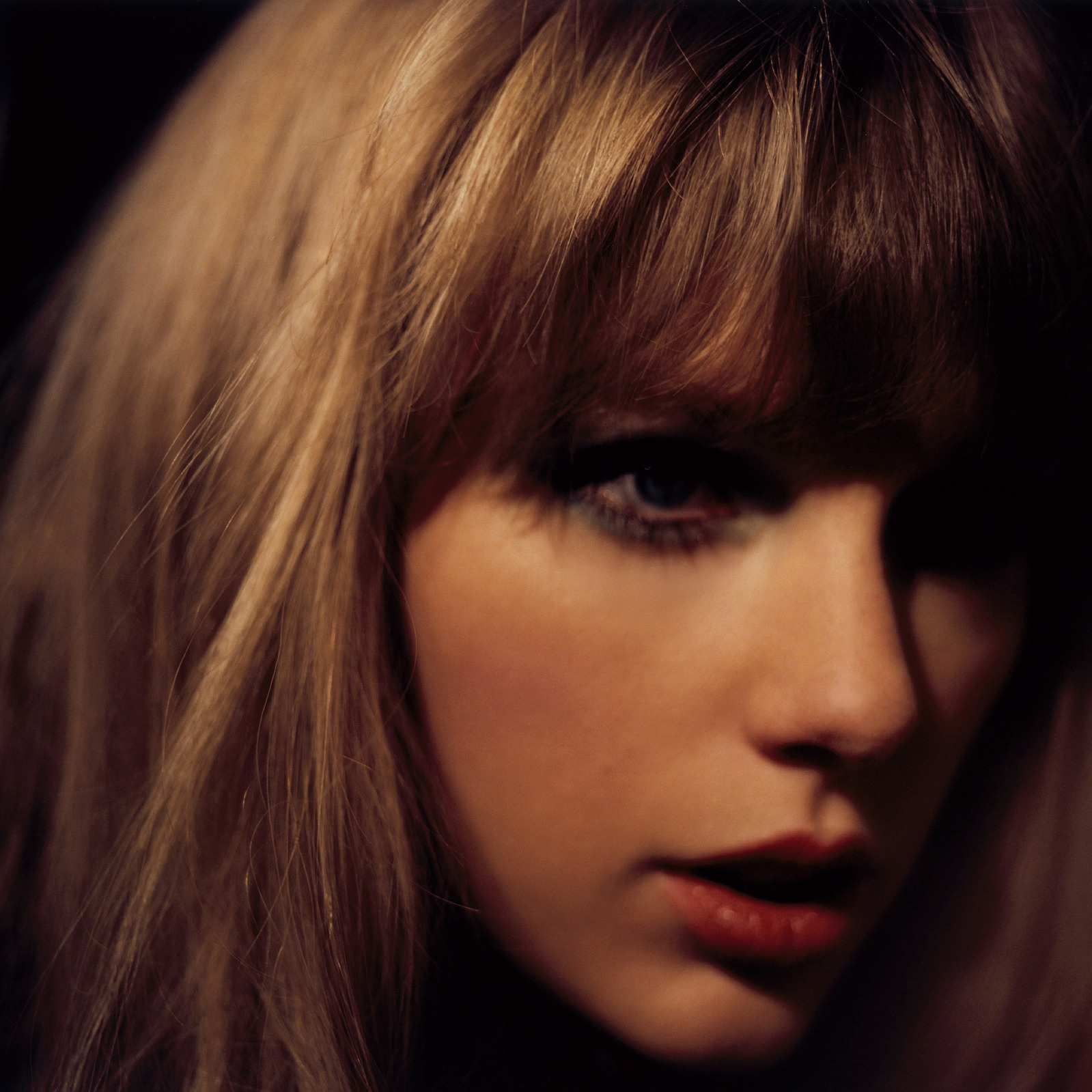
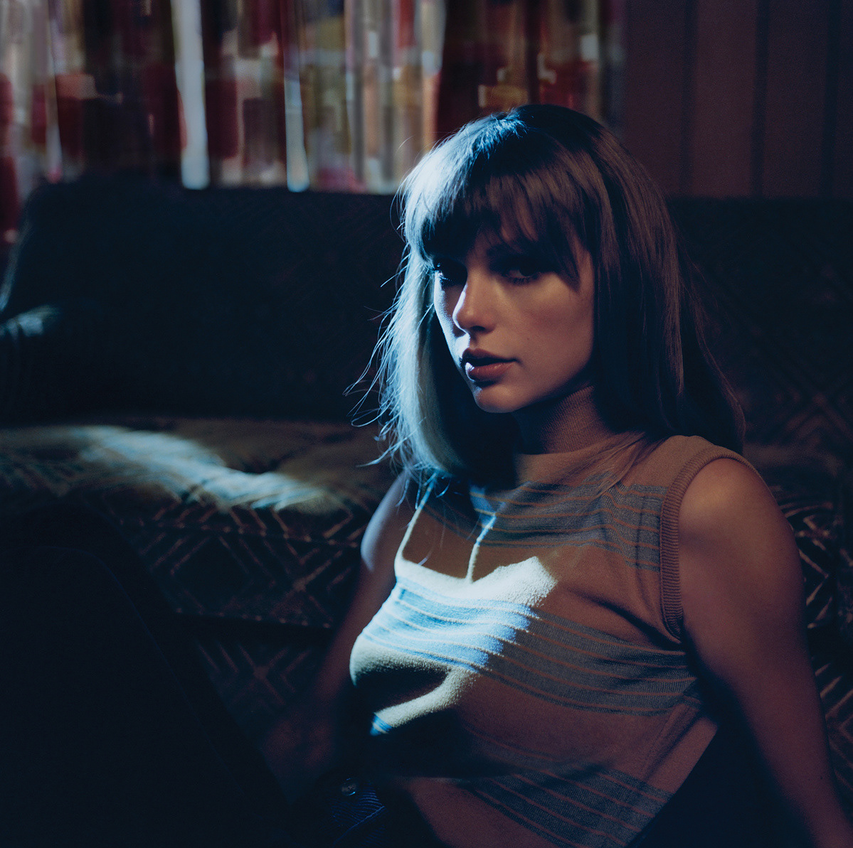
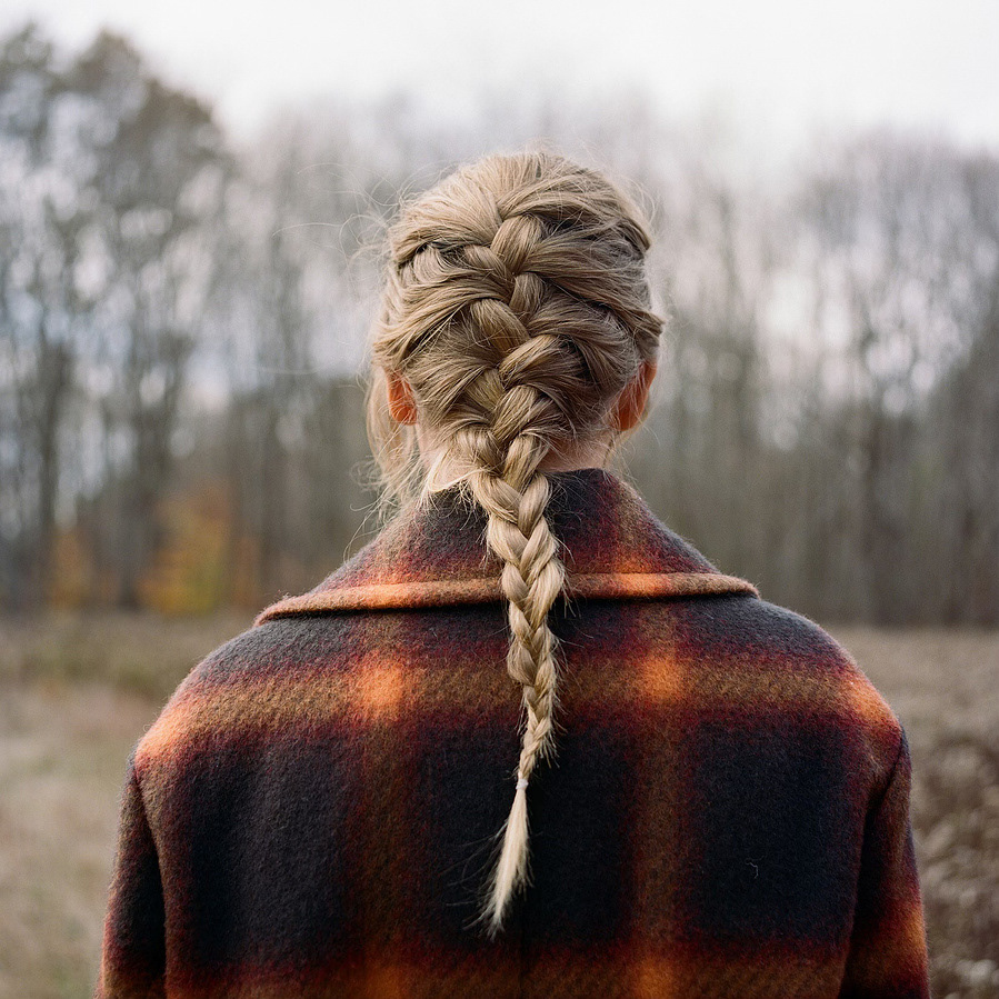
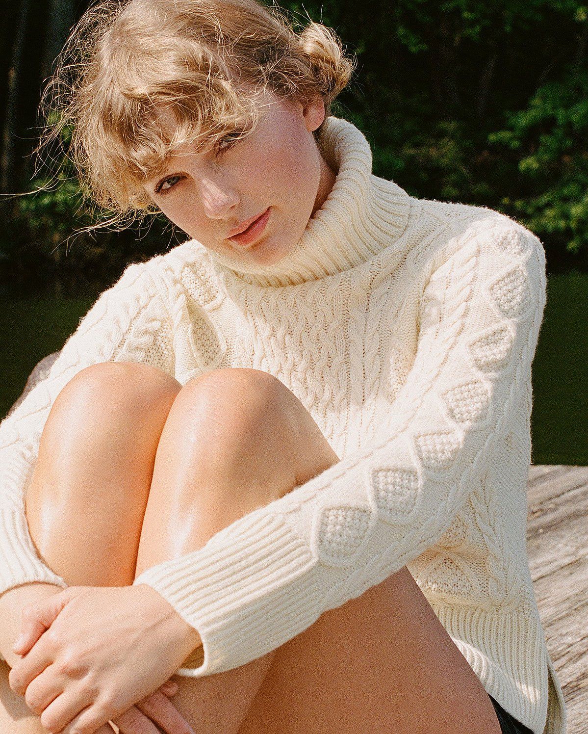
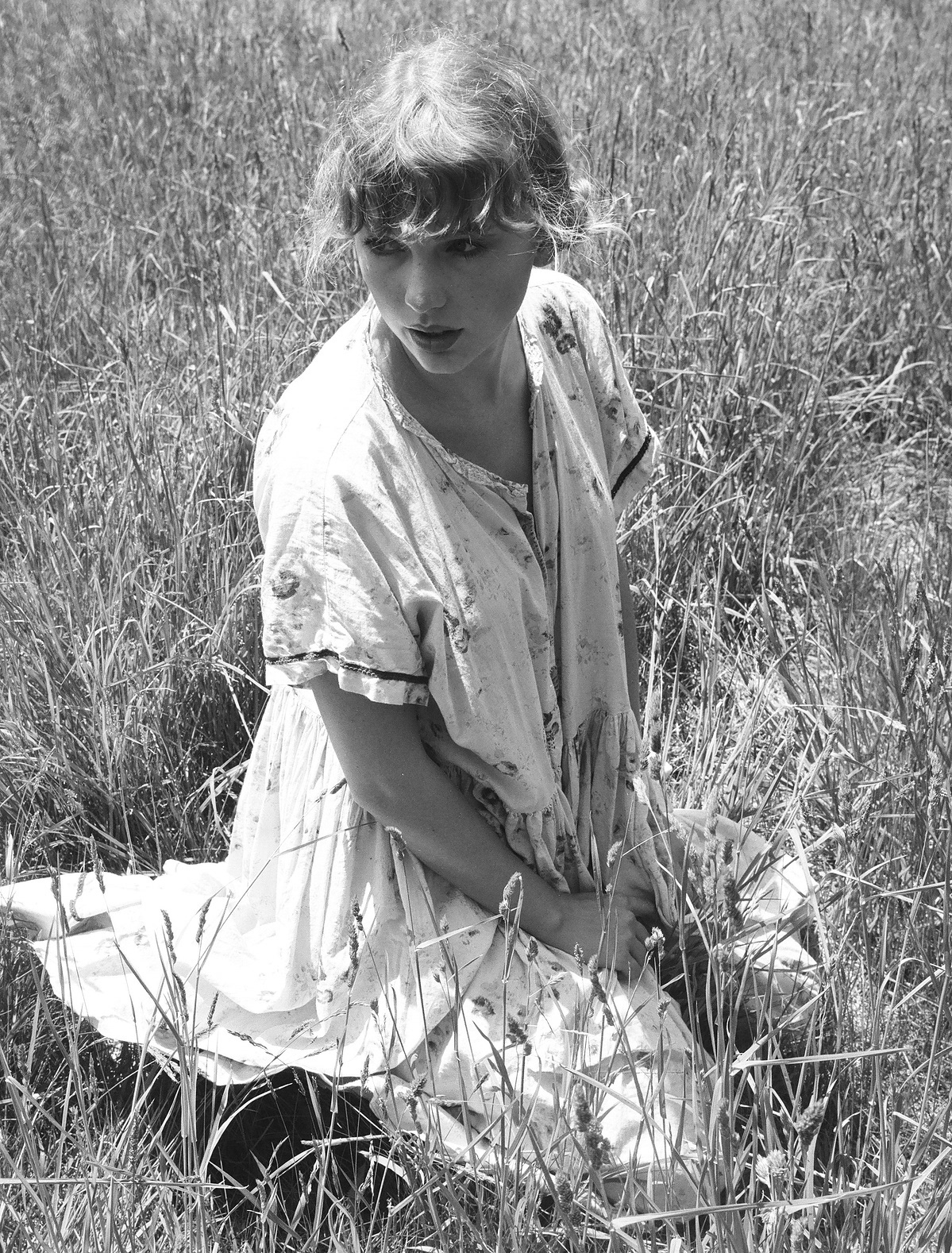
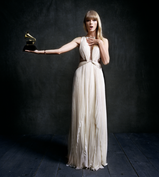
Beth Garrabant, primarily known for her work on the newer Taylor Swift album covers, is an American photographer born in new England who studied at the university of Notre Dame and the international centre of photography in NYC.
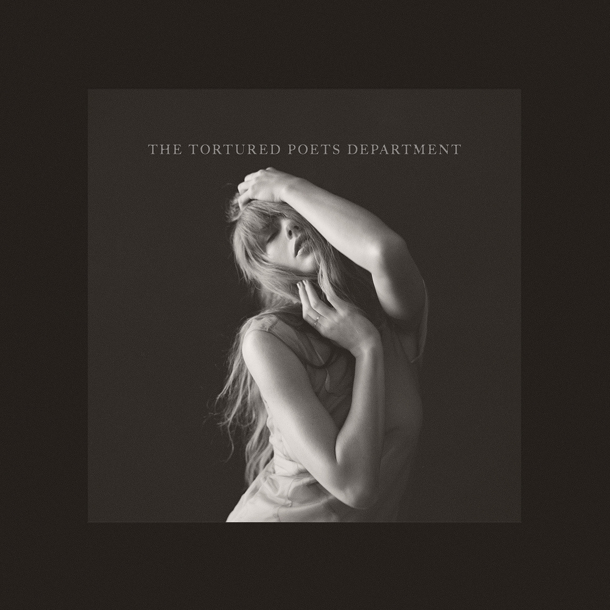
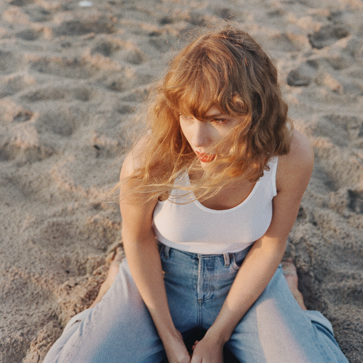
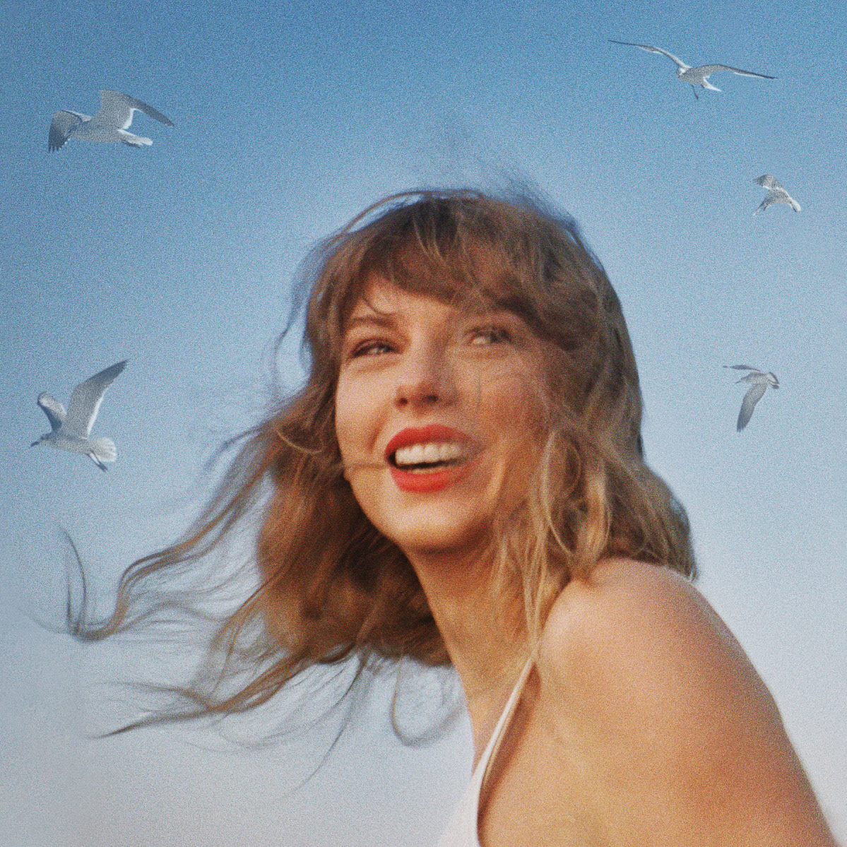
Her most well known work is her work on the Taylor swift album covers since 2020 where she primarily uses medium format film to create portraits combining her vision with the artists which. Beth's style allows for viewers to know which album the subsequent photo goes with by keeping a theme and set throughout her images but also allowing it to be recognized as her work throughout the different albums- essentially keeping a set style within her own style allowing for her work to easily be chunked into small categories. We can see this through the tortured poets department shoot- https://www.bethgarrabrant.com/the-tortured-poets-department#1 - where we can see all of the images are kept in black and white with soft lighting where through all the different sets and lighting we can still identify the model and we can still see these photos are from the same set. if we compare this set to the speak now TV shoot- https://www.bethgarrabrant.com/speak-now-taylor-s-version-taylor-swift#1 - we can still identify this to be Beth's work even though the images are entirely different. I think this is because of the soft lighting, the use of posing, and the use of medium format film. keeping some things the same allows for entirely different images whilst still keeping key characteristics to the artist.
This is an important thing to note as the nature of this photography work means the work will be published on a multitude of different print media, often without the key image, so fans will need to be able to recognise the specific shoot to be able to identify the album. This is especially key with these albums as they are sent to multiple vinyl variant covers which means sometimes the name of the album may not even be written on the front. keeping the colour palette and style the same throughout each different album allows for fans to quickly identify at a glance what they want to listen to.
Garrabrant also worked on a portrait series for the Netflix show "I am not okay with this" which are classic film stills from the set showing further into the characters personalities- these are photos taken outside and they do not use external lighting, the feel is very casual as an attempt to creation a connection to the characters. As well as doing the same for Disney's "Cruella" capturing the cast outside of usual scenes essentially bringing a casual "behind the scenes" to the show showing the characters in scenes you wouldn't see inside of the show to bring an element of casualness. I think Garrabrants work in the film industry is an attempt to remove the "corporate" nature from these shows as she does an immense job of making her photos look casual whilst still professional. Also working on other shows shows and films such as some by A24, love lies bleeding, and Promlemista.
Before this she worked as a photo editor for travel and leisure magazine where she was introduced to two of her main cameras, the Pentax 6x7ii and the Fuji GA645. She also uses a Contax T2 and a Rolleiflex. After this she was the photo director for nylon magazine from 2014 before pursuing freelance work since 2019.
In Conclusion, Garrabrant is a photographer with a recognizable style, whilst still being mostly unknown, people see her images every day and recognize her work even without her name. This makes her a good commercial photographer as she makes the art in the way which the client wants without taking away from these large named clients as the general public recognize her work as the clients work and not the artist. This means she is a good commercial photographer as her name does not come into play within the final images.
Dean Karr is an American commercial photographer from Seattle who studied at Washington State University for a Bachelor of Fine Arts and moving onto Los Angeles to attend the Art Centre College of Design.
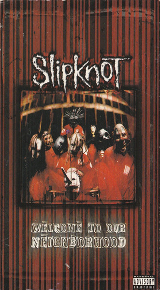
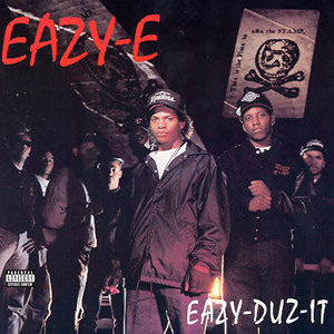
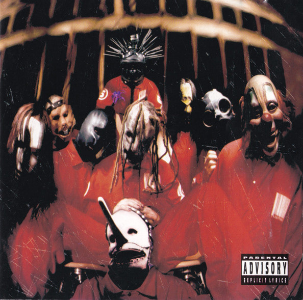
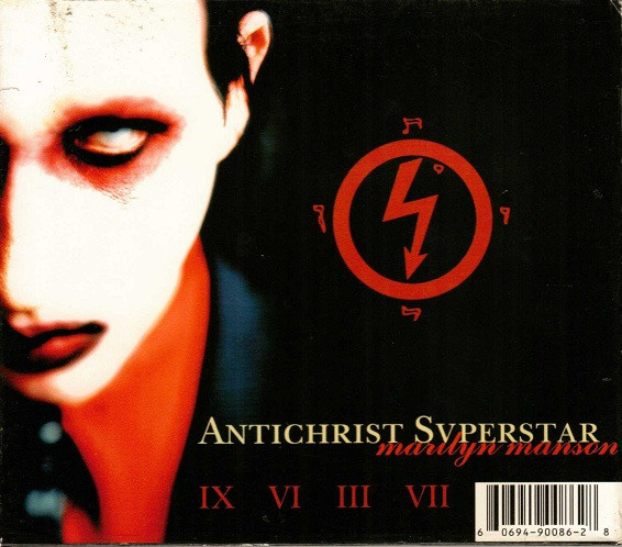
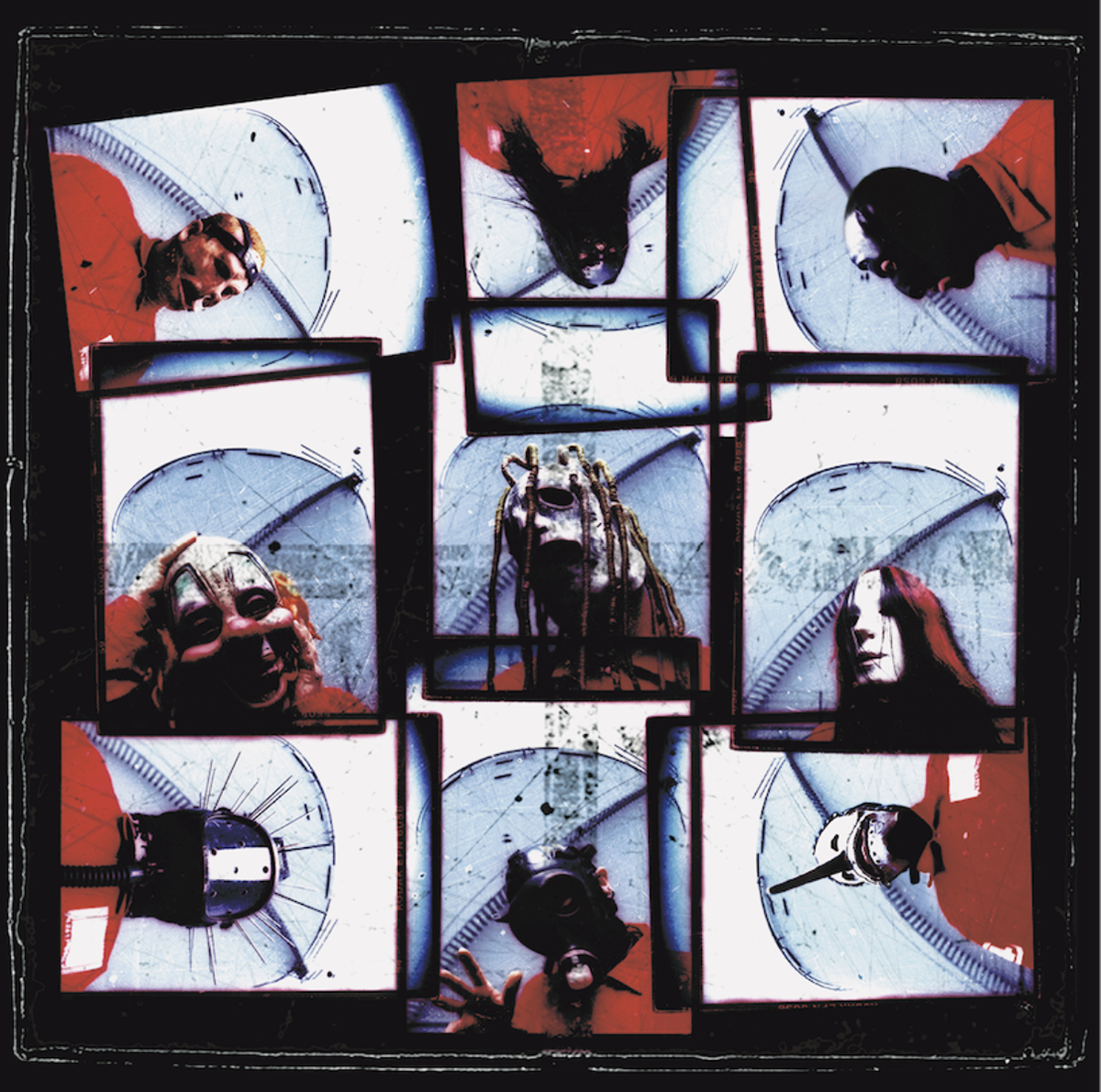
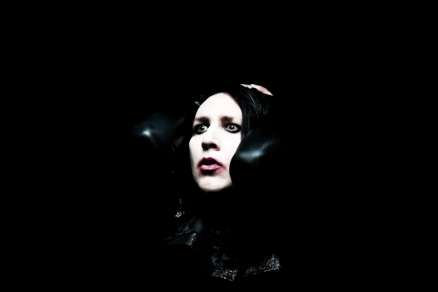
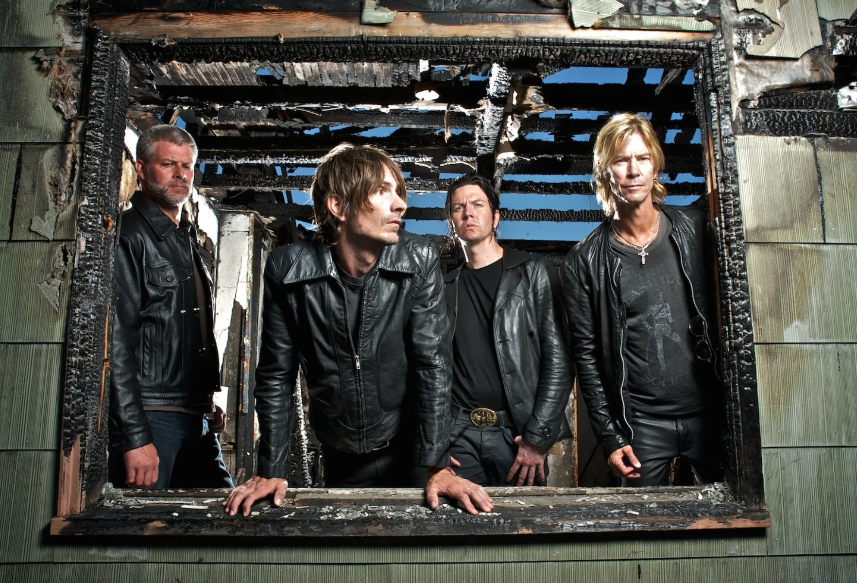
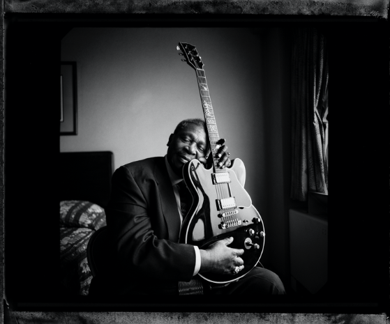
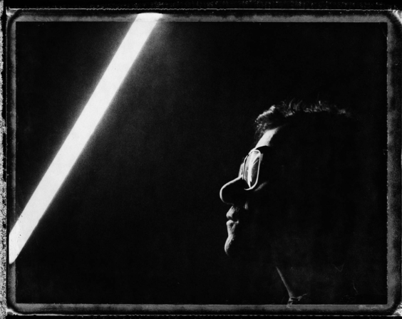
he IS MOST WELL KNOWN FOR WORKING WITH BANDS TO CREATE ALBUM COVERS, MOST NOTABLY SLIPKNOT AND MARALYIN MANSON. his WORK IS RECOGNIZABLE THOUGH ITS EDGY AND "BROKEN" STYLE MAKING USE OF STYLES WHICH MAKE IT HARD TO RECOGNIZE PEOPLE AND BRINGING A SUPERNATURAL FEEL TO HIS IMAGES.
hE IS ALSO WELL KNOWN FOR HIS WORK IN MUSIC VIDEOS HAVING STARTED WITH Marilyn MANSON ON "SWEET DREAMS" SENDING HIM INTO HIGH DEMAND WITH OTHER BANDS. he HAS RECIVED MULTIPLE AWARDS FOR HIS WORK ON CREATING HIGHLY SUCCESSFUL MUSIC VIDEOS.
he IS ALSO KNOWN FOR CREATING PROMOTIONAL MATERIALS FOR MOVIES AND FILMS, NOTABLY HORROR FILMS AS THIS IS WHERE HIS MAIN NICHE LIES WITHIN THE SUPERNATURAL.
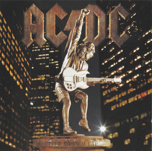
his STYLE VARIES THROUGHOUT HIS DIFFERENT WORK AND DOES NOT KEEP A SIGNATURE STYLE, HE TAKES WHAT THE ARTIST MAKES AND WANTS AND CREATES THAT PHOTO RATHER THAN PUTTING HIS OWN STYLE TO IT. this CAN CLEARLY BE SEEN BY COMPARING aC/DC'S STIFF UPPER LIP TO THE SLIPKNOT COVER. there IS CLARITY AND MODERNESS TO THE AC/DC COVER- IT STILL KEEPS A "WEIRD" FEEL TO THE IMAGE AS THE PERSON IS A STATUE BUT IT IS A COMPLETELY DIFFERENT STYLE COMPARED TO THE FISHETE BLURRED IMAGE OF SLIPKNOT.
dean Karr IS A VERY VERSITILE PHOTOGRAPHER WHO CAN MEET THE NEEDS AND DEMANDS OF HIS CLIENT WHILST MAINTAINING ARTISTIC INTEGRITY, IT JUST MEANS HIS NICHE BECOMES SLIGHTLY WIDER.
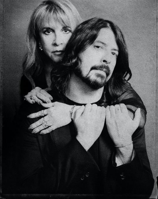
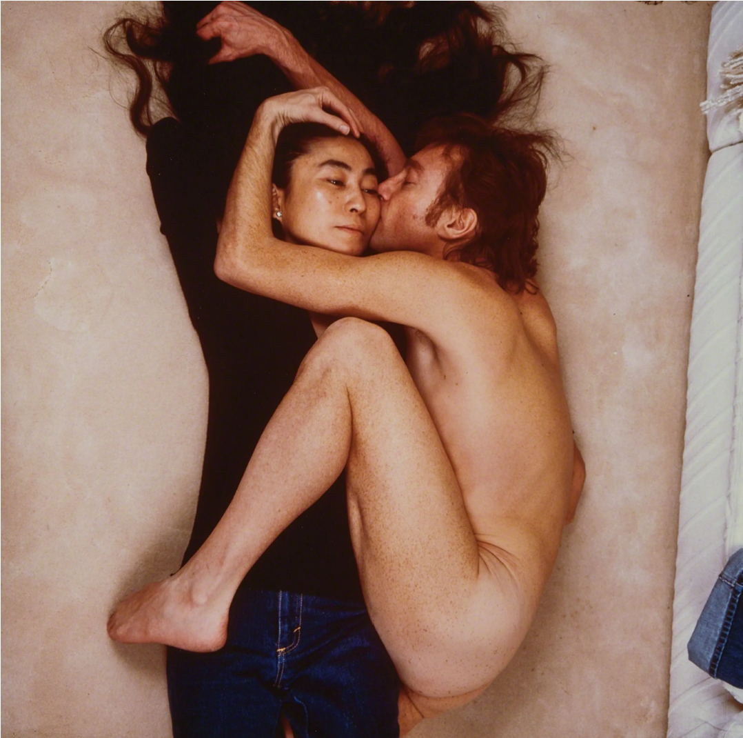
Danny Clinch was born in new jersey in 1964 and attended new England school of photography in boston. He started his carrer as an intern for Annie Leibovitz who was the photographer who took the iconic image of yoko ono and John Lennon 5 hours before his murder.
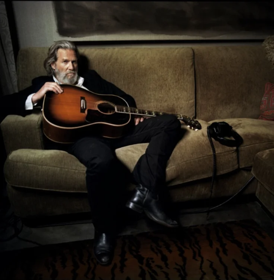
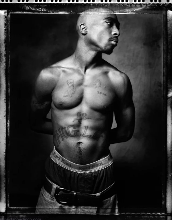
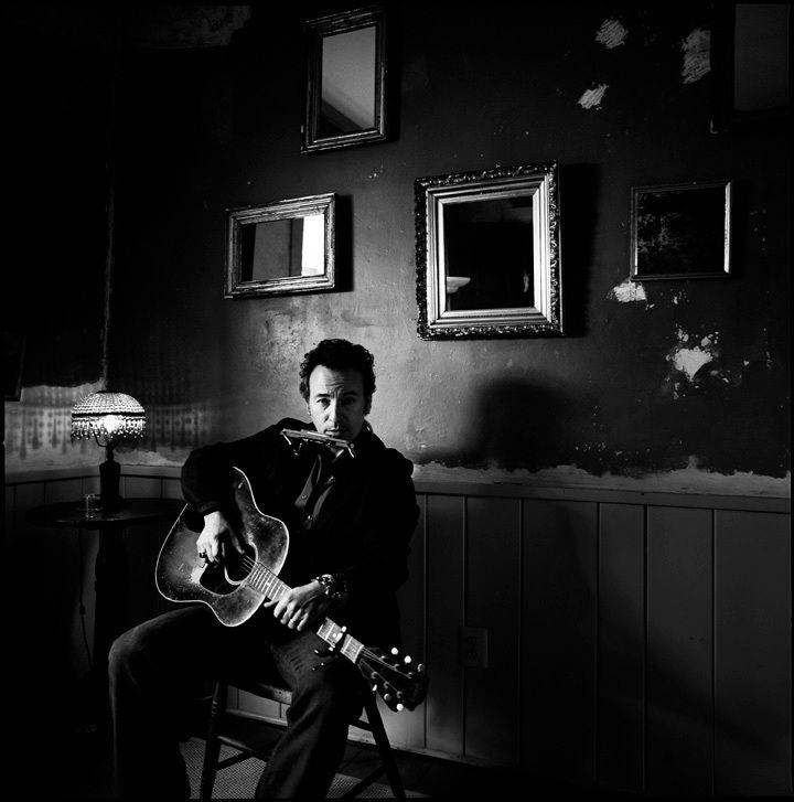
He went on to photograph many popular music stars such a bob dylan, Tupac, and Bruce Springsteen.
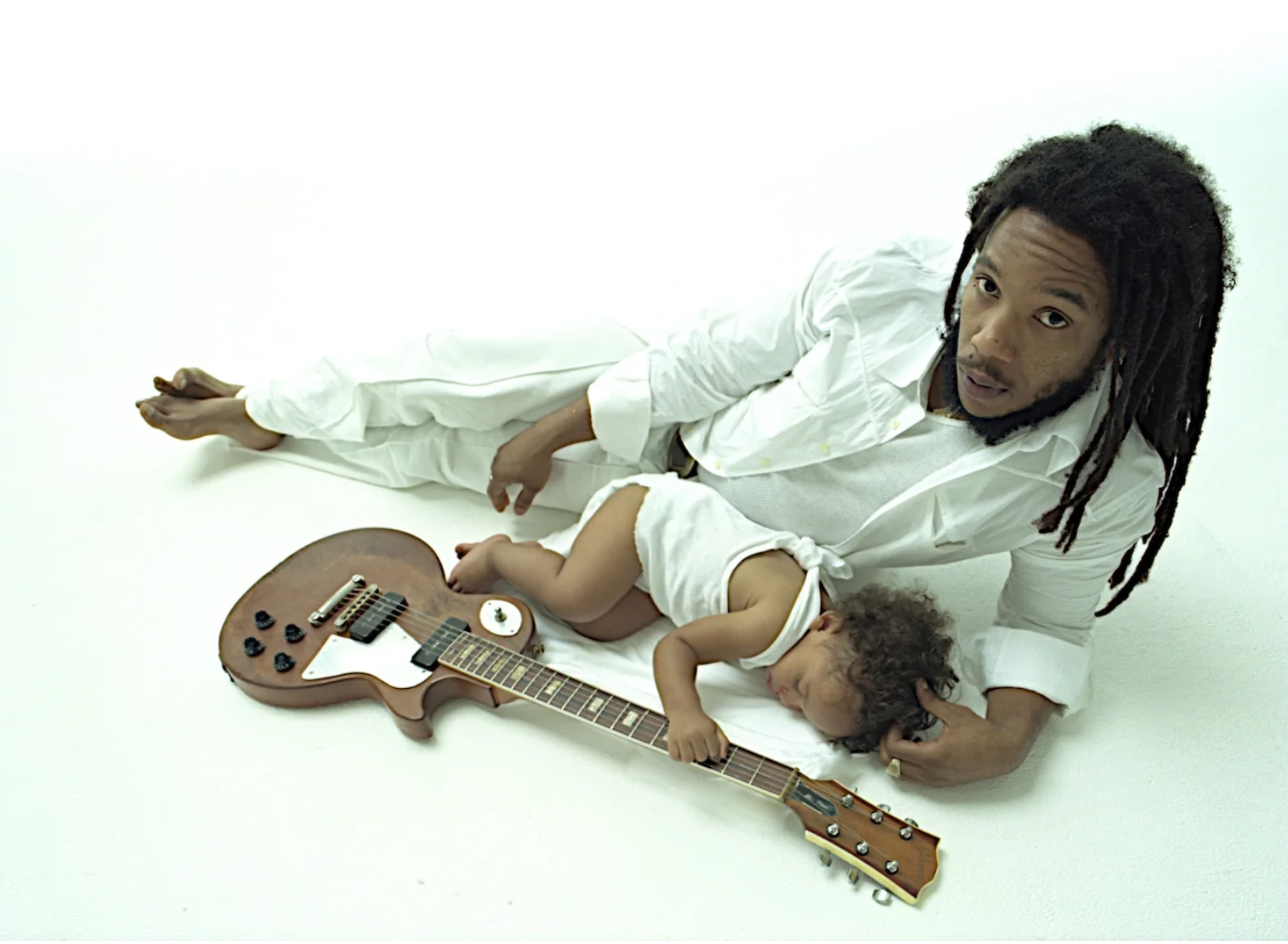
His images are clear and show personality behind the artists and it is clear he takes time to consider their work and personality. Each image he takes shows the individualism of themselves and part of their personality- in the tupac image he is shirtless and looking away which shows nonchalance whereas bruce springsteen is sat with his guitar in a casual feeling environment. The photos portray what is happening in their images and are well thought out. His style appears formal in a casual way, the posing feels very casual but the use of lighting makes the images incredibly dramatic. the image of led zepplin shows this well as he is in a somewhat ridiculous pose but the seriousness is there through the use of black and white and the way the lighting hits his face. There is a huge sense of casualness inside of the formal.
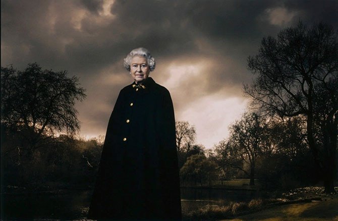
Annie Leibovitz is an American portrait photographer best known for her photo of John Lennon and Yoko ono taken 5 hours before John Lennon's murder. She was born in Connecticut in 1949 and she first became interesting in photography when her father gave her a camera when she was young. She studied at the San Francisco art institute where she was inspired by the work of Robert frank and other photographers, during her time here she visited Israel to photograph Vietnam war protestors and also photographed Poet Allen Ginsberg at the San Francisco peace march- these photographs landed her a position at rolling stone after she graduated.
She worked for rolling stone magazine from 1970-1980 and created intimate pictures of artists which often took the cover of the magazine. in 1971 and 1972 she was on tour with the rolling stones photographing, the band were so happy with her work that they invited her back in 1975 to document their 6 month long tour but during this time she began using cocaine from the "rock n roll" lifestyle and struggled to recover for many years.
on December 8th 1980 she photographed john Lennon for the cover of rolling stones, she was asked to photograph Lennon alone but he insisted that Yoko ono be on the cover as well so she attempted to recreate the image from their "double fantasy" album cover but made him remove his clothes. John then curled up next to Yoko and she knew it was the photo. after taking their photo john said "You've captured our relationship exactly" and Yoko had offered to also be topless but Annie disagreed and said not to to create this iconic photo. She was the last person to professionally photograph Lennon as Lennon died 5 hours later and rolling stones released the image a month later.
in 1980-2000 she moved to working with Vanity Fair Magazine photographing celebrities whilst regularly working with vouge.
From 2000- present she holds a retrospective of her work as various museums.
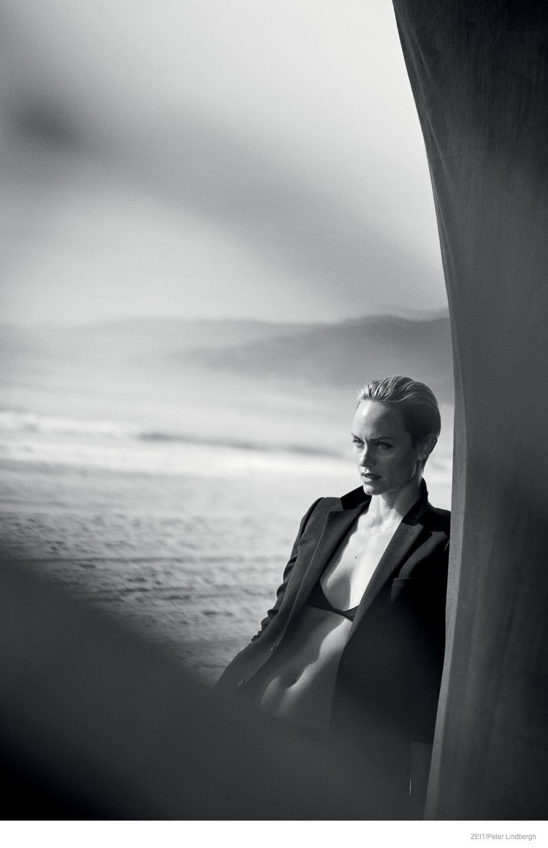
Peter Lindbergh born 23 November 1944 was a fashion photographer from Germany, He studied abstract art at "Kunsthochschule". In 1971 he moved to Düsseldorf and spent 2 years as an assistant for "Hans Kux" a well known Germany photographer and opened his own studio in 1973. During this he worked with Stern magazine. Lindbergh only liked to photograph in black and white, he said using colour allows the imperfections of humans to come through when photographing and creating supermodels, black and white hides these flaws and allows the viewer to fill in what they cannot see in their idealised views. He also photographed for vouge and other large magazines.
First Shoot edited

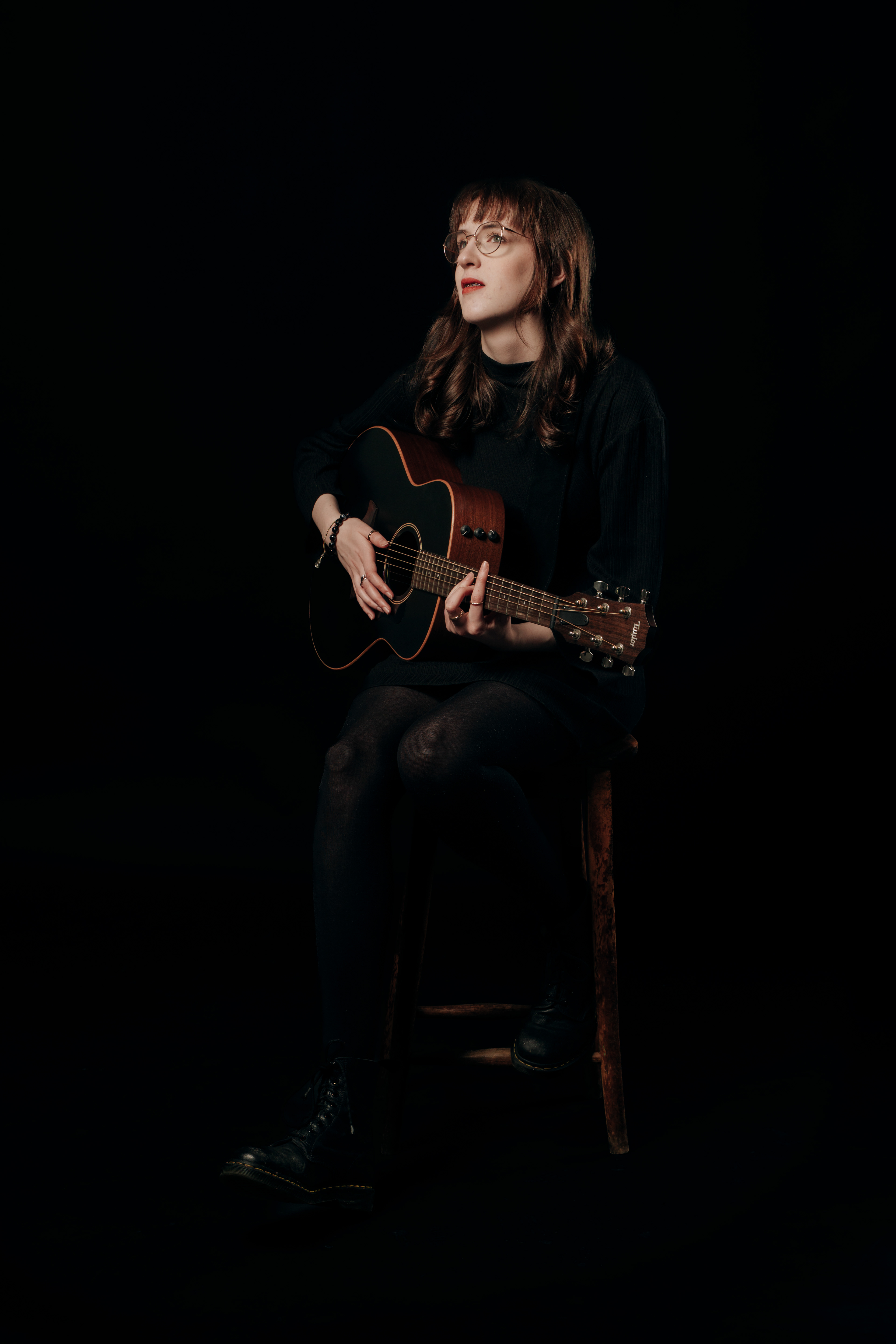
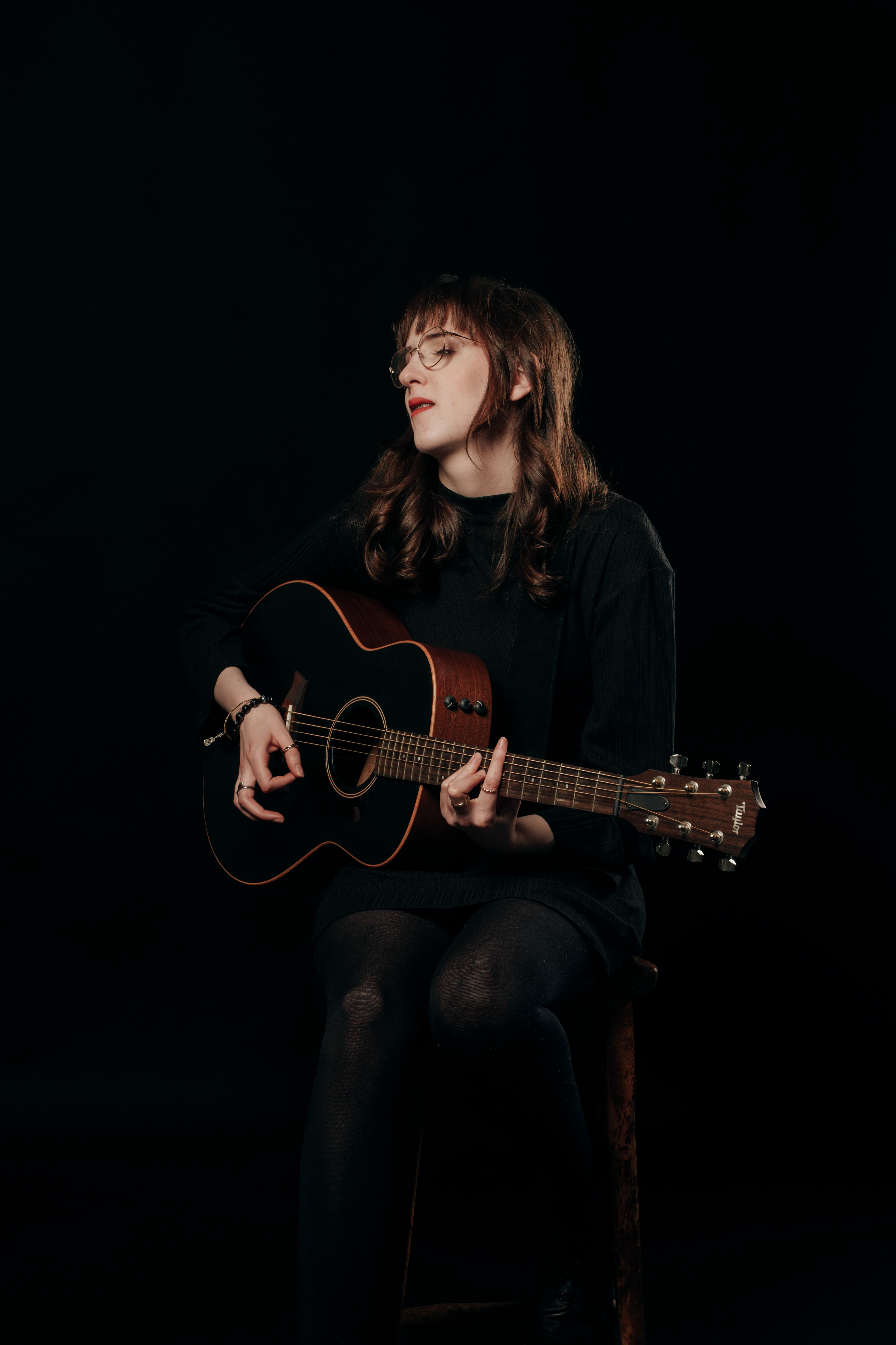
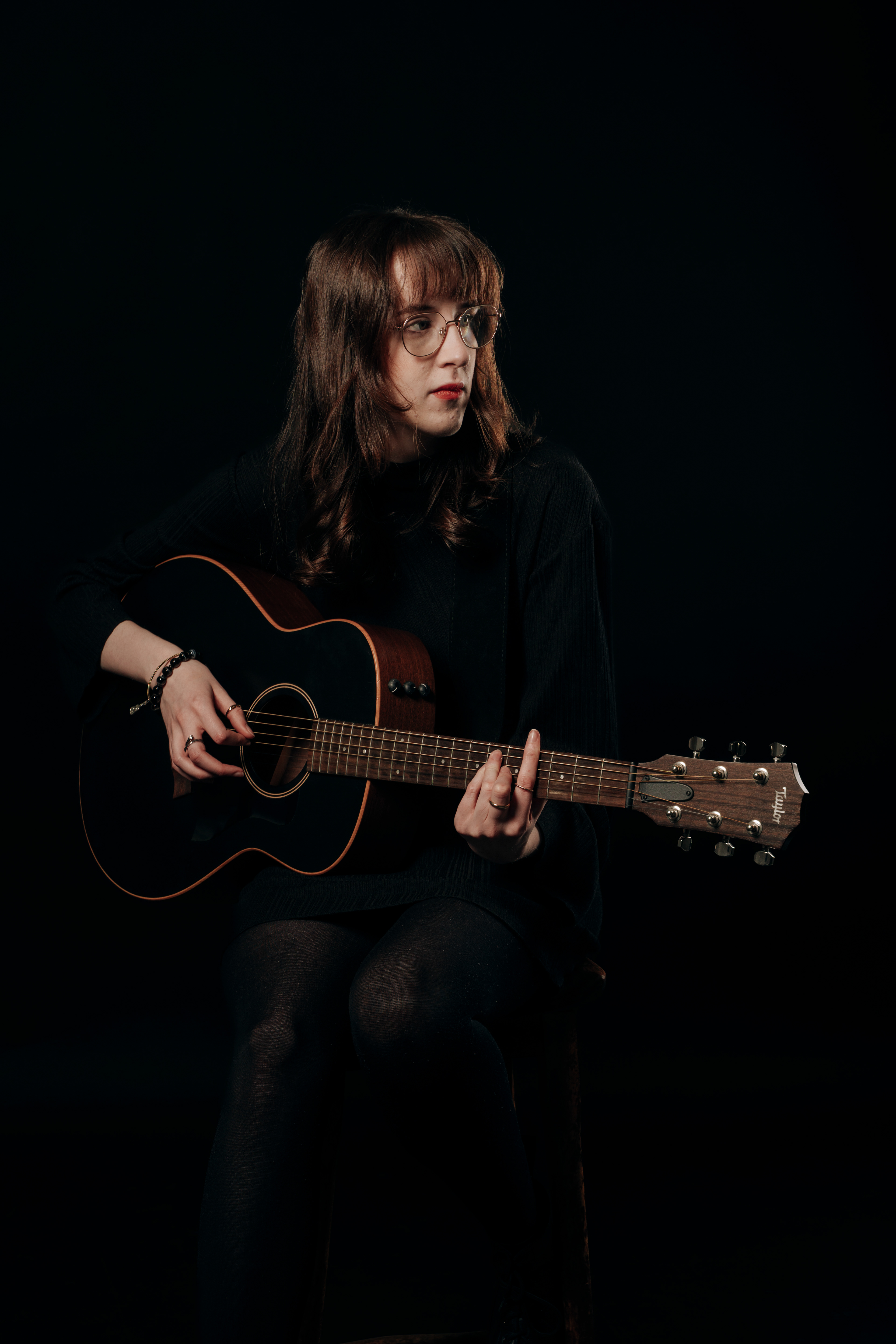

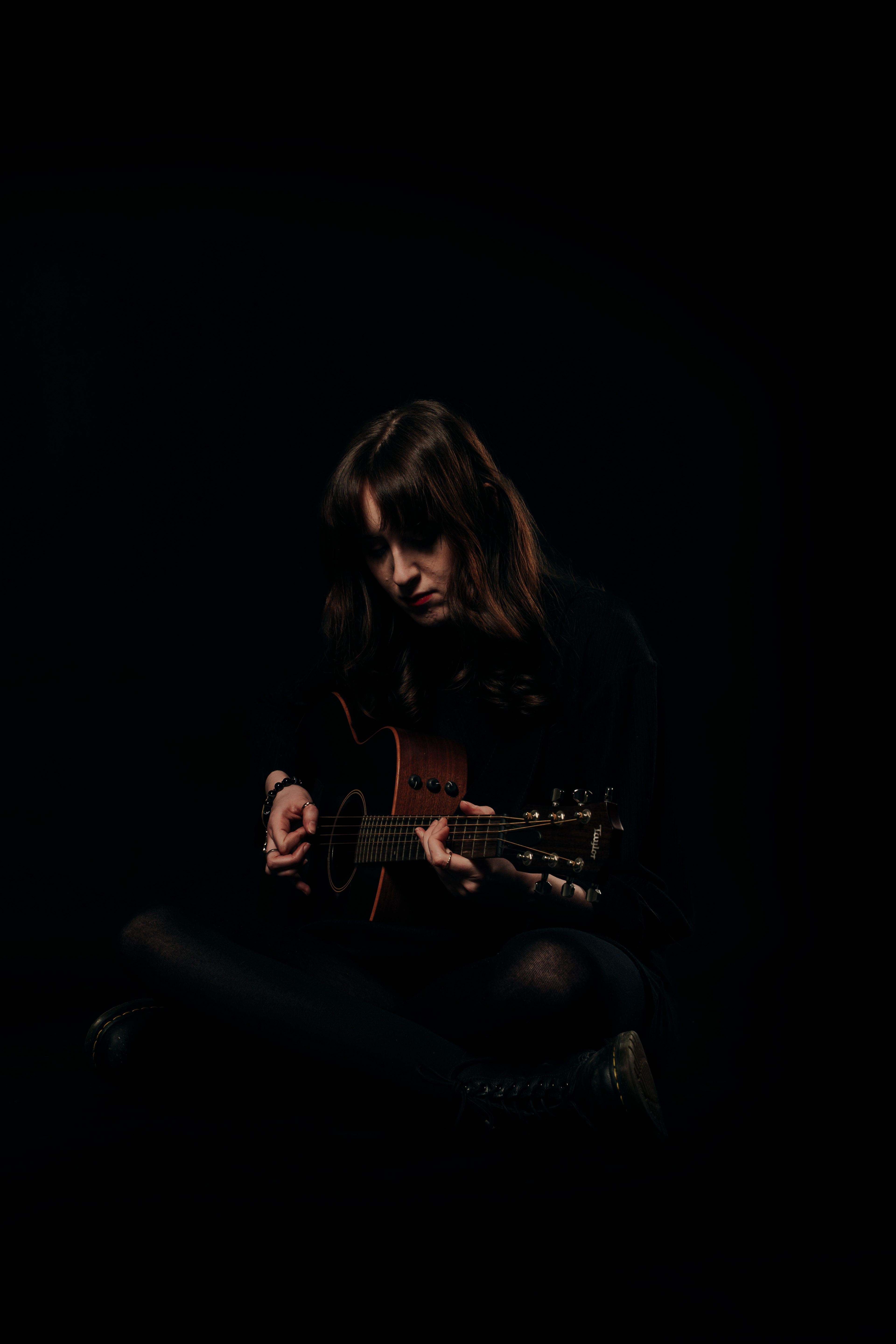
First Shoot process
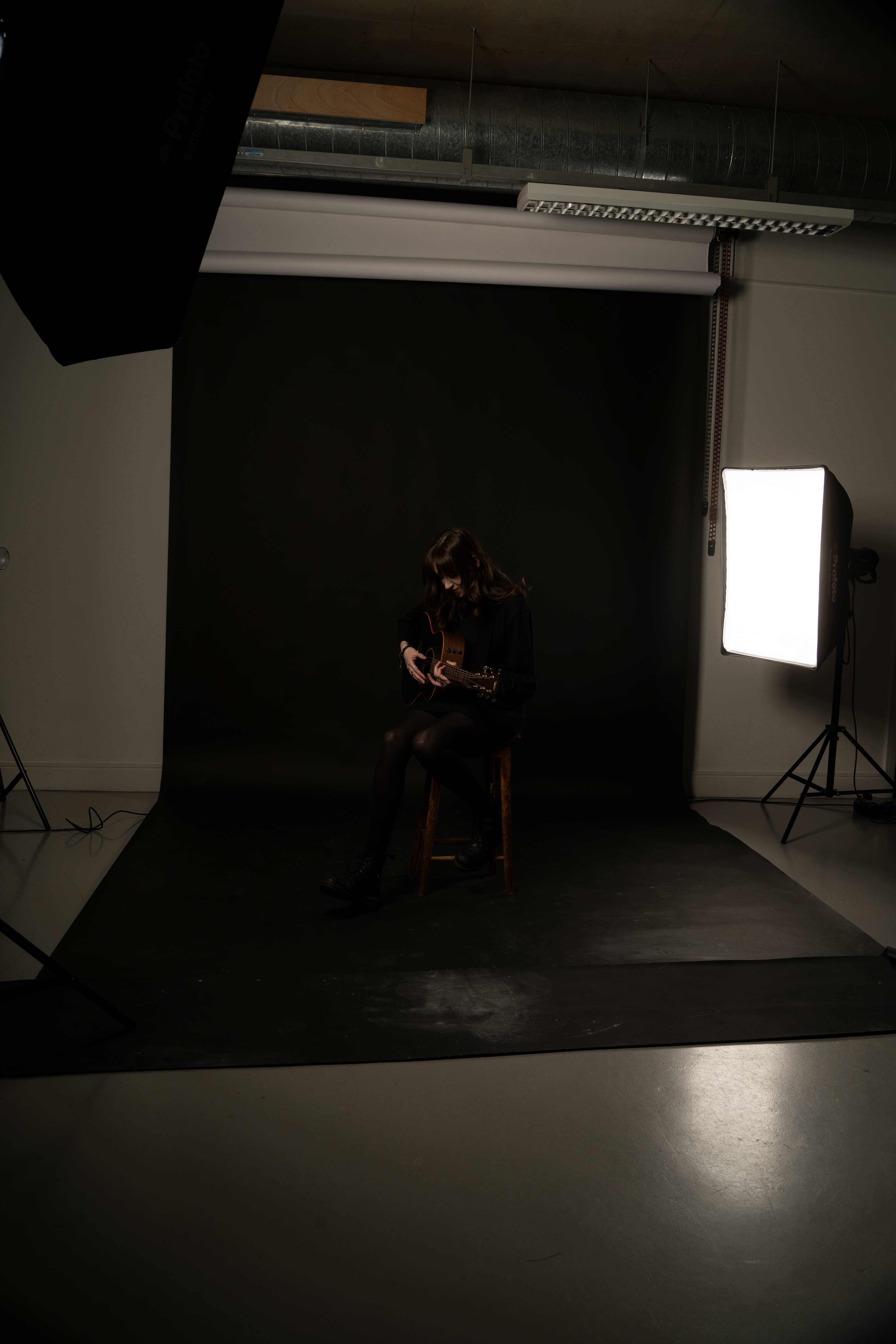
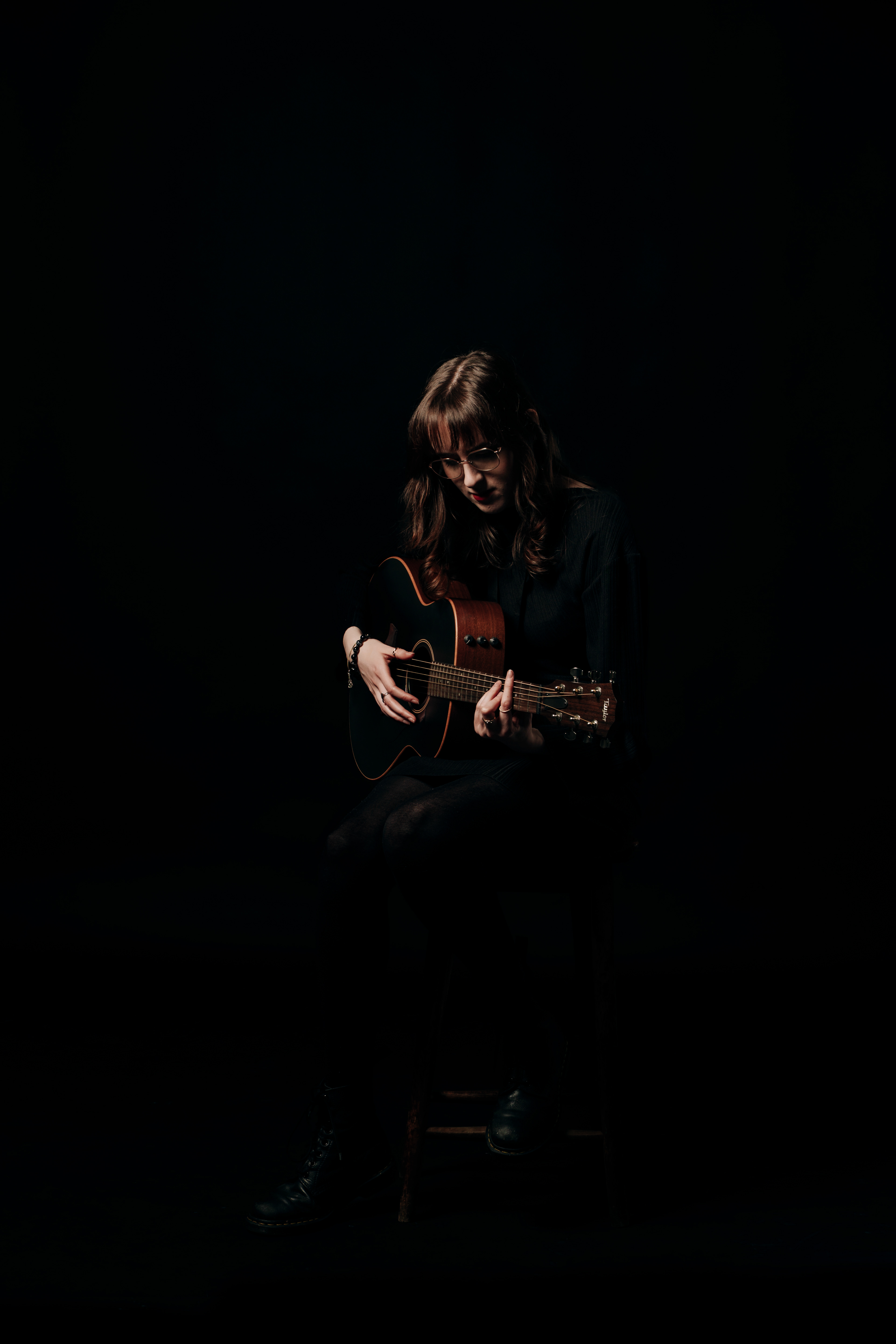
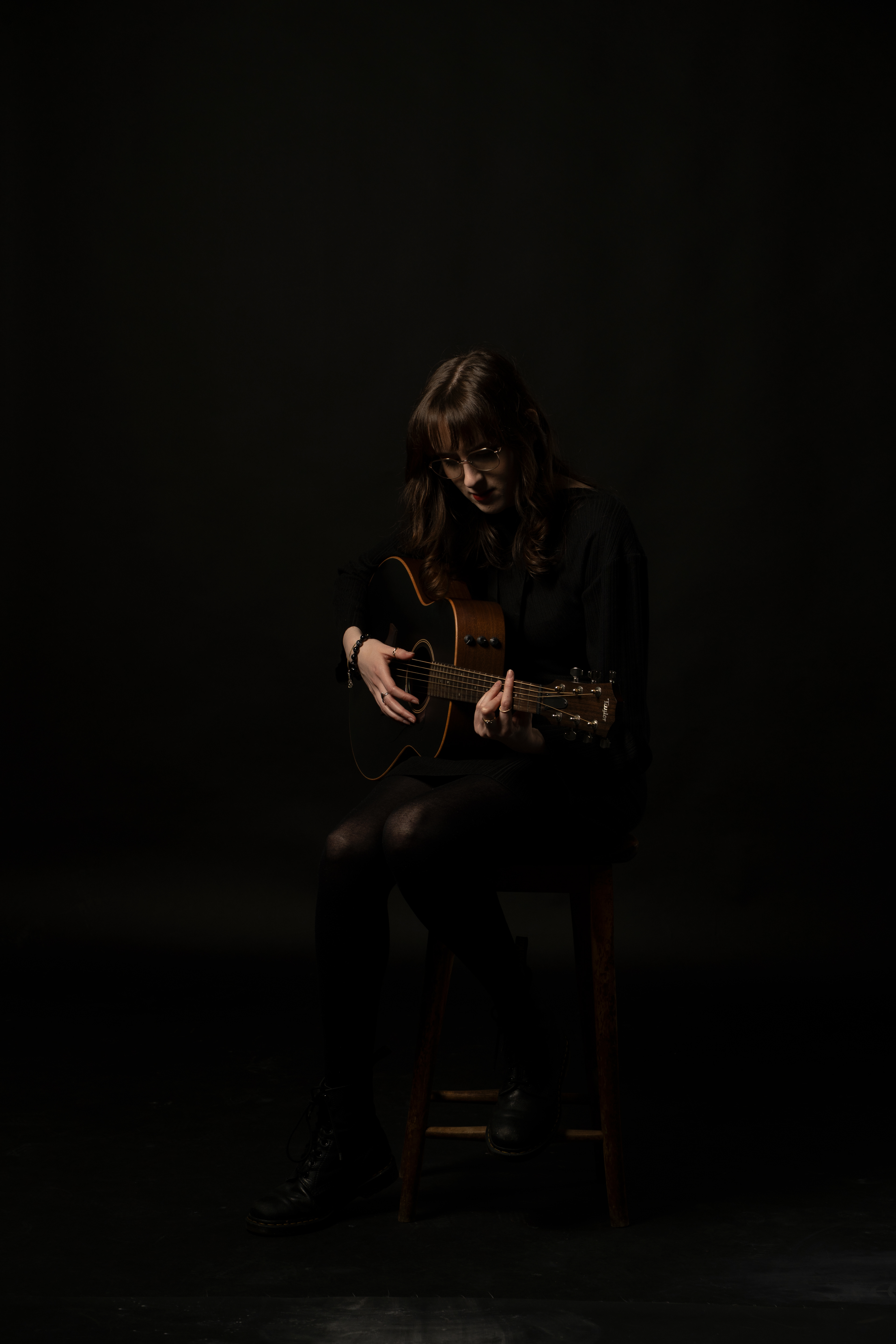
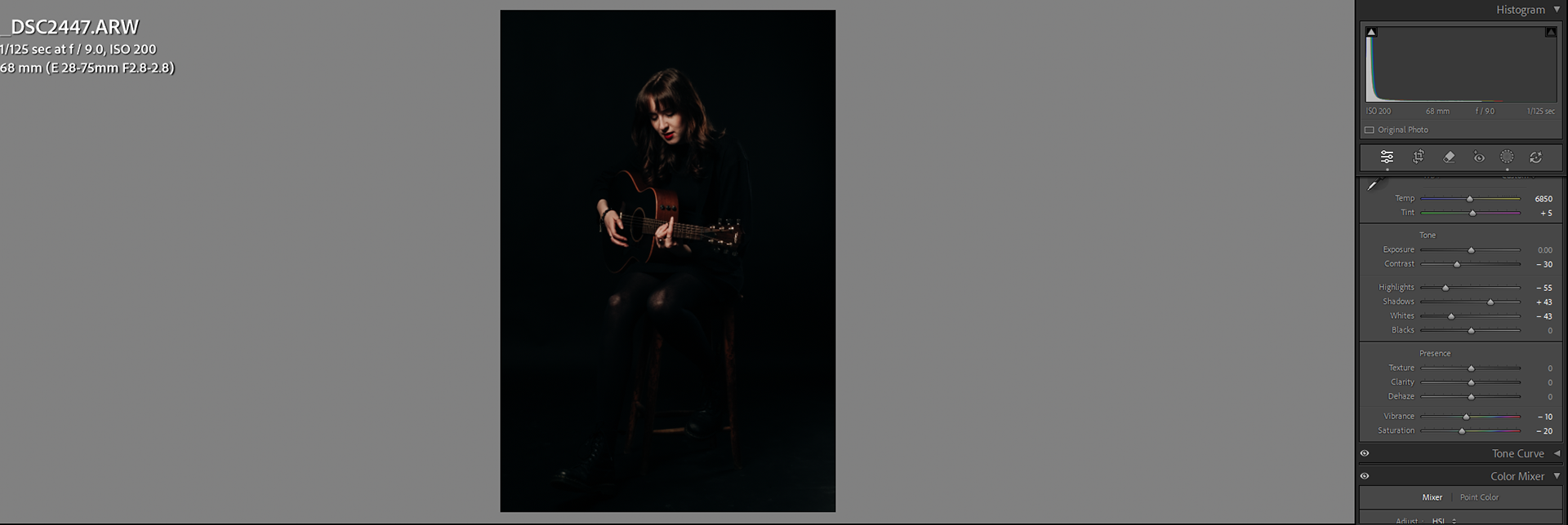
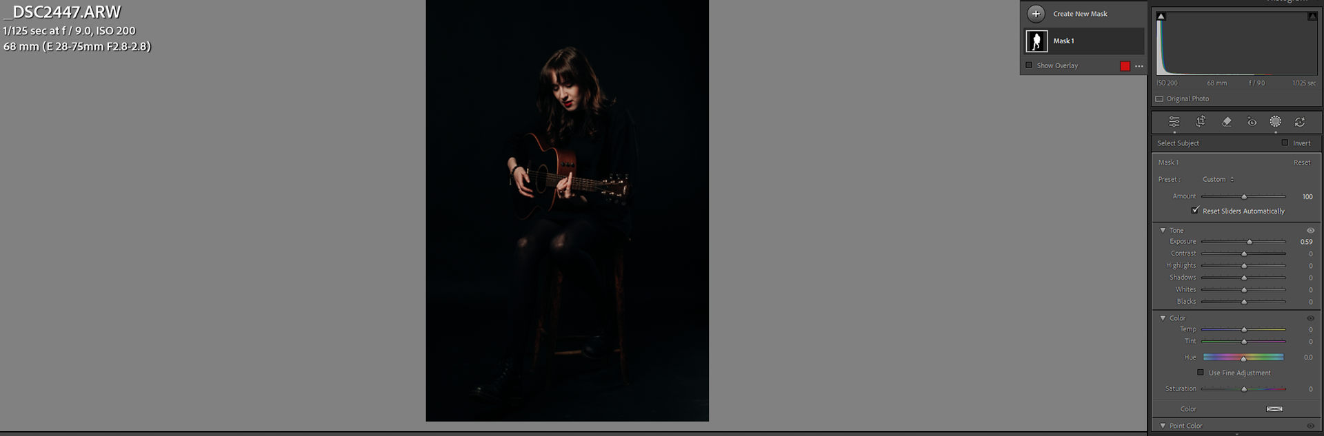
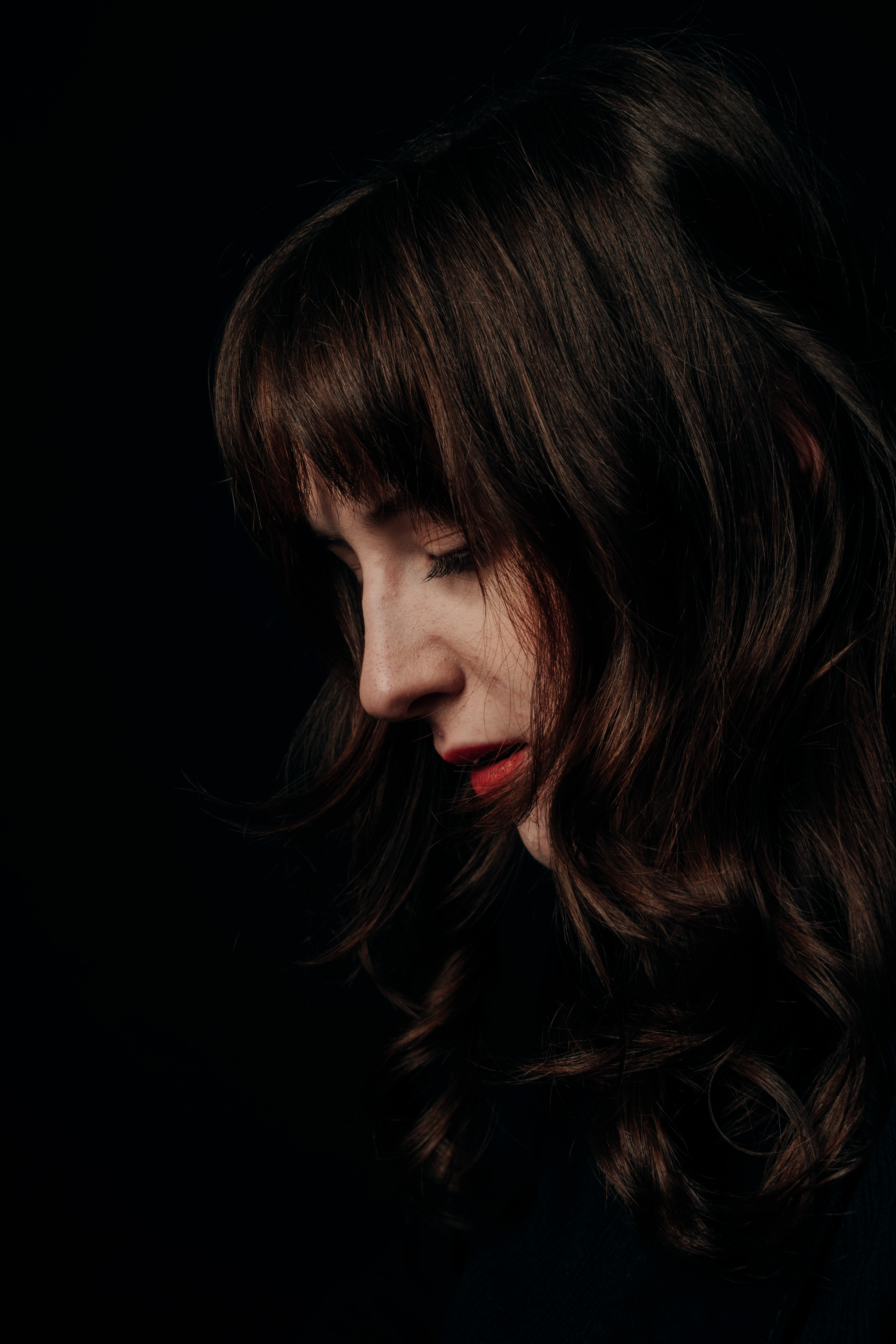


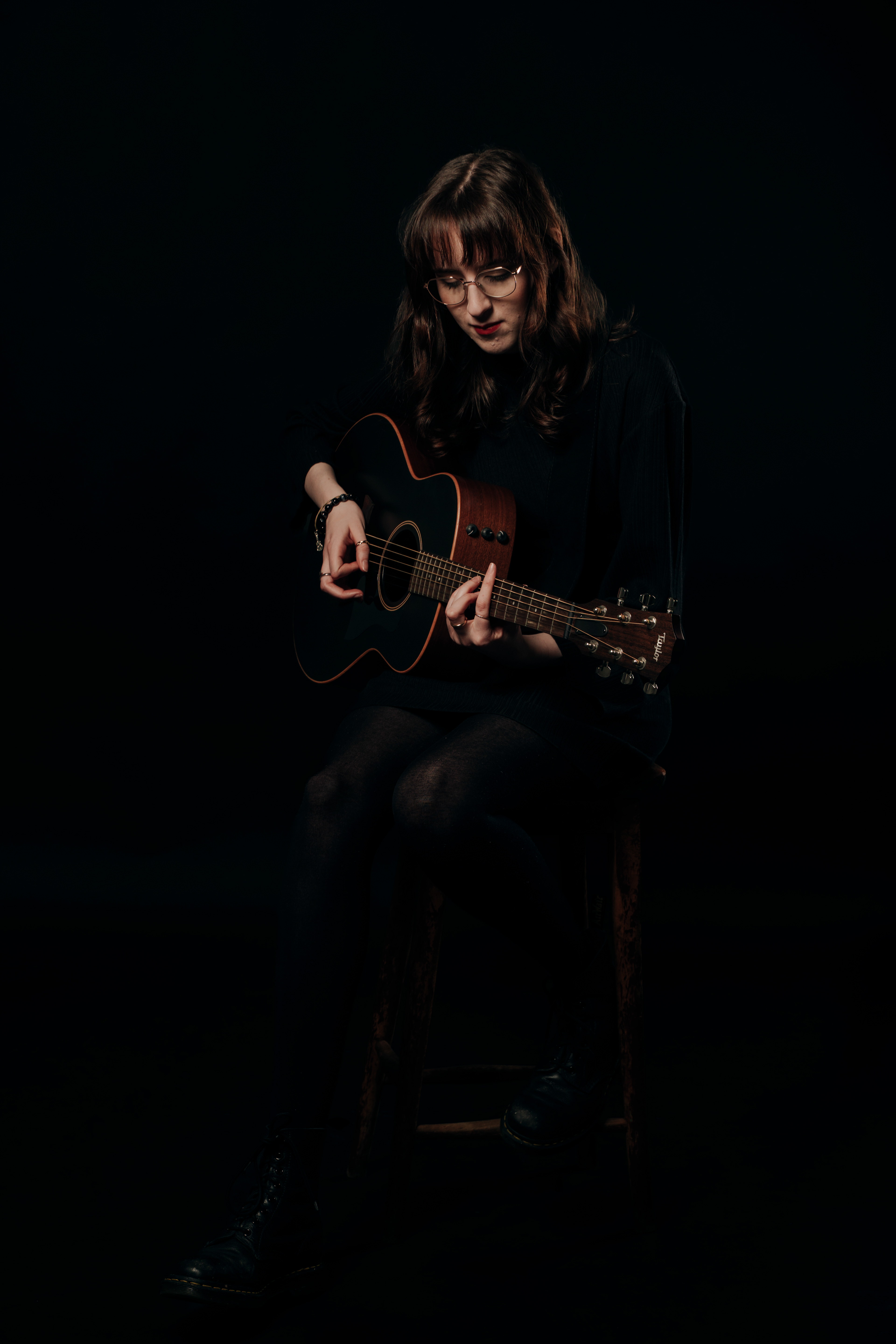
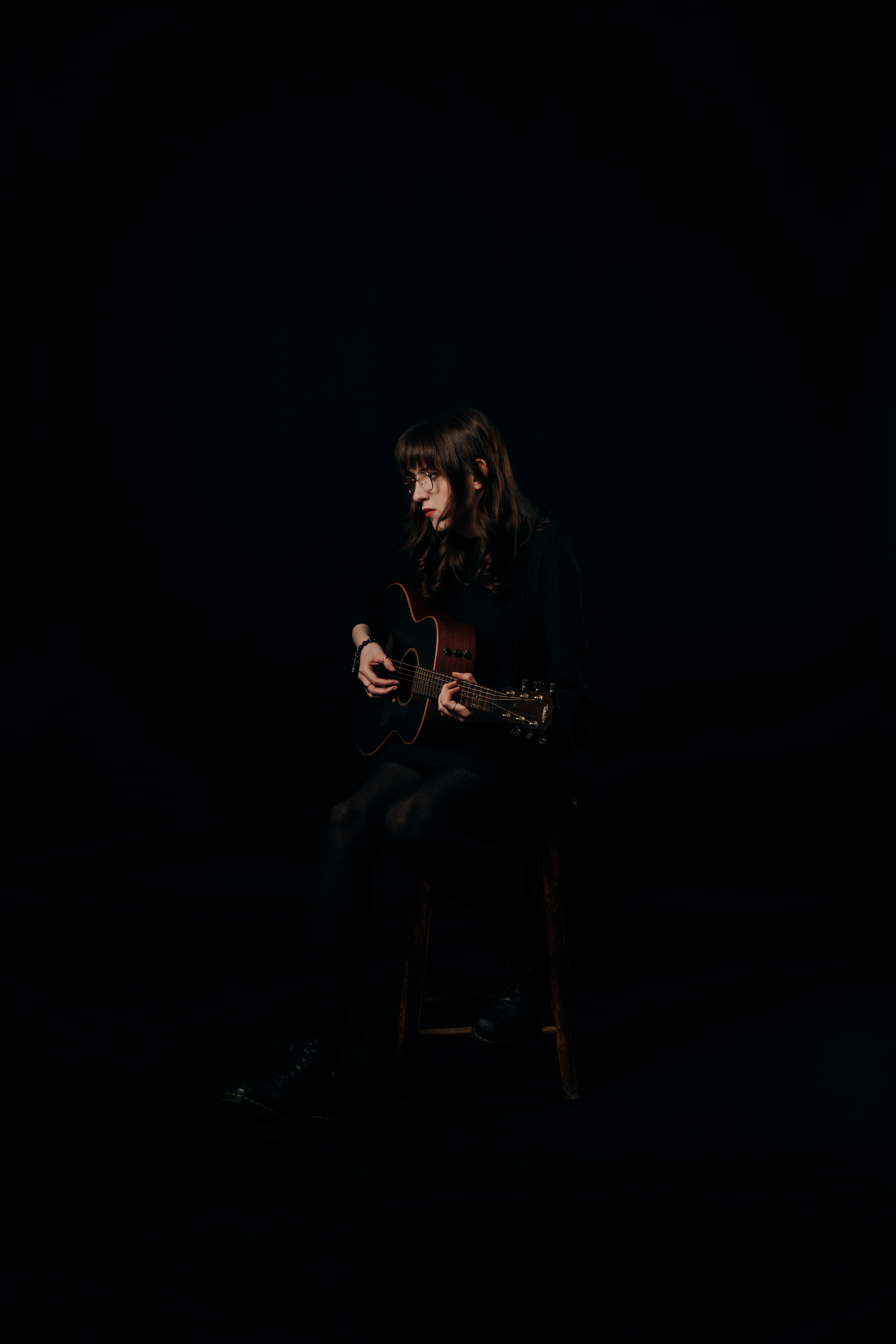
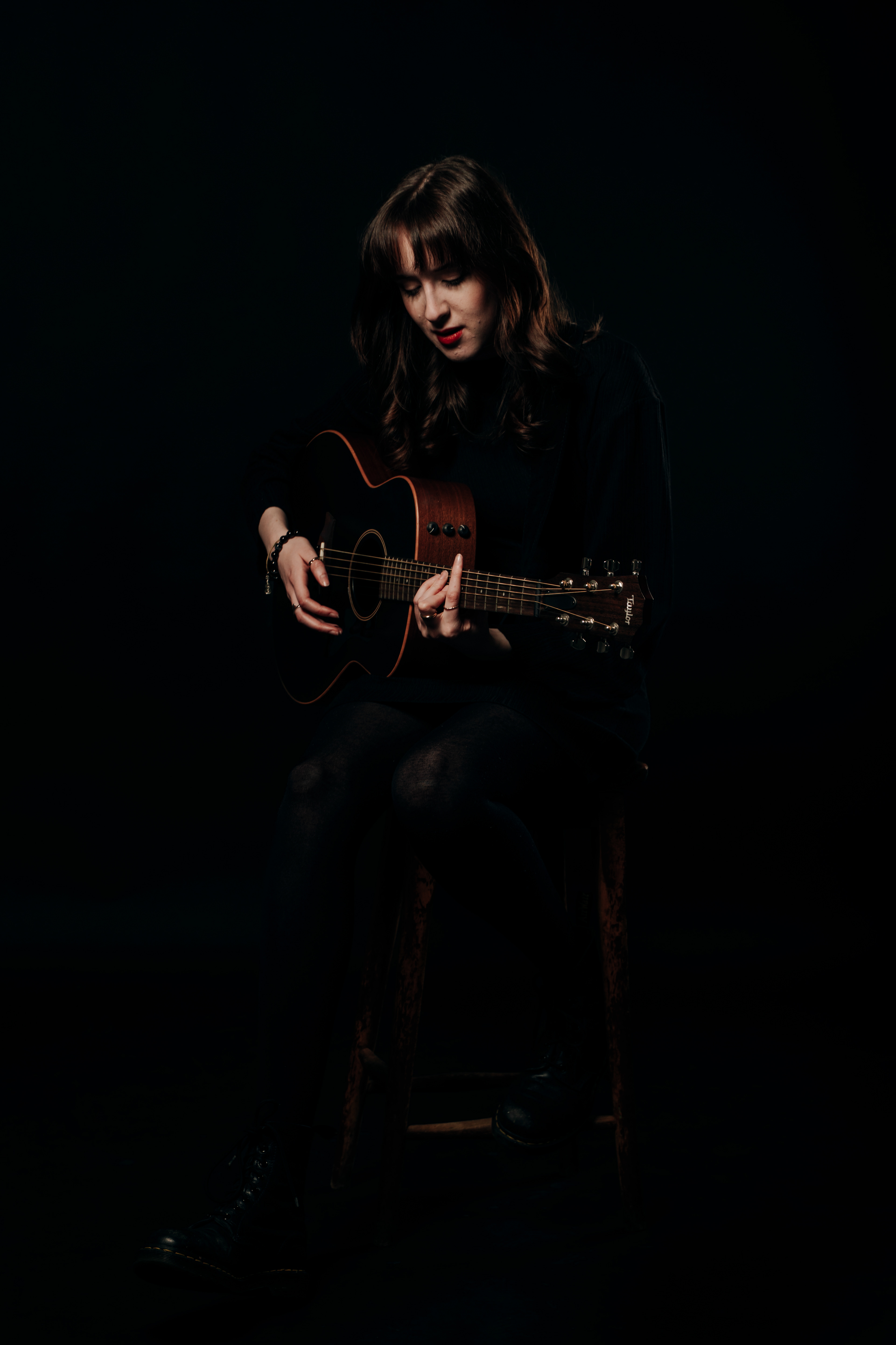
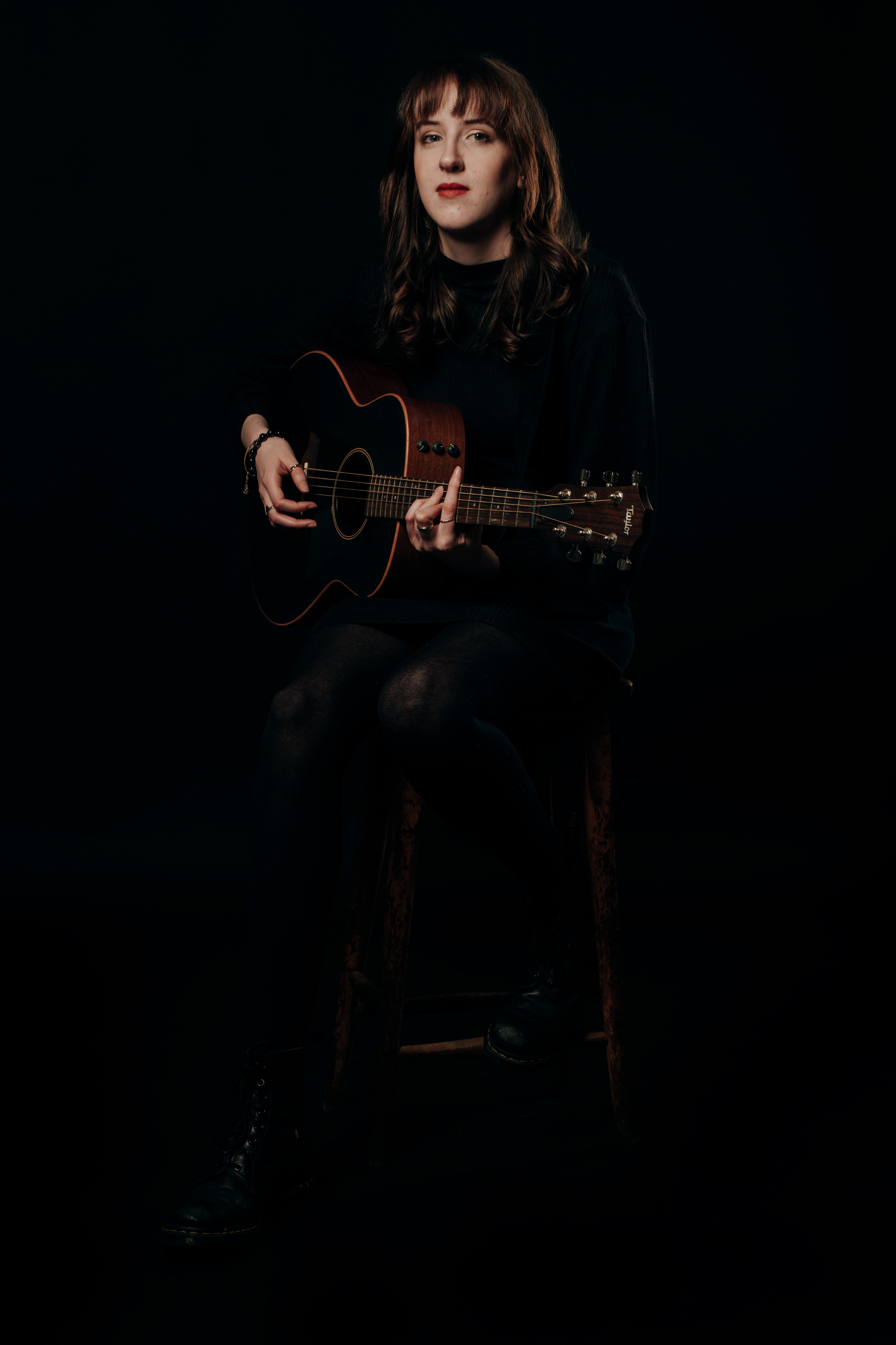
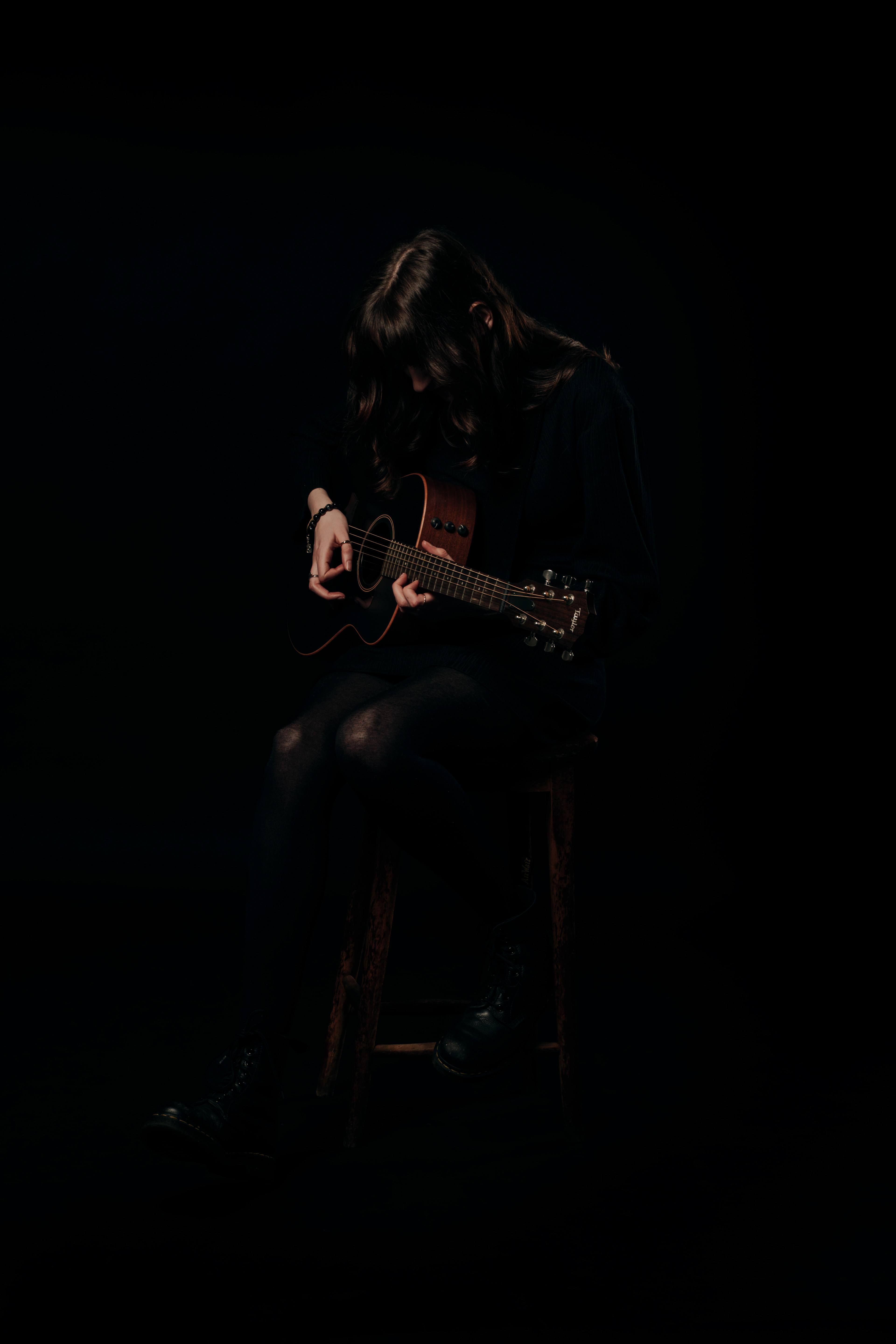
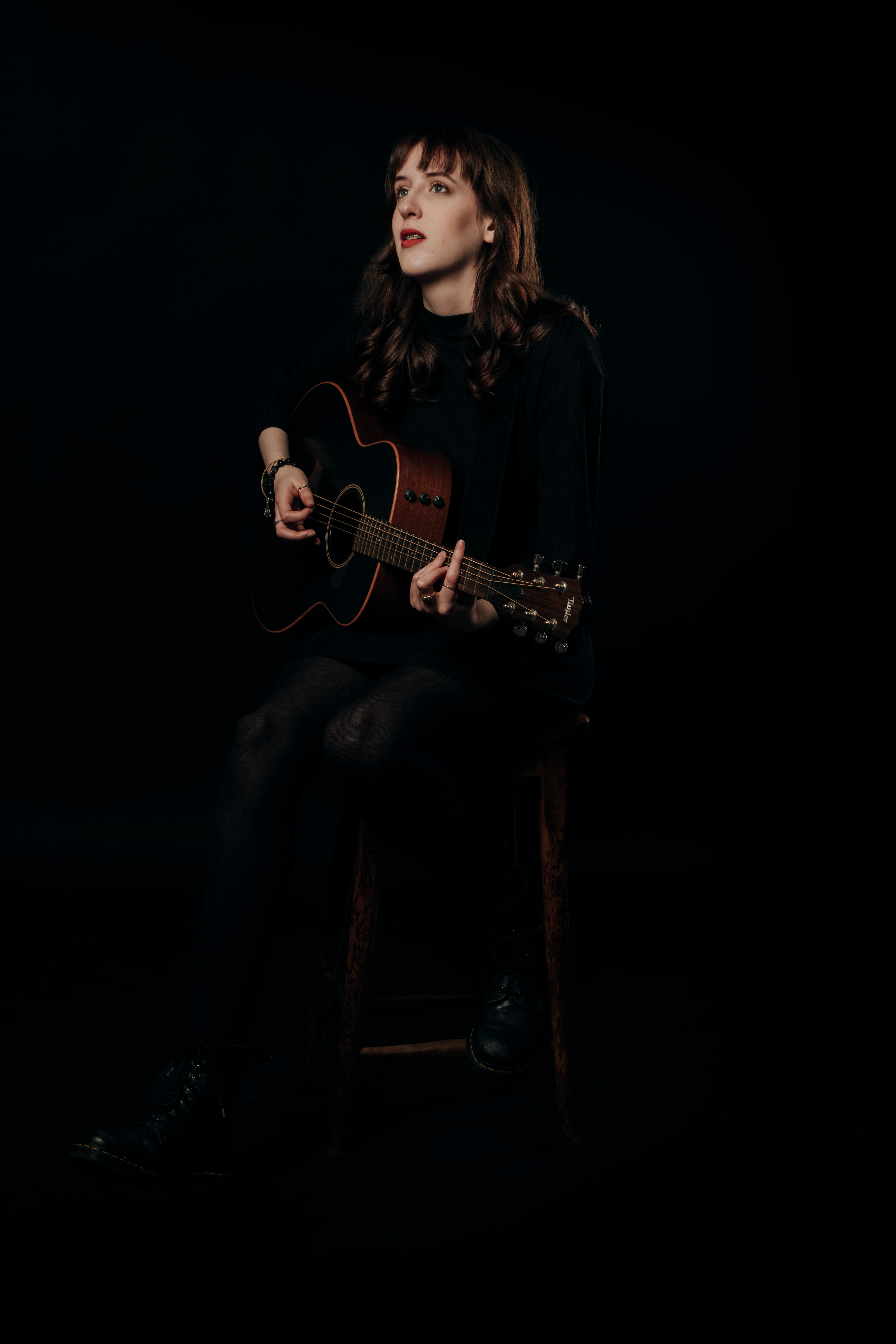
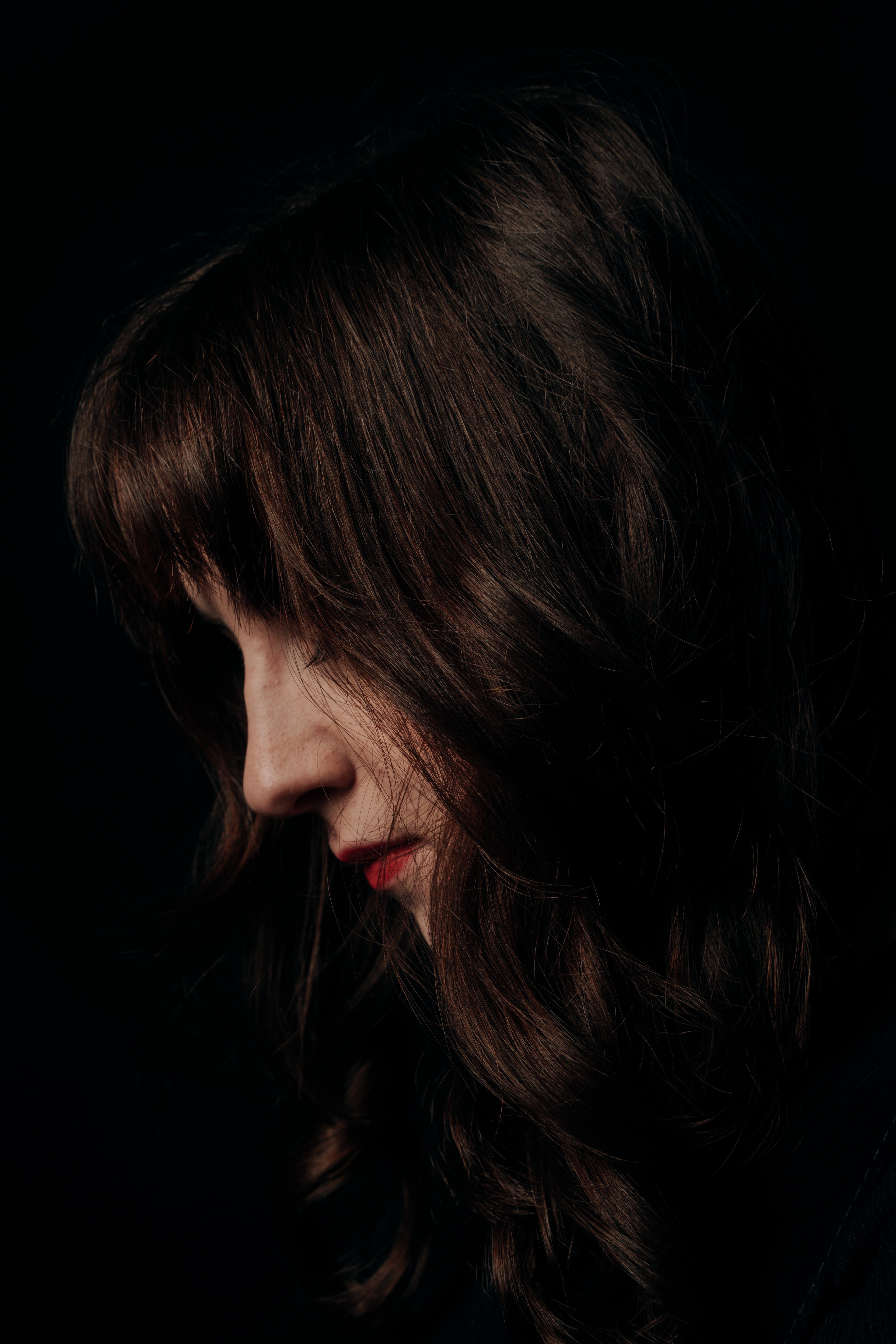
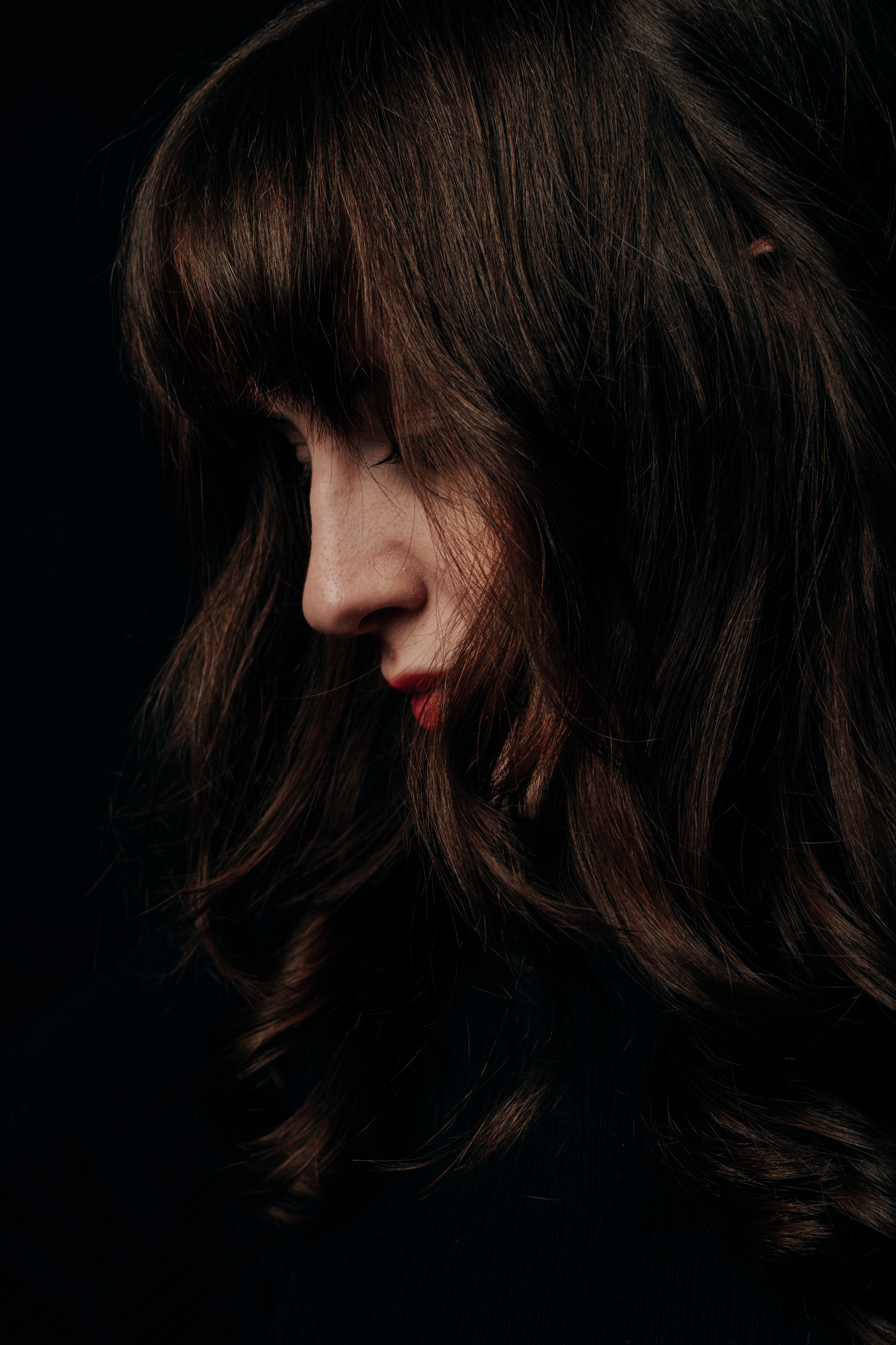
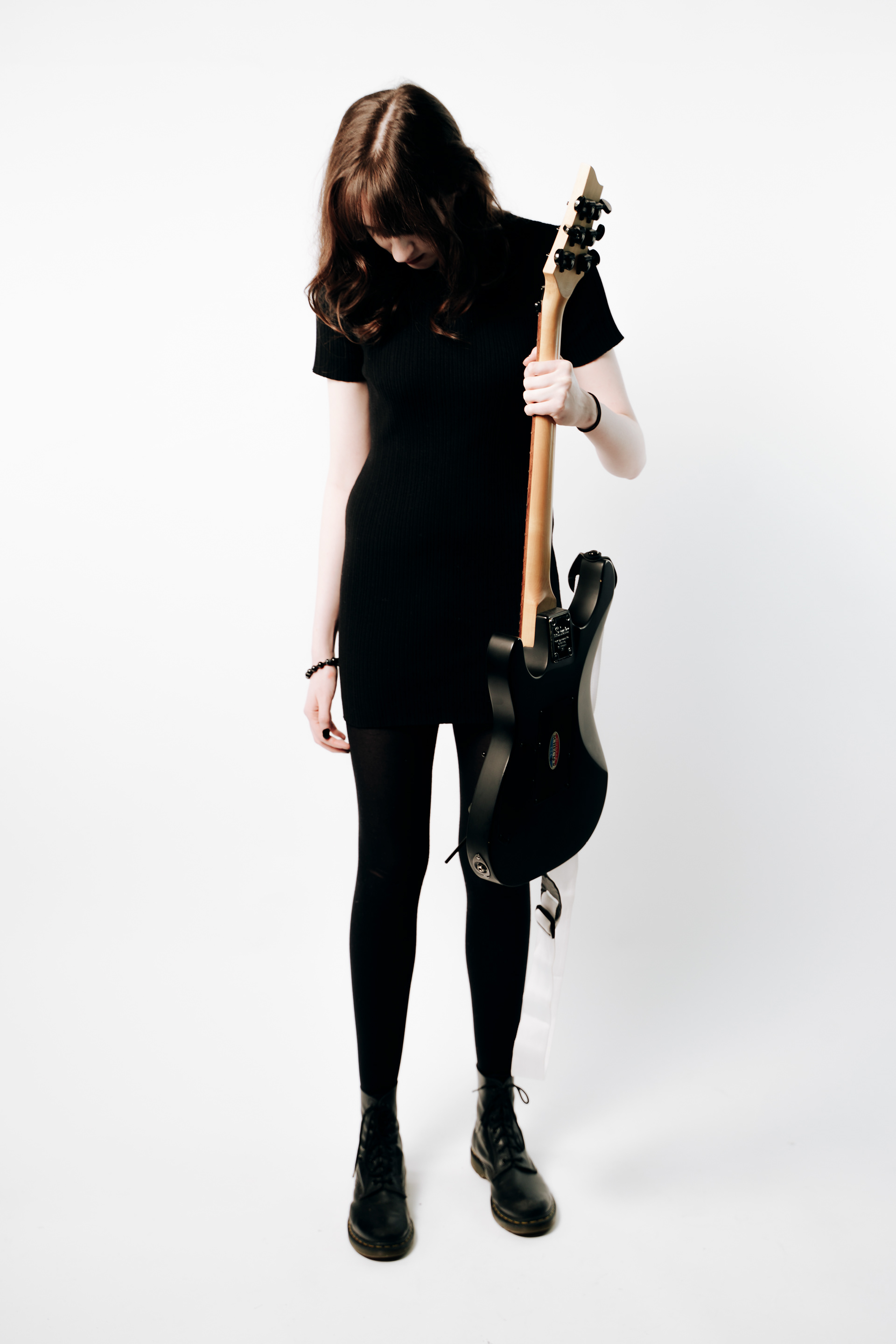
Whilst I am happy with these images from a portrait standpoint I am going to reshoot due to the printing process. With the photos being so dark they may not print up too well with the blacks of the background, the hair, and the dress having chances to blend in together. For my next shoot I am going to go entirely opposite and go for high-key white images.
Second Shoot.
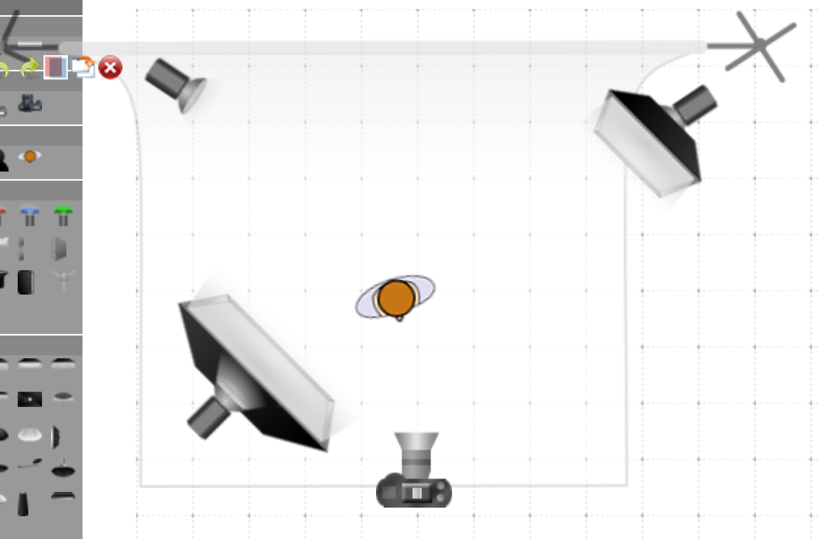
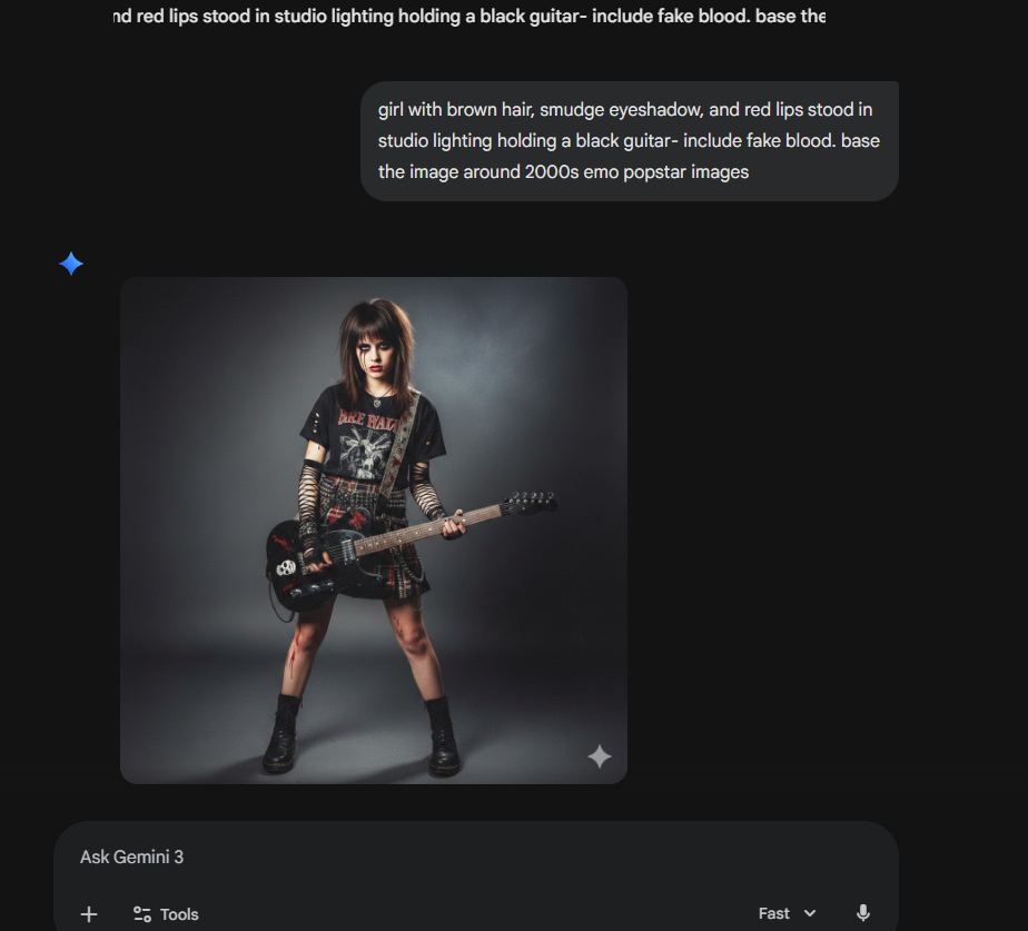
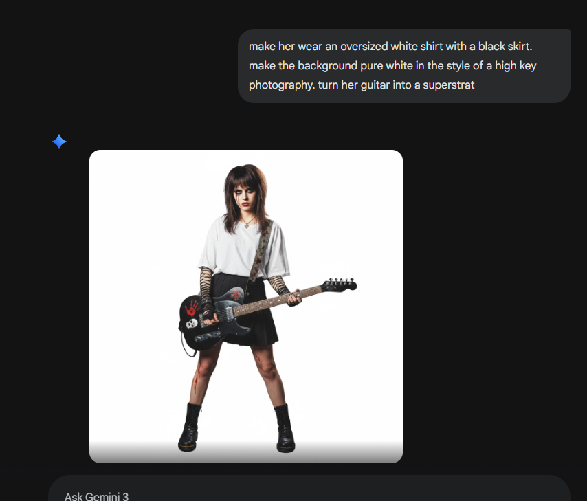
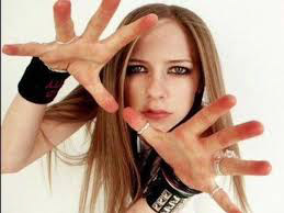
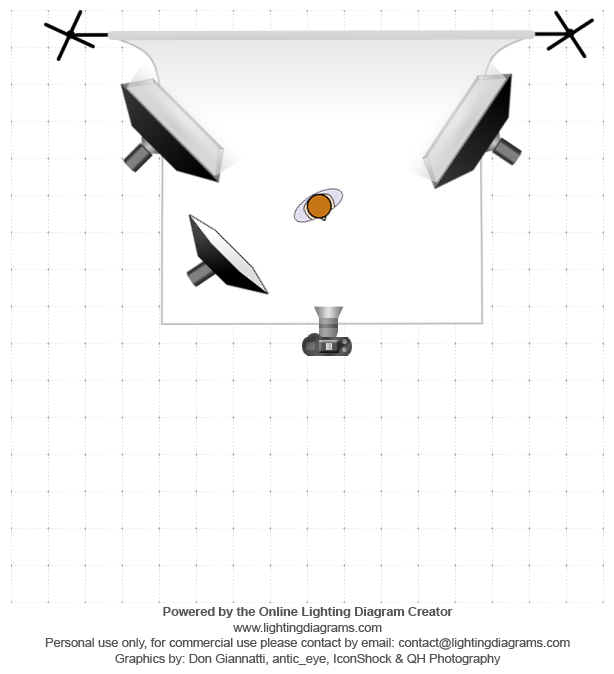
For the second shoot I am planning to use image 1 and 3 from the first set and create a middle image for these in a completely different style. As these images are trying to be album covers in a way I would like to create one of a more metal and emo vibe to sit in the middle showing versatility of the artist. The next shoot will feature an electric guitar in a high key lighting setup similar to 2000s popstars. I could not find an image for reference of this shoot so I went into Ai to build something which could similarly explain the image in my head. this is far from the perfect image in my head but it has given me a rough idea for how the lighting will work. Avril Lavigne's early photoshoots will be an inspiration for the lighting and basic premise.
Second Shoot edited images
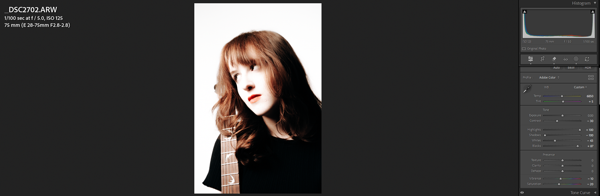
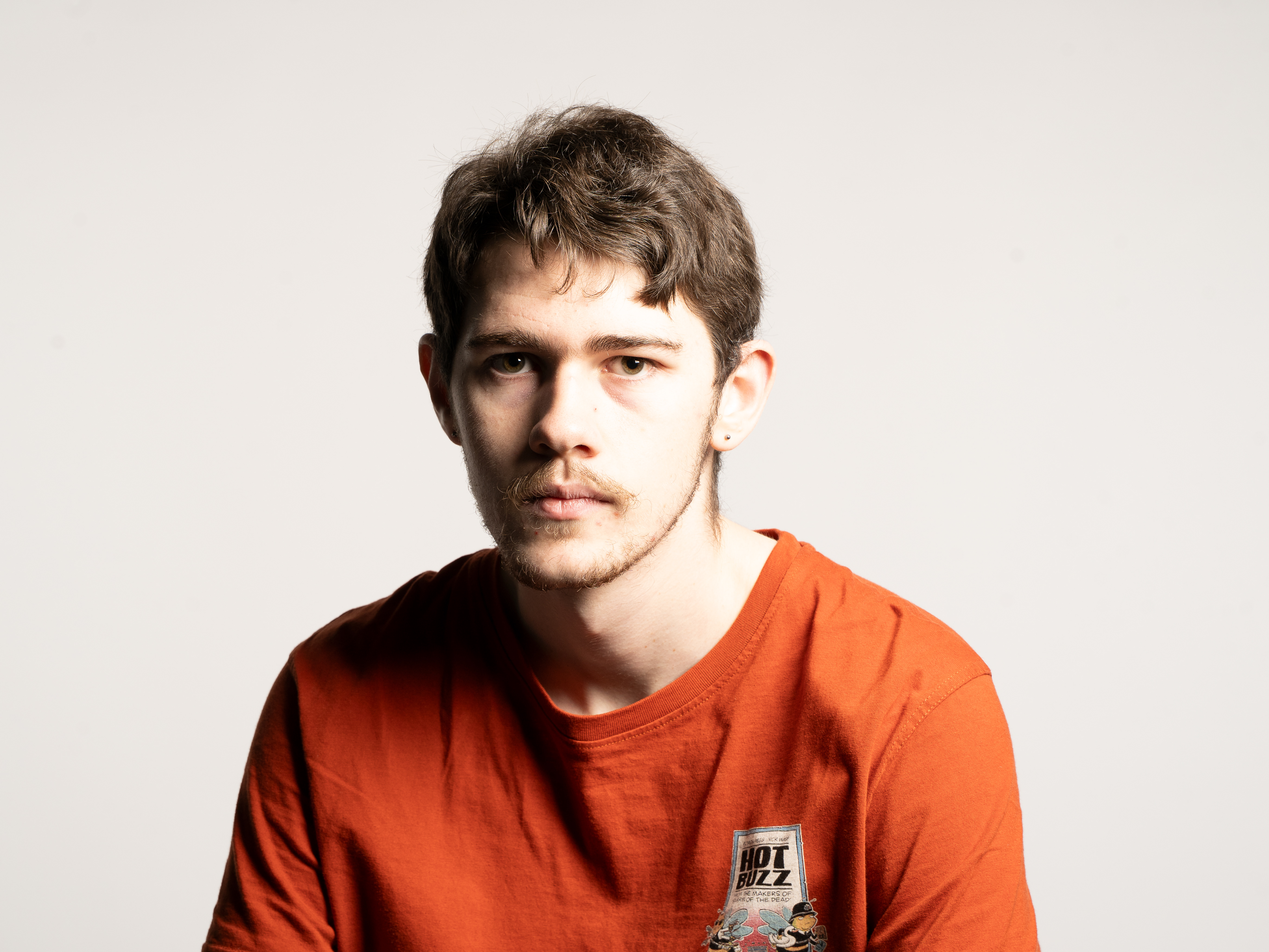
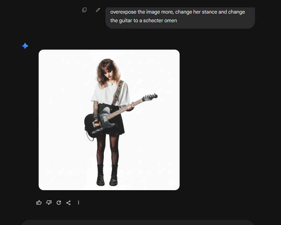
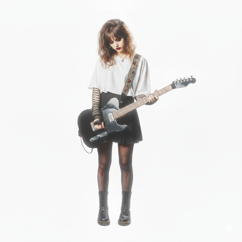
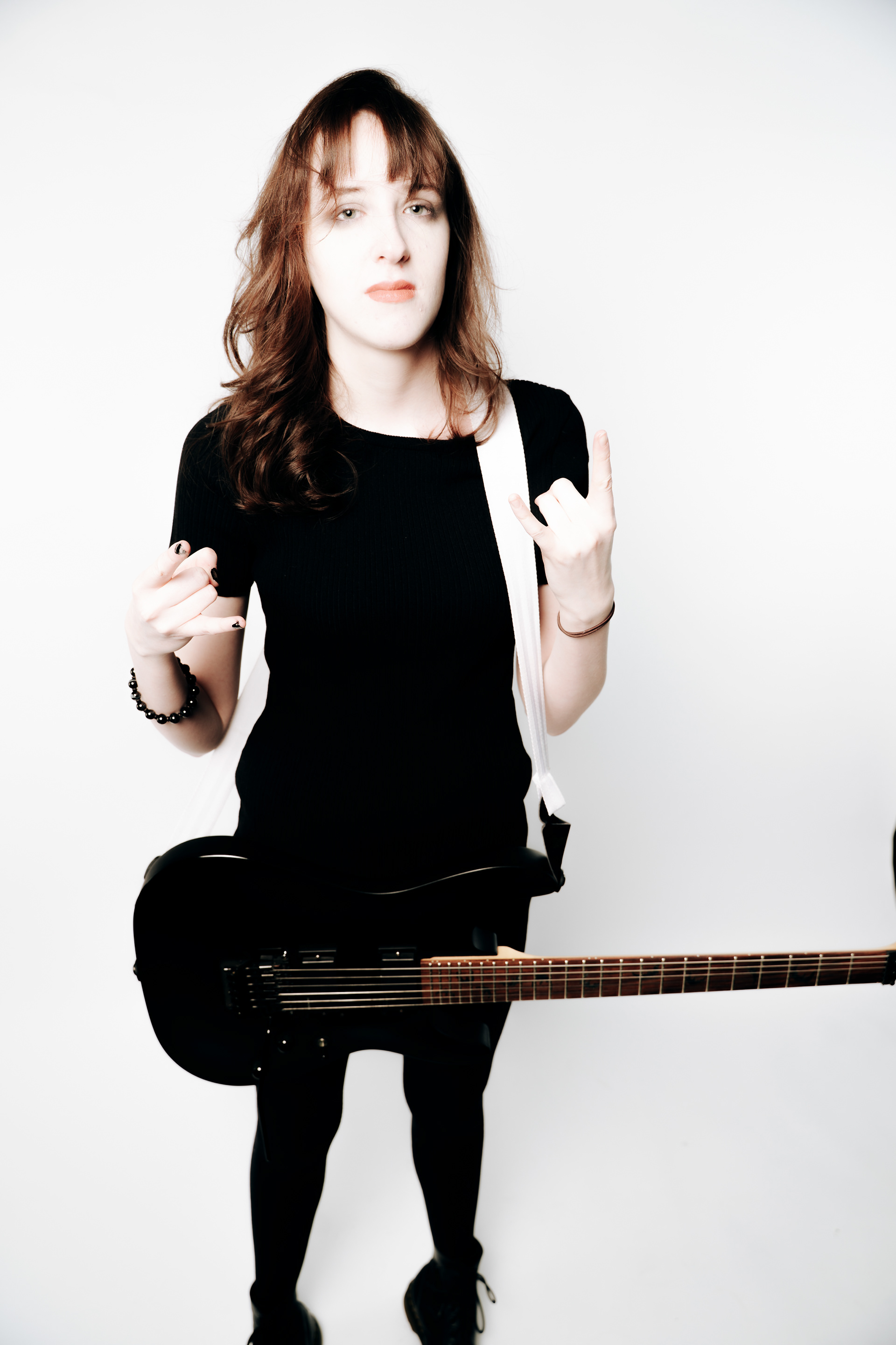
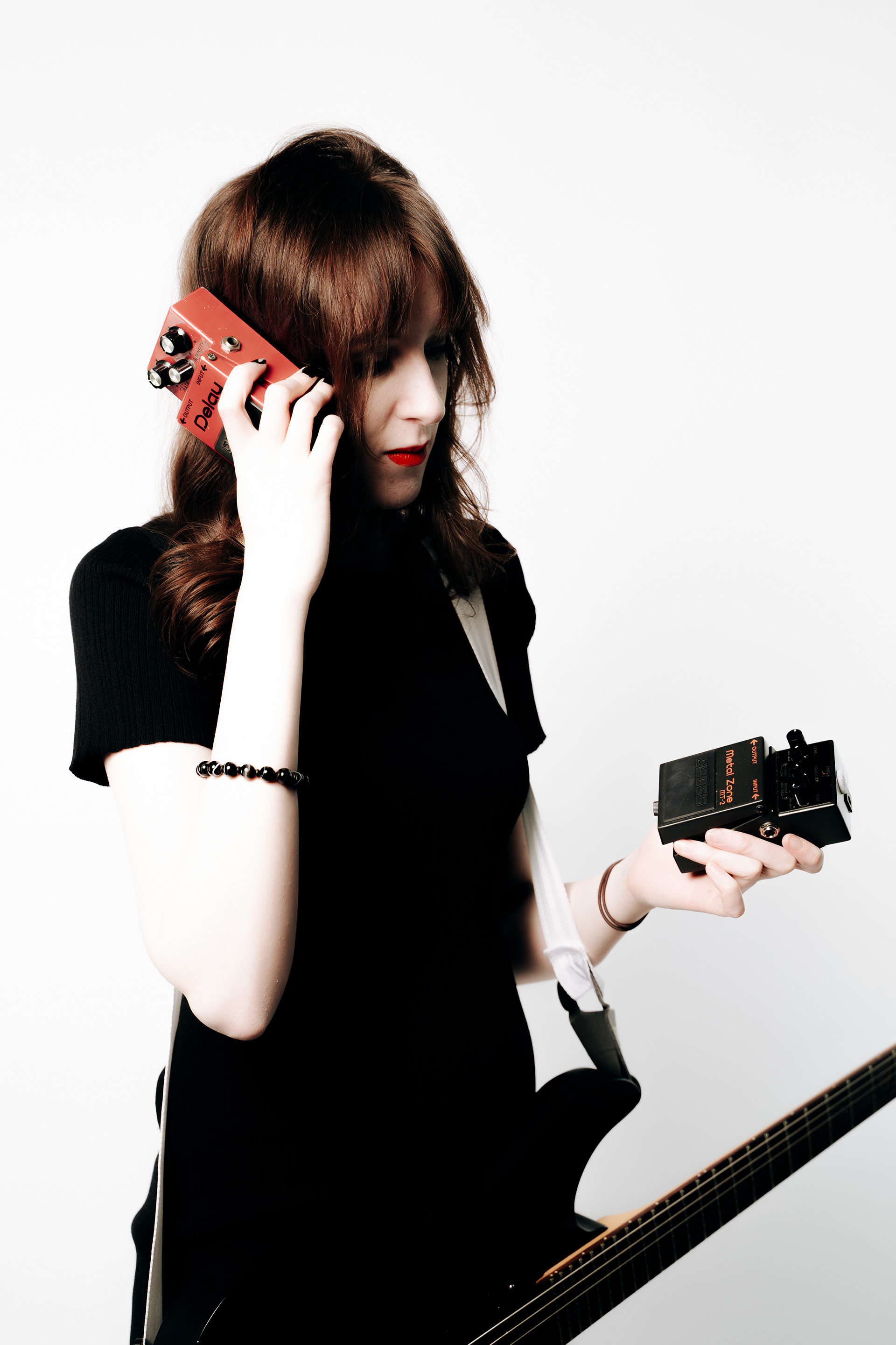
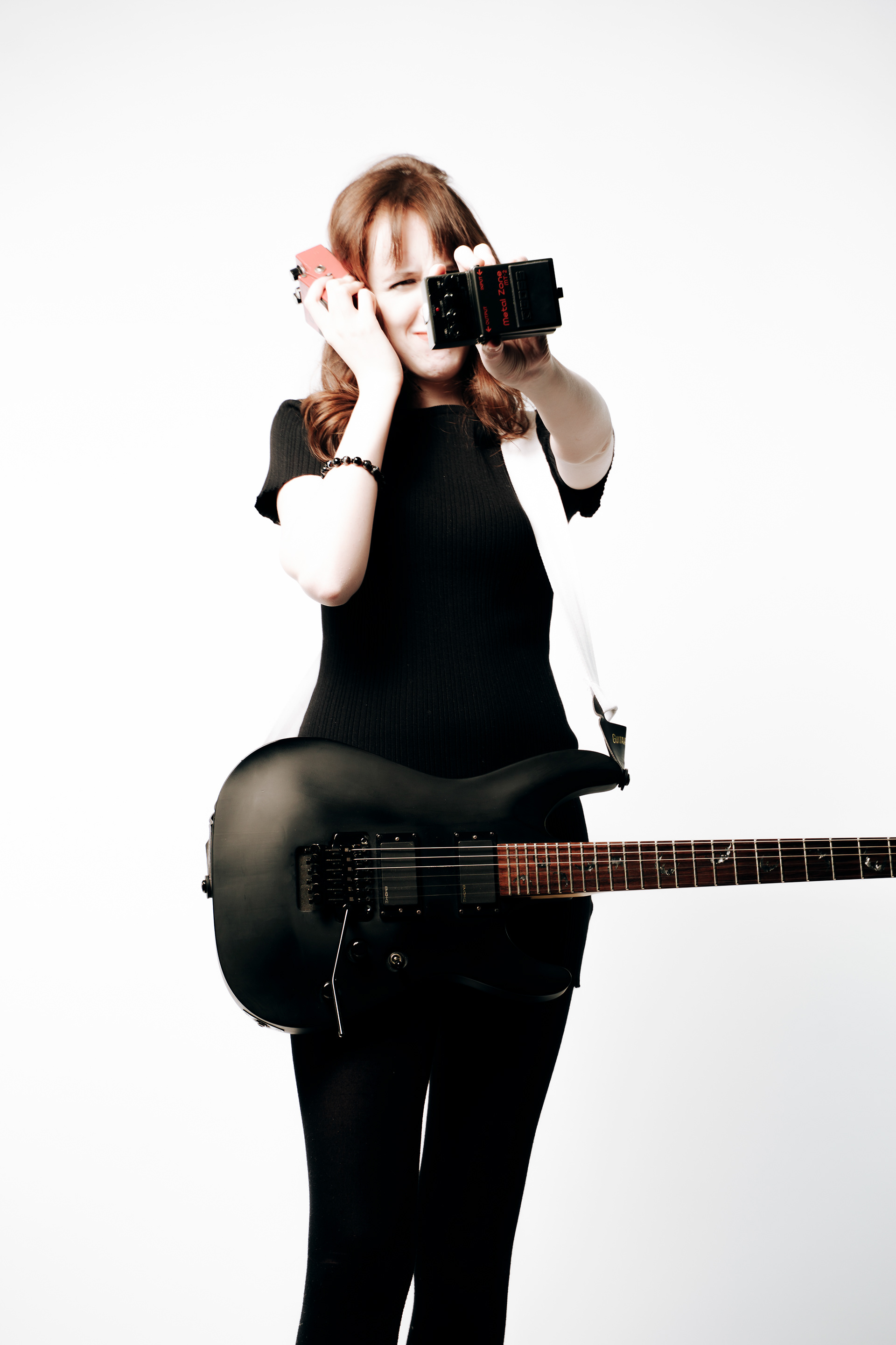
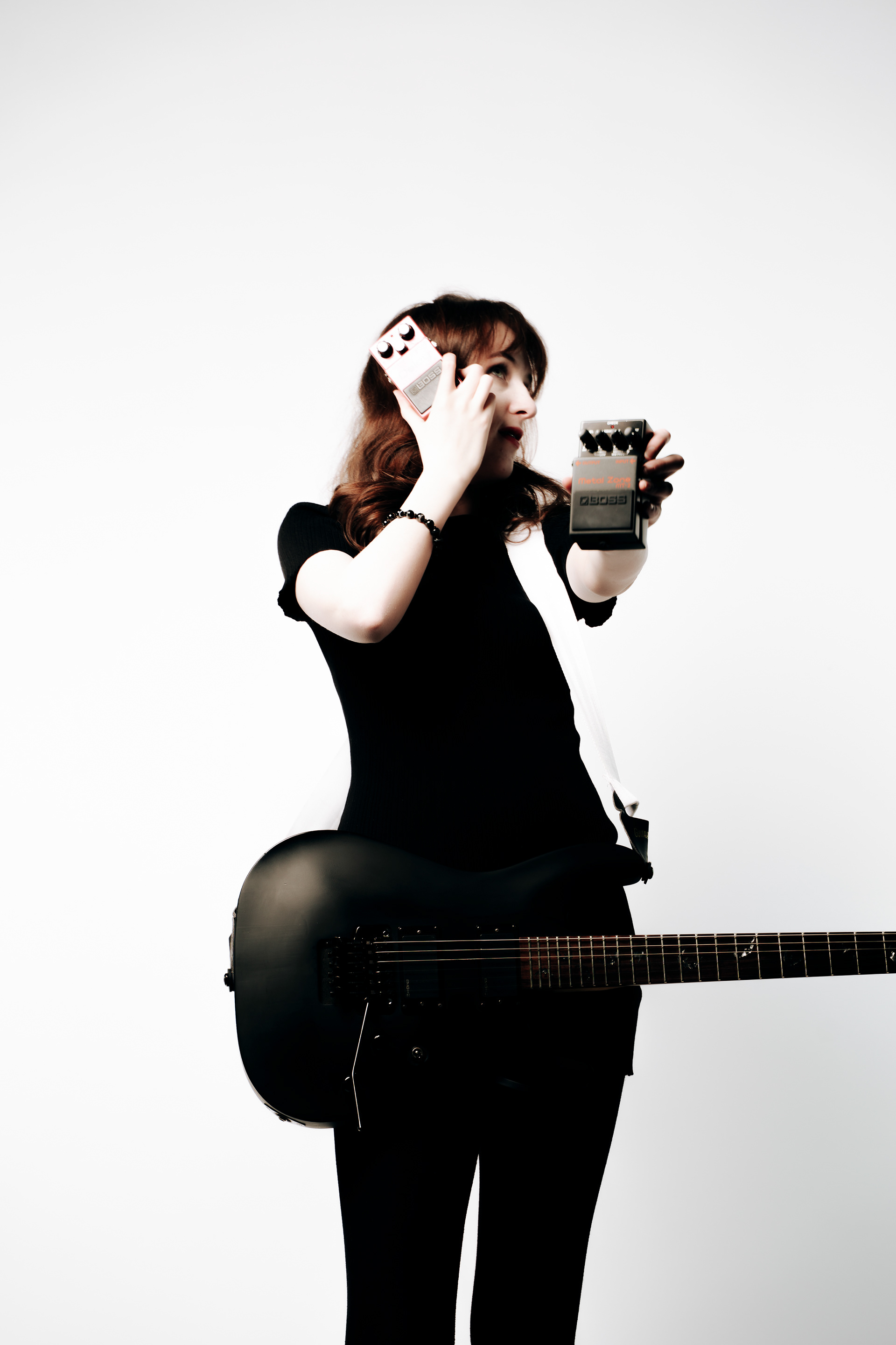
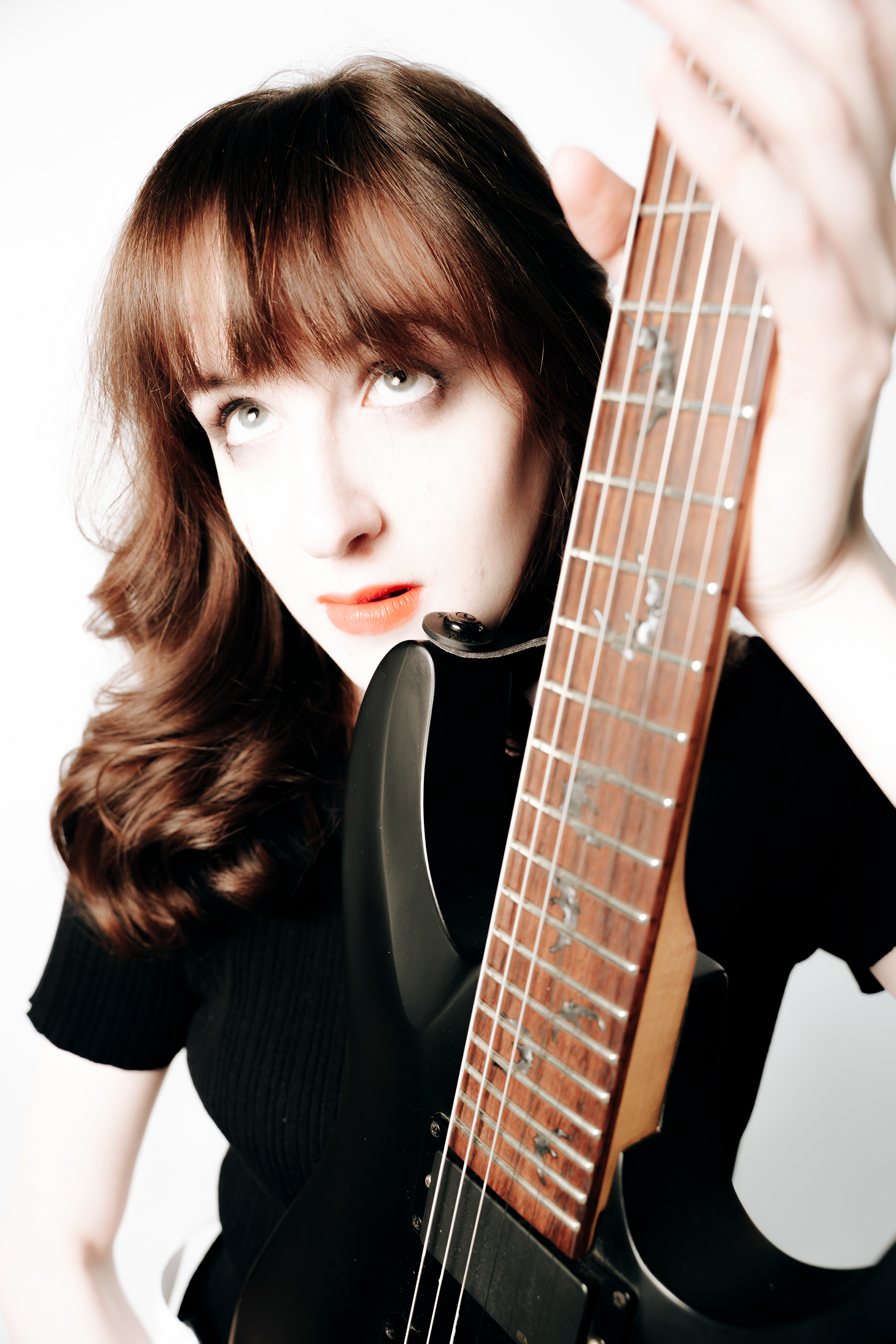
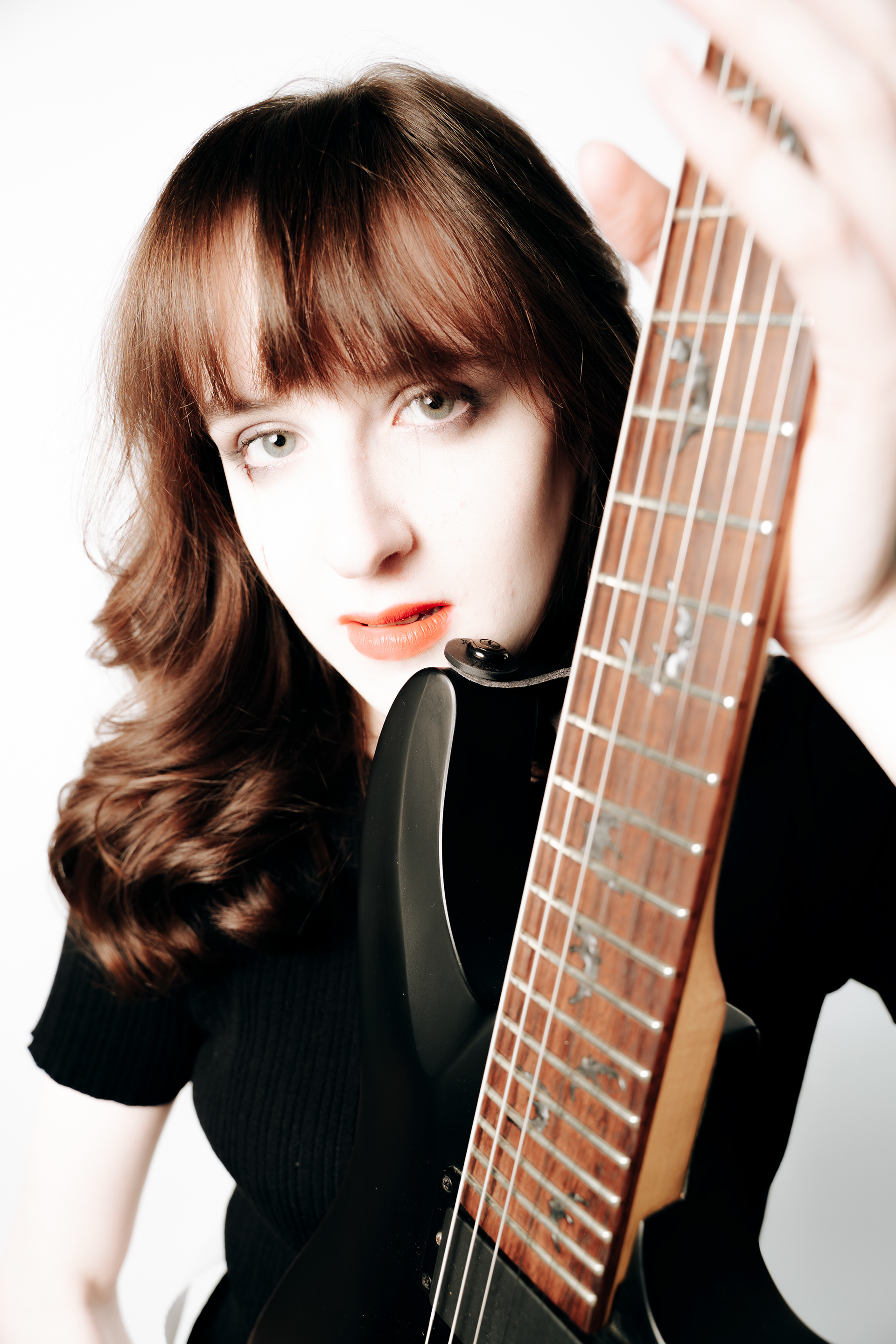
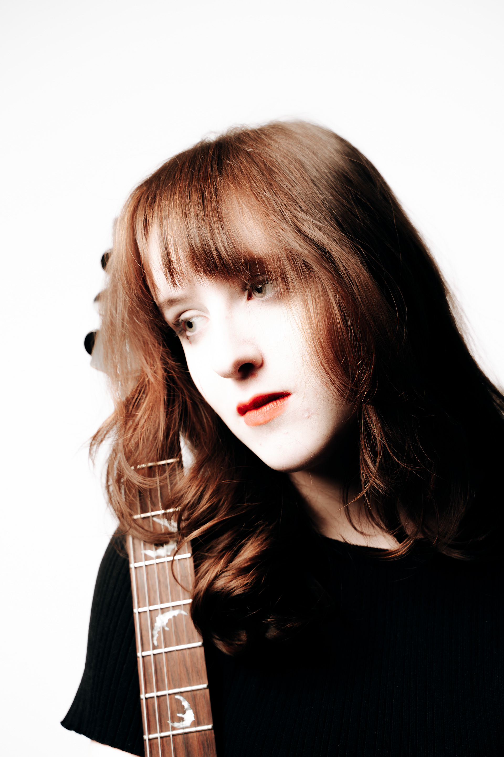
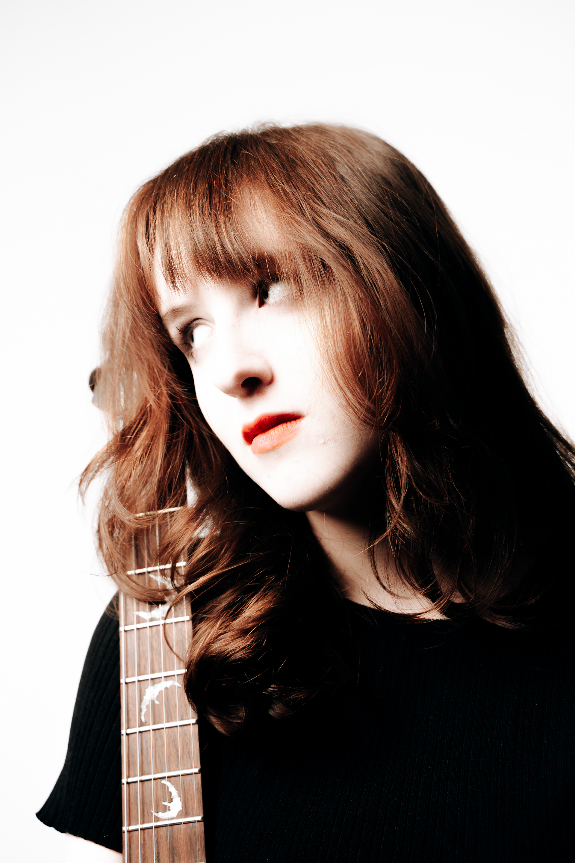
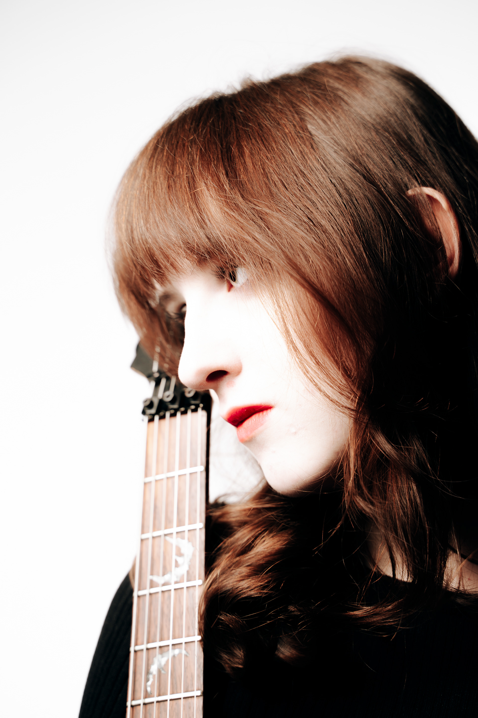
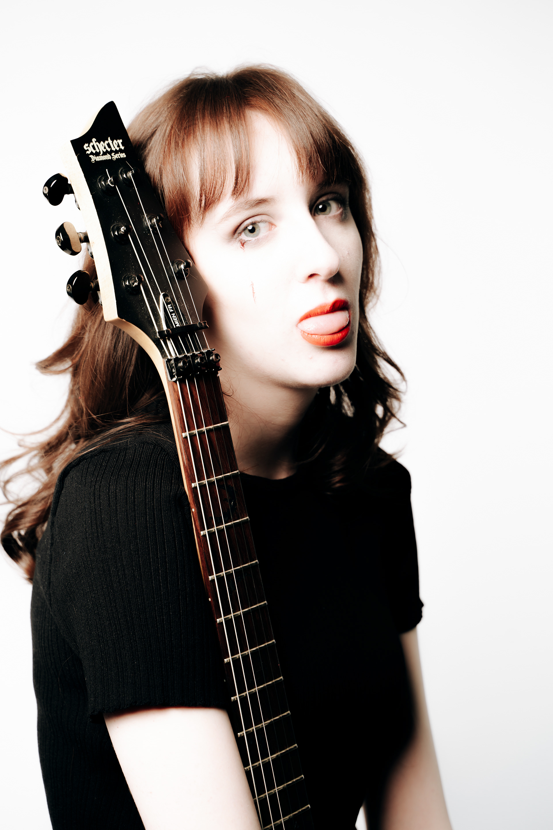
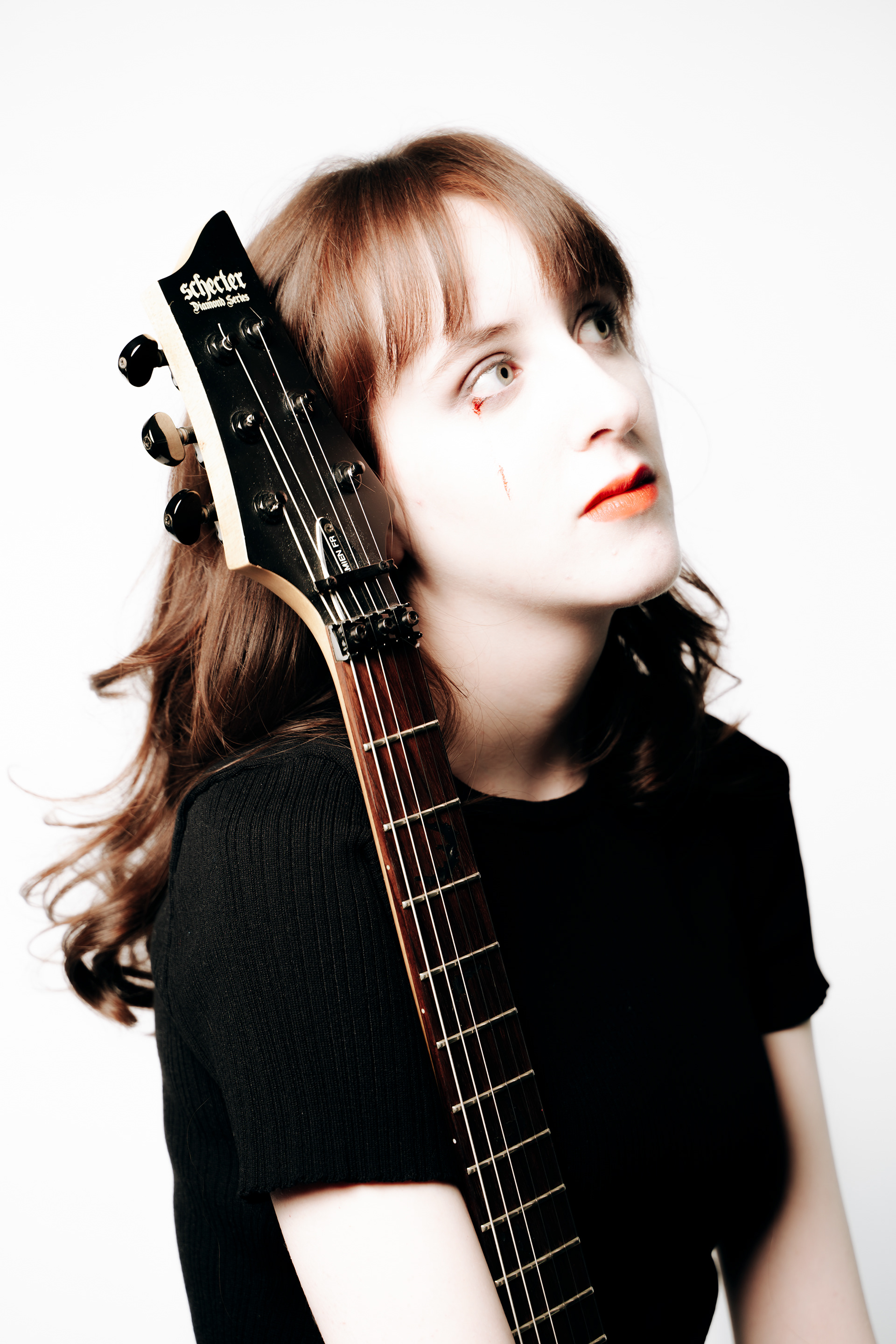
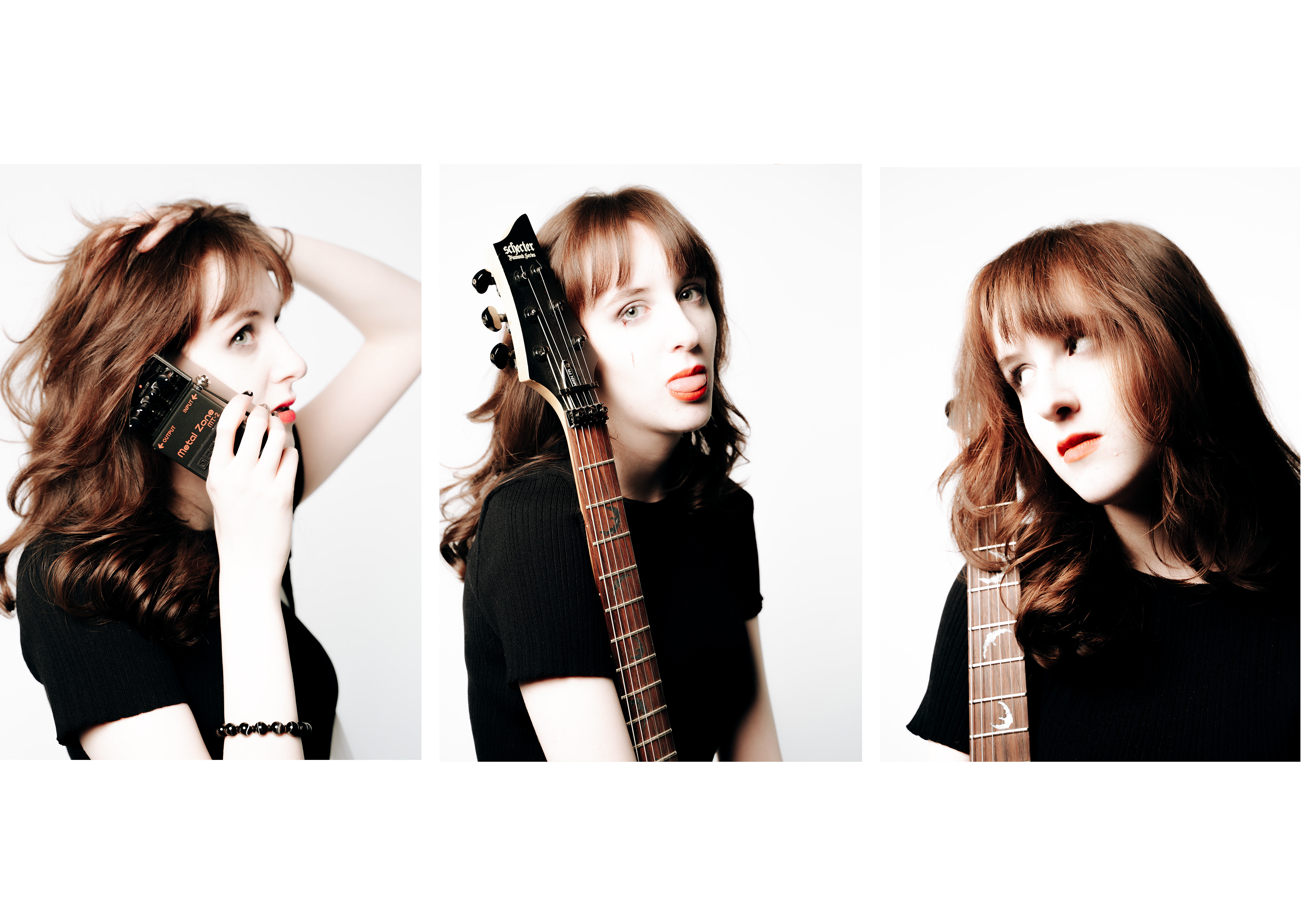
I decided to go for a completely contrasting look with this set of images and aimed for a "pop punk" kind of style. My idea was to try and create a rockstar who is doing a promotional shoot for her signature guitar items. This is common in the music industry- often popular guitarists will have brand deals with pedal and guitar brands as they sell well because people buy to be able to sound like their favourite artists. this shoot was intended to be a joint shoot between Boss, the pedal brand, and schecter, the guitar brand- working together to use the artist to sell the products together. I took these photos on a white background and overexposed to get a high-key distinct look which I desired to replicate the early 2000s atheistic with female artists often being portrayed as extremely pale. In editing I crushed the shadows down to remove details from the dress and attempt to make it look solid black as well as bringing the highlights near to the top to create a very contrasty image - feeling like black and white in the portions away from the face. doing this also creates a doll like effect through removing any blemishes or detail in the skin which was often popular around the time. I experimented with classic rockstar poses like the reaching forward hands and and the first 3 images before moving into more casual marketing positions showing off the gear alongside the model. I am happier with this set than the last one as I feel they are less generic and as far as I can see, using the guitar pedal like you'd hold a phone has never been done in a photoshoot before. I feel these images are more exciting than my first shoot with the editing style and posing being more unique and eye catching. During this shoot I used a 28-75mm f2.8 and stuck around f.3.5-f.5.6 which brough some blur into the image and helped the background stay clear white at such short focal lengths. I used the whole range of the lens through this set, experimenting with somewhat fisheye images but for the final images they are all taken towards the telephoto side of the lens.
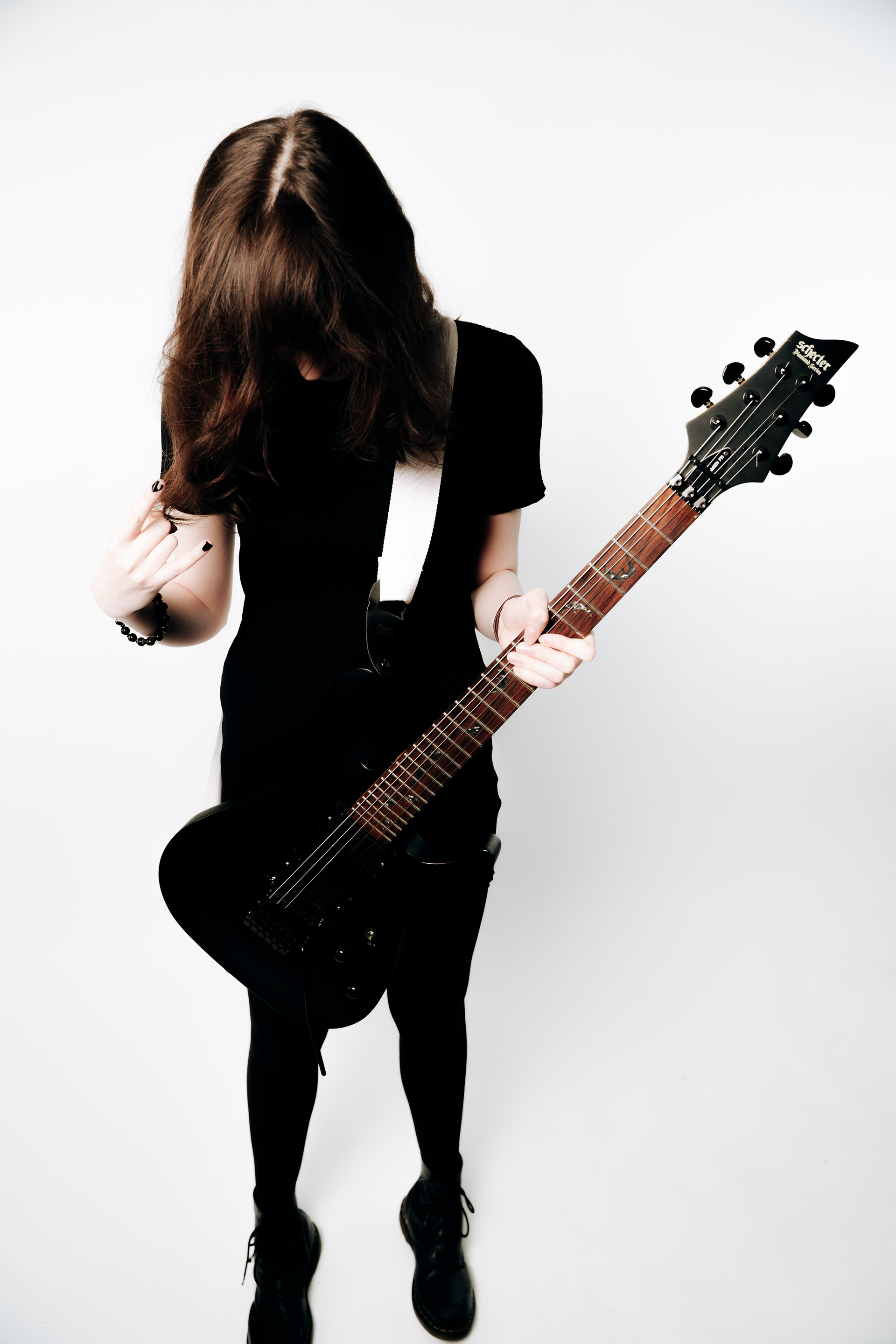
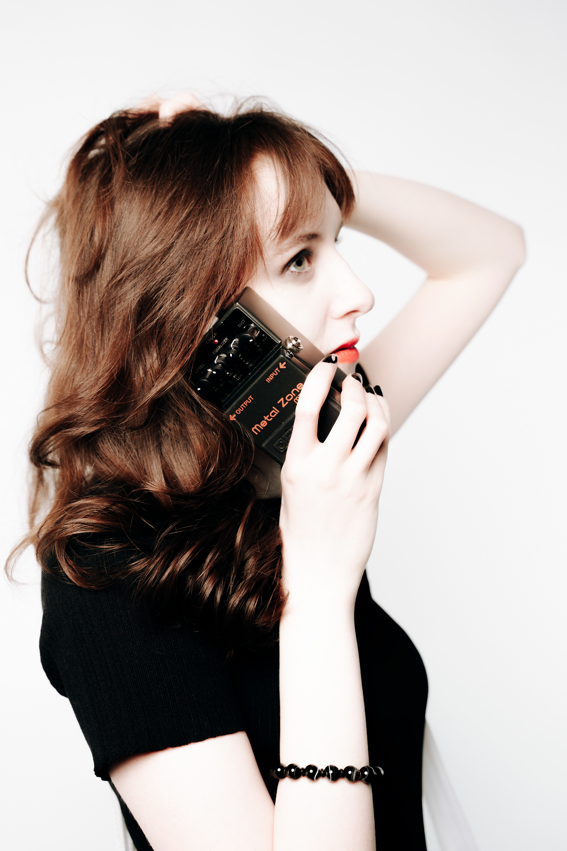
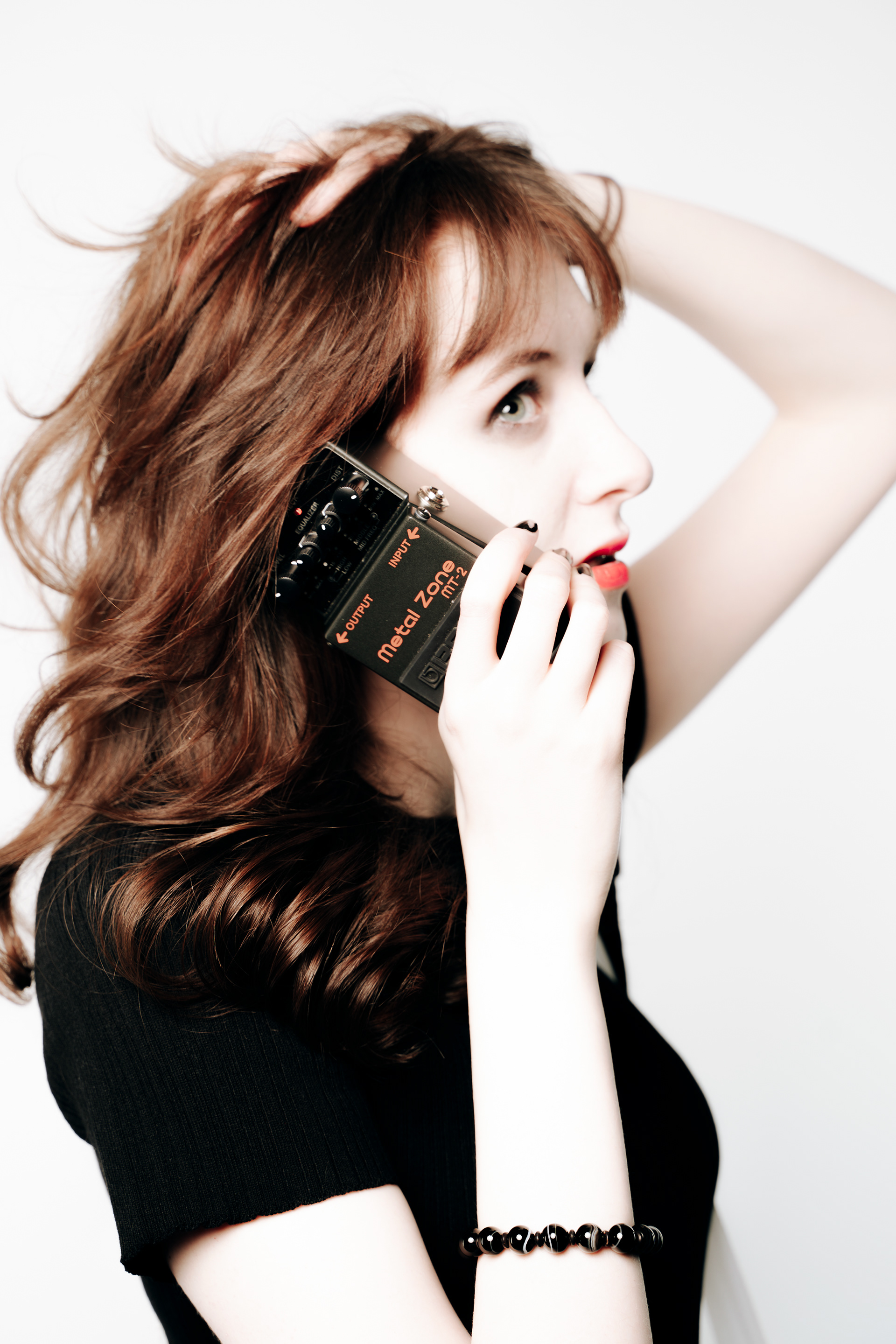
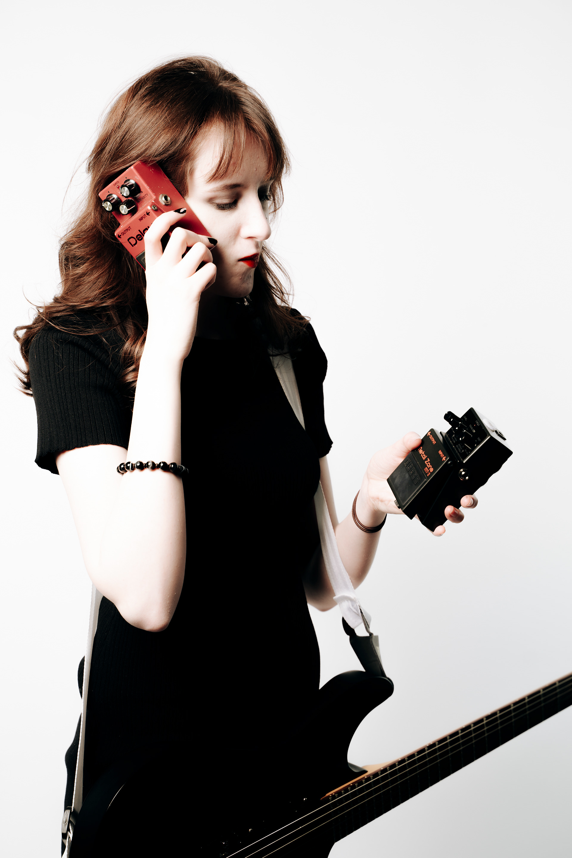
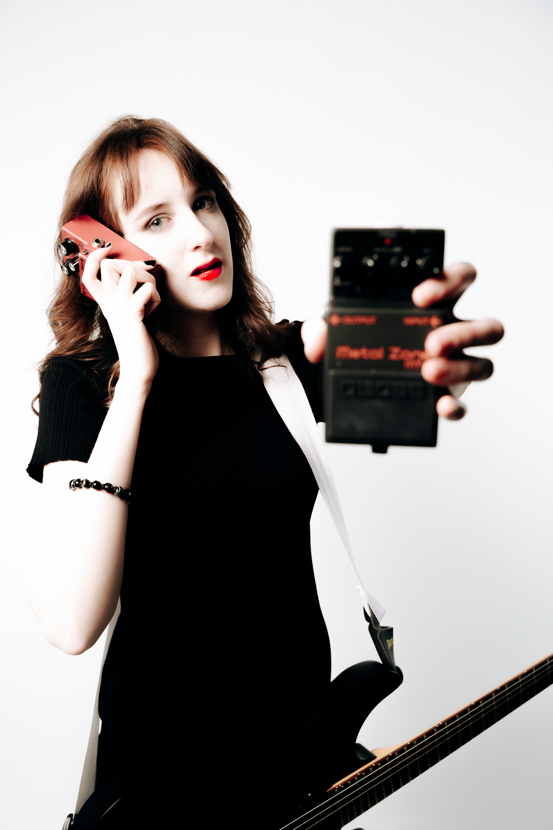
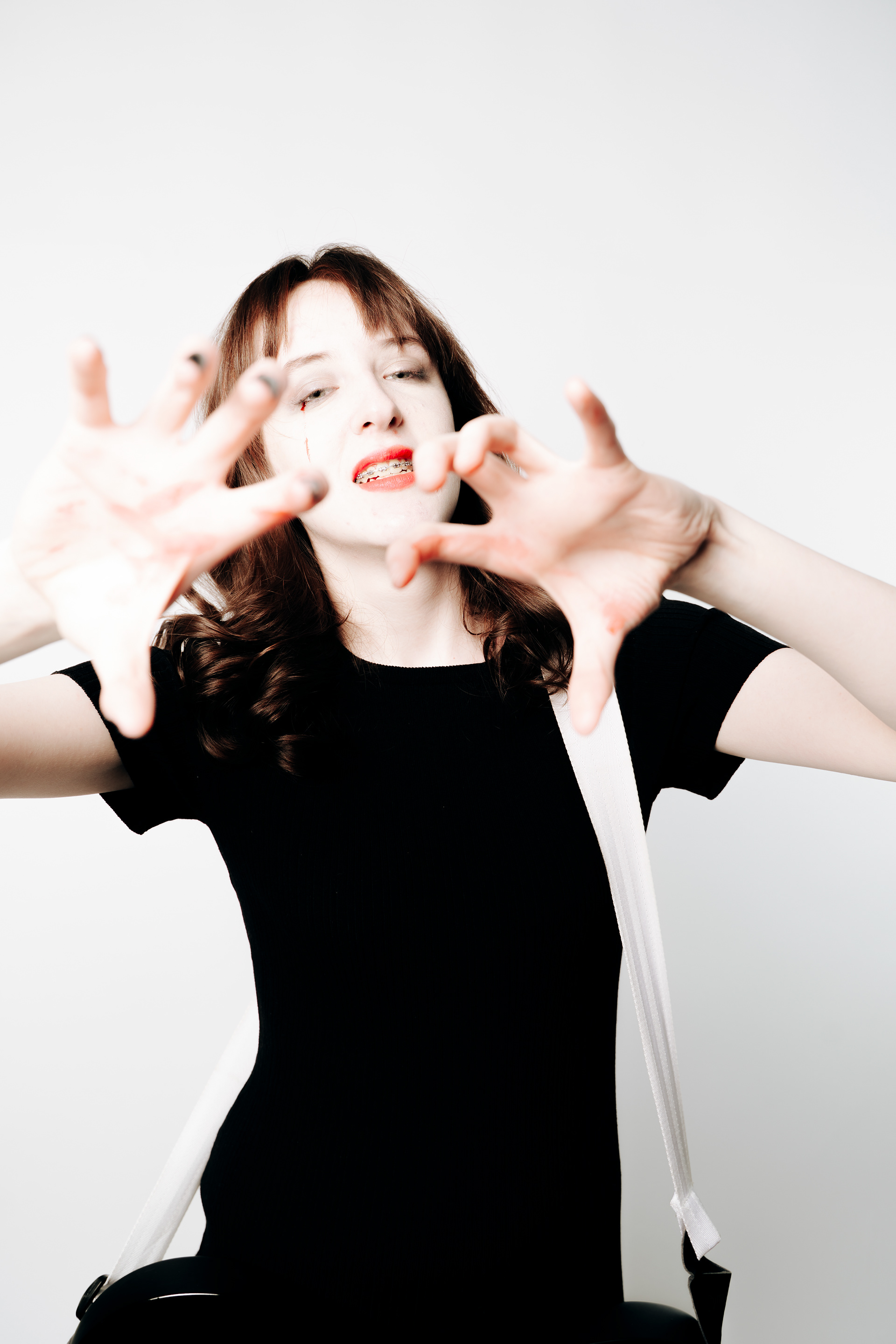
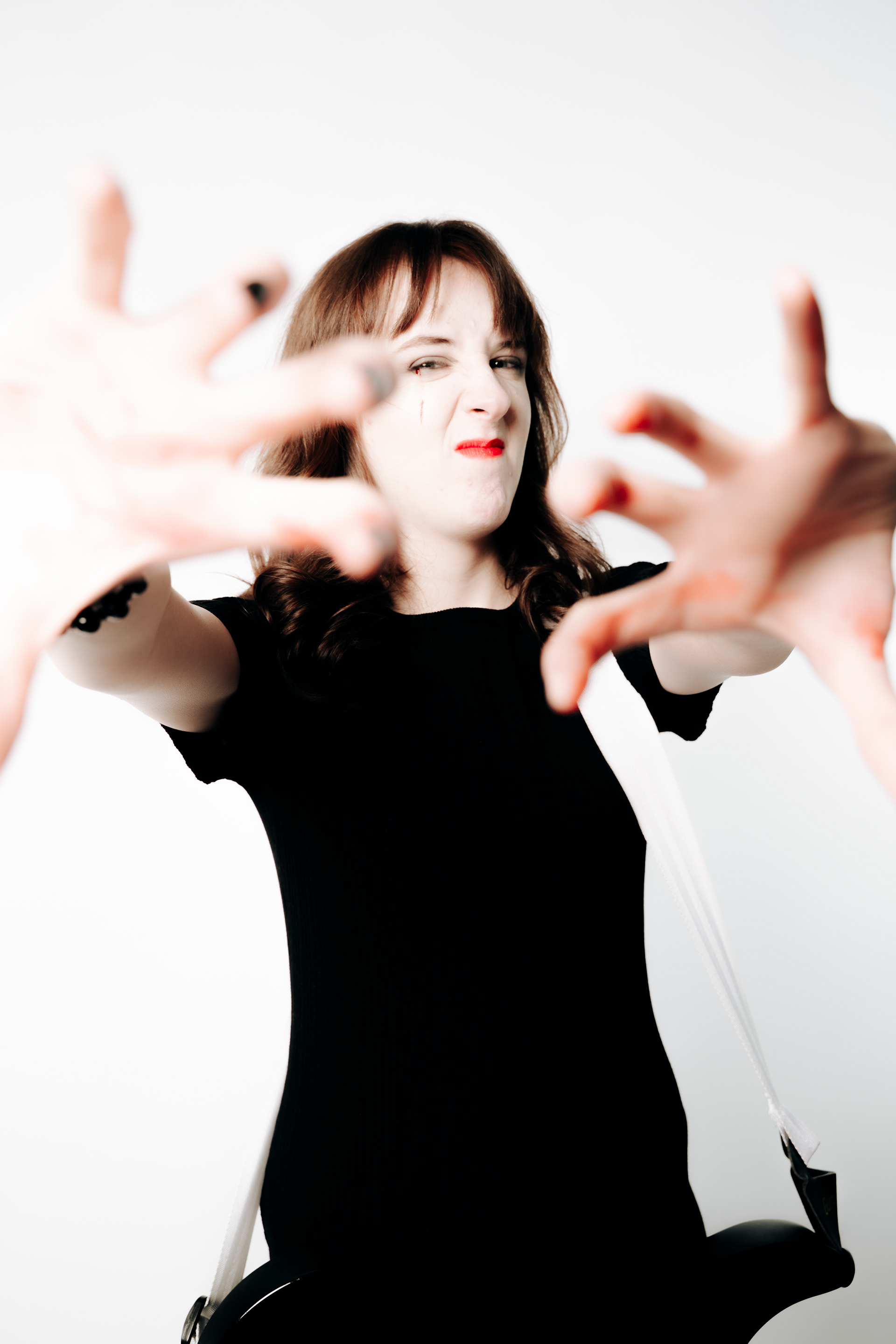
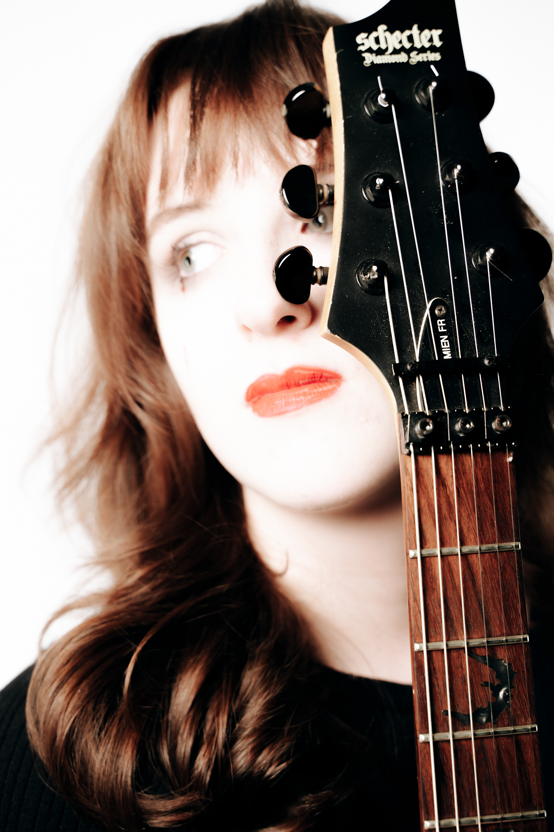
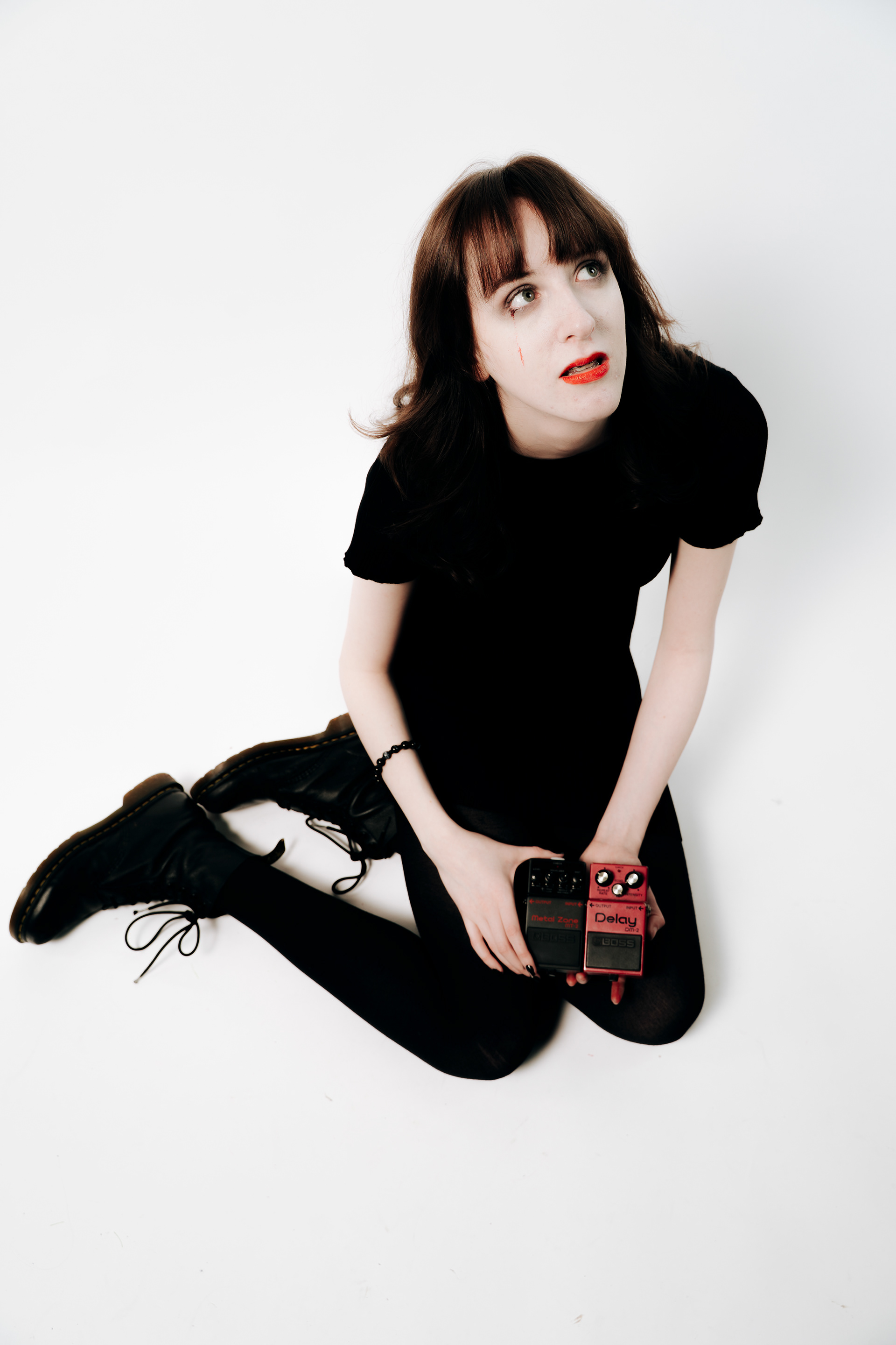
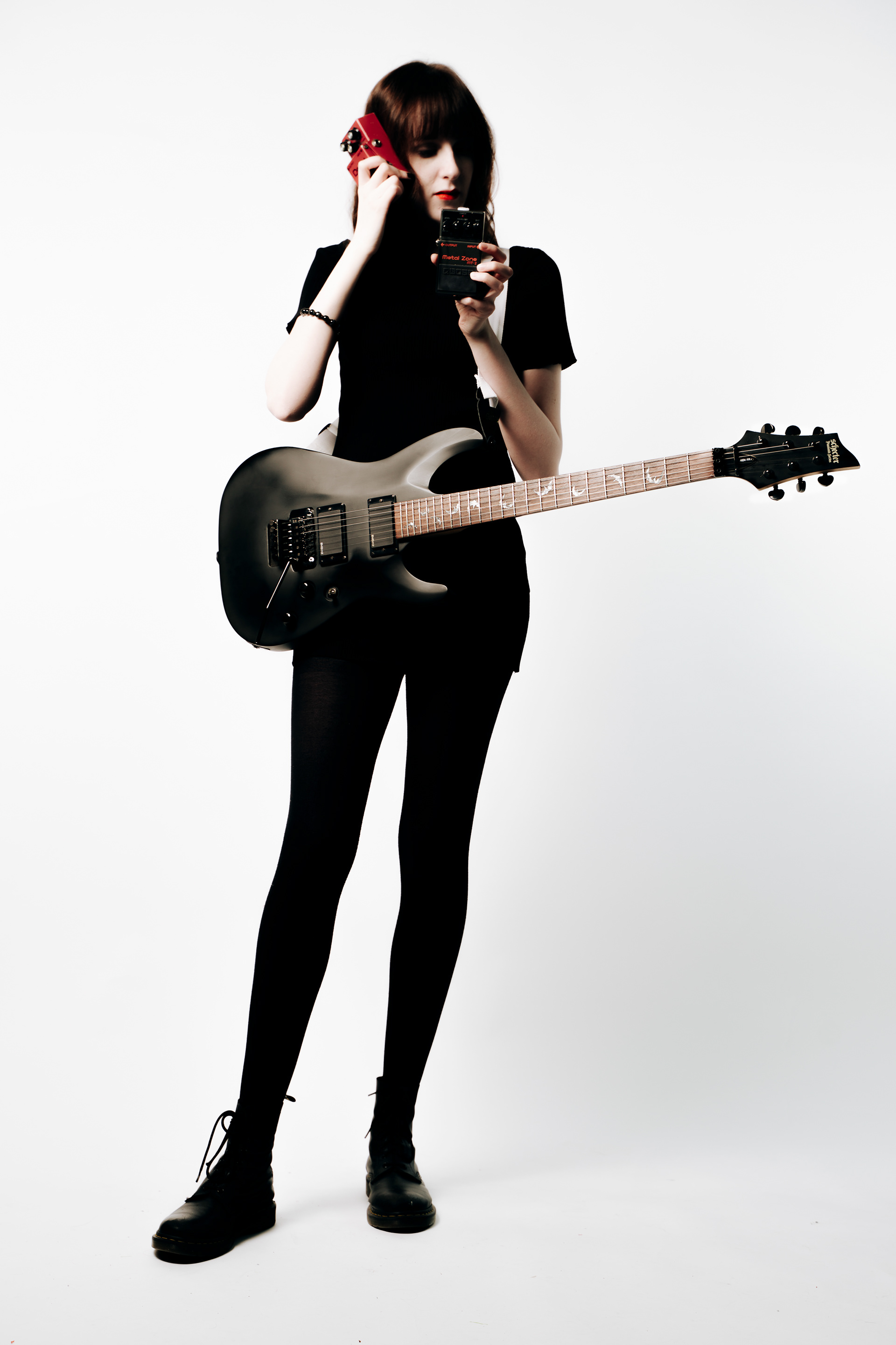
I picked these 3 images from the set because The first image shows the model posing with the pedal, the second with the guitar, and the final showing just the model. I feel these three would have been picked for an actual campaign for this reason and includes the one without any branding as to try and appear as if they are not only and directly selling. I also like the models poses in these images. The first image shows a very classic on the phone shot but with the pedal as the phone so I feel like it looks staged in a way that an audience would recognise as purposefully looking staged, the way she is looking and her hand in her hair shows stress which adds a comedic effect to the photo as the viewer knows she is not actually talking to anyone. The lighting falls softly on her hair keeping all its detail but still overexposes her face and hands. The red lips show the style of the time I am trying to replicate. because she is looking upwards we can also see the light in her eye which I think adds to the image.
The second image shows the model posed with the guitar, she had fake blood under her eye dripping down in a tear formation and is sticking her tongue out which creates a juxtapositions of emotions- like the is pretending to be okay when she is not. this is further exemplified by the guitar which has bats on the inlay which is an inherently "gothic" feature- as well as the guitar and her dress being black- there is a gothic sense which is contradicted by seeing her tongue.
The third image shows the model looking towards the light with the guitar going behind her hair still showing the neck. This is a photo to purely show the subject but the guitar is kept in to remember the context and as the point is still advertising it is in the image subtly. This image has the light falling directly onto the subjects face unlike the last two which creates a beauty effect. the subject however still looks sad which brings could be because the gothic elements of the bats are still in the photo and because in this scene she is a female rockstar who often sing about depressing themes so this could be her brand. Keeping this sad brand and juxtaposing it with the first image brings another comedic value to the first image as it makes it even more clear to the viewer that she was asked to pose like that as it doesn't seem like something she would usually do with the other 2 images contexts.
All the photos were edited similarly in lightroom, using masking on the guitar neck to bring back any overexposed details such as the wood grain and the bat inlays, and masking the pedal to bring back details in the text and make sure it wasn't pure black, as well as saturation masking on the lips to make them pop more against the white in the face.
I exported these images as Tiff Files from lightroom at 300dpi, I took the photos into photoshop and cropped to ensure they were at a3 size. I then brought the images to the digital design hub and chose semimatte 250 paper. I then printed the images and removed the borders of the paper and the images were complete.
I think these images fall into the portraits category but may border on fashion as they are using the guitar related images as "fashion" as the model is showing them off and they are images that, in context, would be used on a website or a magazine.