My initial idea for this is to create a product style photo including my guitar pedals, highlighting 1 at the front and forming the rest in a V formation behind to allow them to drop out of focus, but, I will use a high aperture to keep them in focus and in post I will use photoshop to create different blur affects on the background relating to what the subject pedal does to sound- for example I would use motion blur to create a "spikey" look on the background of a distortion pedal.
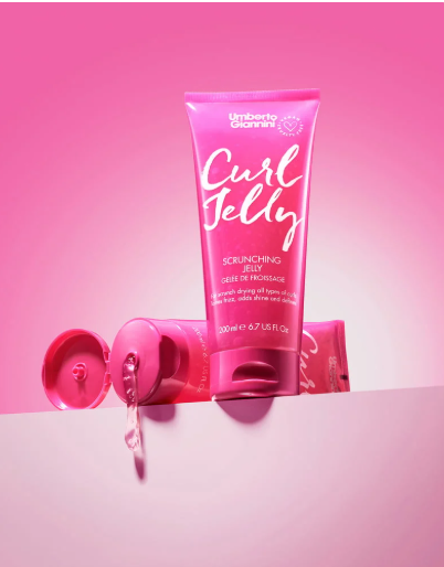
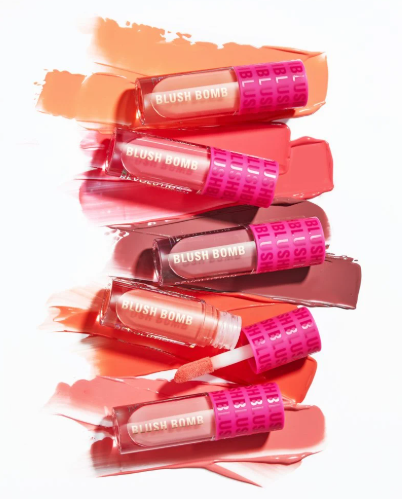
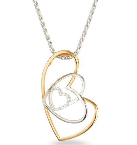
Katie Howey is a product photographer and band creative partner who uses colour in a high profile way to shape the look of products. Her images are often high key with popping backgrounds in a way that tells the story of the product. These images use the viewers emotions to persuade them into making an emotional buy, the bright colours trigger endorphins in the brain to make the viewer feel like this product resonates with them and pushes them to make the purchase. as well as this, these images are beautiful on their own and make great use of lighting to ensure logos are clearly readable and use the right style for the product.
These images use bright colours to convince the viewer to make an emotional purchase.

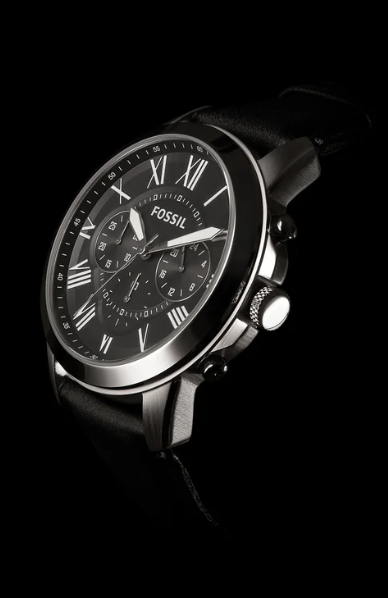
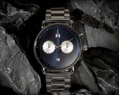
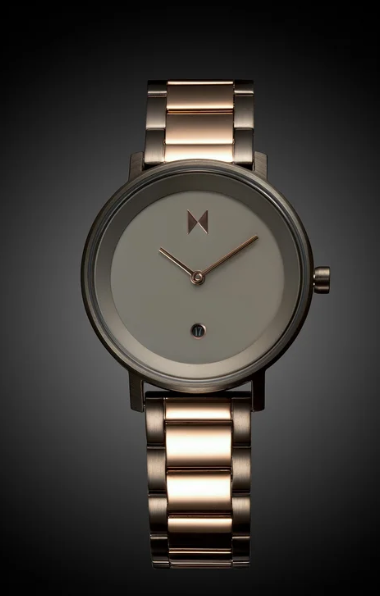
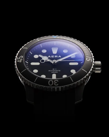
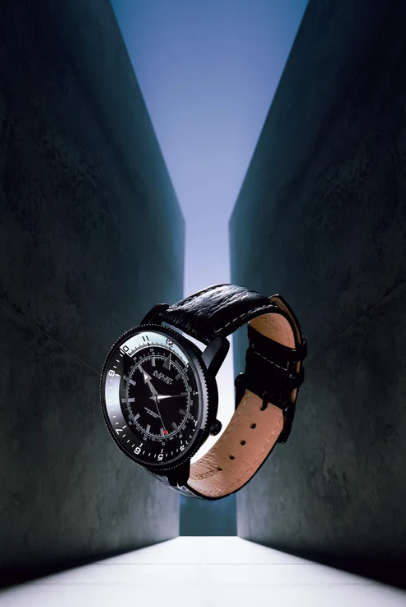
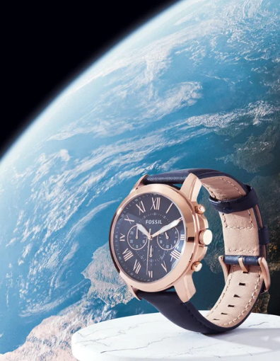
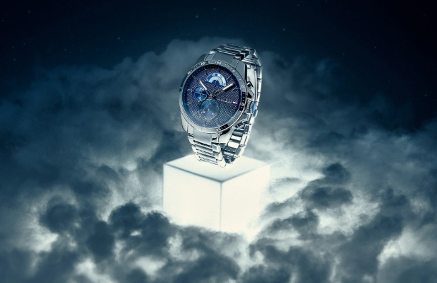
IGHStefan Oprea is product photographer who specialises in watches. His images are often dark and lowkey and present the watches in a powerful way. His use of angles in a lot of the images show the viewer looking up towards the watch to show that it has power and will bring status- enticing the viewer to want to buy it for that sense of power. He also, in every photo, has the watch set to 10 past 10 which is commonly used in watch photography as it allows the hands of the watch to frame the logo in a way that creates a clear and pleasing image. He also makes use of photoshop in a lot of his images to create interesting backgrounds and make it look like the watch is floating which adds a premium sense to the images as it is unnatural and may make the viewer feel they can do things which are not normally possible without it. Using photoshop he also does background replacements, as seen with the watch in front of the earth which creates a huge feeling for the viewer with it being placed there and not looking explicitly wrong, with the image not looking "wrong" it makes it feel highly premium making the viewer feel as though they could be above the earth with it.
Stefan Oprea uses dark tones and makes heavy use of photoshop to create powerful images that solicit power to make the viewer want to purchase to uplift their status.

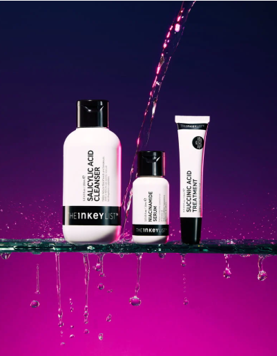
Andras Hari is a commercial photographer from the uk who specialises in capturing ecommerce photos. He uses simple backgrounds and makes use of lighting to make products look real and beautiful. He uses a close approach to ensure the viewer can see the details in the products, allowing them to see what they are buying and ensures there is no imperfections with this close up look. Shadows are carefully calculated to draw the viewers eye to the correct spot and ensure areas are all well lit without being flat. He also often uses photoshop for background removal for ecommerce, making the background the right shade to adhere to ecommerce sites such as amazons guidelines.
His photos are clear and show the viewer exactly what they are going to buy whilst still creating pleasing images.
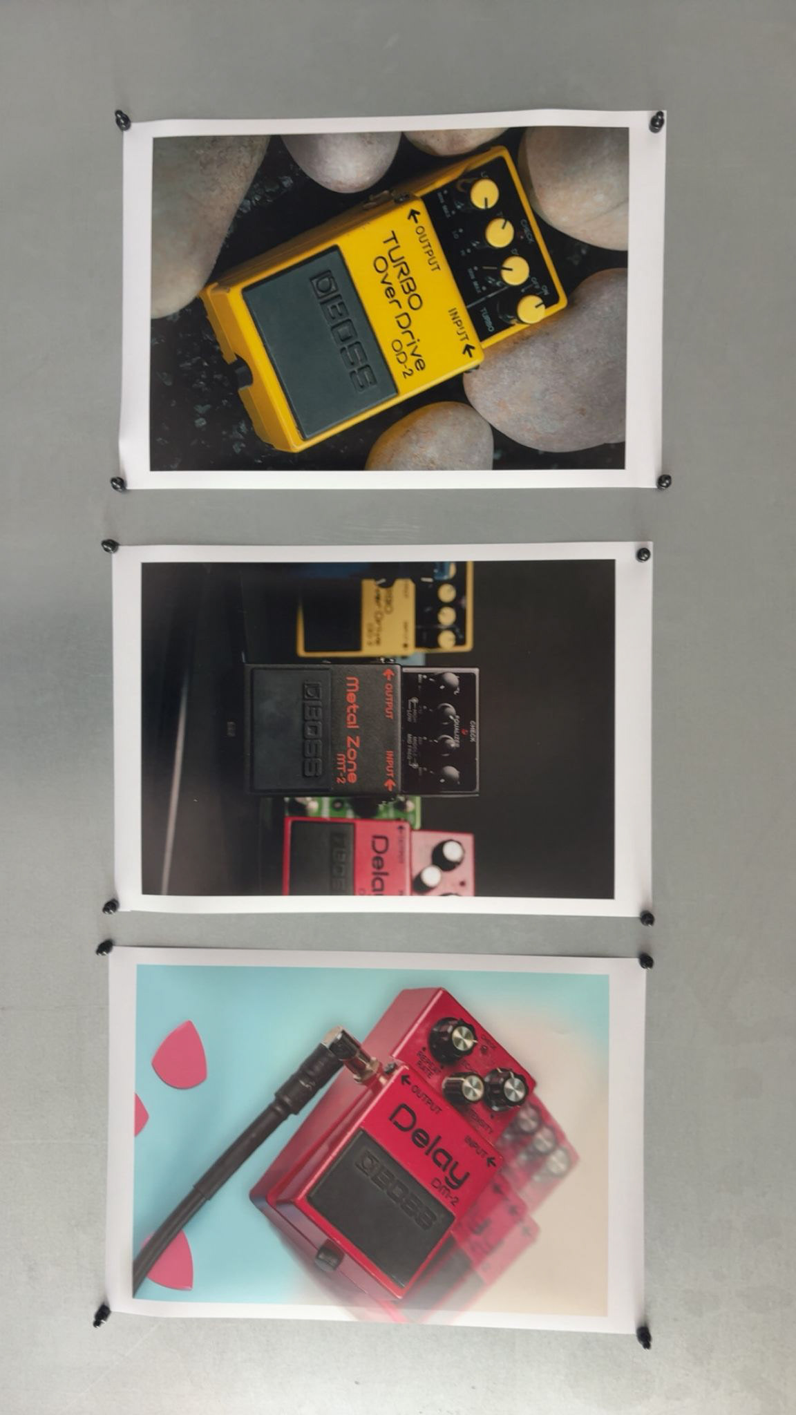
For this shoot I decided to photograph guitar pedals that I often use in the studio using backgrounds that reflect what they do are how they are known.
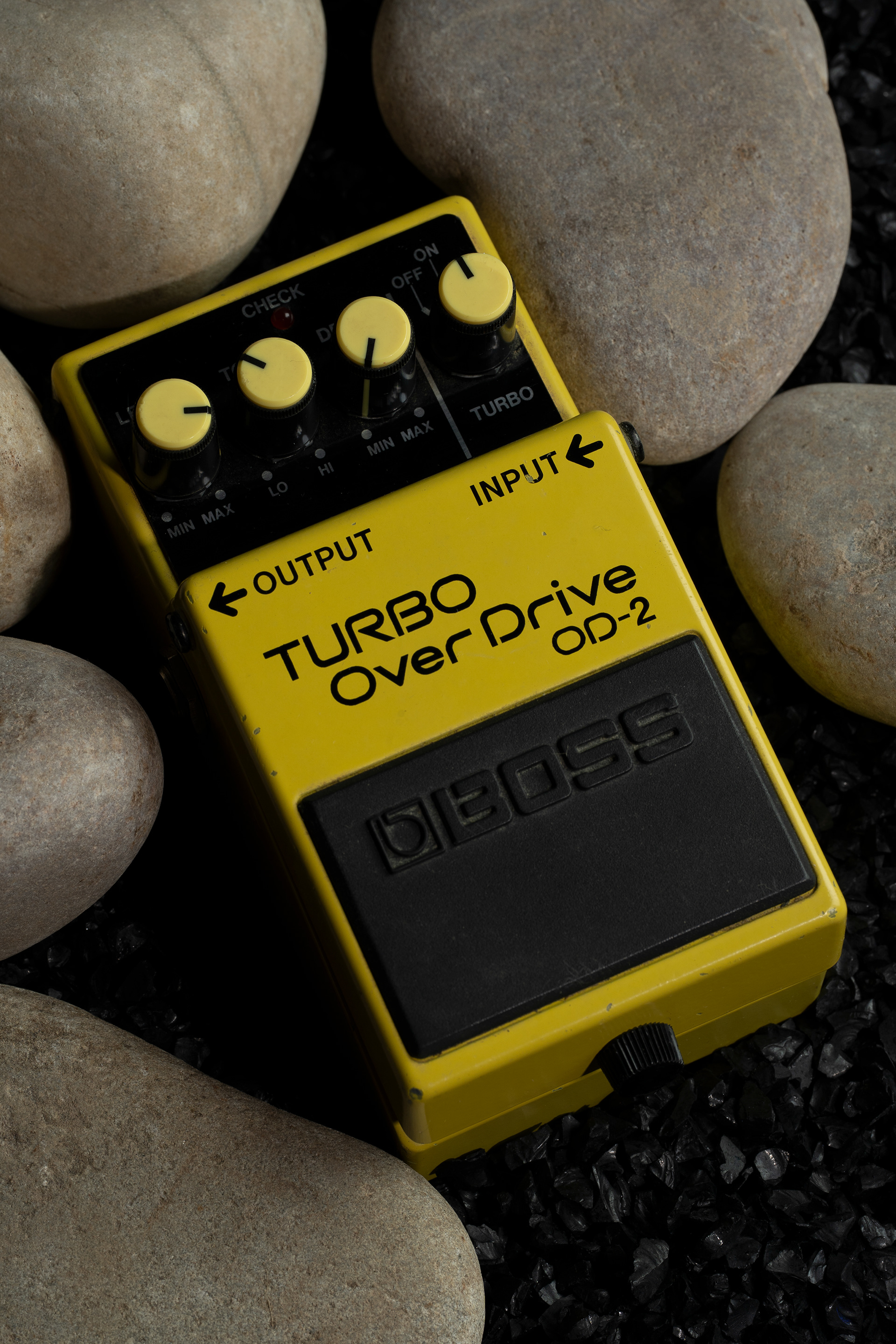
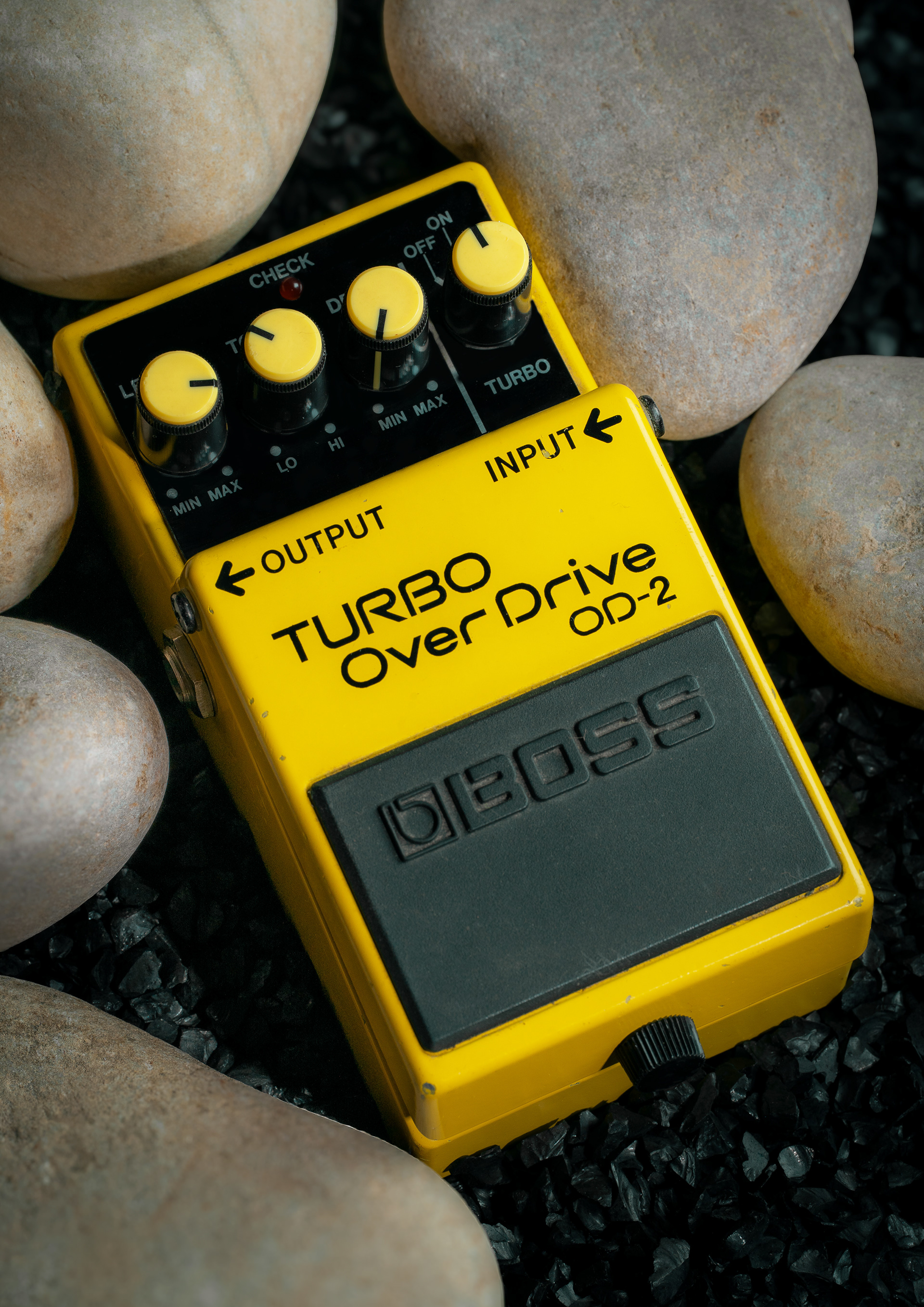
The first photo shows a boss OD-2 turbo overdrive pedal which is classically used for rock n roll music so my idea was to place the pedal on and around some rocks which feels like the simplest idea to do with this but i think the simplicity turned into an effective image. I started with the small rocks on the backdrop creating a layer of depth to immerse the image into the scene of this being surrounded by rocks and ensuring the bottom of the backdrop was not flat. I then added the large rocks surrounding the pedal, essentially cradling it. There was a few adjustments of the large rocks, ensuring everything was placed how I wanted it to be. I then used a key light camera left and a fill light back camera right to fill in the shadows and create an edge of light to the pedal.
in post I adjusted the exposure to ensure the blacks were not too black and popped the yellow of the pedal to make it stand out, I also went through and removed any imperfections from the pedal, leaving some that gave character to the object but removing anything unpleasant like dust and dirt. I also added some minor gaussian blurs to some of the rocks to create more depth and bring focus to the pedal.
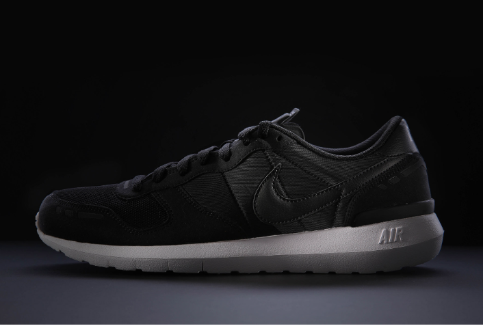
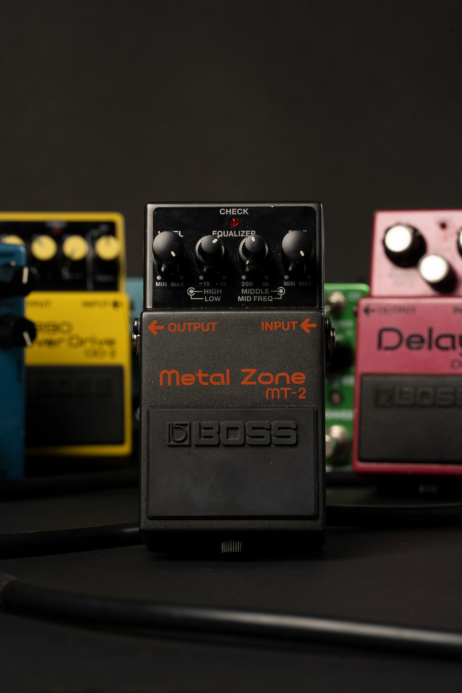
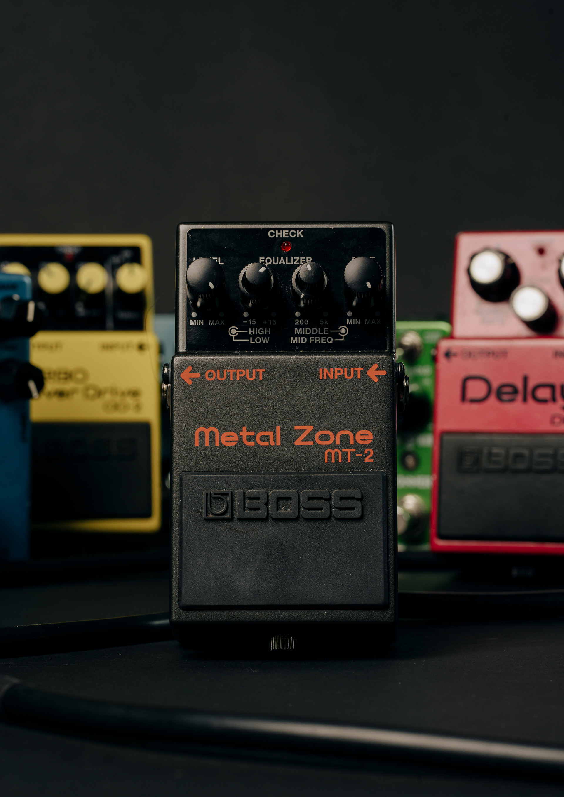
The next shot shows the boss Metalzone pedal which is often referred to as the king of pedals, so for this shot I decided to place a lot of other pedals behind it and use a low aperture to blur these out to create a heavy focus on the front pedal. Showing those behind it are lesser. I also ran a guitar cable through the scene to add context to the image. I used a black backdrop to create a moody feel and lit from above close camera left and rim lit far camera right. This ensured the black pedal and cable would not fall into the backdrop and allows for the texture to be shown- whilst also lighting the rest of the pedals. In editing I added a moody colour grade and and fixed up any imperfections on the pedal, whist again still leaving details that show use but are not unpleasant. This image presents the metalzone as the "king" of the pedals and makes it stand proud with others behind it.
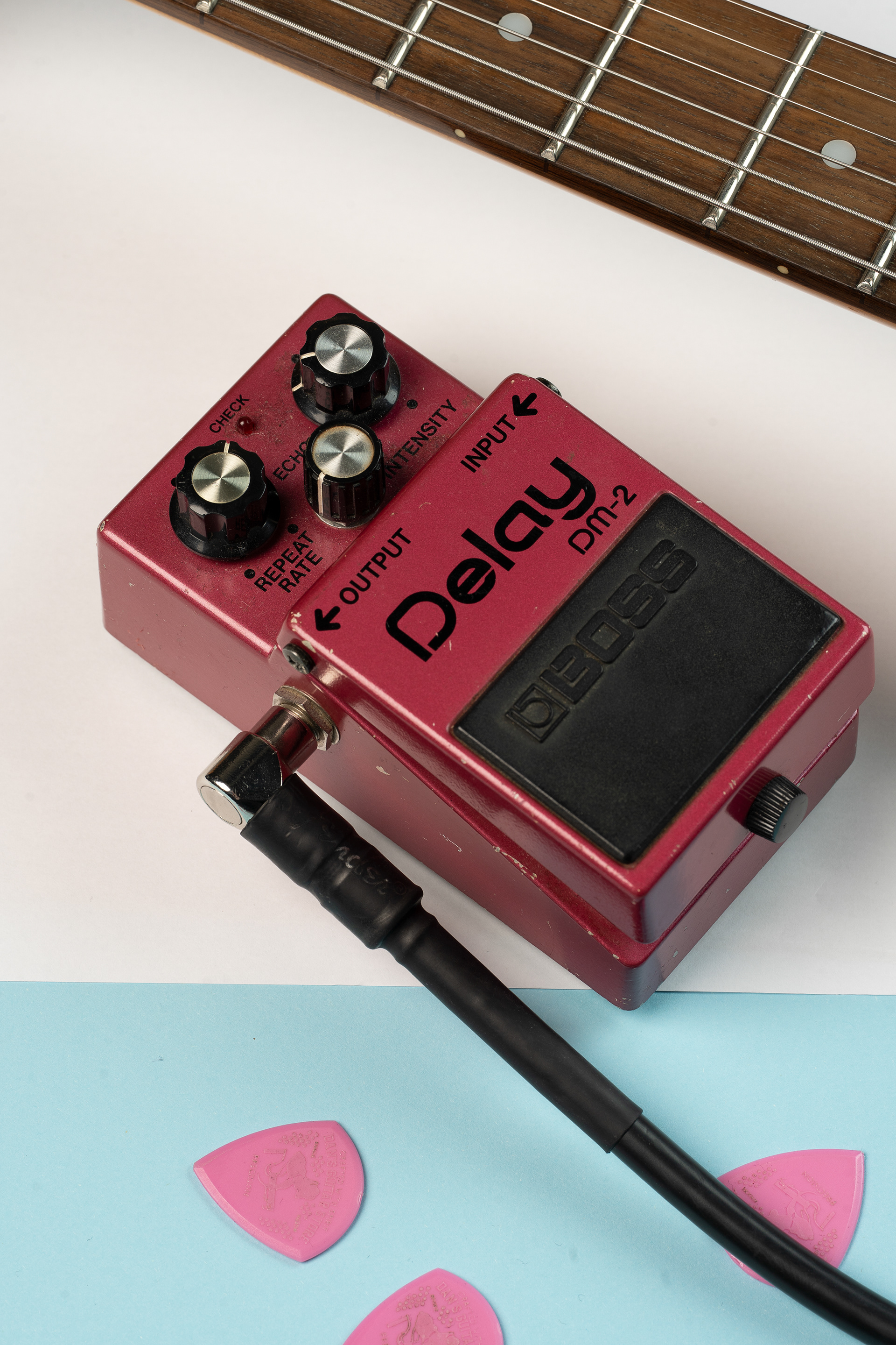
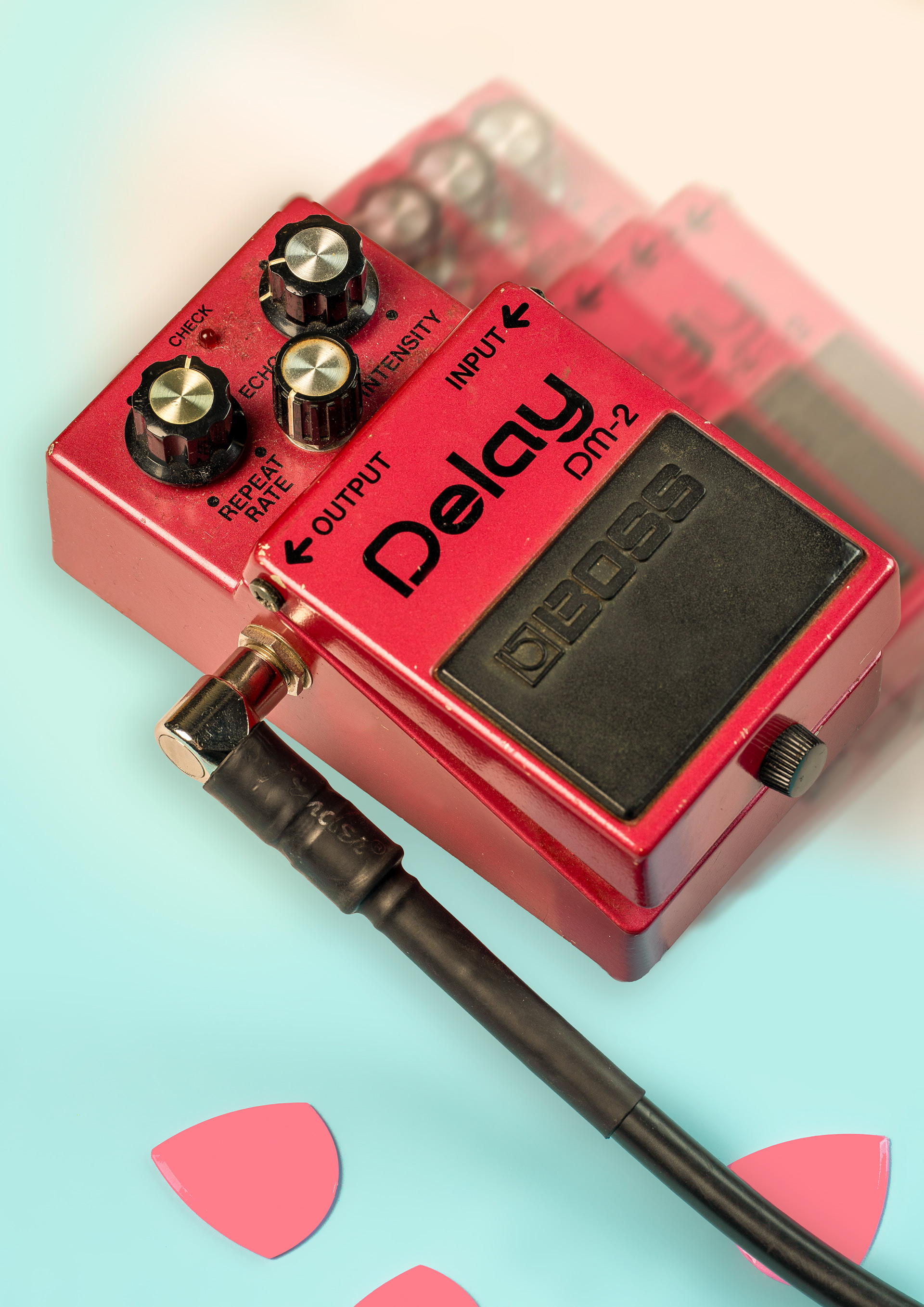
The third photo shows a Boss Dm-2 Delay pedal which belonged to my father and was made in the 1980s. This pedal creates an intense echo delay which I wanted to try and incorporate visually. For this image I decided to go for a more high key approach, I used a similar lighting setup to the previous photo but took the key light further away so the spread would be more equal. The pedal was placed flat at an angle with a guitar neck in the corner and the background has an element of white and blue to add some interest to the image. On the blue, I placed guitar picks to add context and plugged in a cable to the pedal. In editing I decided to remove the guitar neck as It did not give the effect I wanted and I extended the blue background to make the line less jarring, I also increased the pinks and blues in the image to be more vibrant and made the white balance warmer to make the image feel less flat. I then removed any major distractions of damage and dust from the pedal but kept more than the previous images as this pedal is significantly older and the wear tells a story. After this I used the pen tool to select the pedal and duplicated it, I then rotated it slightly and moved it to the right to create another pedal poking out. After this I added a small gaussian blur to create depth and a larger motion blur to make it look like it was moving, I then repeated this increasing the blur amounts to make it look like the pedal was experiencing a delay effect visually. This image is in a high key format as it is more likely to be used in less heavy music like jazz and acoustic which creates a lighter vibe for the use of this pedal- however I included it in the second image as it is versatile and can be used in a darker setting.
For the printing of these images I decided to include a border to frame the images, for the final image of the delay pedal I allowed the delay effect to go over the border to add interest and bring more attention to the duplications whilst also making the viewer wonder how it was done.
These images show pedals that I use every day in scenes which describe the way they are used and perceived.
Raw
Edited
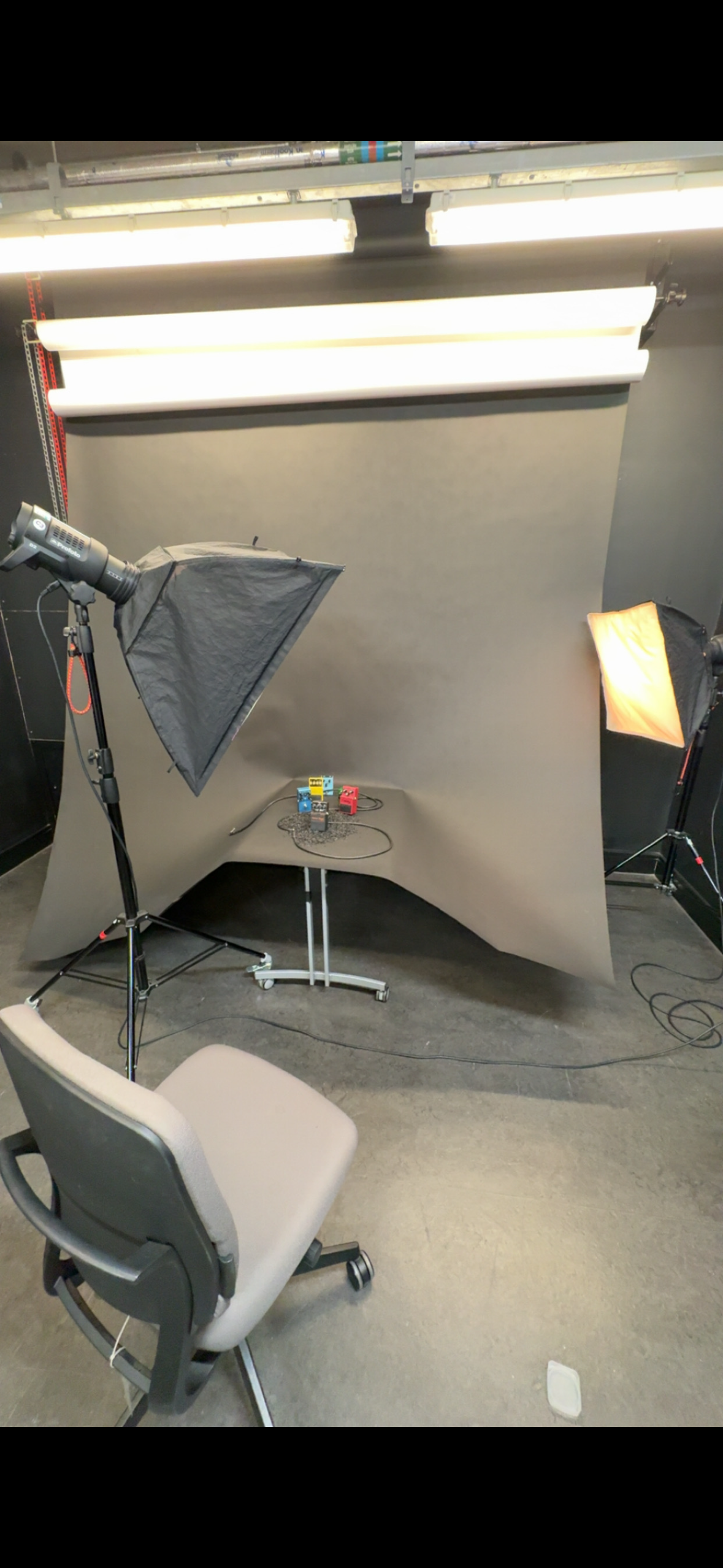
BTS
Printed