produce a final sequence of exactly 5 photographs, forming a coherent
series. These must demonstrate a creative and considered use of compositional devices and
framing strategies.
series. These must demonstrate a creative and considered use of compositional devices and
framing strategies.
Researching others work
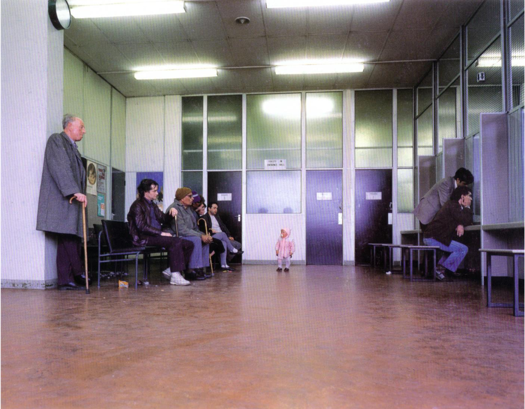
This photo shows a child stood in the dole office, it is framed at a low angle with the child in centre frame which creates an uneasy image and makes the viewer feel bad for the child.
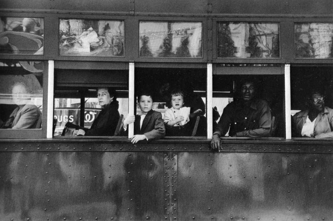
this image shows a group of people on a bus who are separated by windows, the windows separate expression and also create segregation. this image is framed as a line through the middle with the windows making smaller frames within the frame.
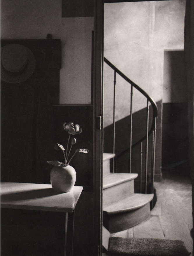
this image shows a plant on a table with a staircase in the background, i picked this image because the framing makes it so there is so much to look at and something about the staircase makes it feel like a mirror.
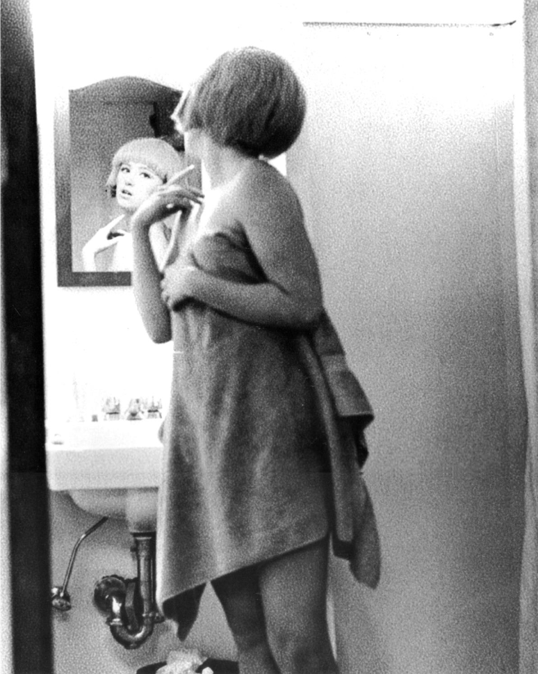
I picked this image because of the way the framing uses the mirror to show the woman's face as well as the back of her. this is effective because it allows for the viewer to have lots to explore within the frame.
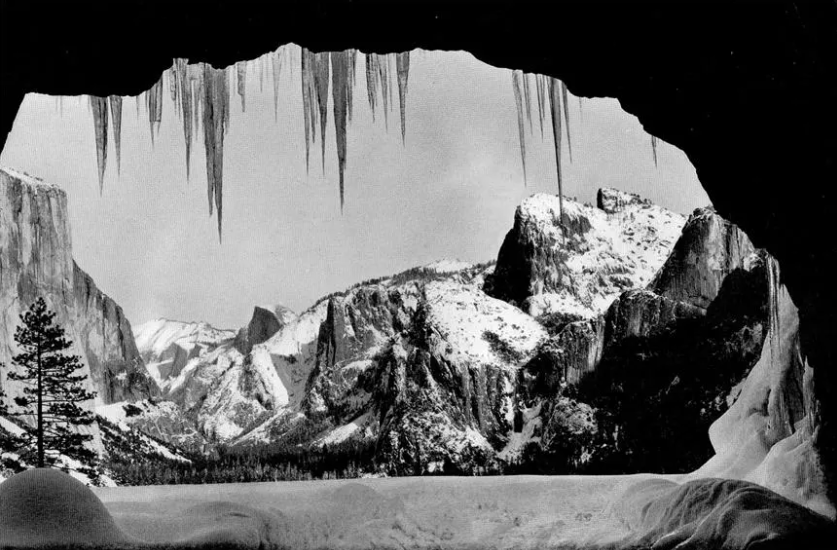
this image is framed by being taken from inside a cave which creates a natures "vignette" around the subject which I think makes a good use of framing and composition
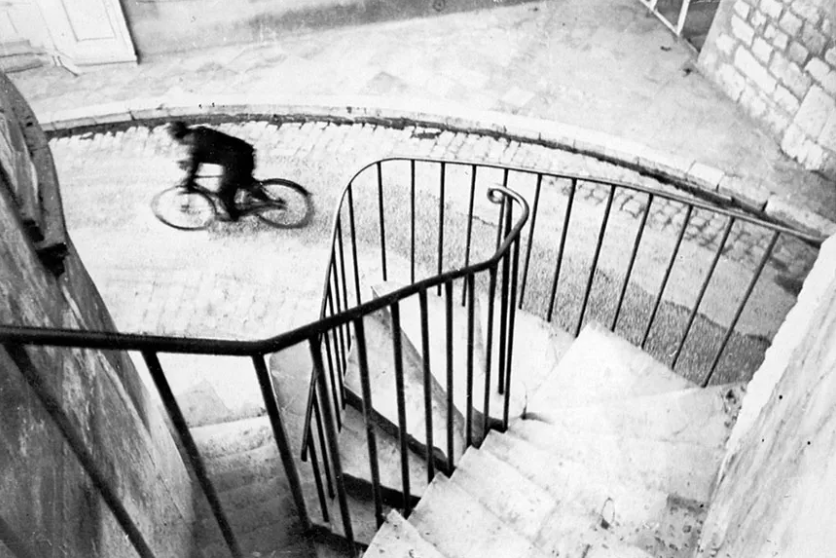
I picked this photo because the way it is framed essentially has 2 subjects, being the lines of the staircase and the bike rider, this almost creates 2 images inside of 1 which I think is interesting.
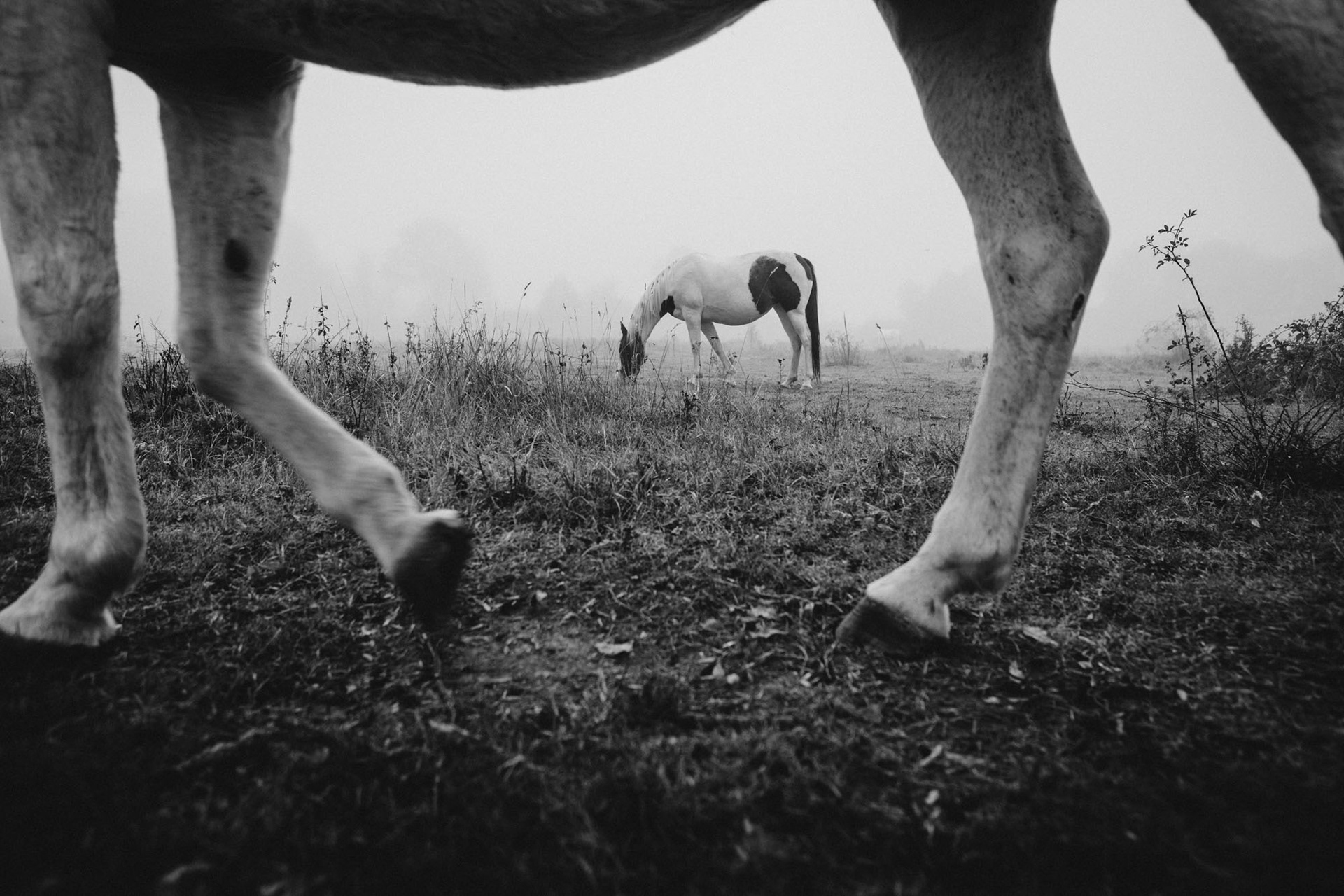
THIS IMAGE SHOWS A FIELD WITH A HORSE IN CENTRE FRAME WITH ANOTHER HORSES LEGS IN THE FOREGROUND. THE USE OF FRAMING IN THIS IMAGE IS USED HEAVILY TO ADD CONTEXT, IF THE PHOTOGRAPHER REMOVED THE FOREGROUND HORSE FROM THE IMAGE THEN THE IMAGE WOULD SHOW A HORSE ENTIRELY ALONE IN WHAT LOOKS TO BE A FOGGY FIELD EATING THE GRASS WHICH COULD HAVE CREATED QUITE A SAD FEELING BUT ADDING THE FOREGROUND LEGS IN SHOWS THE VIEWER THERE ARE MORE ALONE. regardless OF THIS I STILL FEEL LIKE THE IMAGE CREATES A SAD FEELING AS THERE IS SEPARATION BETWEEN THE TWO ANIMALS, THE FOREGROUND HORSE APPEARS TO BE WALKING FORWARD WHILST THE OTHER IS STOPPED, THEY ARE IN THE SAME PEN TOGETHER BUT THEY ARE BOTH ALONE IN A WAY. I THINK THE WAY BLACK AND WHITE IS USED IN THIS IMAGE HEAVILY ADDS TO THIS FEELING AS THE BACKGROUND IS BLOWN OUT, I THINK THIS IS BECAUSE ITS FOGGY BUT IF THERE WAS TEXTURE IN THE SKY AND/OR COLOUR THEN THE STYLE OF THIS IMAGE WOULD BE ENTIRELY DIFFERENT. THE BLOWN OUT BACKGROUND ESSENTIALLY STOPS THE IMAGE RIGHT AFTER THE SUBJECT leaving the viewer to wonder if there is more animals or if there is just nothing behind it. This image uses framing and composition effectively to raise questions without answers and make the viewer consider their emotional connection to the image.
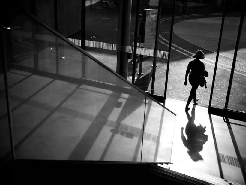
this image shows a woman walking out of a door onto a street from inside a building. it makes heavy use of a leading line of a staircase handrail to direct the viewers eye to the woman and her path, and the window bars and the shadows created by them create vertical lines throughout the whole image which converge at the floor leading the eye to the woman's feet who in turn becomes leading line into herself to show her as a whole. this use of shadow almost creates a duplicate of the image inside of itself and as the shadow is bigger than the woman it creates a smaller sense of scale. this image uses a fast shutter speed as there is no motion blur and also uses a midrange aperture of maybe f5.6-f8 as the handrail is slightly blurred and the double lines in the street are not entirely clear. this image is also in black and white which i feel helps to concentrate and bring attention further to the compositional elements, raising questions to the viewer about the context, location, and the subject. I think this is an effective use of black and white as it brings attention to the form of the image.
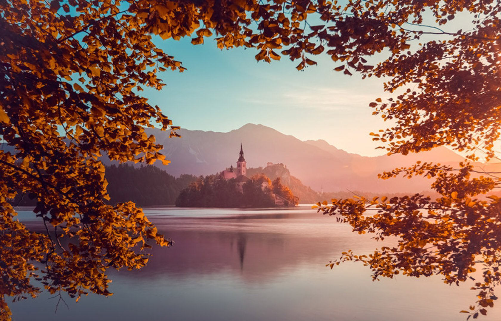
this image shows a building, a church or a castle, on an island in a large lake with mountains in the background and leaves in the foreground. the colours in this image are very late summer but the leaves are autumnal with a hue of pink surrounding the whole image. this is pleasing to the viewer due to the blue sky and lake as blue and orange are contrary on the colour wheel and the pink brings in a familiar middle ground between the analogous. this image is taken at a high aperture and a slow shutter speed, this is because every part of the frame is sharp focus and the water is not frozen in place, it is a calm "dreamy" type of water which works well with the general "vibe" of the image.
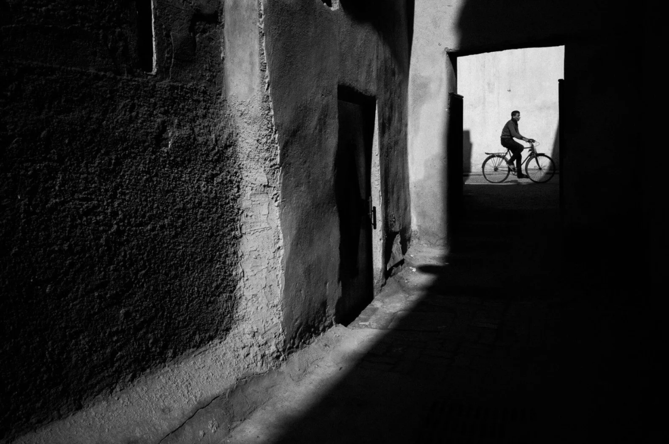
This image shows an old wall which is lit next to what could be an alleyway entirely shrouded in darkness, but at the end of the alleyway is a lit wall with a silhouetted cyclist passing through the opening. this image uses the rule of thirds by putting the cyclist on the rightmost third whilst he is facing right to give the impression that he is leaving the frame, and the small gap he is fitting in gives the viewer the impression that he wasn't AND WON'T BE THERE LONG- MAKING US THINK THIS IS A FRAME THAT HAS BEEN CAPTURED AT THE PERFECT MOMENT. THE USE OF BLACK AND WHITE ALLOWS THE VIEWER TO FOCUS ON WHAT IS HAPPENENING RATHER THAN WHATEVER THE COLOURS OF THE WALL OR THE FLOOR MAY BE, IT ALSO ALLOWS THE VIEWER TO SEE THE TEXTURE OF THE WALL, HOW IT GOES FROM ROUGH TO SMOOTH IN DIFFERENT PARTS, AS WELL AS THE FORM OF THE "DOORWAY" TO THE CYCLIST HOW IT IS NOT BUILT STRAIGHT SHOWING US THIS IS A NOT MODERN LOCATION. THE FORM OF ALL THE WALLS AND FLOOR SHOW US THIS, THEY ARE NOT FLAT OR STRAIGHT IN ANY PLACES, THEY LOOK HAND MADE AND VERY OLD GIVING THE IMPRESSION THAT MAYBE THIS PLACES PRESERVATION HAS BEEN IMPORTANT- THE BIKE ALSO LEADS INTO THIS SYMBOLISLM AS DUE TO THE OLD NATURE THIS IS WHY HE IS TRAVELLIGN BY BIKE RATHER THAN CAR; AS THE ROAD HE IS IN APPEARS WIDE ENOUGH TO BE A DRIVABLE STREET. I THINK THIS IMAGE USES FRAMING EFFECTIVELY AS THERE IS SO MUCH INFORMATION TO BE SEEN AND DISCOVERED WITHIN THIS IMAGE THAT CAN BE SEEN AFTER THE INITAL FRAMING LEADS YOU DIRECTLY TO THE SUBJECT.
First Shoot
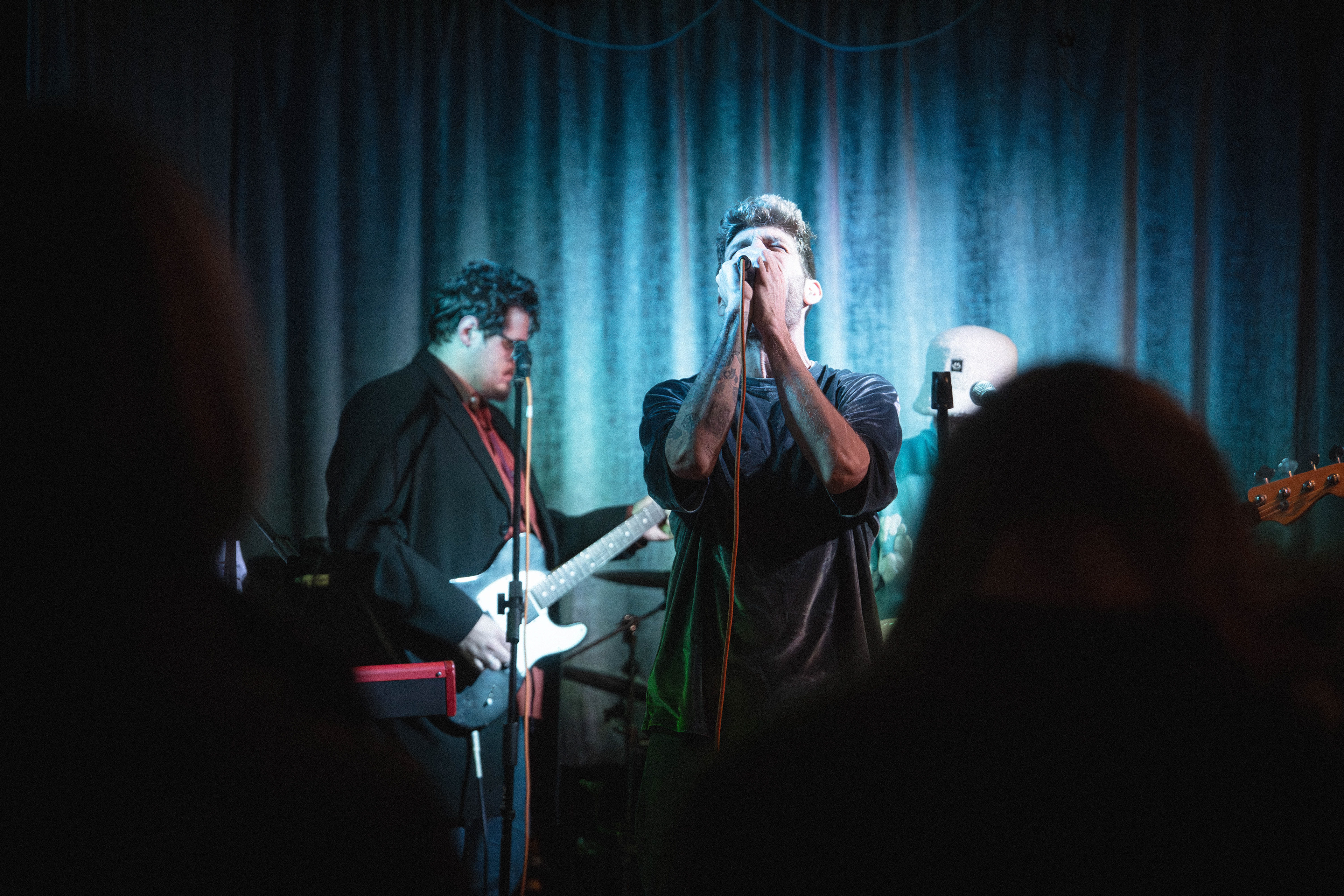
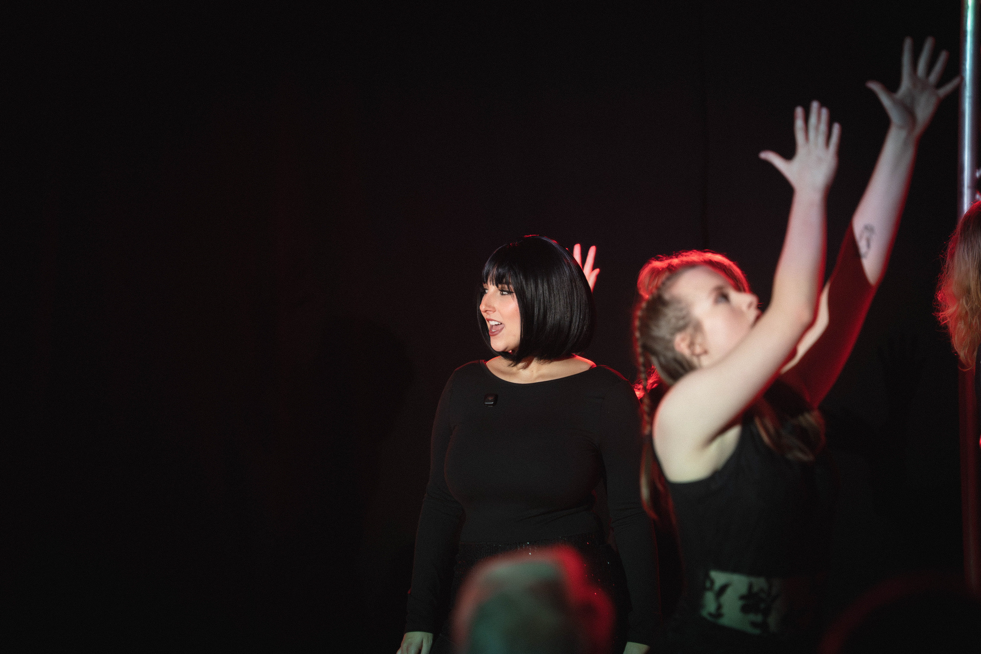
These photos were taken at a gig I photographed and were taken with the intention of being used in this project, during the process I was considering composition and how to create a cohesive storyline throughout images. I am not happy with these images to be the final pieces due to the microphone stands and some of the images having heads in the photo which look unpurposefully placed, as in there were unavoidable in the shot and not intentional.
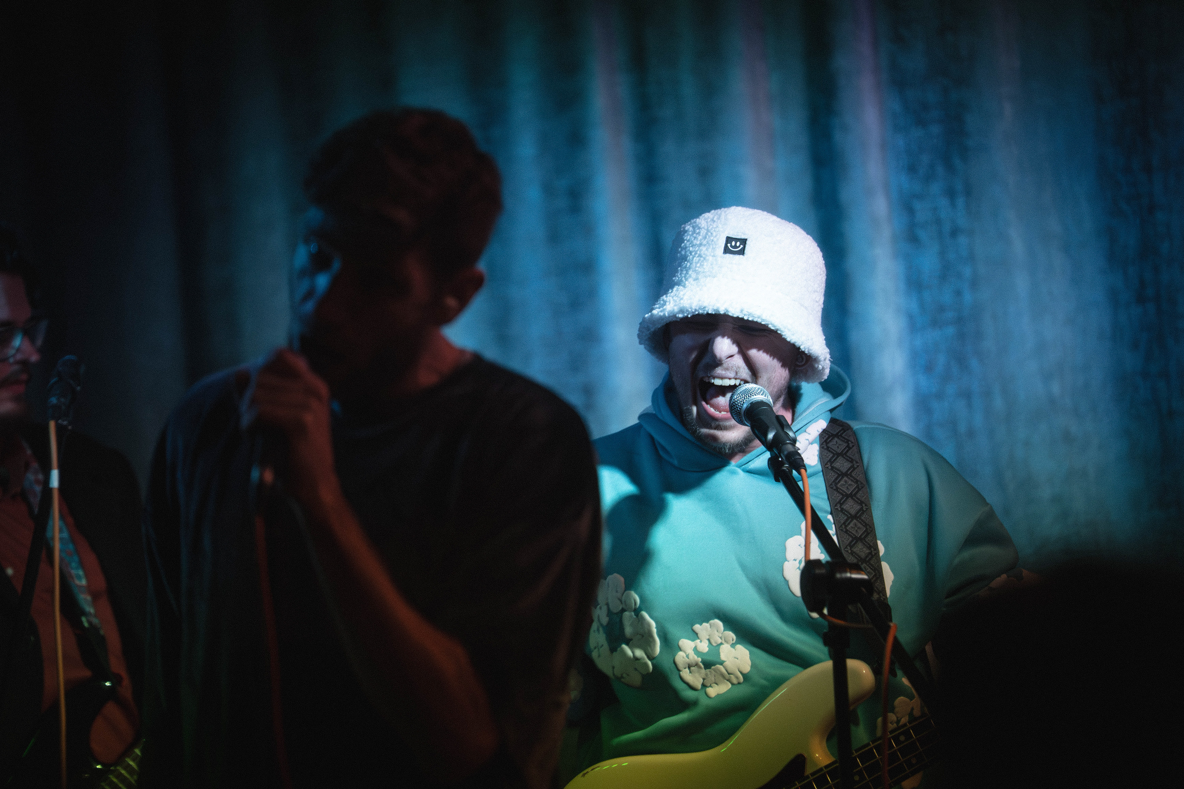
The first image was taken at 1/640, F3.2, Iso 25600 and shows the singer posing with the microphone with the band in the background. I like the lighting in this shot and I feel like the subjects position and framing is effective but I feel like the rest of the band could be placed better and the head in the foreground cuts off the bass guitar. This band had 6 members on a relatively small stage so it was difficult to make it so all members could be seen without those at the back falling behind someone else. this first photo shows this exactly as the bassists face is cut off by the singer and the drummer is cut off by the bassist. I think this shot captured a great moment in the show but could have been composed from a different angle to make a more effective photo.
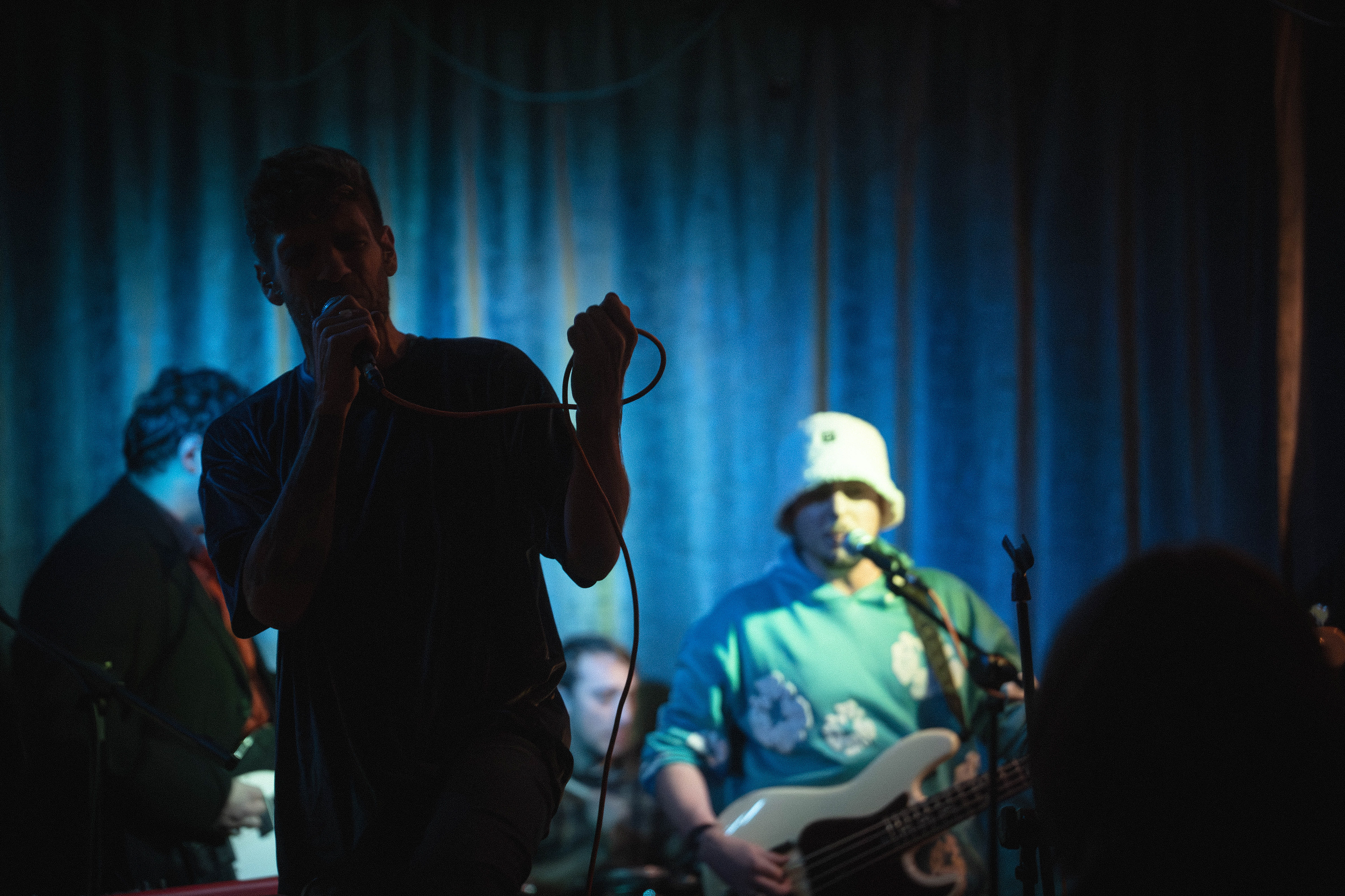
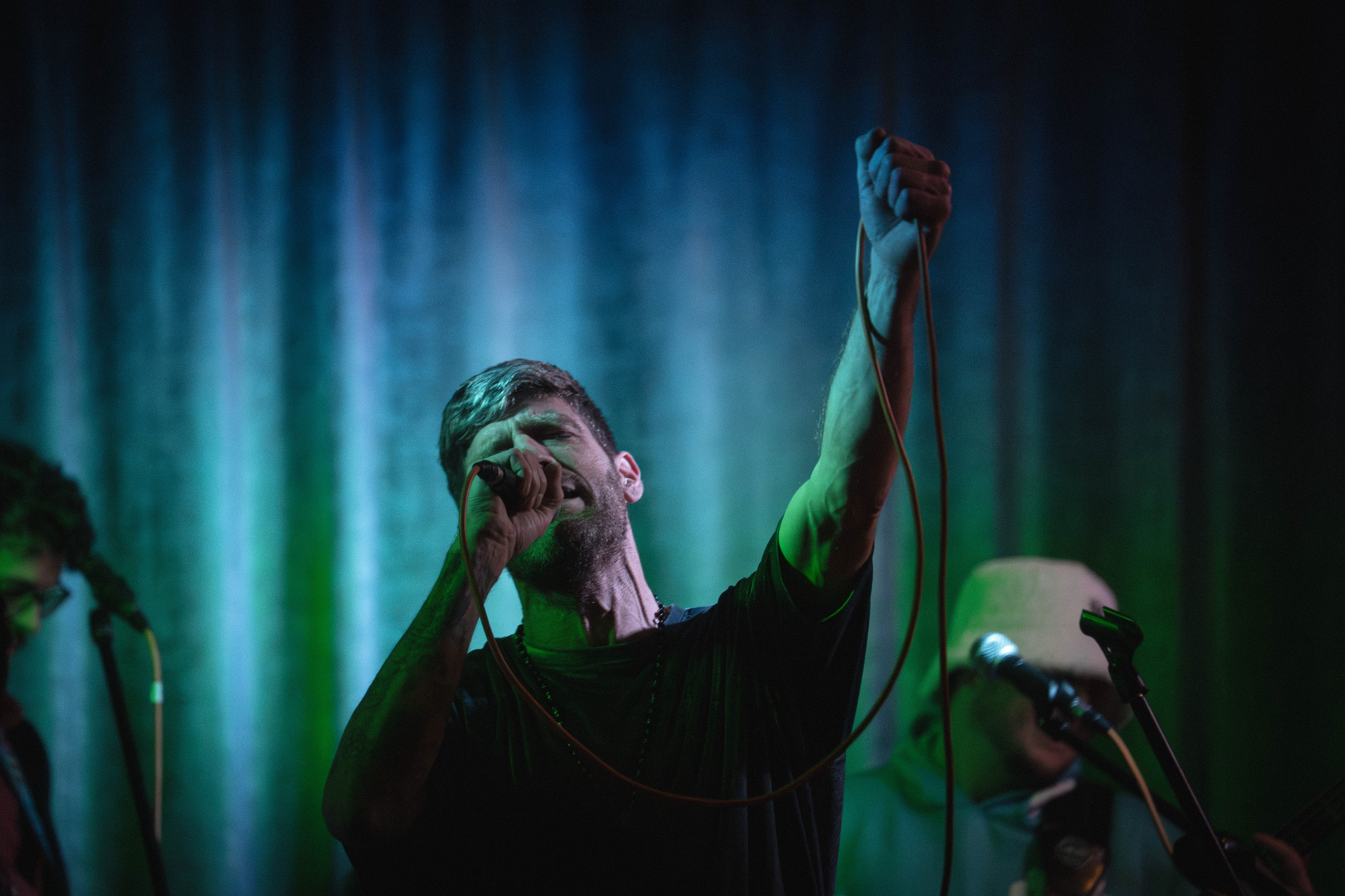
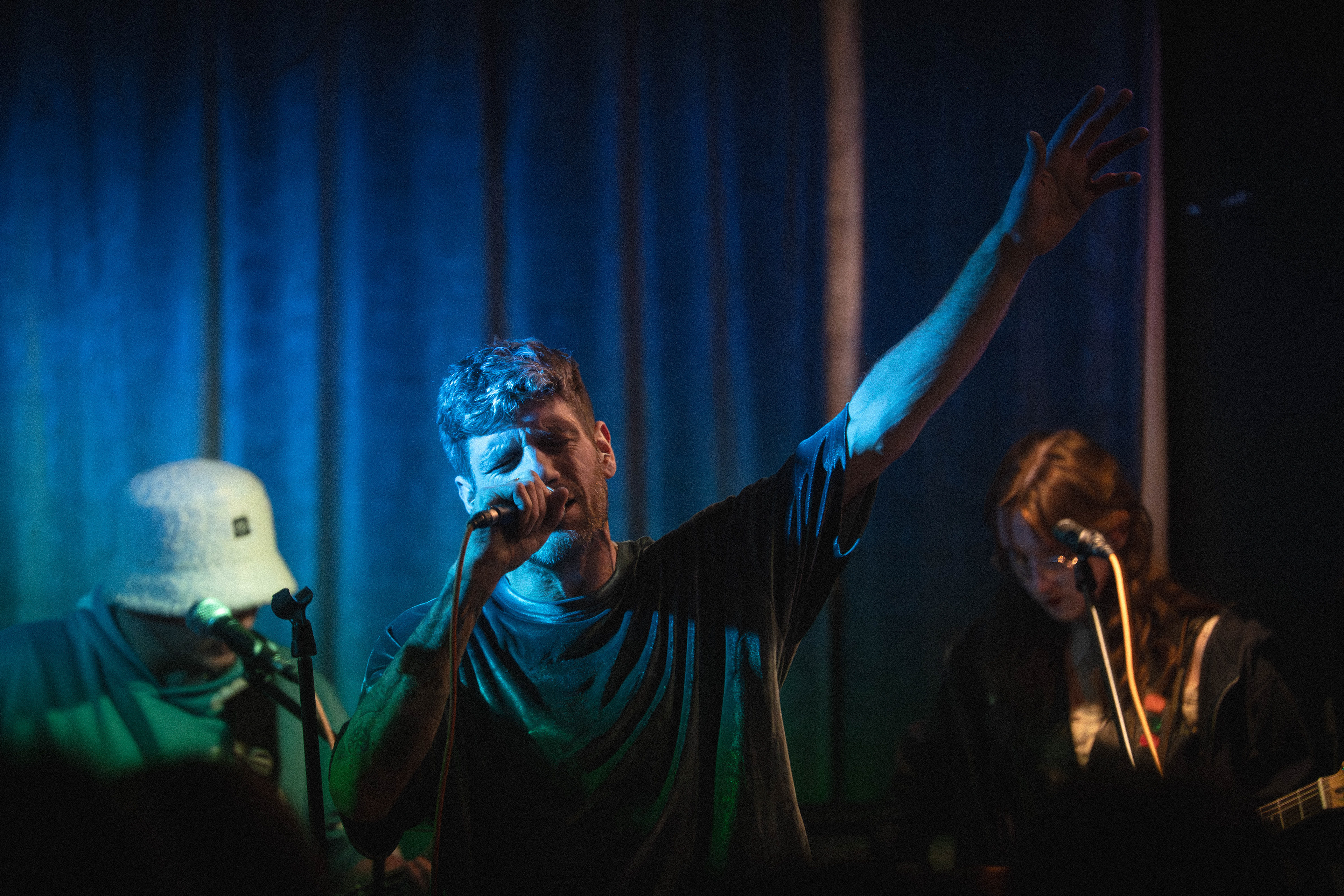
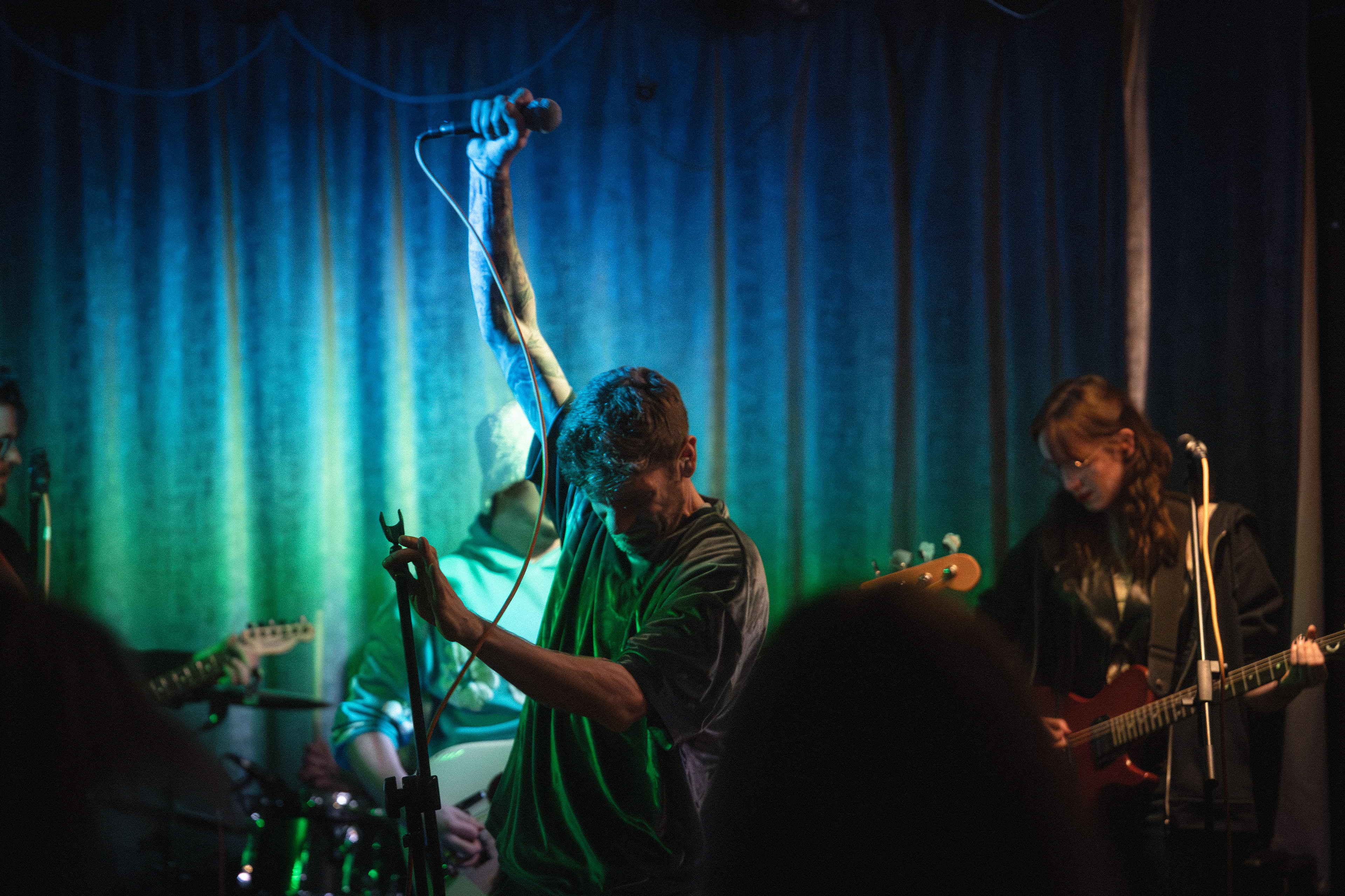
This second image was taken at 1/640, F3.2, Iso 16000 and shows the singer encased in shadows with the microphone wrapped around his hand whilst singing. he is stood in front of the light which allows for the viewer to see that he has walked forward and is really invested in singing. the way he is holding the microphone cable with his fist, i feel shows so much emotion behind him singing. The bassist, drummer, and guitarist can be seen in the background of the photo but have been dropped out of focus due to the aperture. the bassist is singing into the microphone which shows that this part of the song is important, as combined with the singers emotion, there is emphasis on this part with another singer. the drummer is cut off again by the singers wire but we can now get a look at his face which is dropped off by focus again- I feel like this photo could be lowered slightly to show more of the drum kit. the singer is also cutting off the other guitarist, but I feel like if the guitarist was facing towards the camera it would have made for a less effective image due to me placing the singer on the rule of thirds line, so the guitarist is currently walking into frame and his head is not cut off by the side of the frame but instead is showing he is travelling a path through the frame. I like the lighting in this shot again with the singer being encased in shadows as it keeps the focus on him but also allows a look around to the rest of the band which could not be seen last photo. In a way I am using this set to explore each member of the band. once again there is a head in camera right which is not best placed and the image could be cropped to remove the edge of the backdrop curtain where light is coming through.
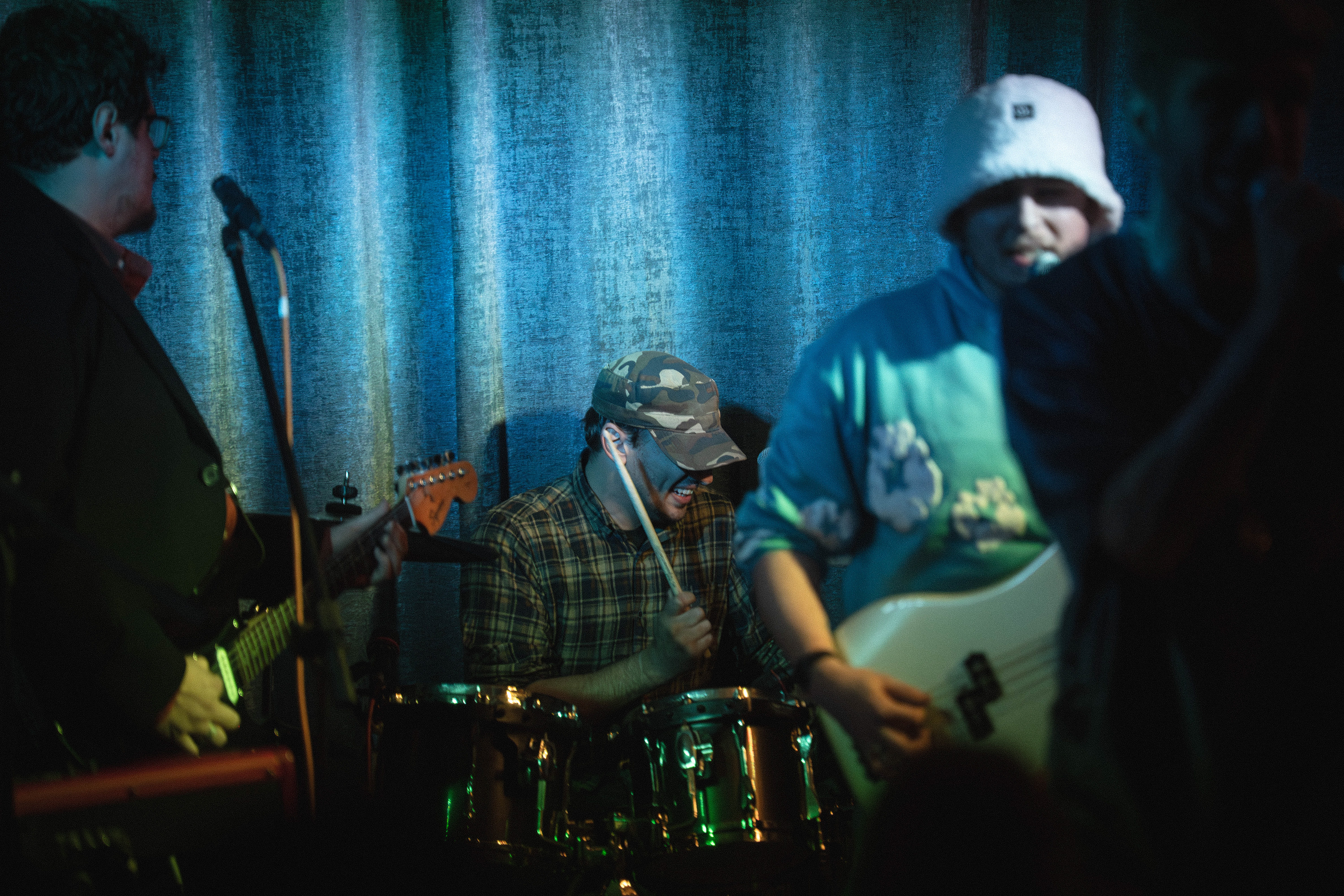
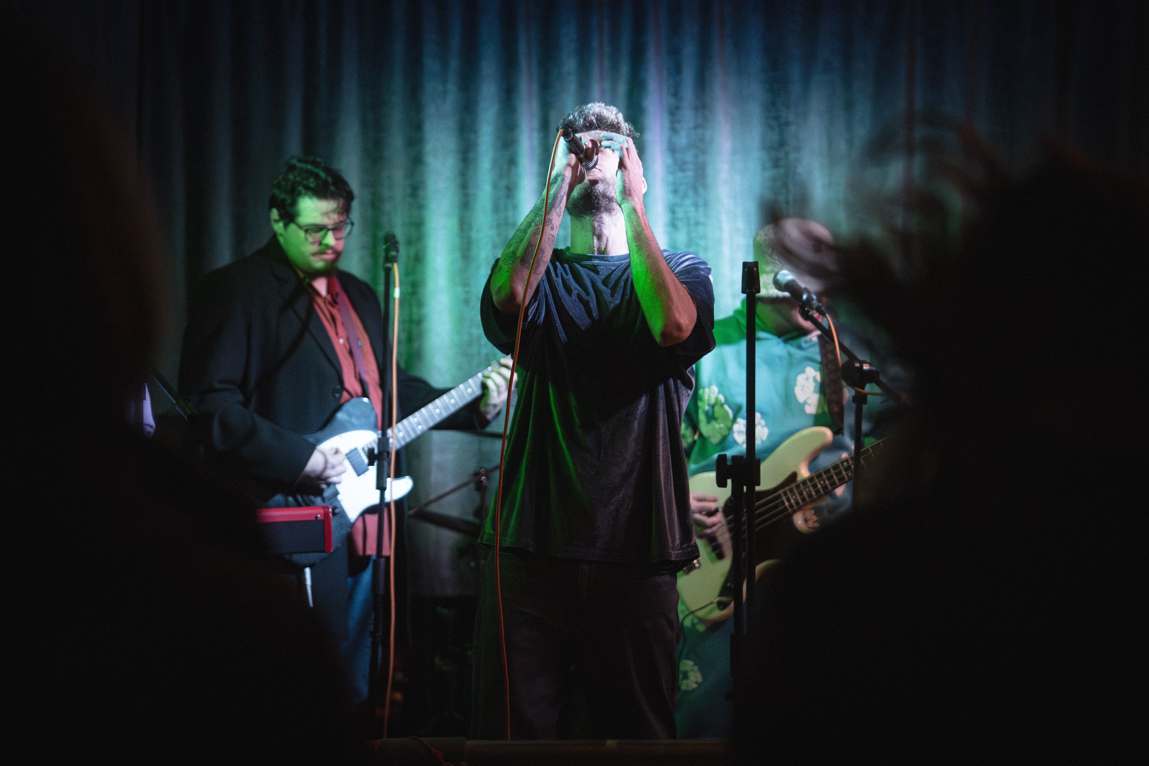
The third image was taken at 1/640, F3.2, Iso 16000 and removes focus from the singer and explores the drummer who has not been properly seen in the rest of the images. this photo shows the drummer about to hit a drum with his teeth showing in a smile with the bassist guitarist and singer in the foreground out of focus. this photo shows emotion as he and the bassist are both smiling showing that the band is enjoying themselves. I feel like this photo could have been taken from a higher angle to keep the other band members in the frame but also have less negative space above the drummer and I also think the microphone stand in front of the guitarist looks unpleasant as he is not using it. I think microphone stands are my least favourite thing from this type of photography as in lots of my photos my autofocus wants to focus on them instead and they just create an unpleasant object in the frame, I do not think it is worth photoshopping them out though as it is ultimately part of the scene and that should be documented. I like this photo for the fact that it shows the drummer and that makes it fit in this set but otherwise I think I could have done a better job.
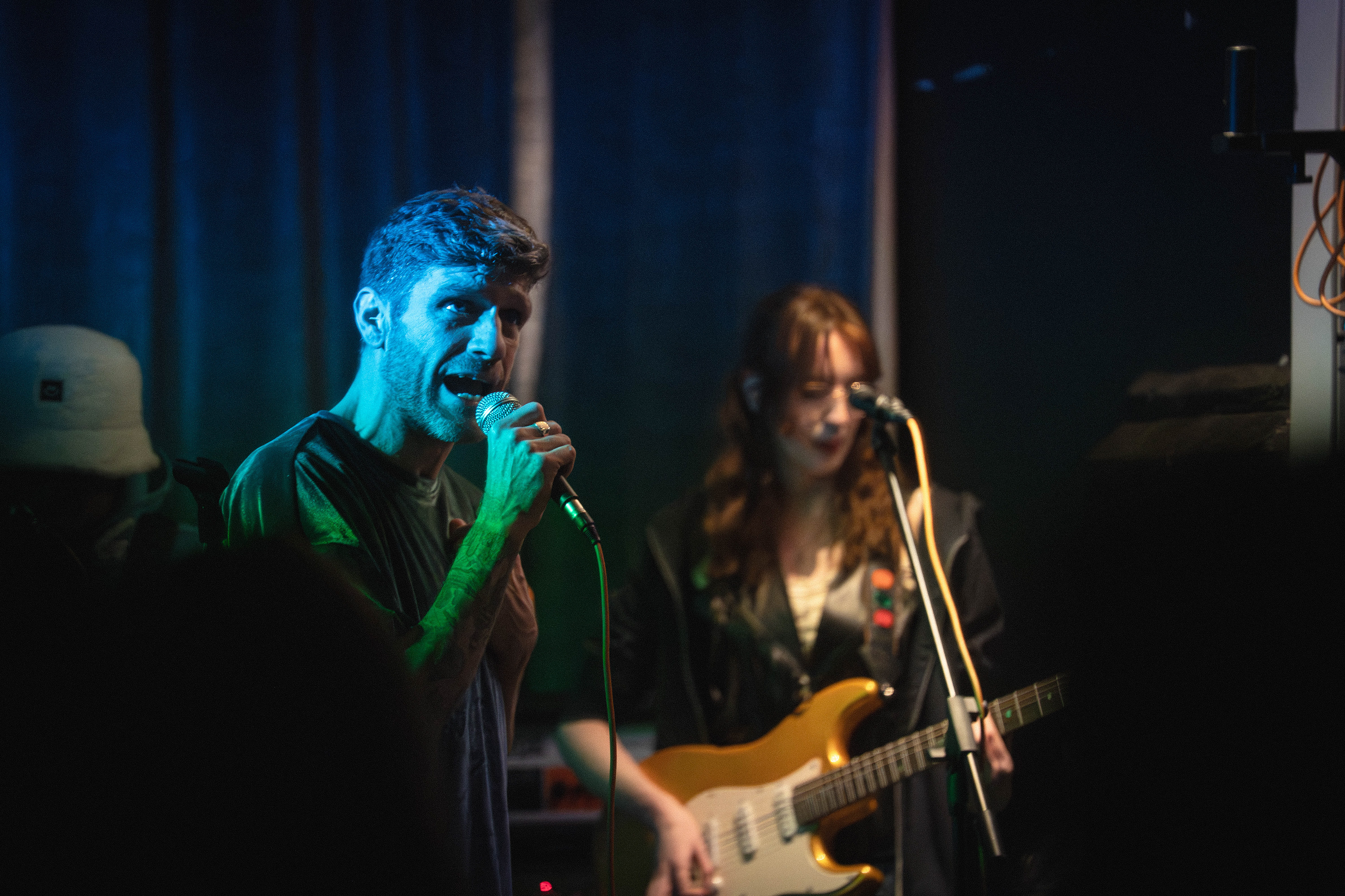
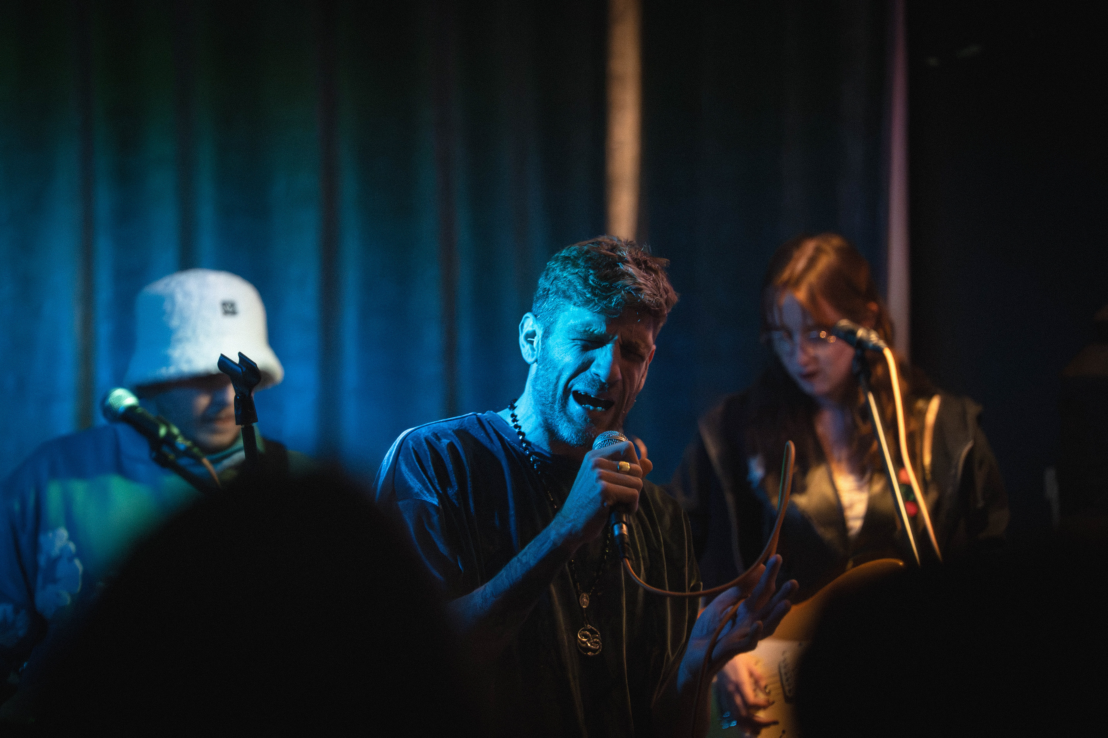
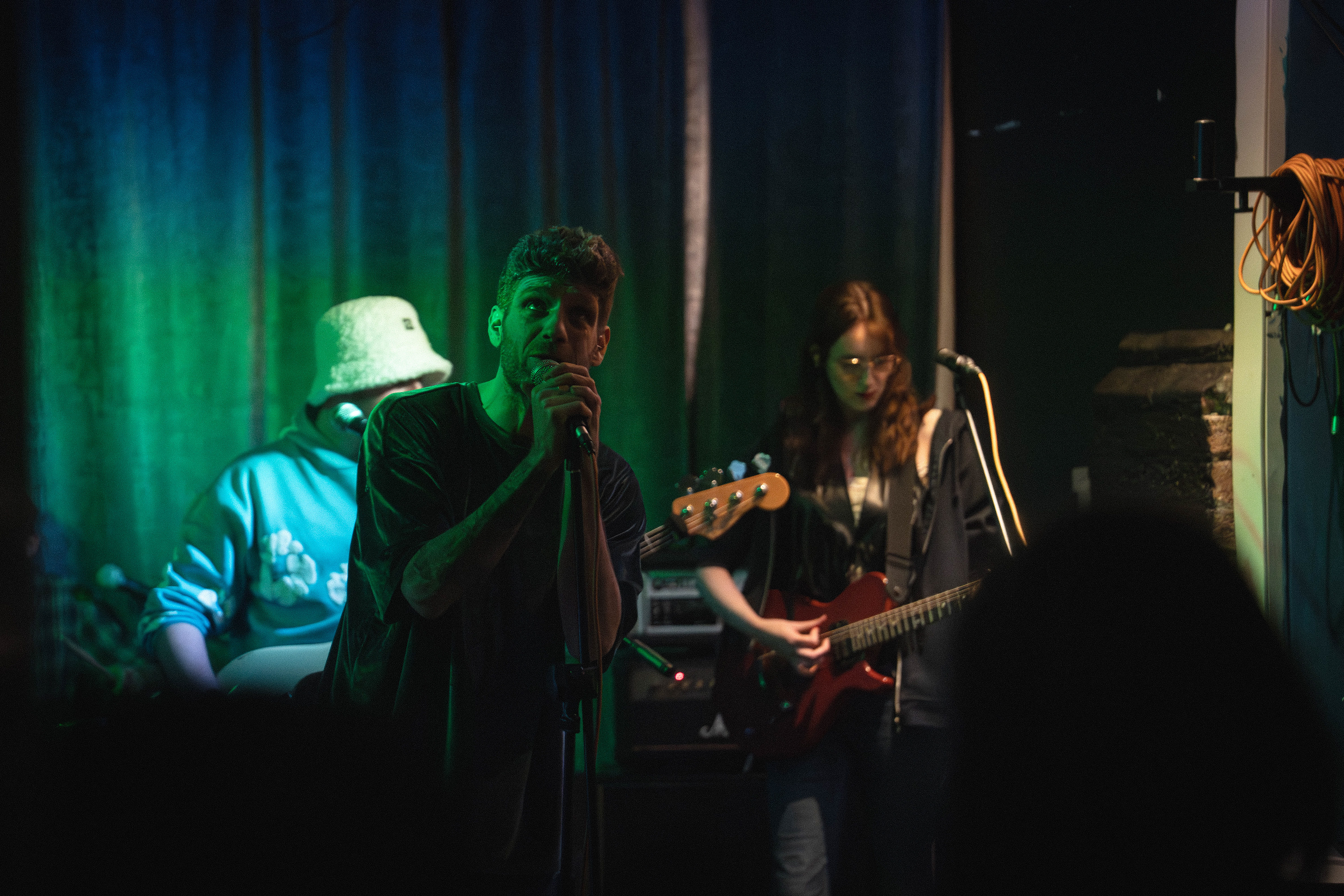
The fourth photo was taken at 1/640, F3.2, Iso 25600 and shows the singer and guitarist in the frame without the rest of the band. the light is 2 toned on the singer with a green and blue and is side lighting his face whilst his mouth is open and is singing. The guitarist in the background is lit fully with neutral light which provides a contrast. I like this photo for the lighting and the way it shows these 2 members working in sync with each other but once again the mic stand is in the guitarists eye, there is a head blocking the guitar, and there are wires in the frame camera right so this image could be better with changes to these parts.
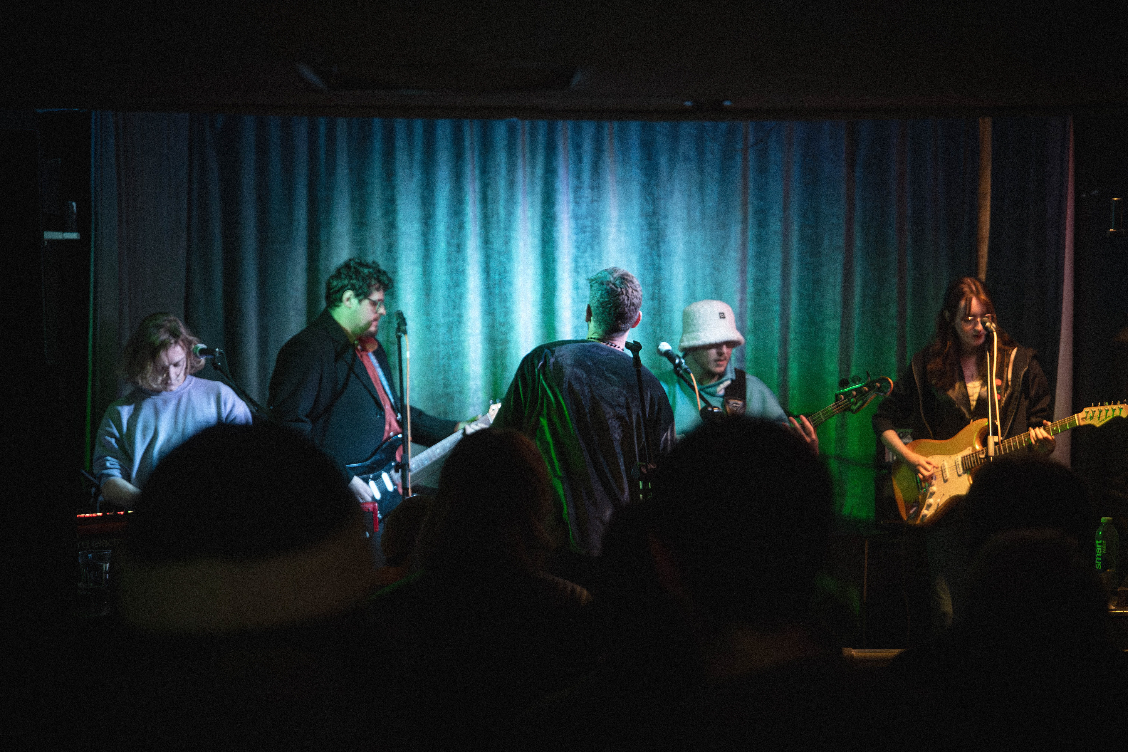
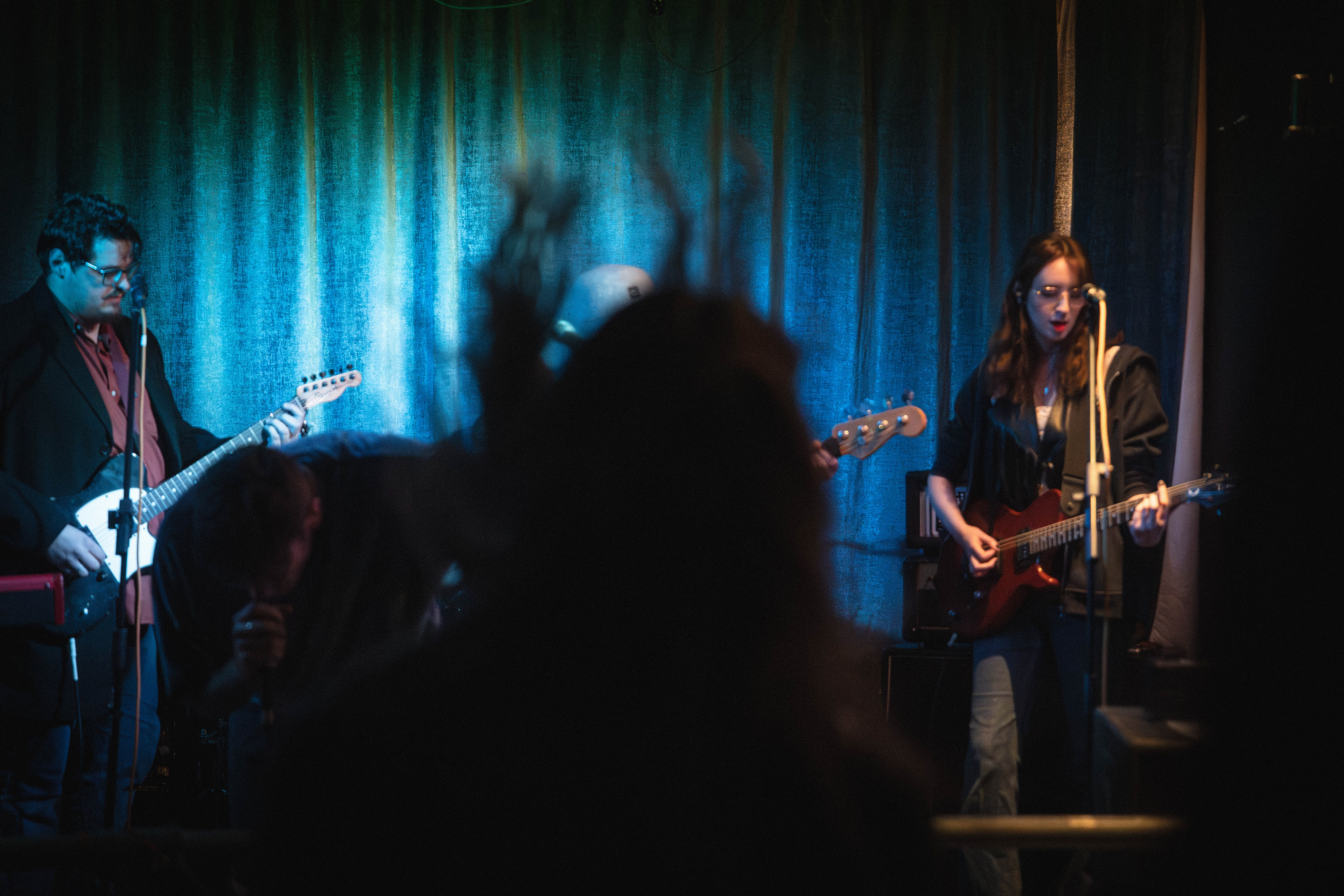
the fifth image was taken at 1/640, F3.2, Iso 25600 and shows the whole band together, bar the drummer as he is obscured by the singer. For this reason I included the solo image of the drummer. the whole band is in the photo and shows the singer turned around as the show is ending. all the band is lit equally and the viewer gets the first look at the keyboardist so now every member of the band has been seen. using the set to slowly reveal all members. this photo looks directly on at the members and composes itself very straight in a way to simply show what is going on. I like the way the heads work in this image and think they feel purposeful to show the crowd looking at the members but once again I do not like the microphone stands and feel like they distract from the point of the image.
This set could be better and I will be looking into creating another set for the final images with what I have learned from this shoot.


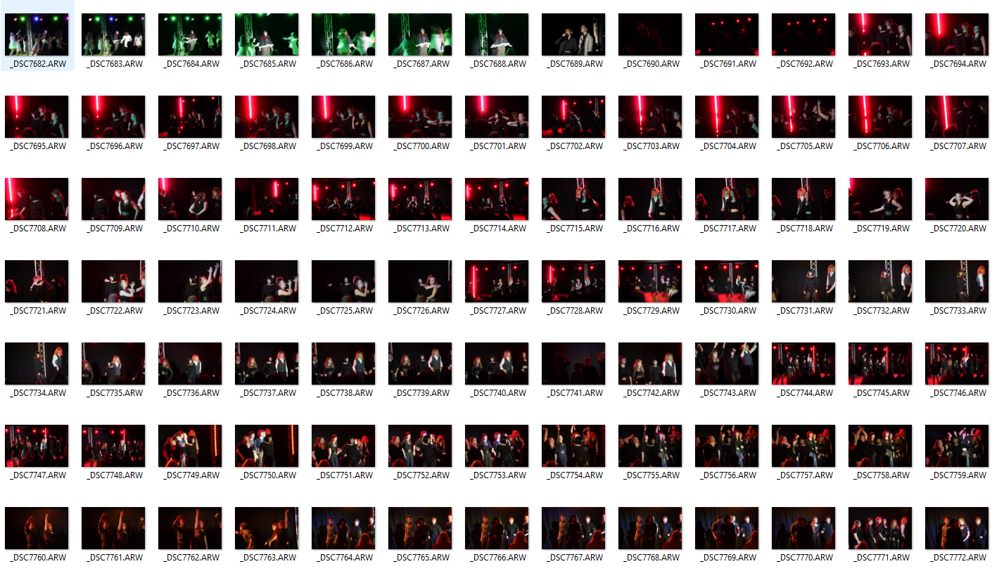
All possible selections


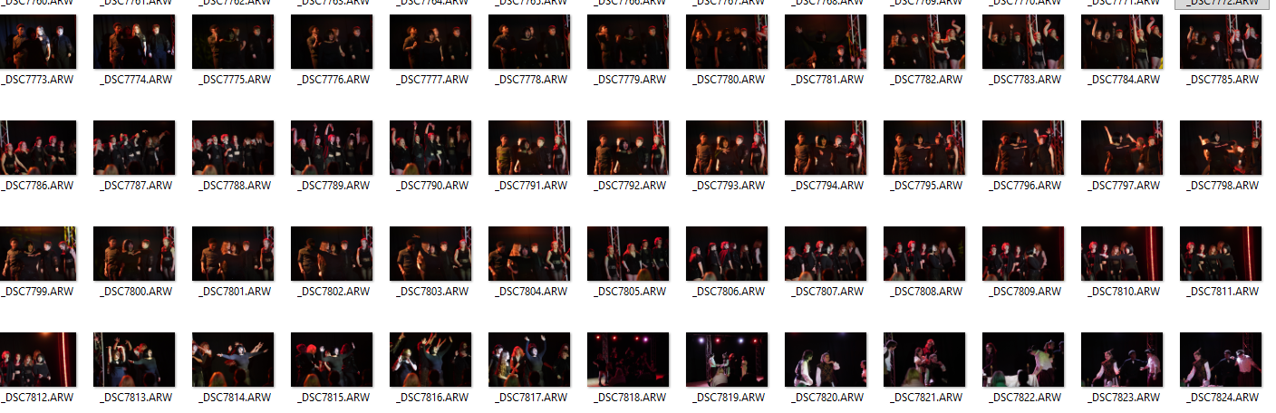
Contact Sheet of all edited
Second Shoot
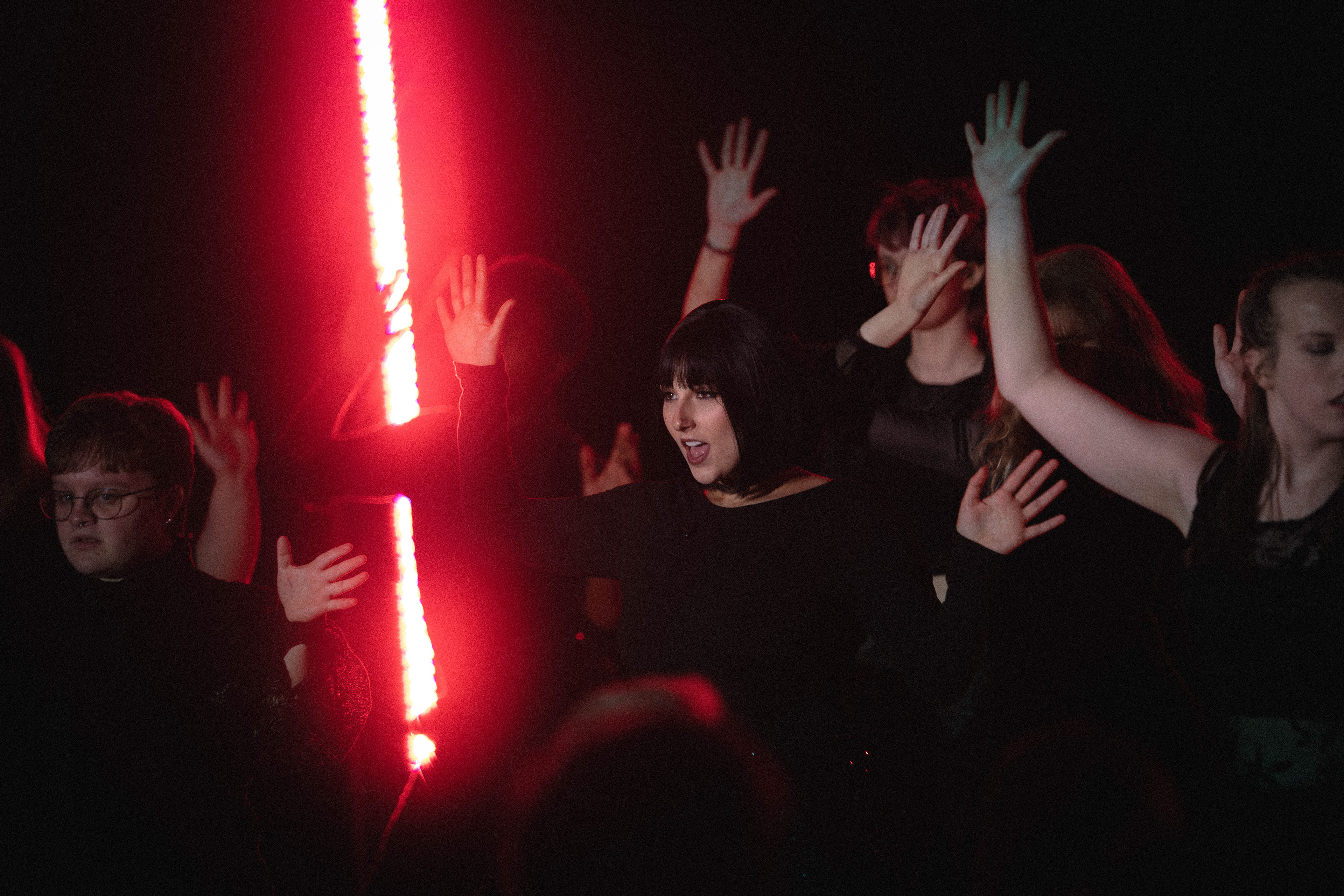
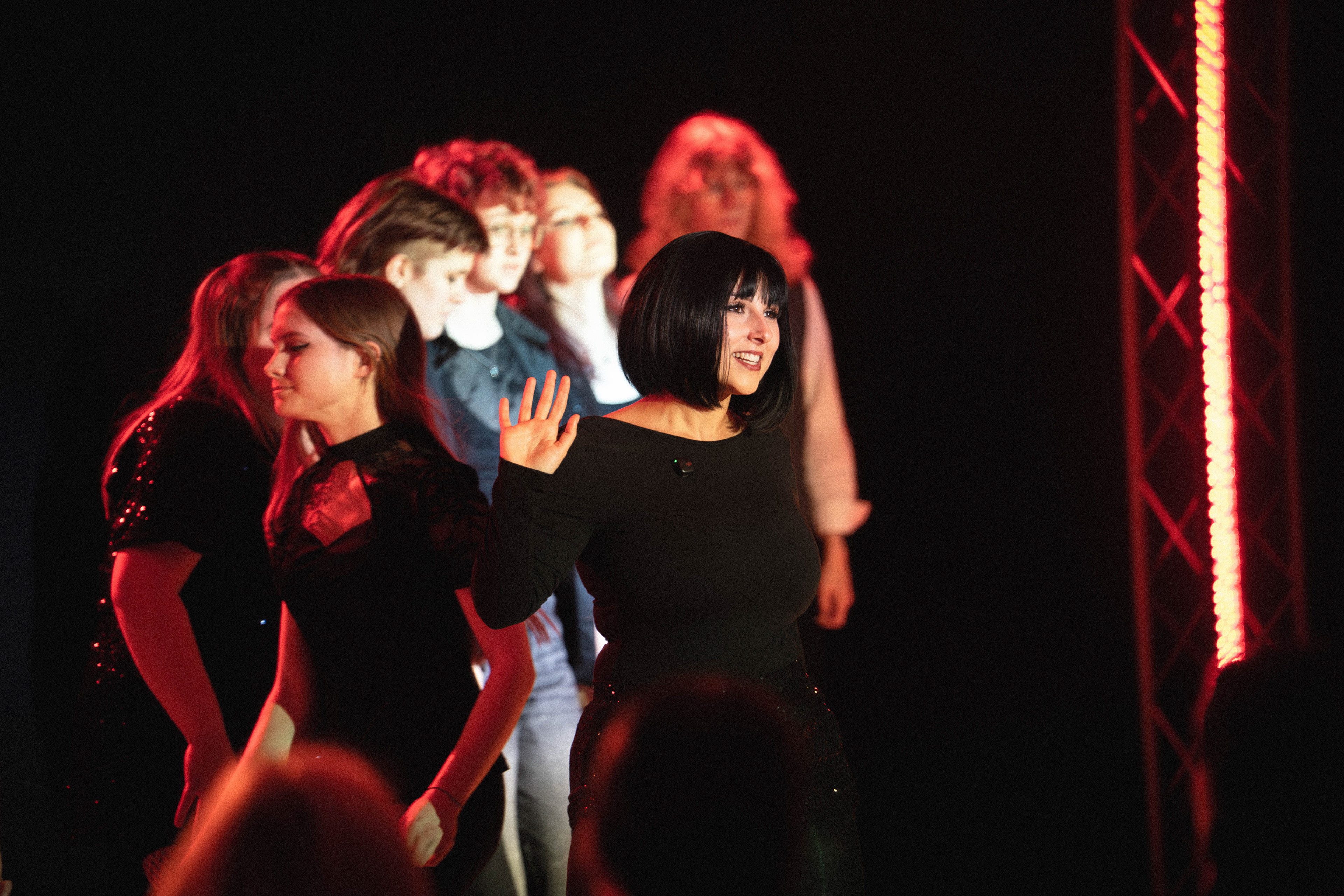
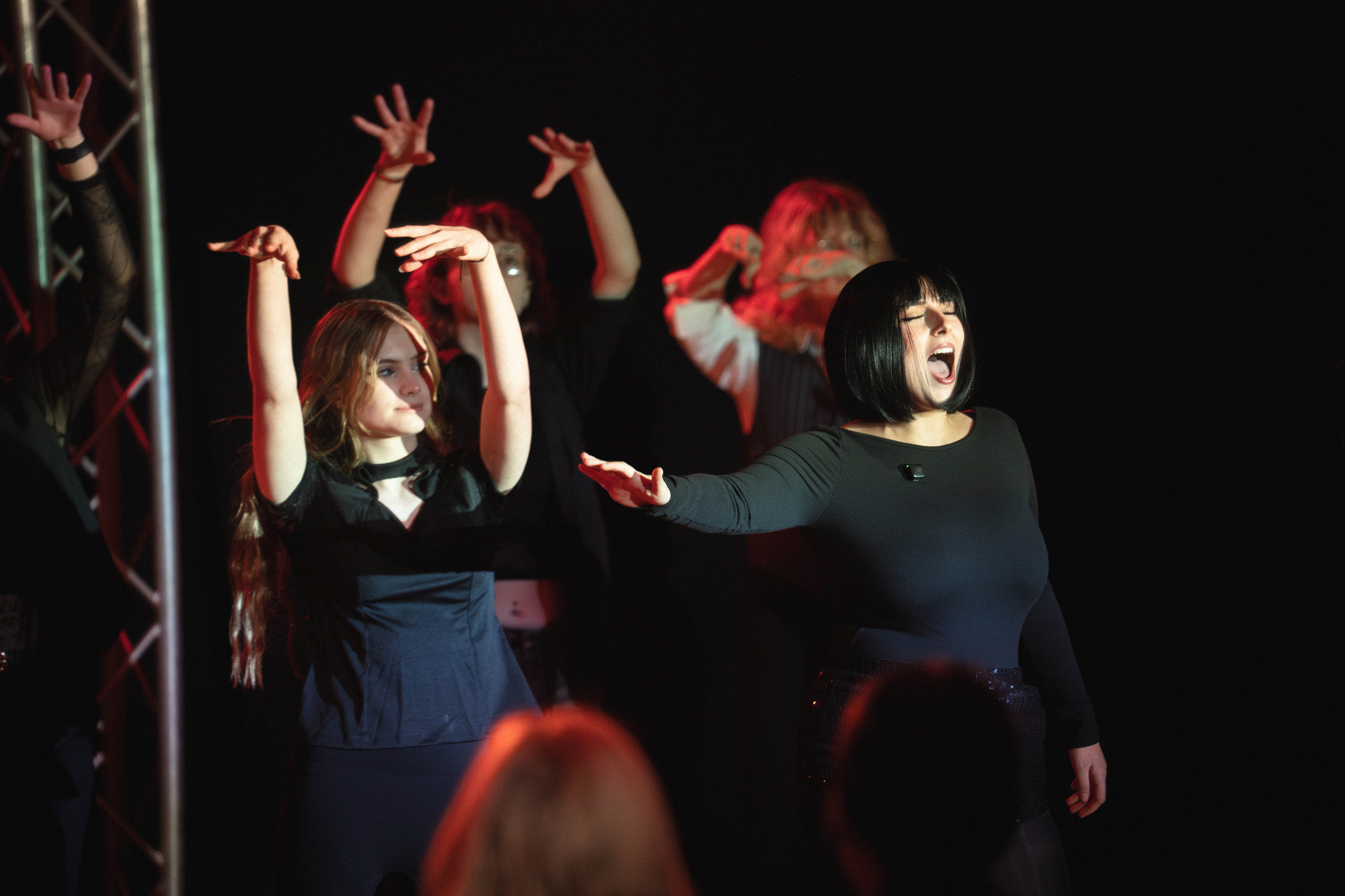
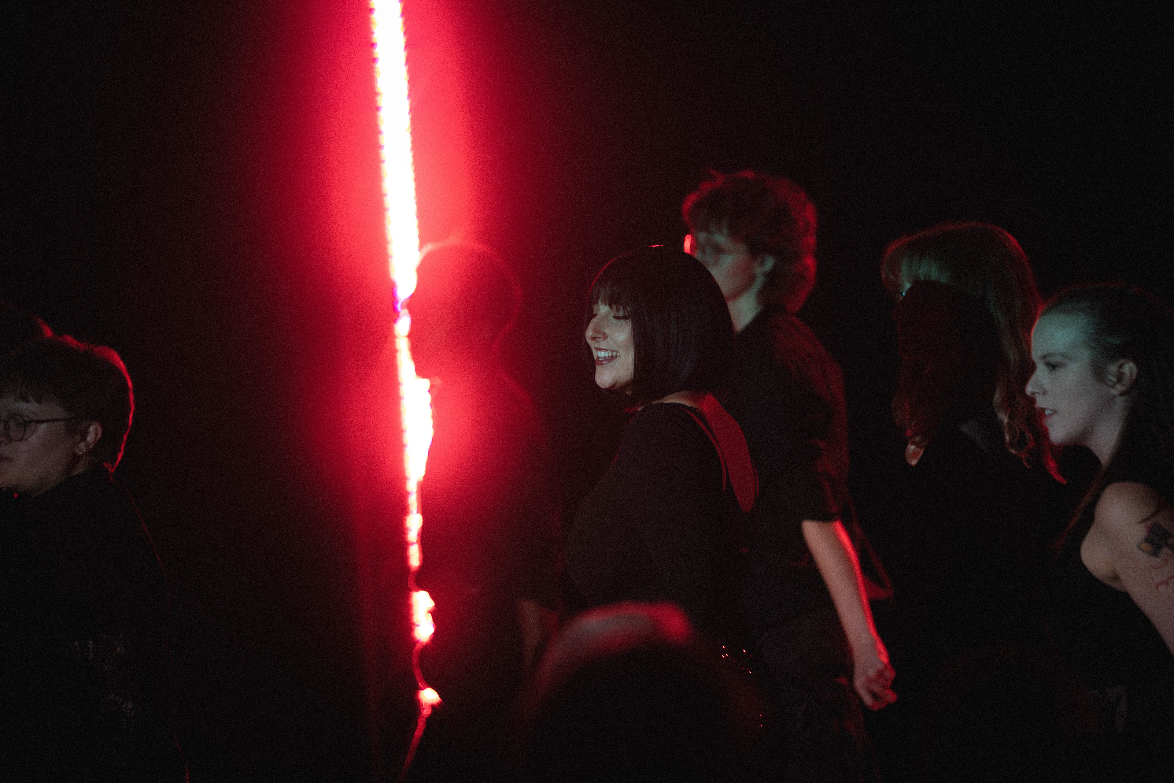
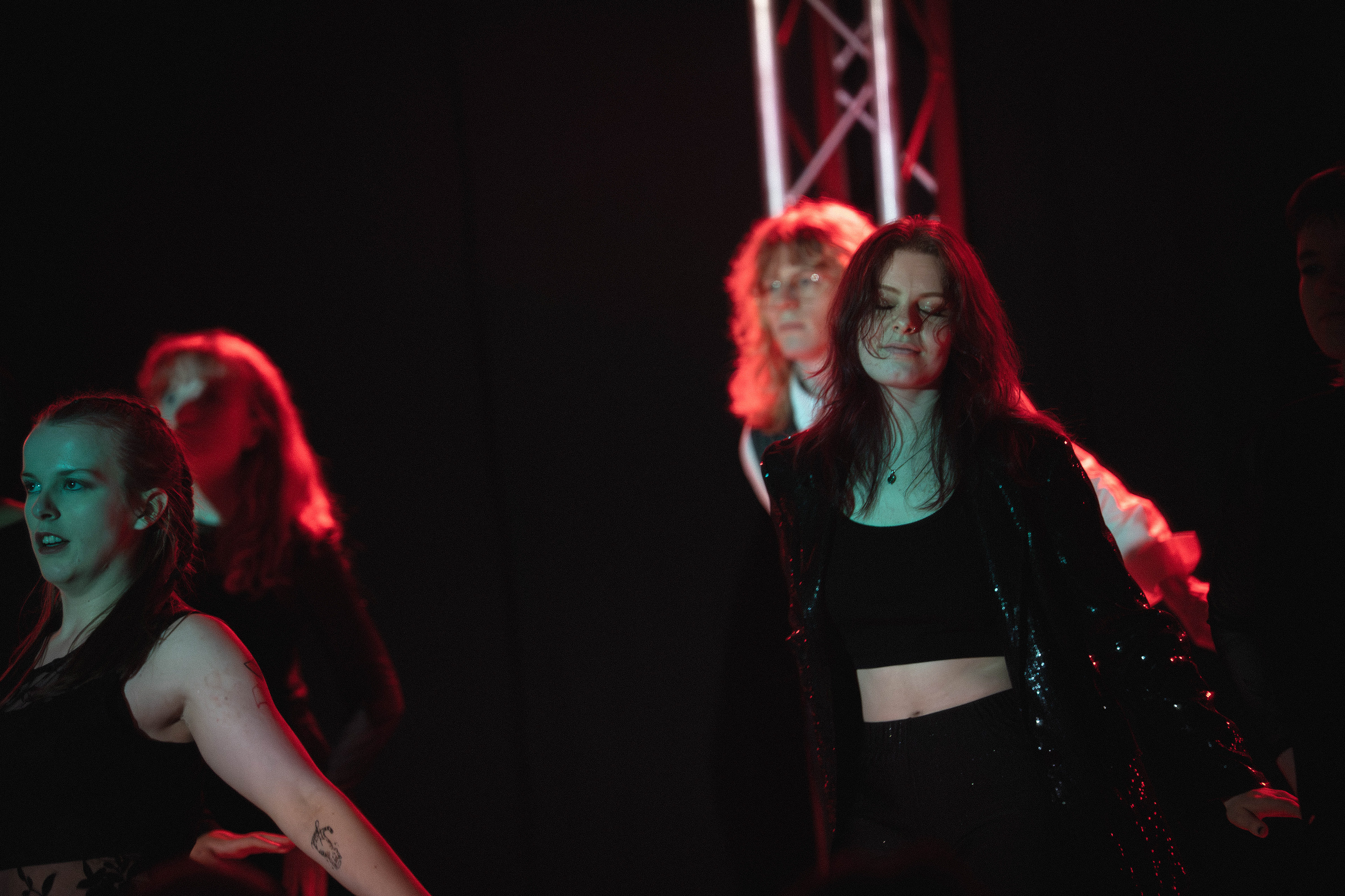
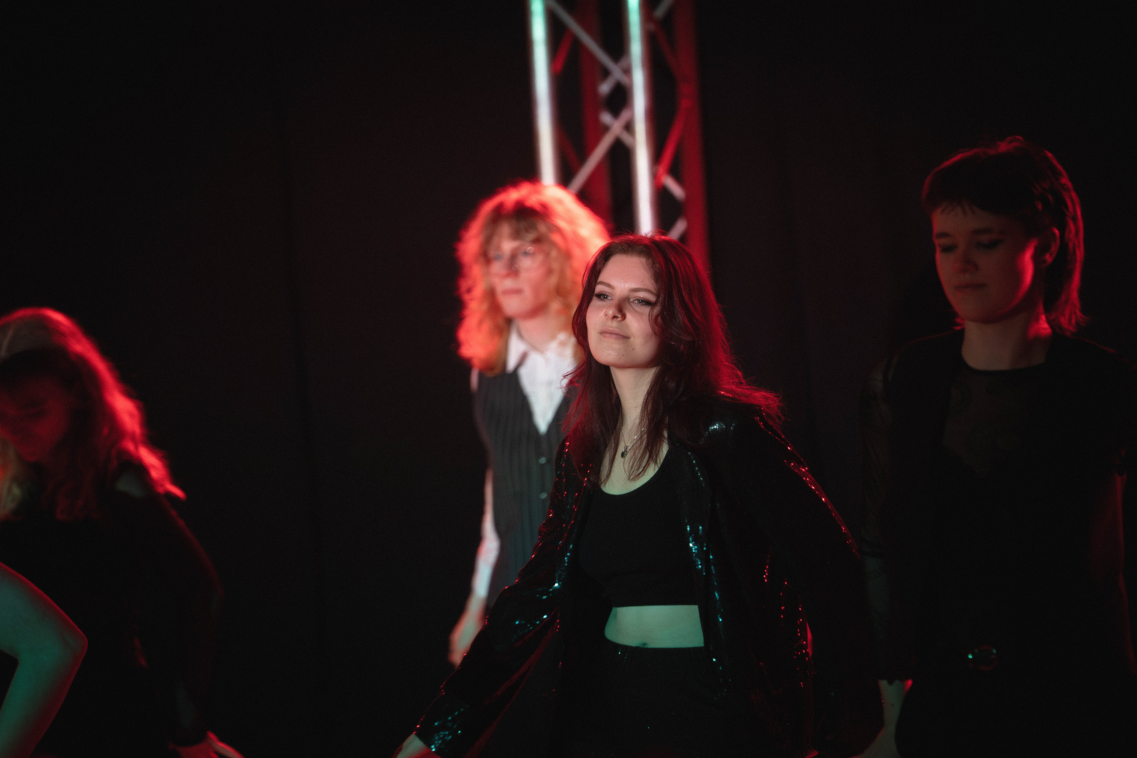
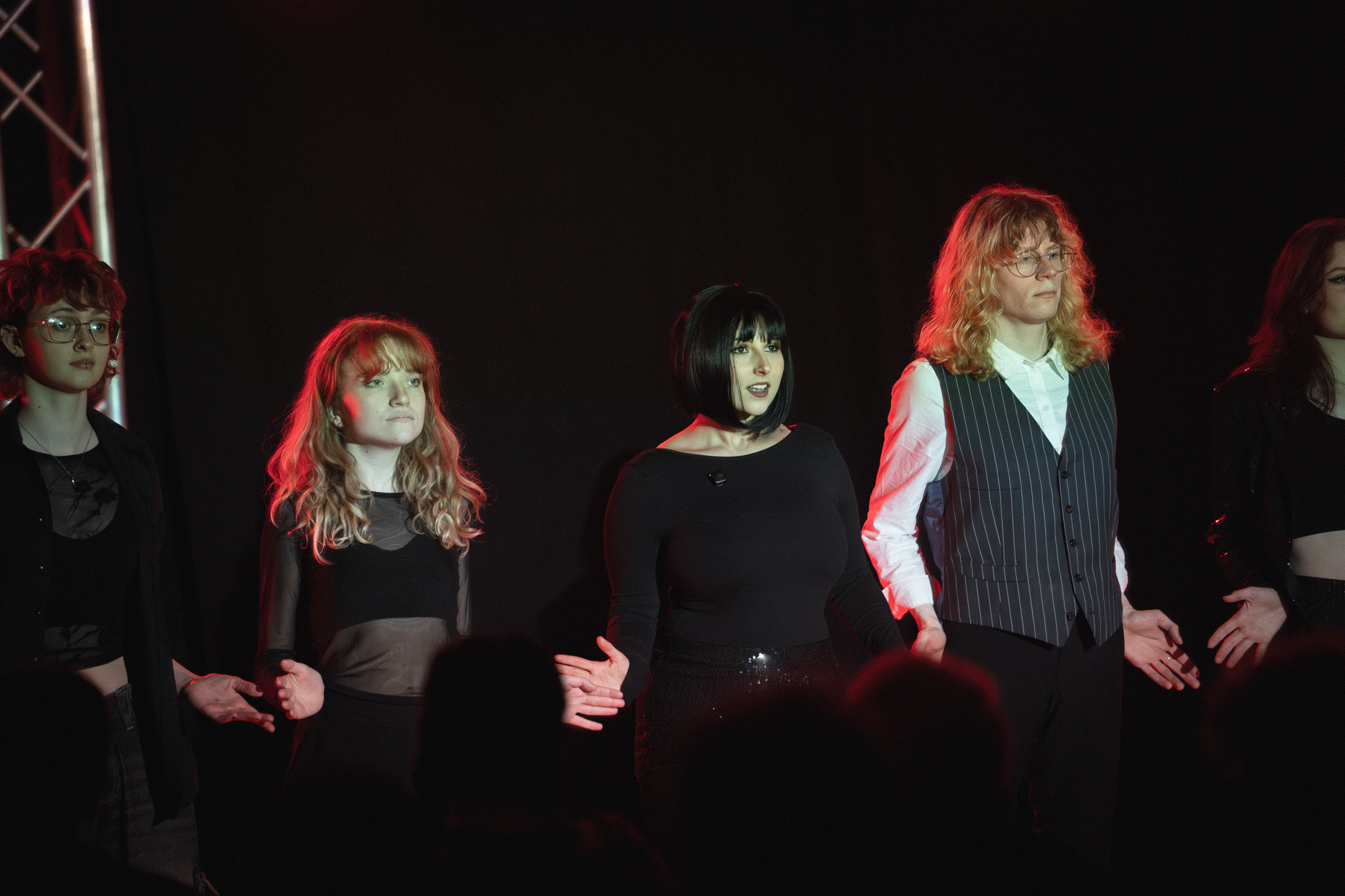
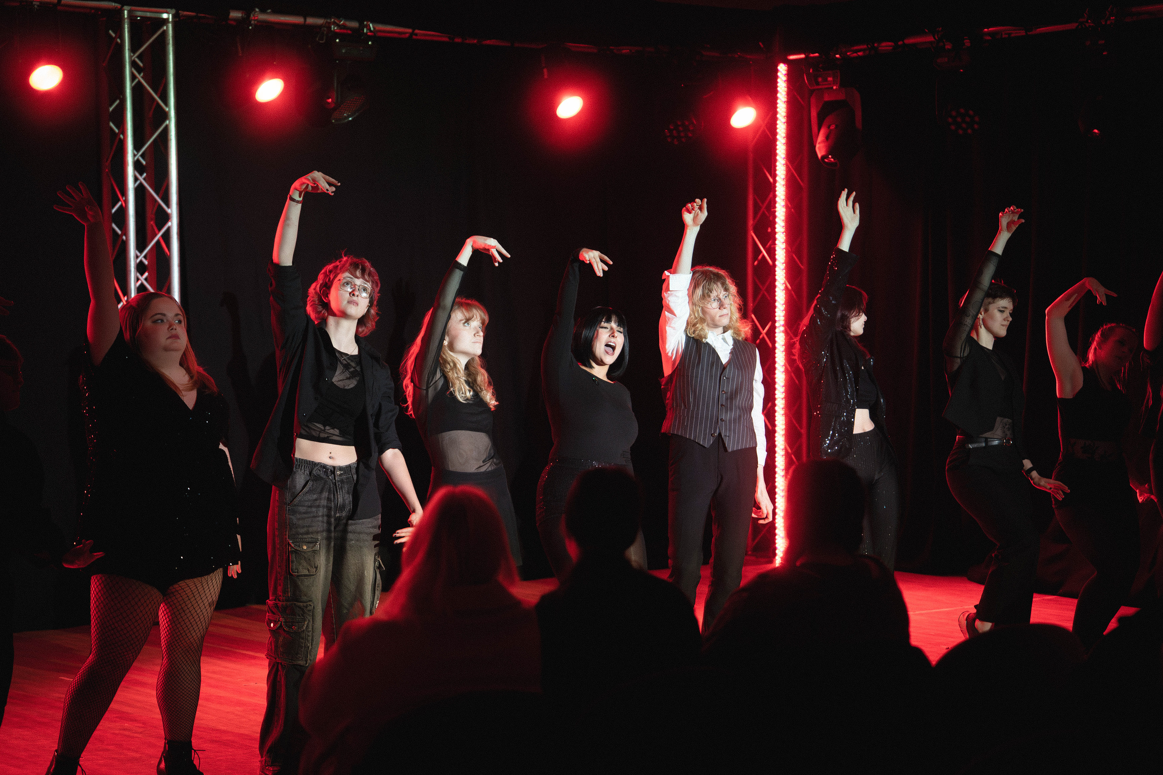
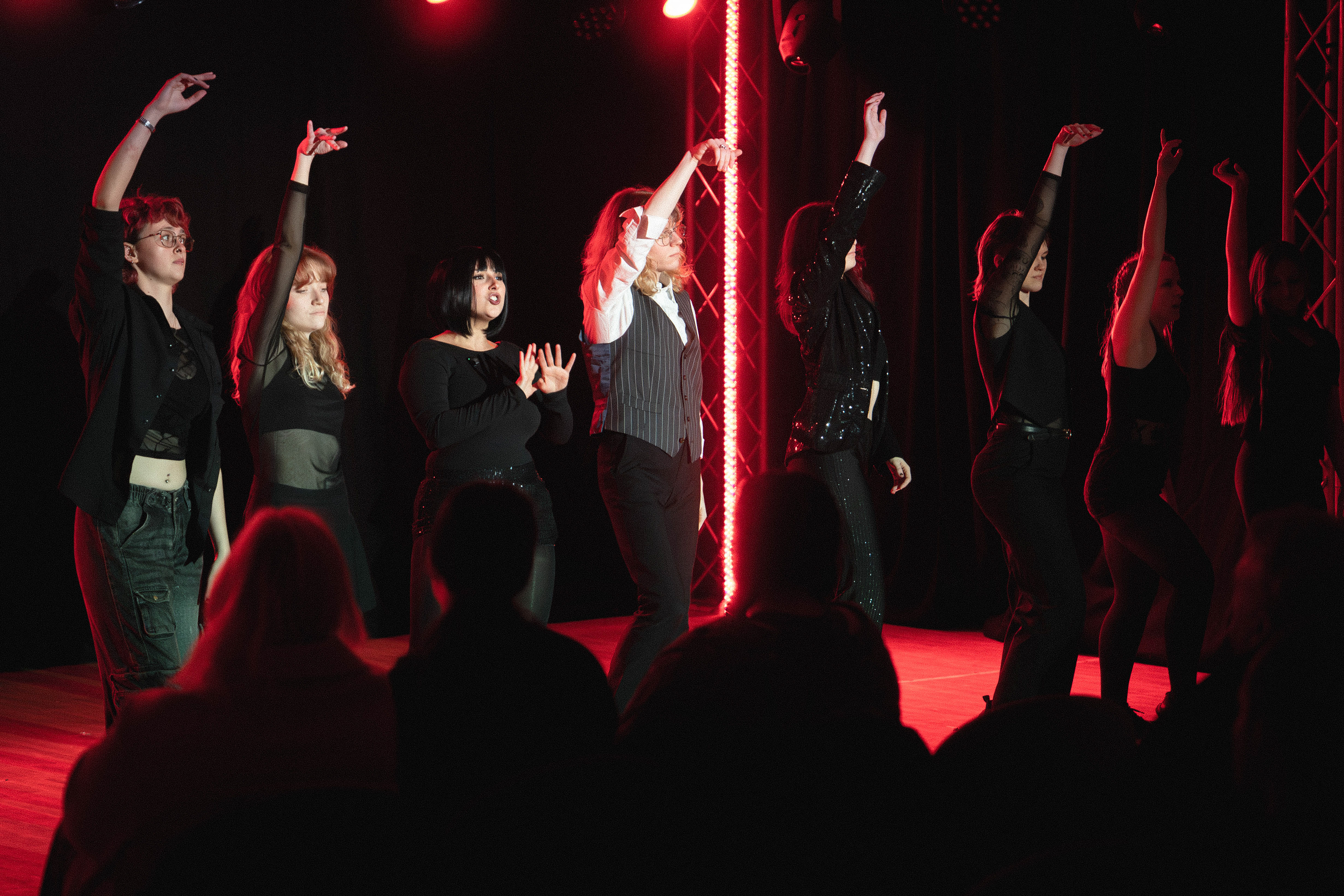
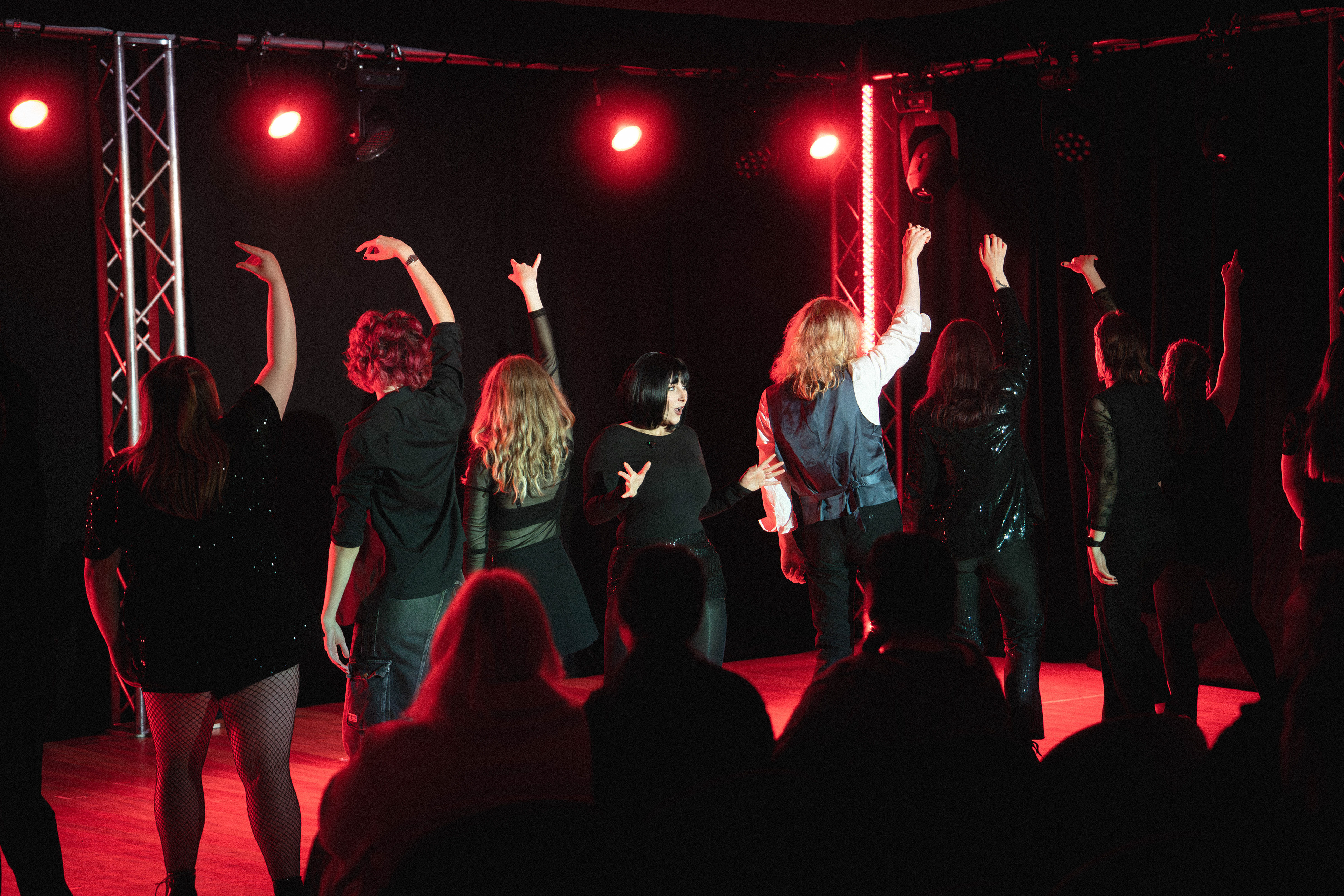
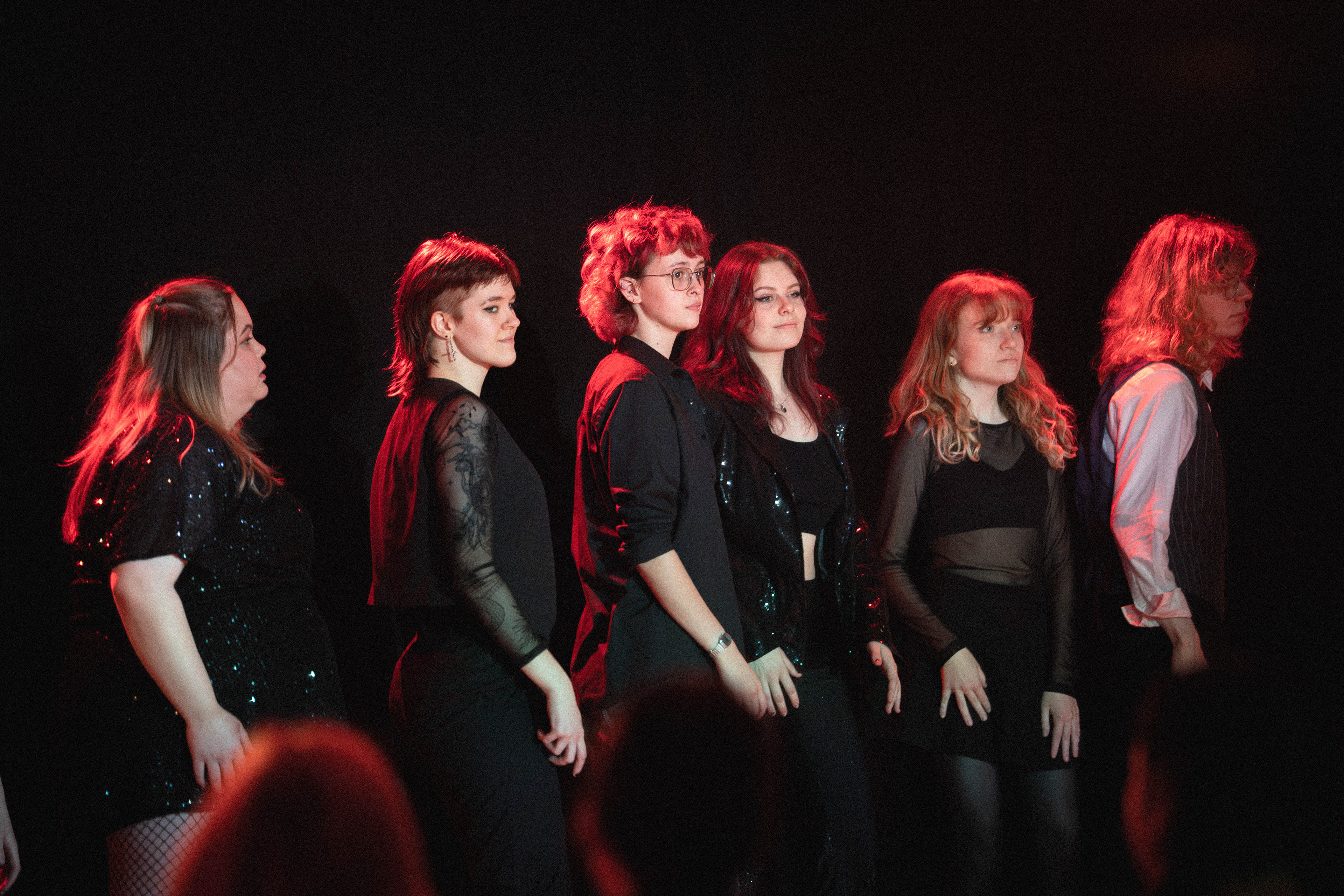
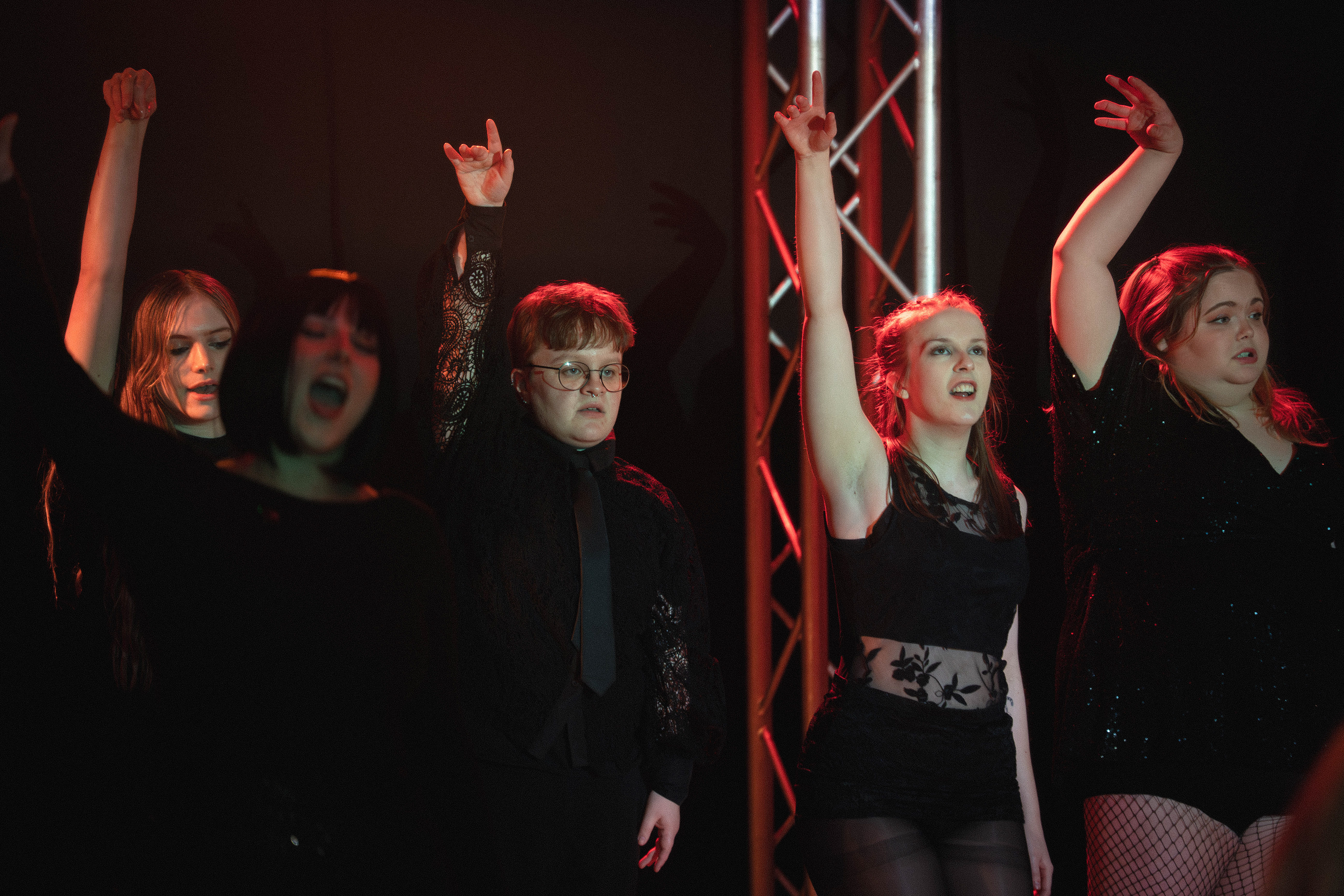
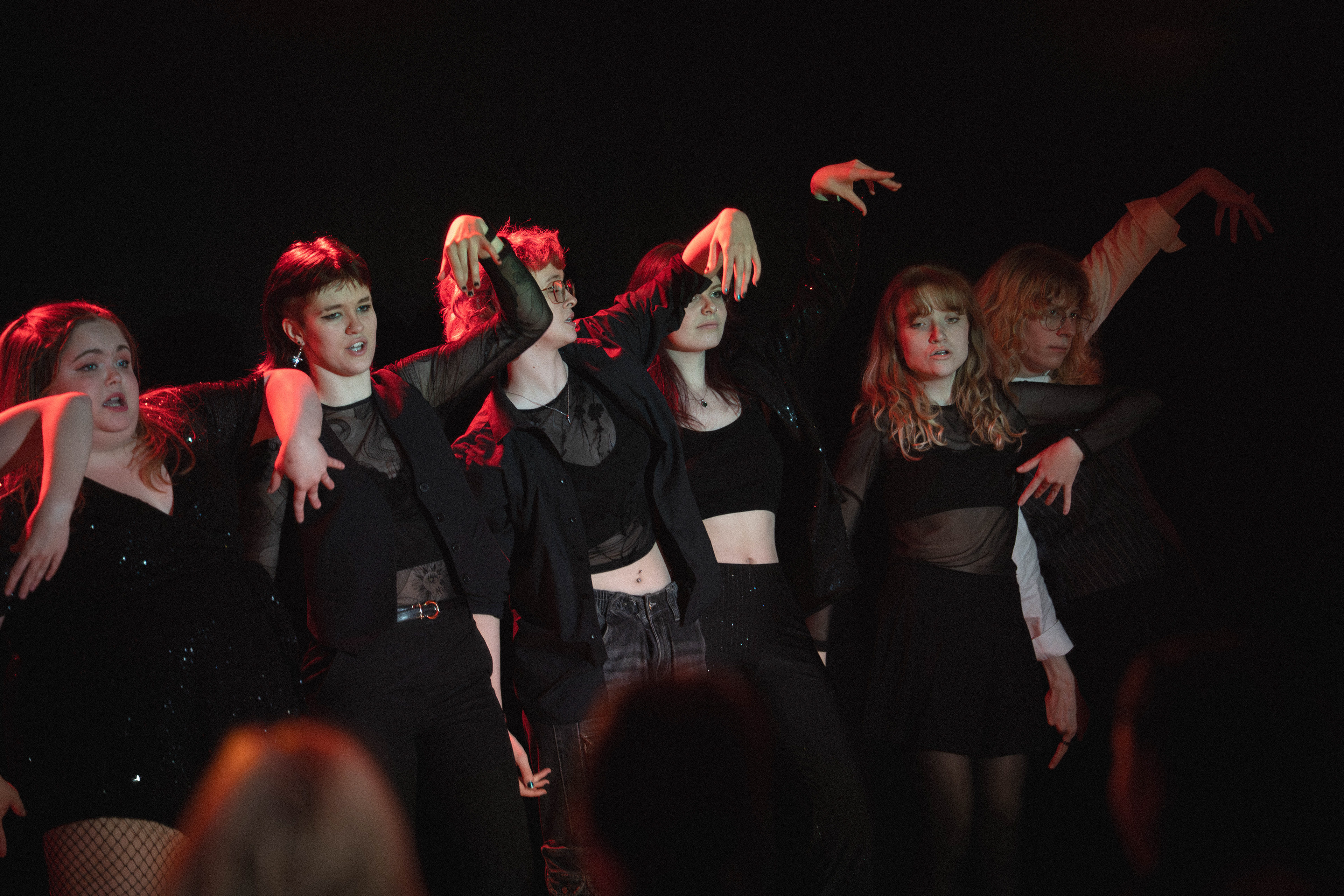
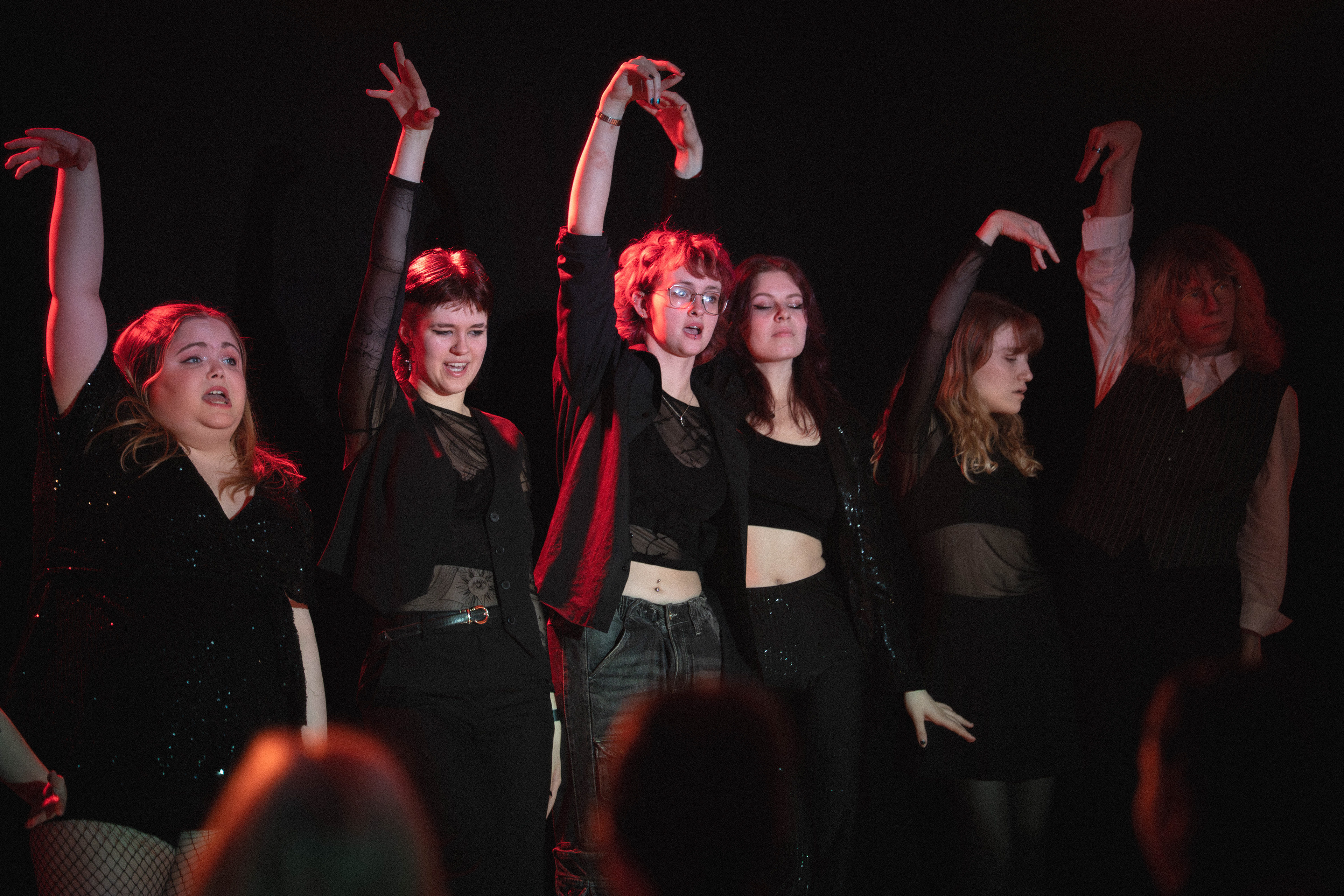
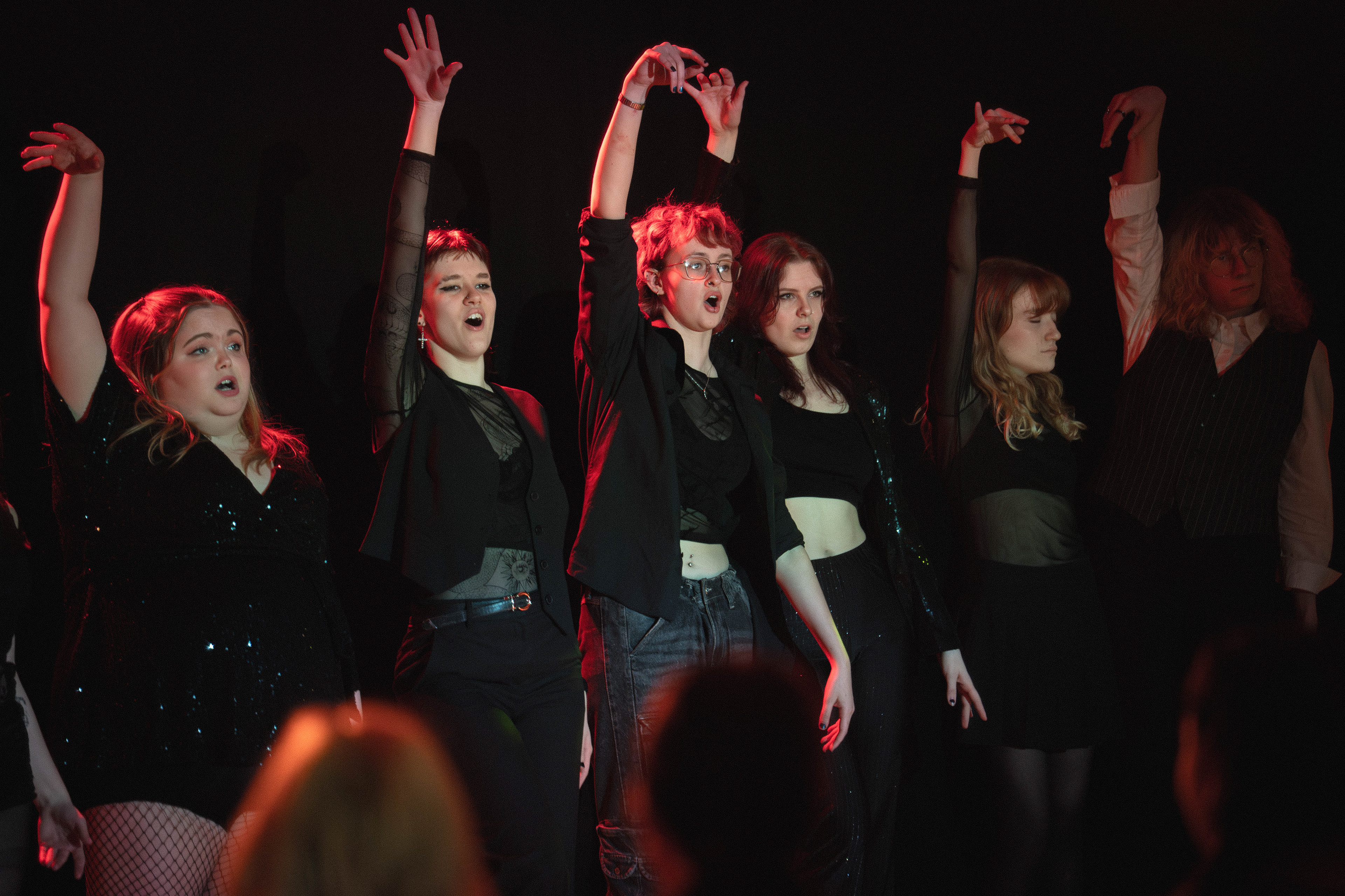
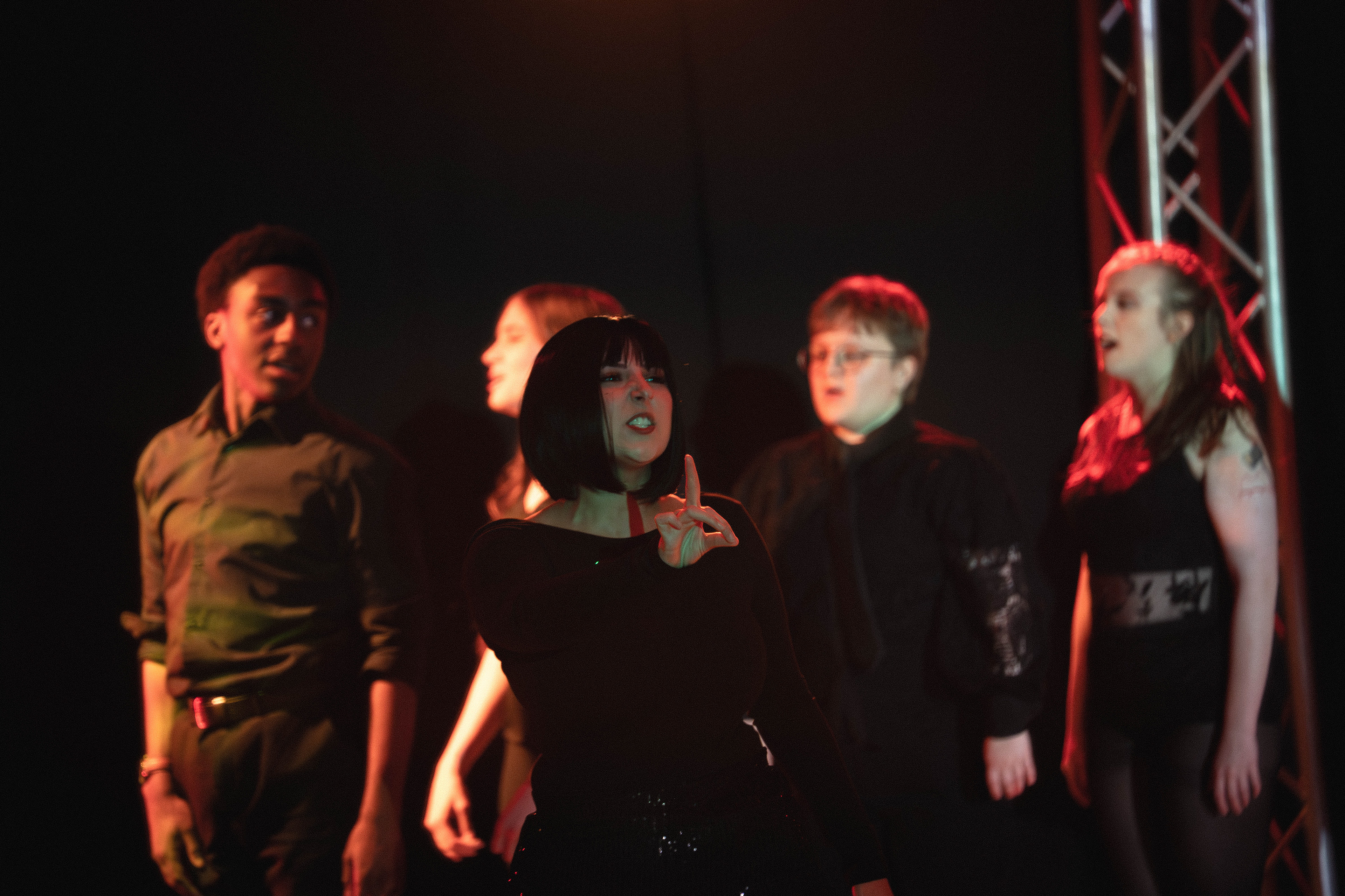
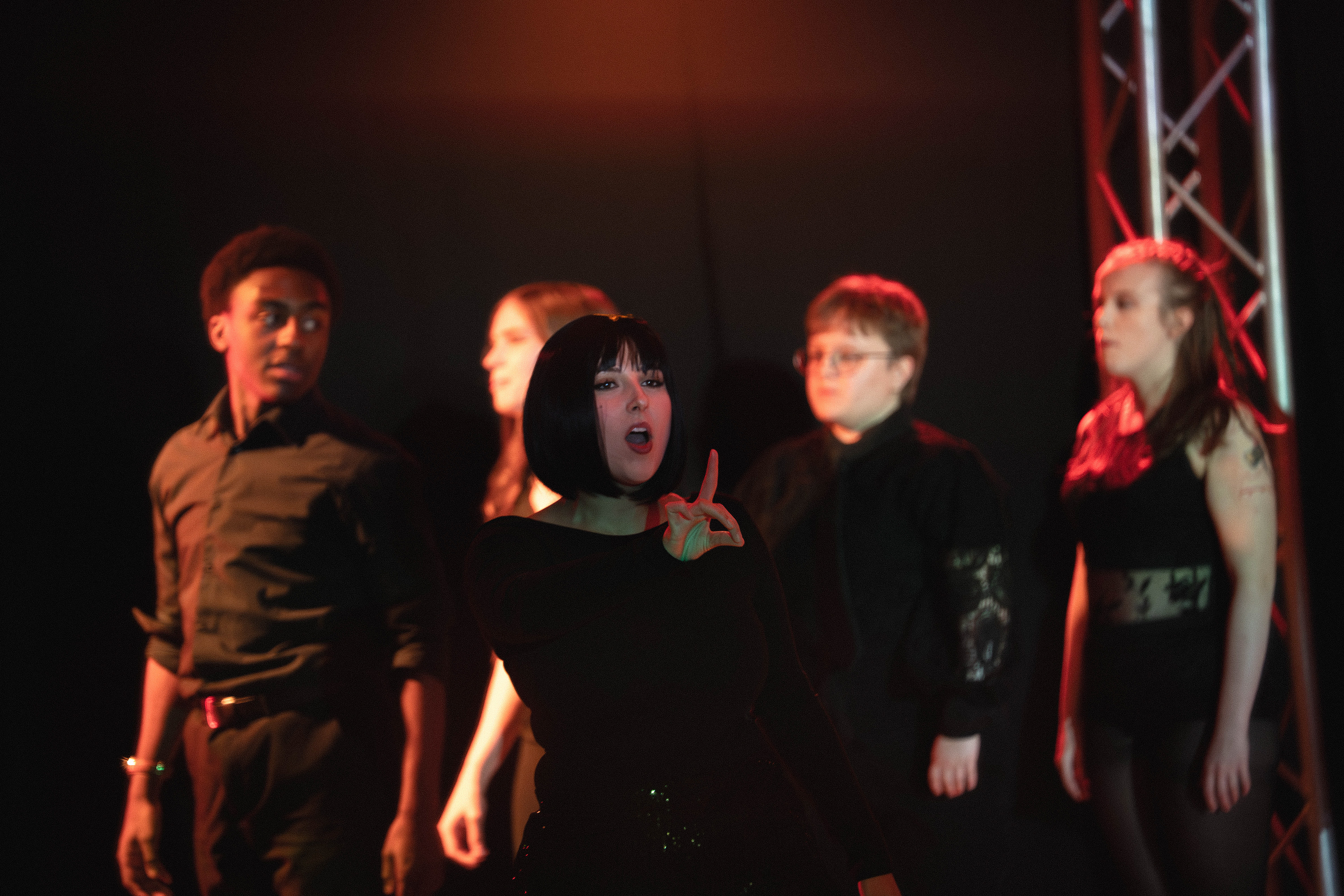
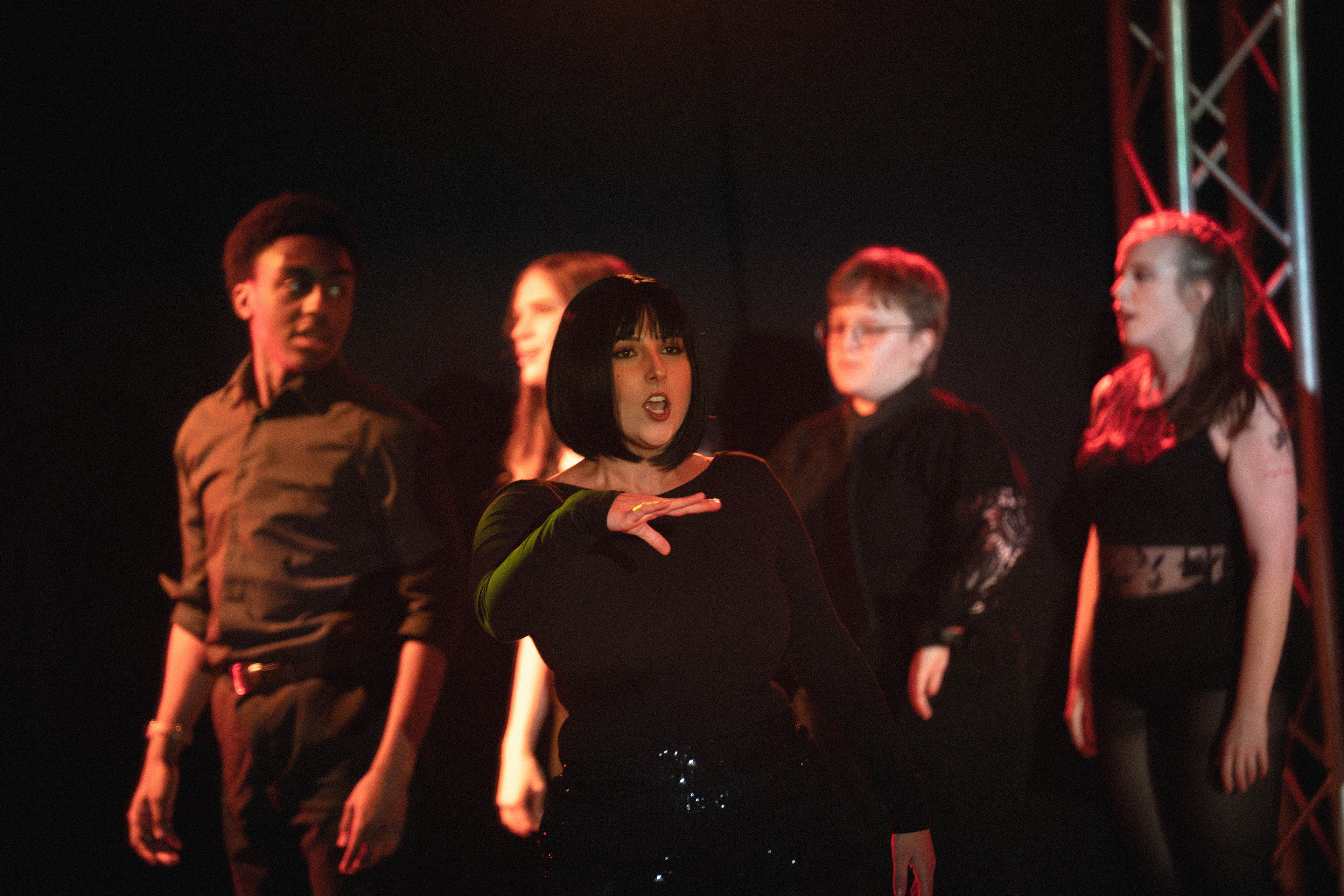
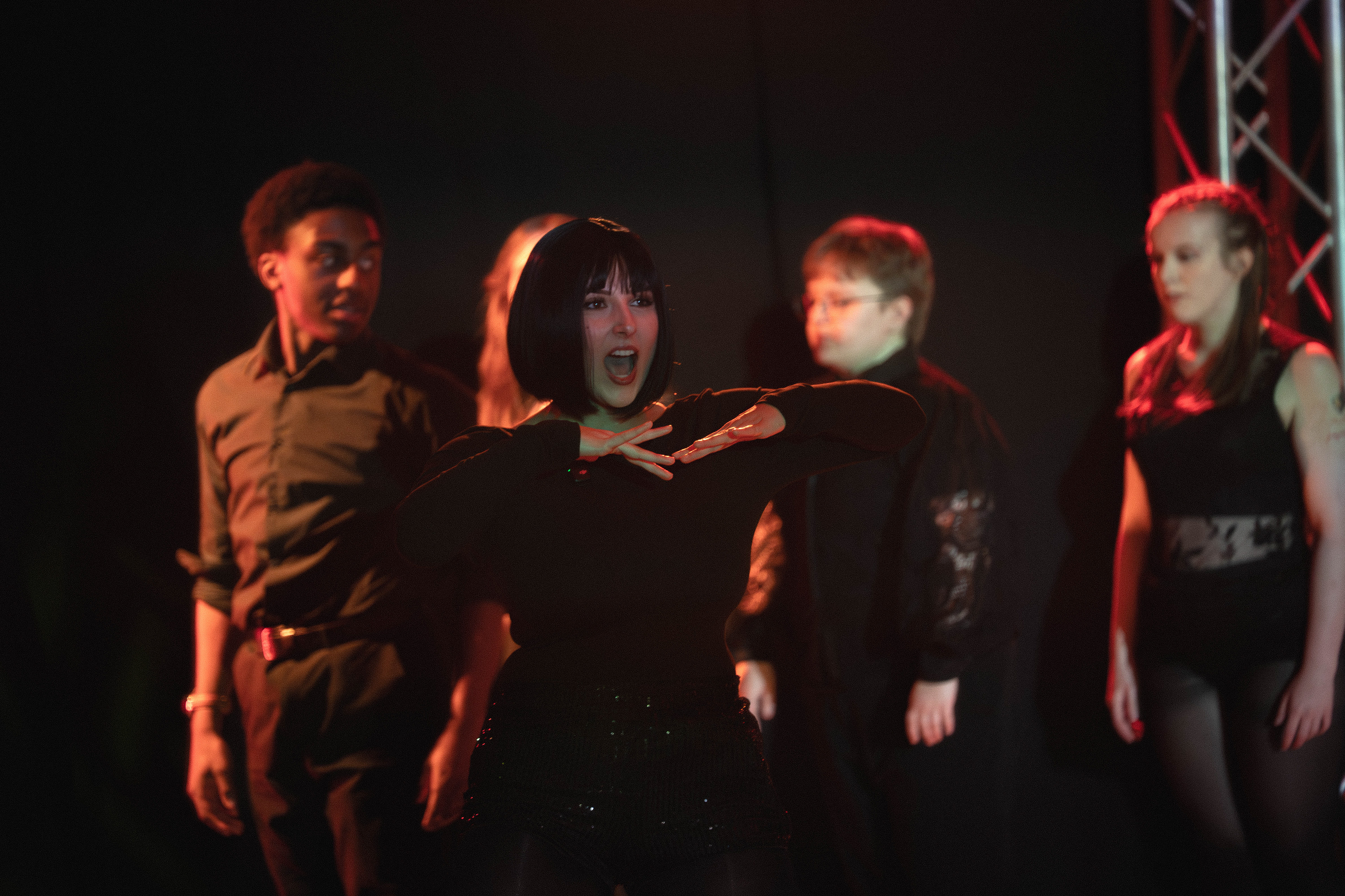
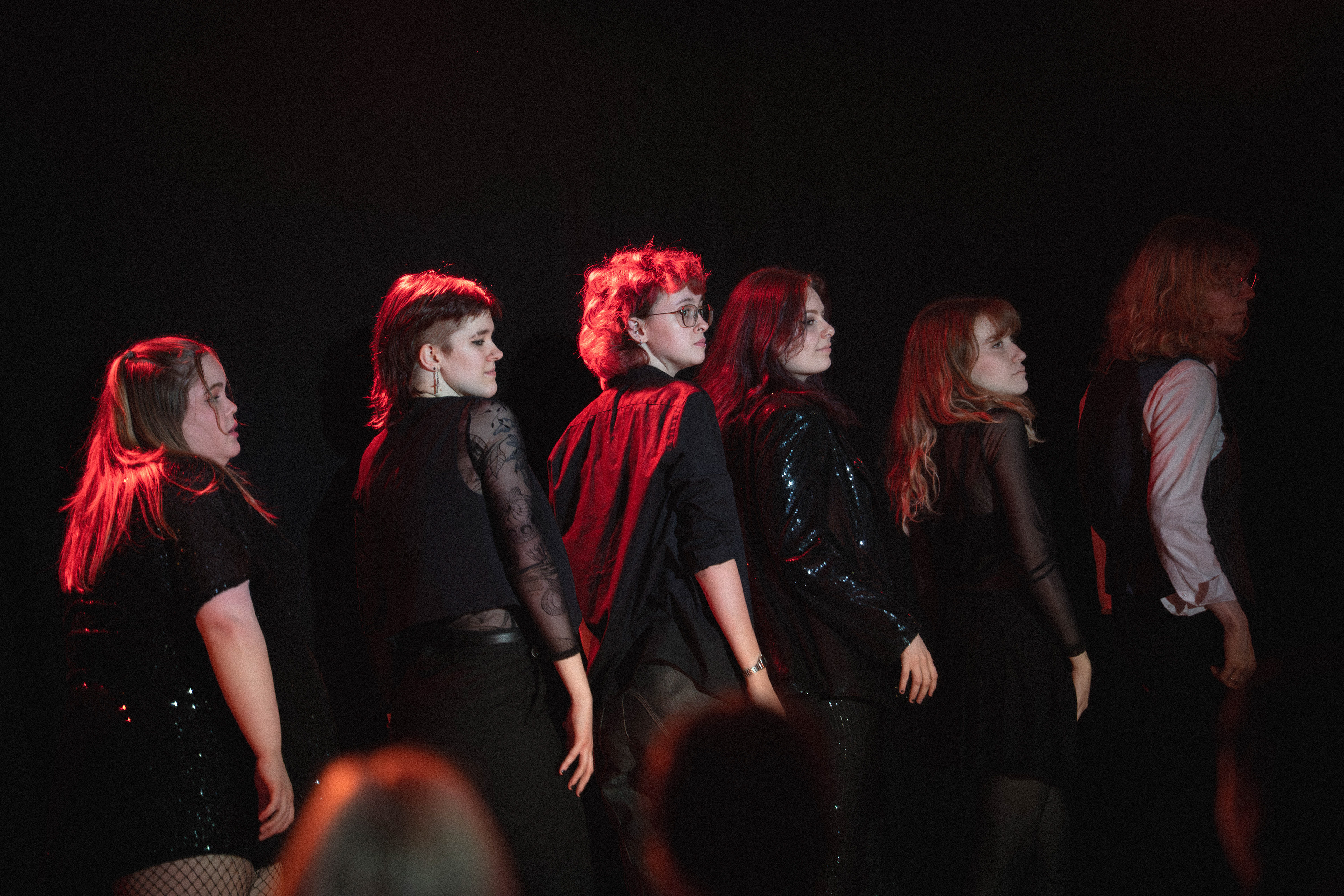
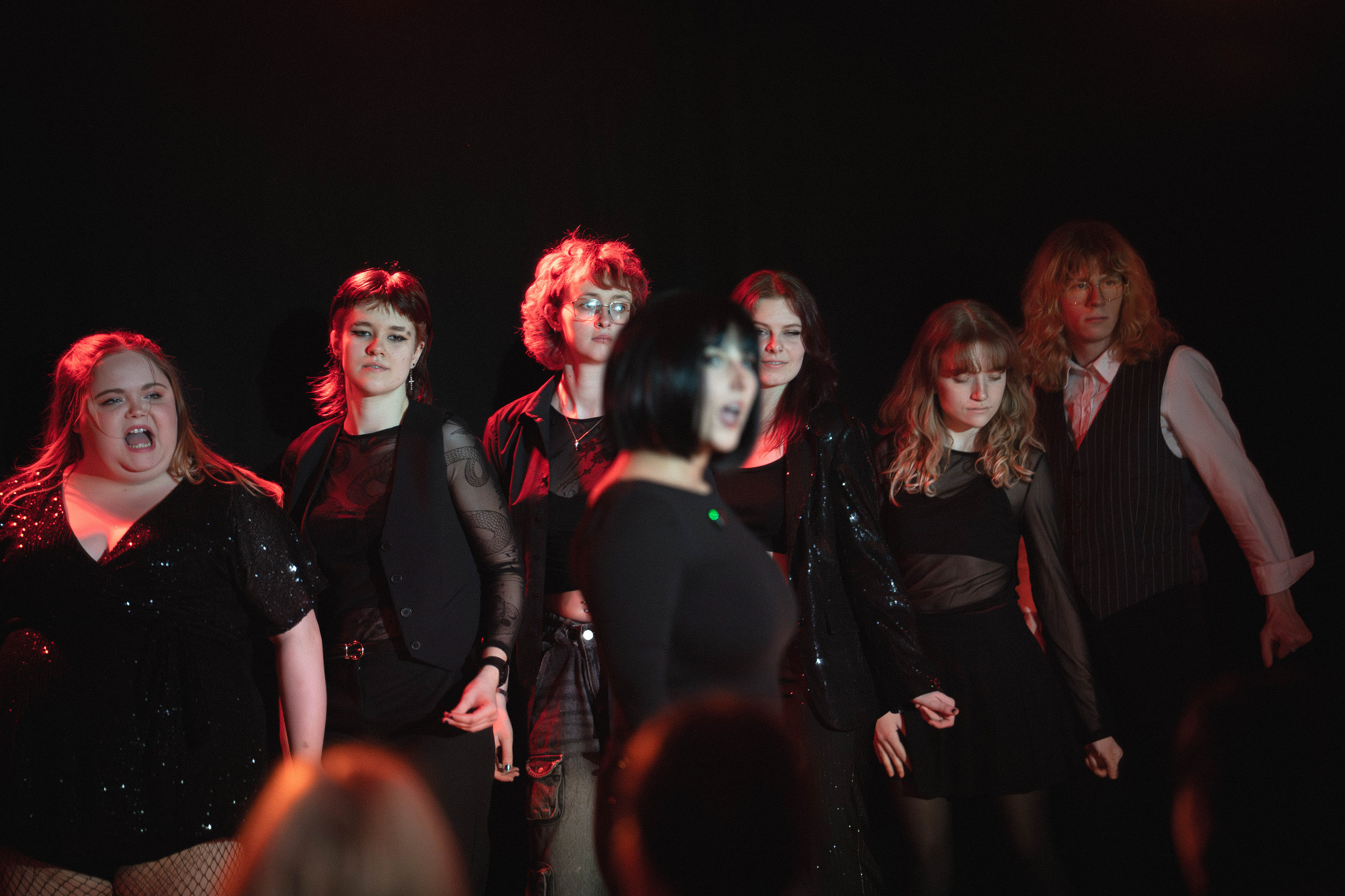
These photos were taken at the University's musical theatre showcase and explores one of the acts in the show which was performing "all that jazz" from Chicago the musical. The show was 2 hours long with 23 songs , I chose to use this set as I feel the lighting and the filled frames work well, a lot of the other sets had people scattered throughout the stage but this set had a relatively high amount of people all close together which I feel improves the composition and general mood of the images.
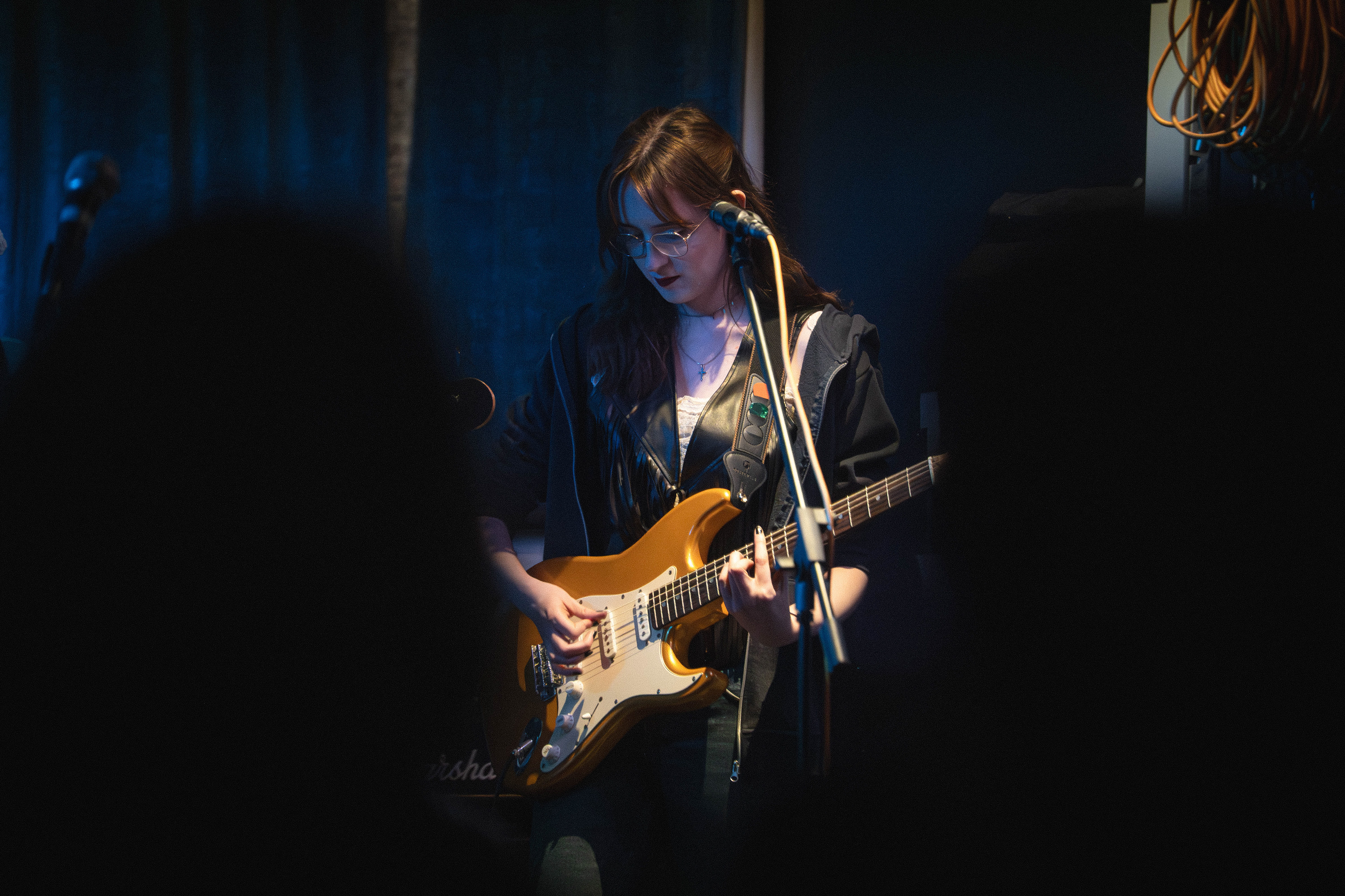
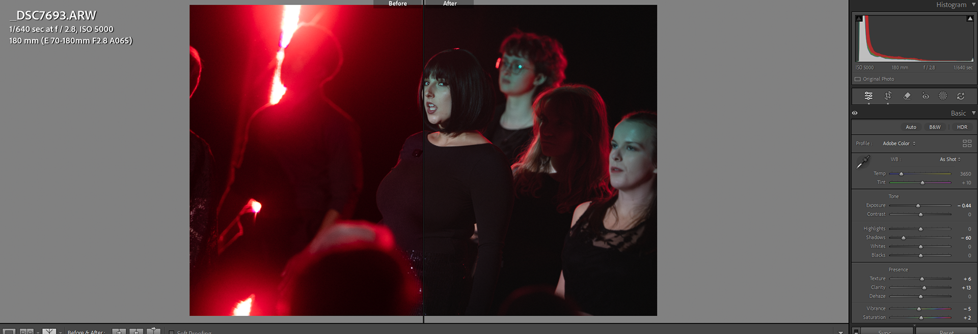
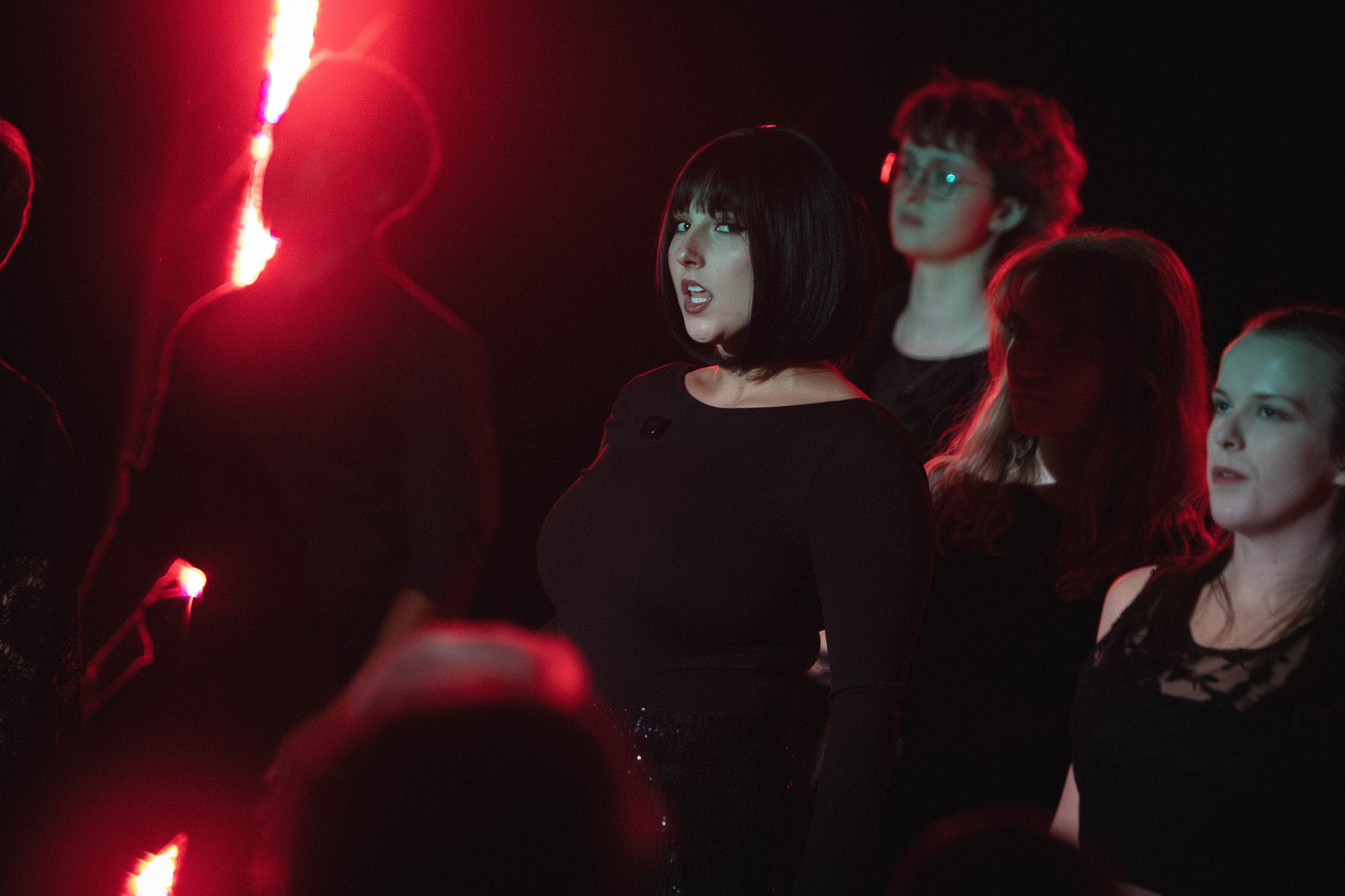
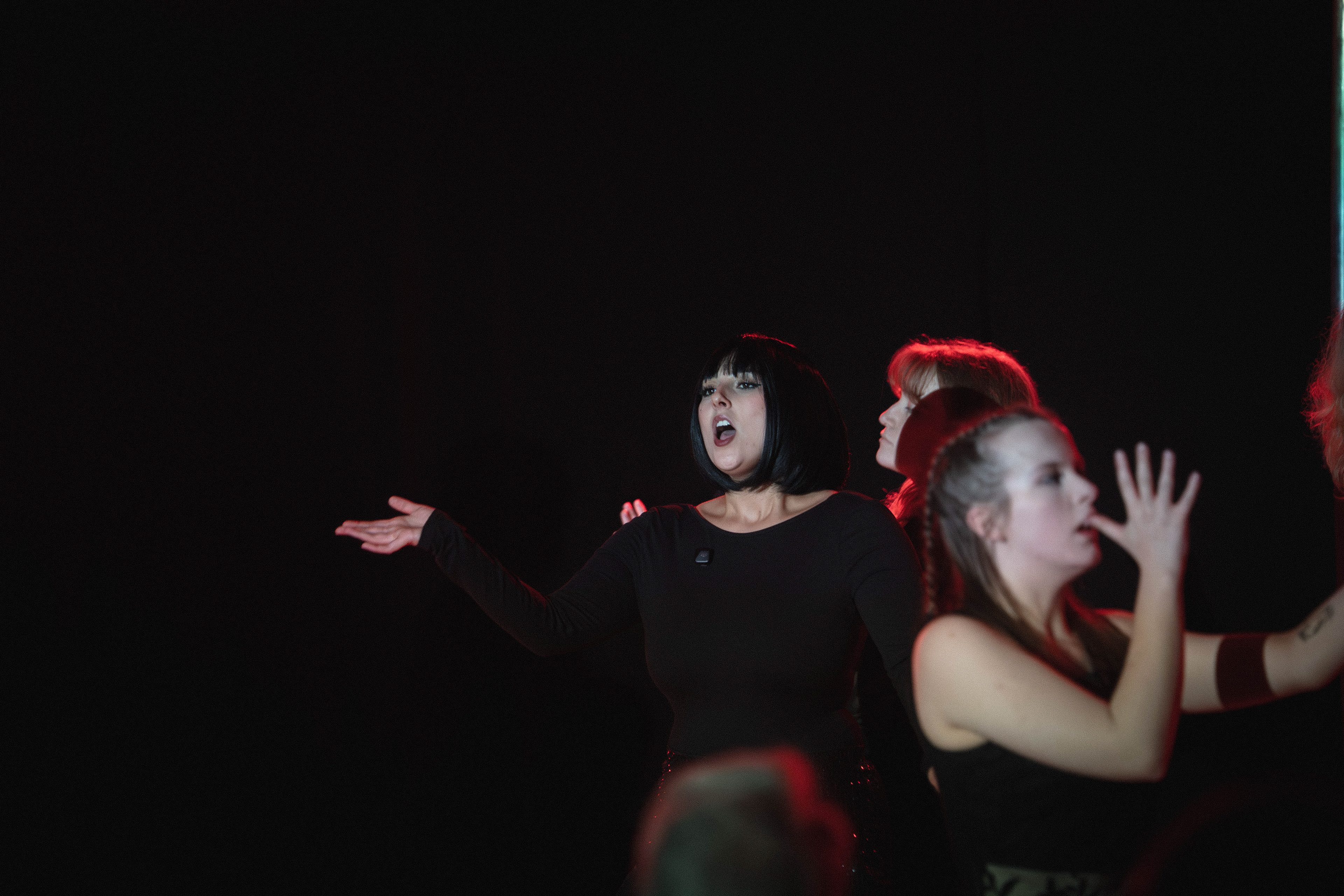
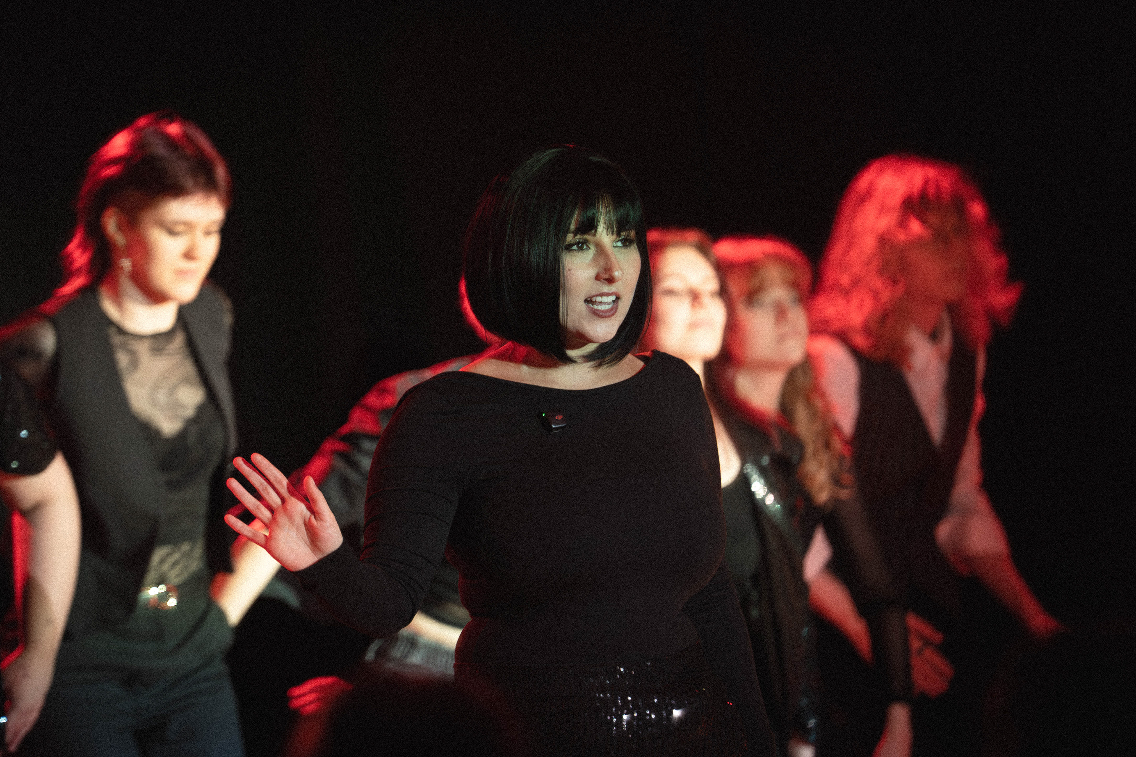
The first image was taken at 1/640, F2.8, Iso 5000, and shows the main subject looking straight at the camera whilst singing. The photo is on a Dutch angle which I feel works for the fullness of the frame as the weight is shifted towards camera right and this is the lower side. there is more people in the right side of the frame which is almost pulling the frame down. Generally in photography, I try to avoid the Dutch angle as I feel it can bring an amateur feel to the photo but In this case I think it works well and, especially with the subject looking directly at the camera, a straight image would not have been as effective. Placing the subject in the direct centre frame allows for the rest of the cast to be seen but establishes that she is the main focus, this is also shown by the subject being the only one with her mouth open showing that she is singing- this is a fact in all of the sequence. The use of depth makes it so the backup dancers are out of focus and shows that they are stood in an uneven line, some are close to the side and some are behind- a higher aperture may have presented as they were stood next to each other. The subject is lit by a red rim light which can be seen in the photo and the aperture turns this into bokeh, along with the pro-mist filter which expands the light radius and blurs around the dancer camera left which I think is a nice aesthetic feature. She is also lit by a neutral blue key light which is coming top camera left which creates a professional performance aesthetic by keeping facial shadows low. Once again there is a head in the bottom of this image and I would prefer this to not be here but due to the angle I fear it was unavoidable, although It does show the environment is a show which people were watching which adds context to the image in a way.
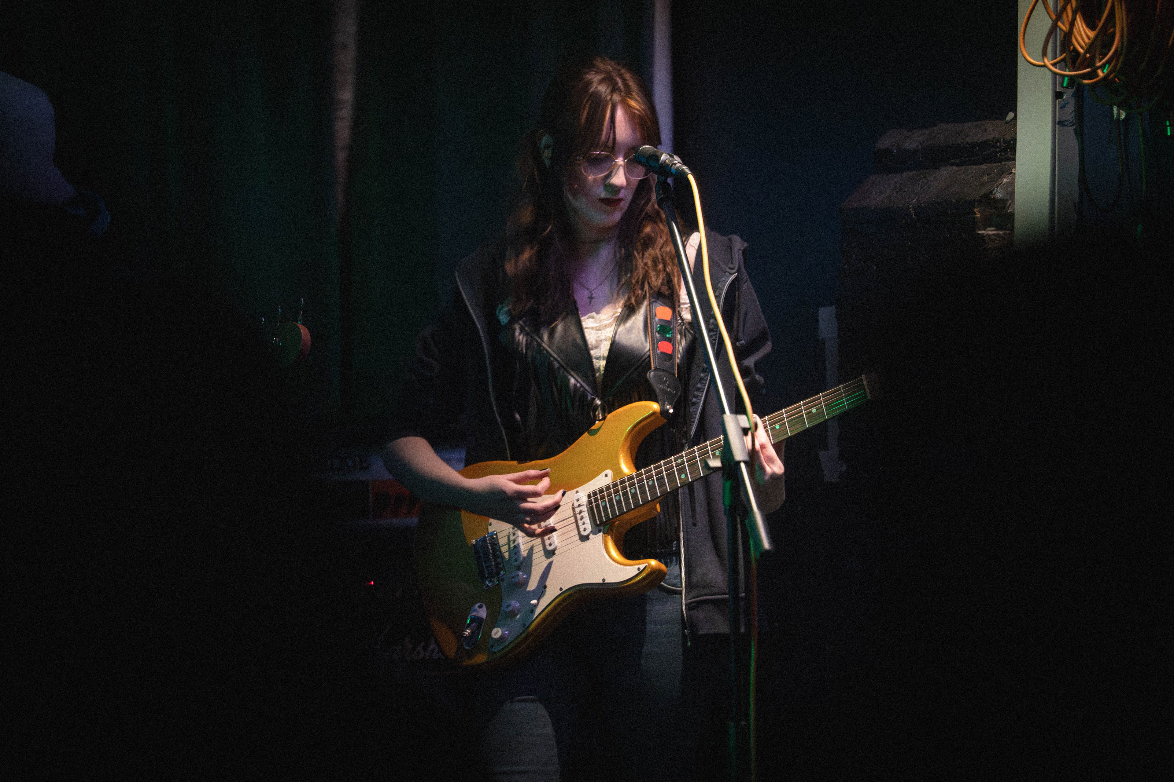
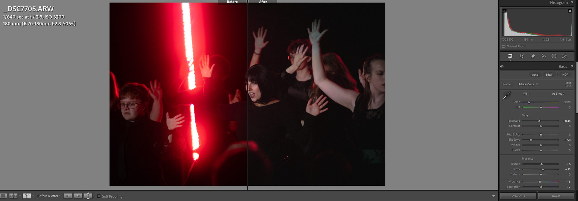
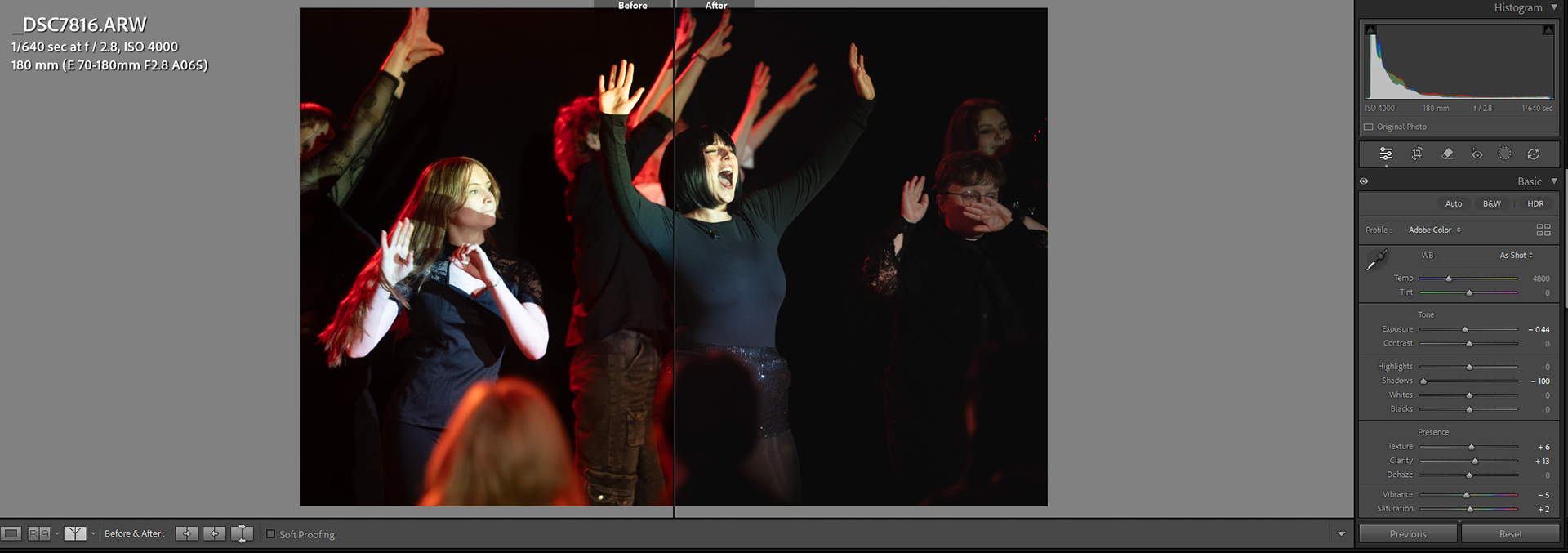
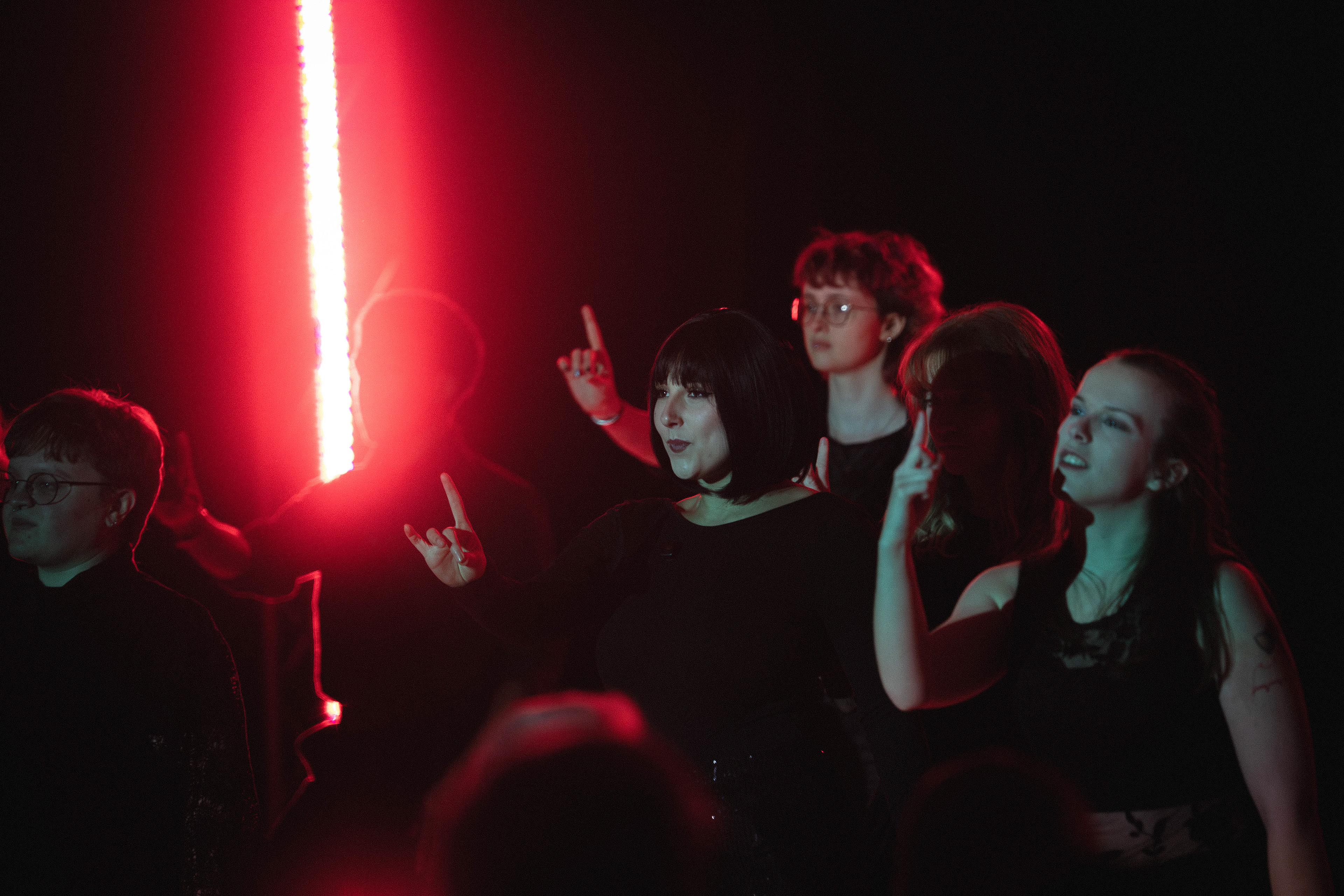
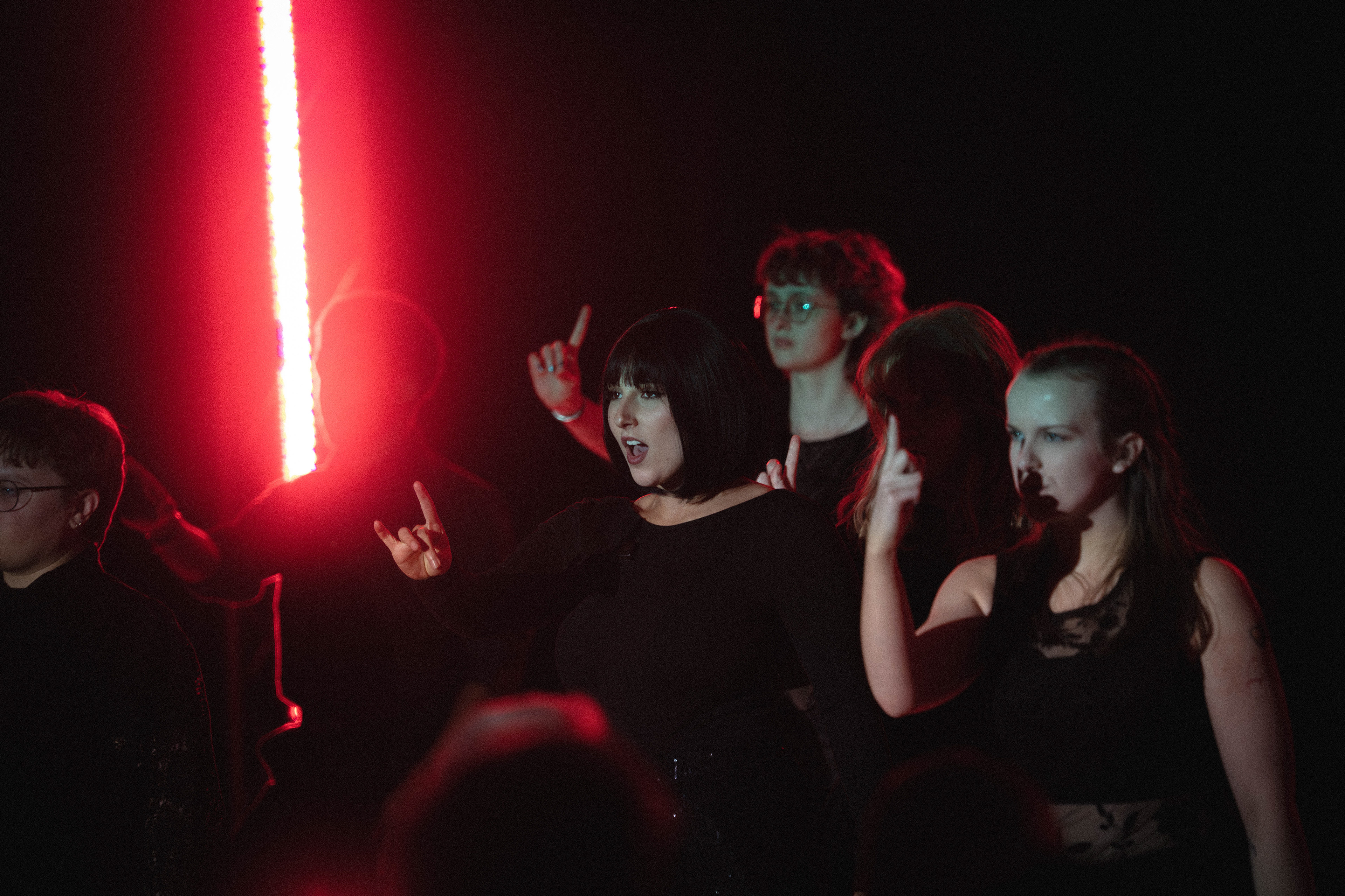
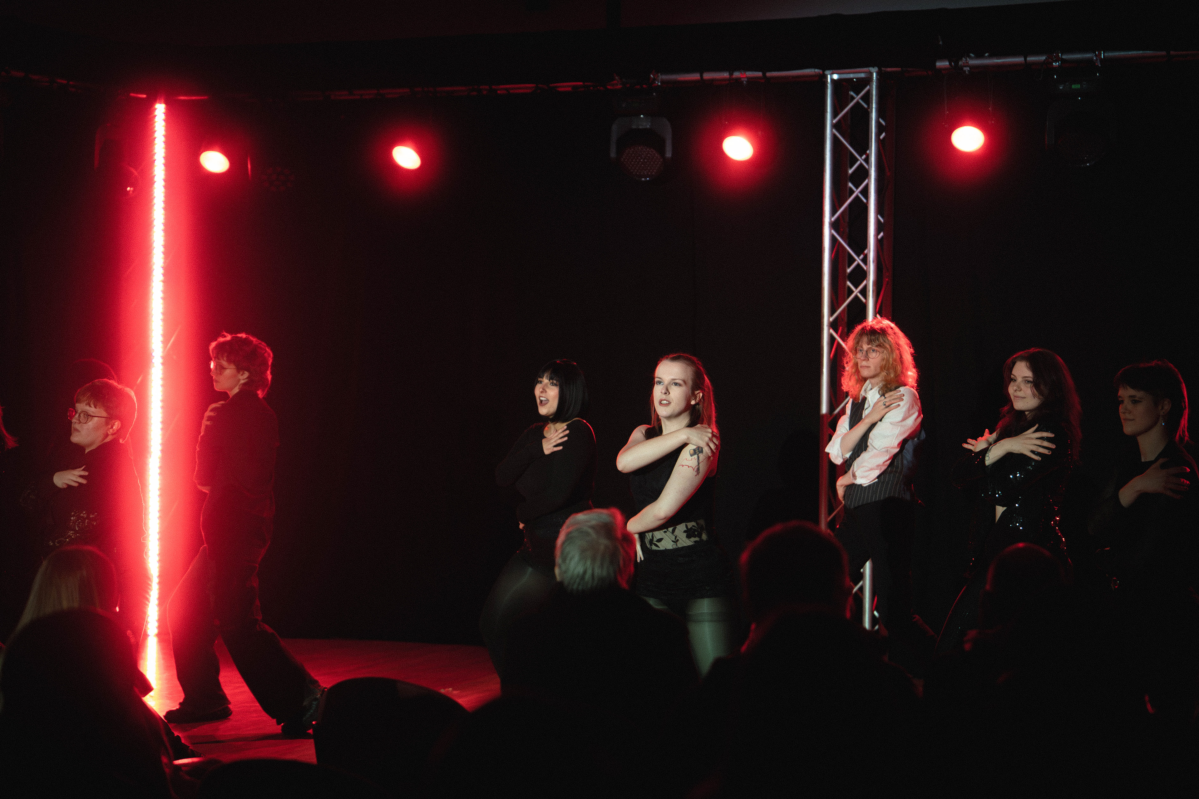
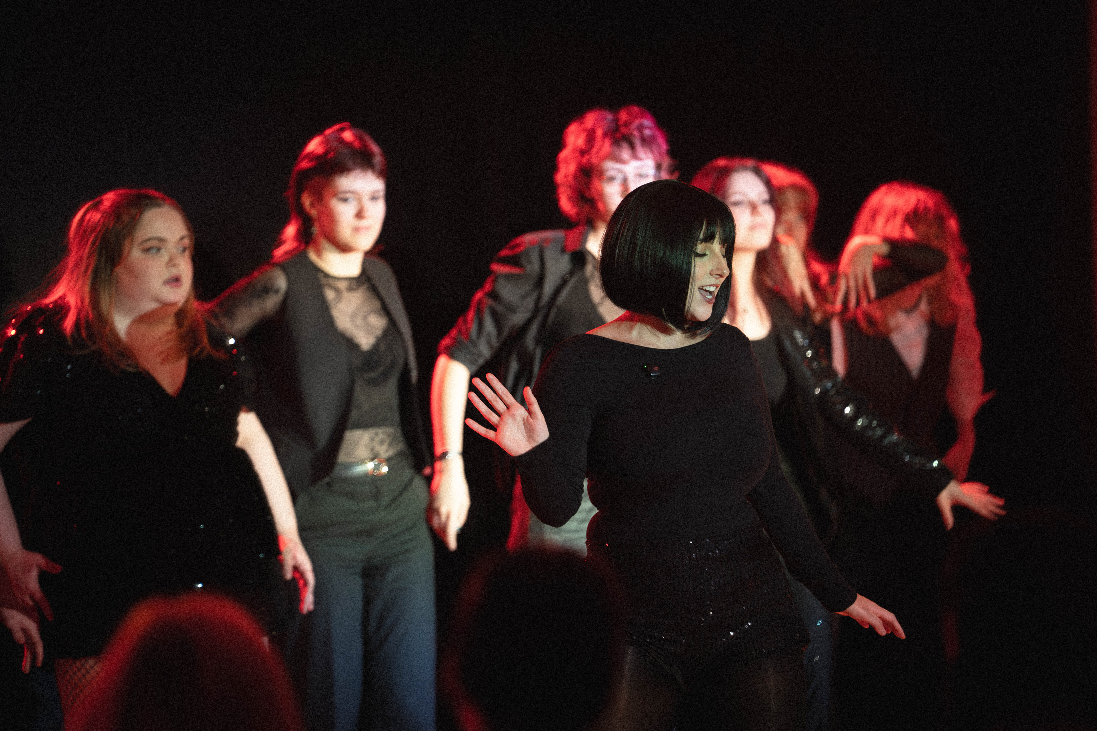
The second image was taken at 1/640, F2.8, Iso 3200 and shows a similar angle at a wider focal length with the cast all raising their hands in the same way. this image has the Dutch angle taken the other way to a lesser extent to contrast the way the cast are raising their arms. the main subject is still centre frame and is lit differently to the rest of the cast, this time she is looking forward towards the crowd- we can still tell she is the main act due to the centre framing and the different lighting. This image once again has a head in the bottom of the frame but as it was taken from the same angle. this is the image the "client" used to promote this part of the set and I think this is because of the action and similarity between the whole cast making the same move. I think I could remove some negative space from the top of this image but keeping the aspect ratio the same will cut off the cast member camera left and leave hands and arms unpleasantly cut off so i am going to leave it but If i framed it slightly higher I think this image could have been a lot better.
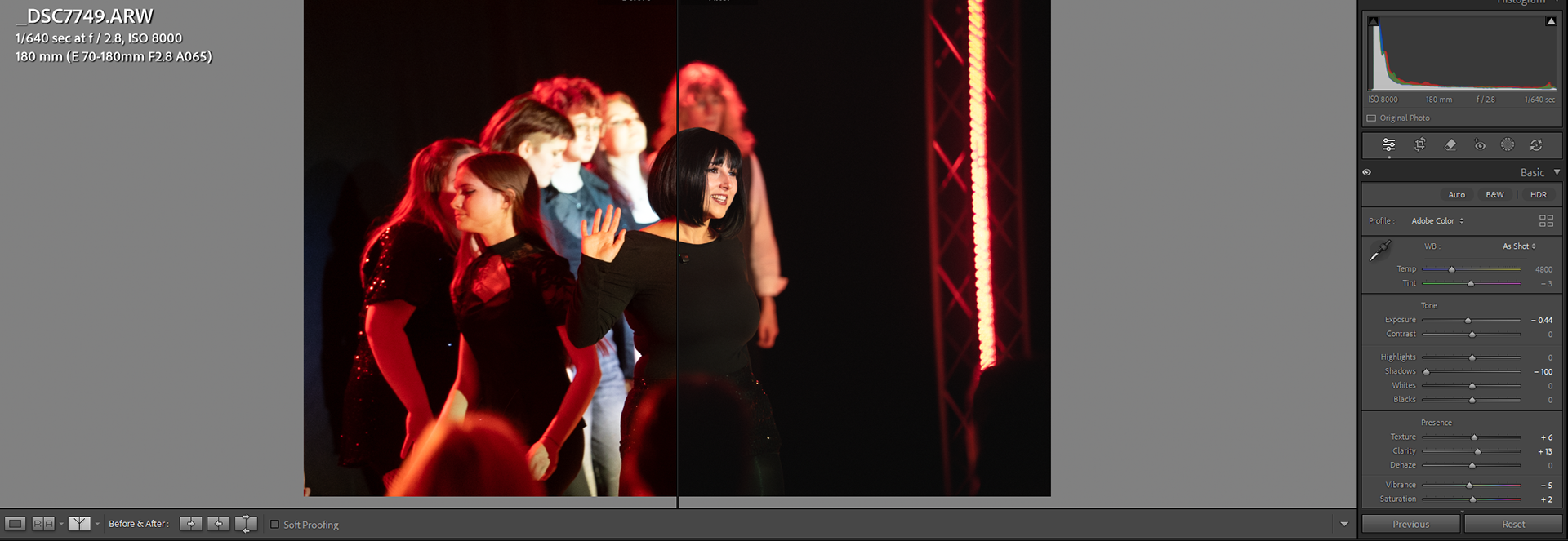
The third image was taken at 1/640, F2.8, Iso 8000 and switches angle to the other side of the room and straightens up the frame from the previous images, most of the cast is blurred apart from one who I captured walking to their position, this is unfortunate and I takes the photo down a lot for me as I like the pose and expression on the main subject, I think if all the rest of the cast were in a straight line this would be exactly as I envisioned it, still rest of the cast are blurred and create a nice separation between support and main in the show. I like how the red light at the side of the frame is not as blown out in this photo and is rim lighting the cast but the main subject is lit by neutral light, i feel things brings a nice contrast to the image.
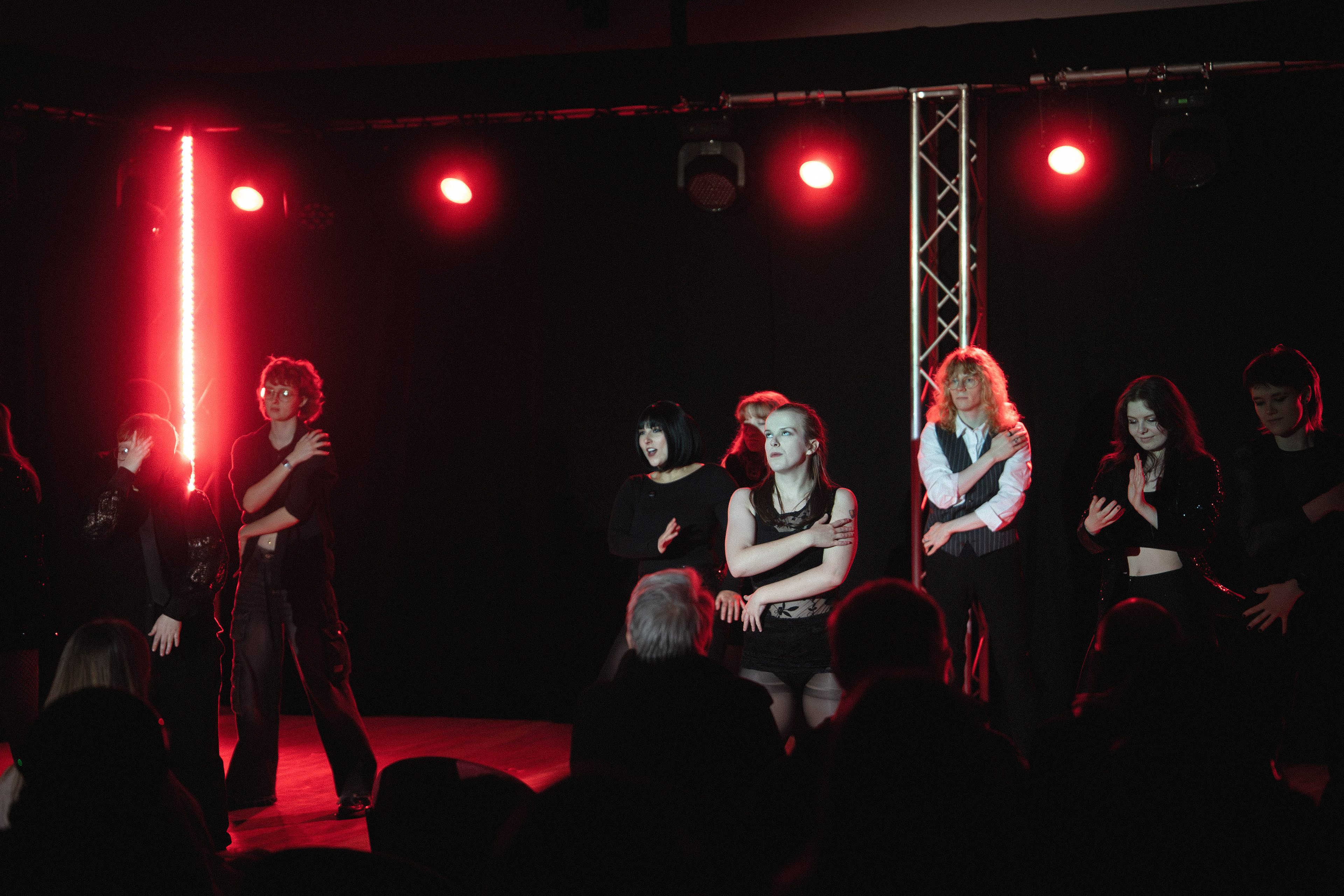
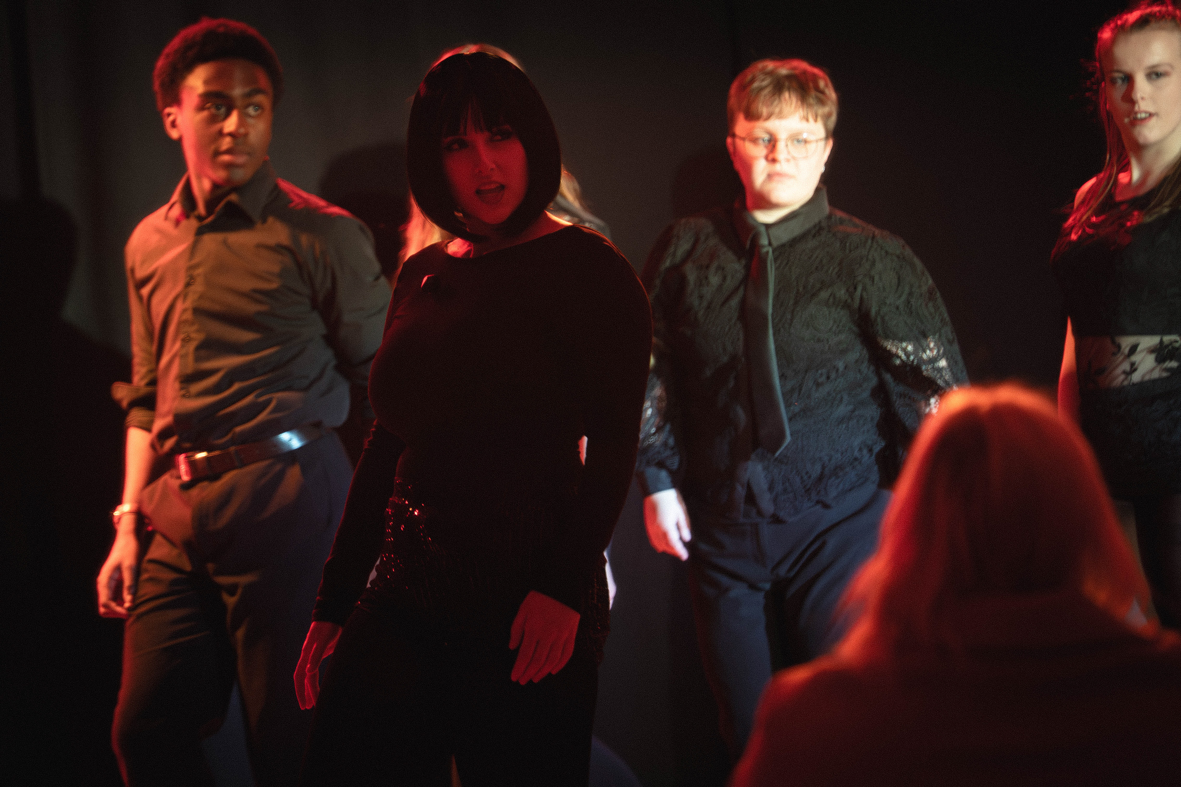
The fourth photo was taken at 1/640, F2.8, Iso 4000 and removes the subject from the centre of the frame, instead using rule of thirds to show two cast members working together to create the performance with the dancer and singer next to each other. removing the idea of the others being secondary, the viewer can still tell that the main subject is singing and is supposed to be focused on but it brings in more context of this cast member and shows that they are not just supporting but also a part of the show. this is further backed up by the fact that both these subjects are lit by the key light and neither are rim lit like the cast behind them, showing that at this frame both members are key parts of the show.
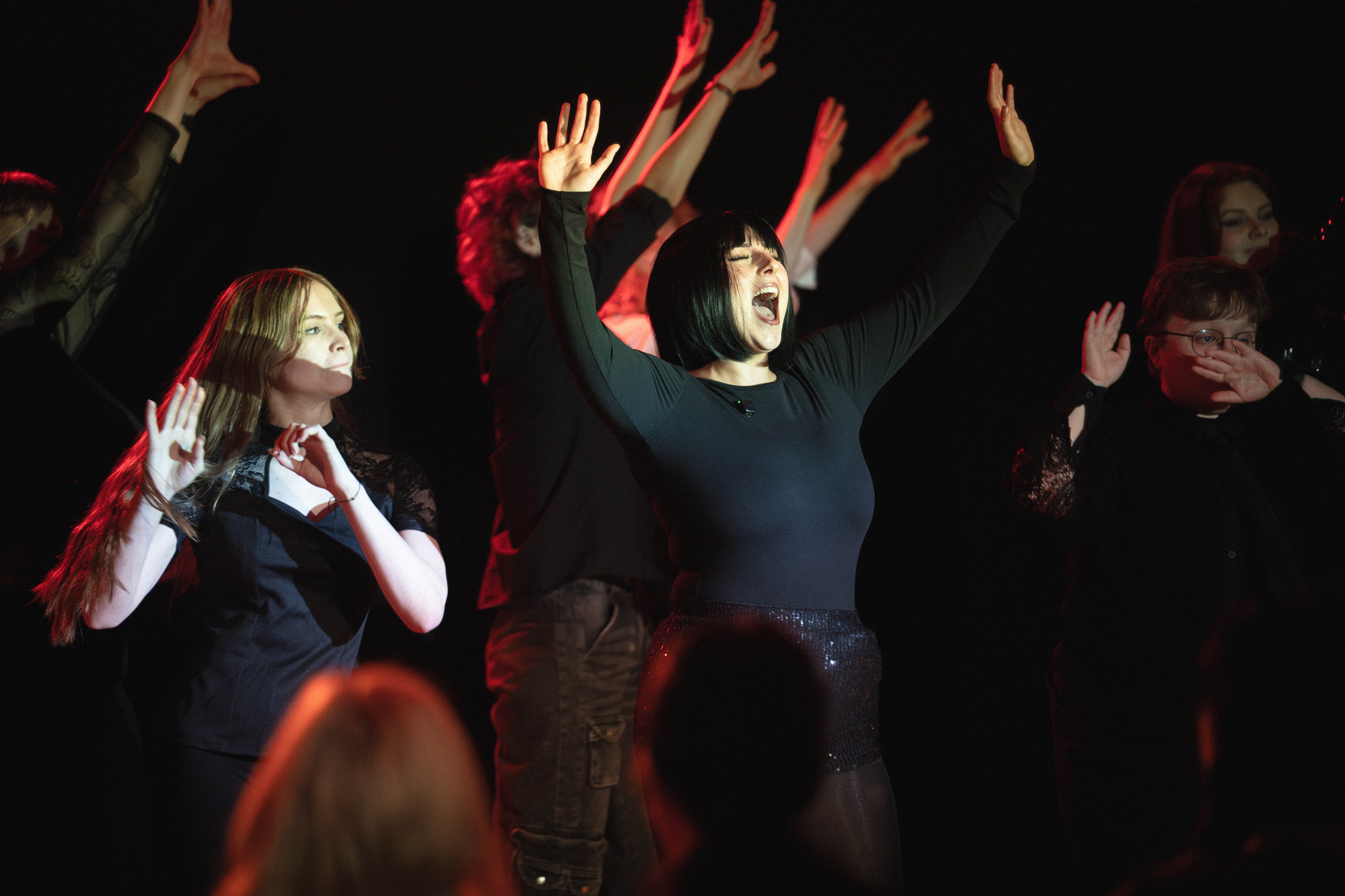
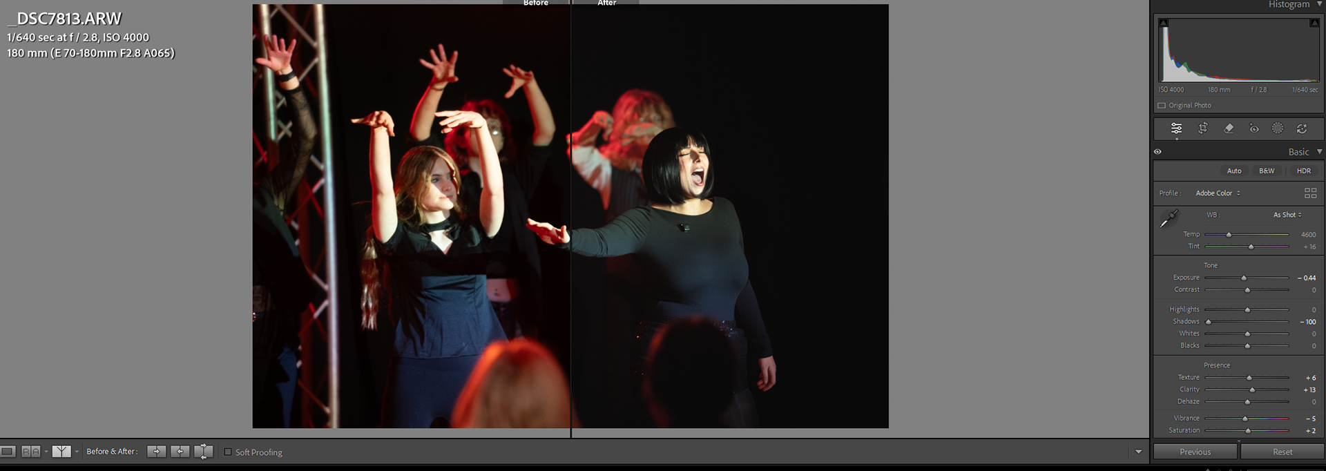
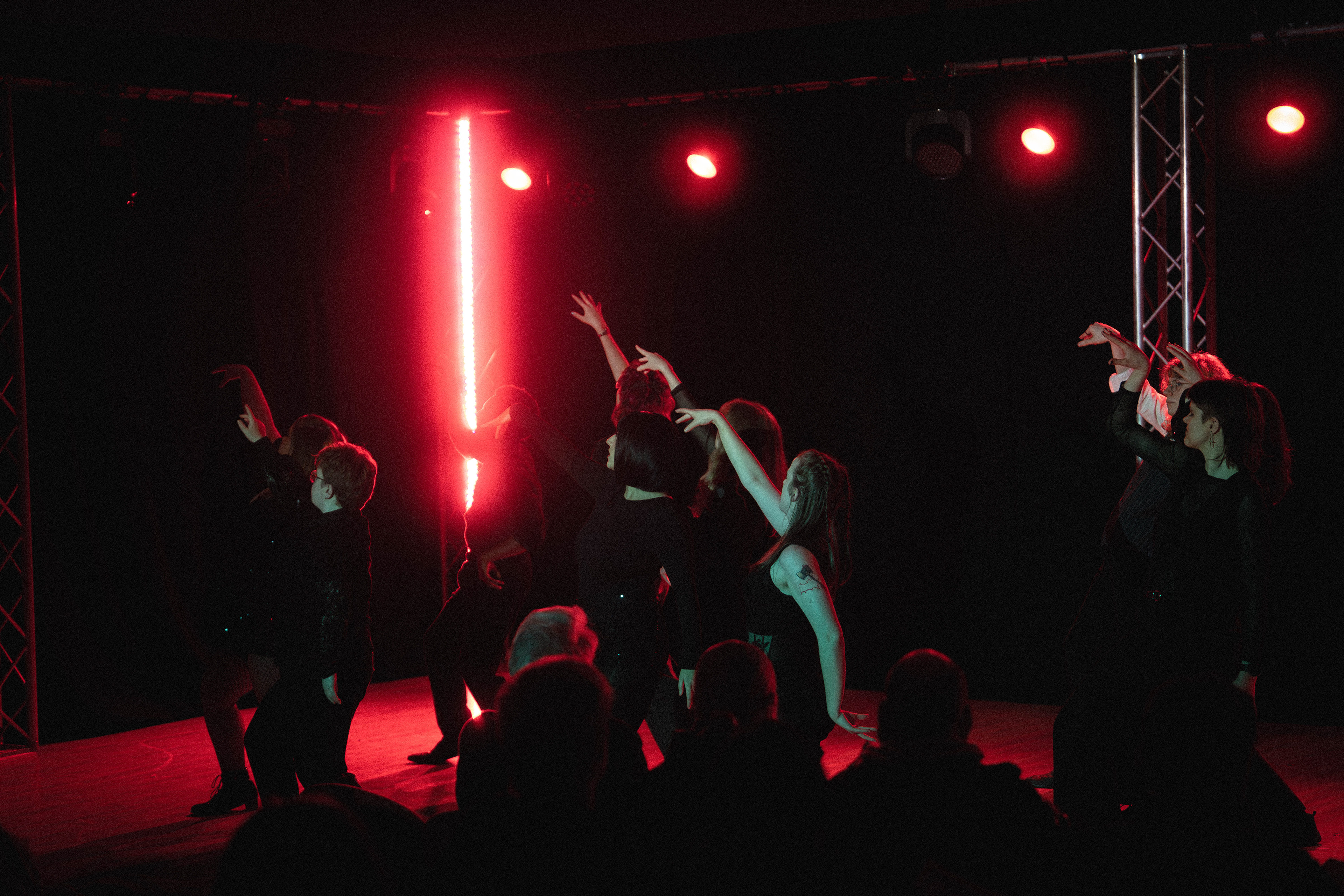
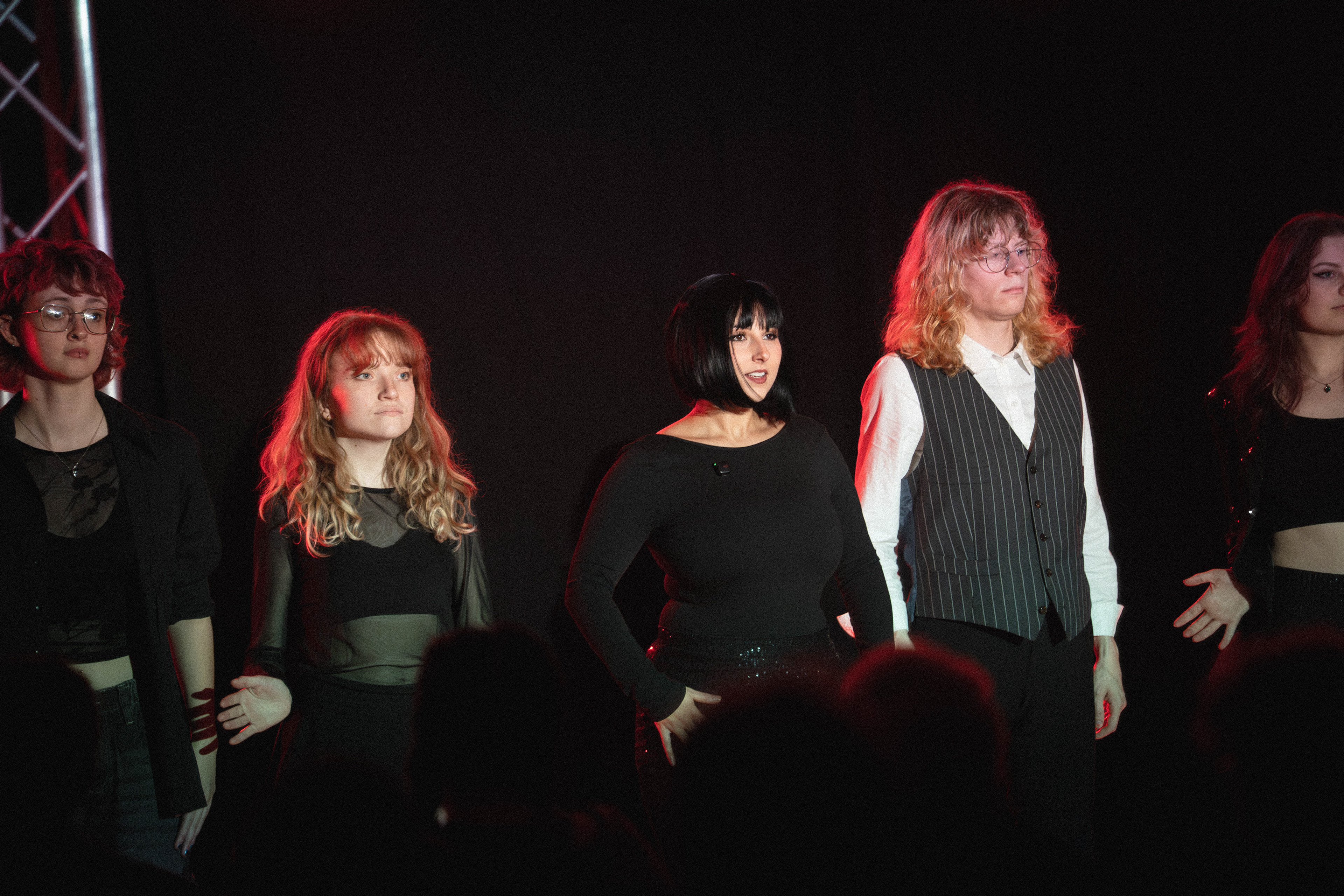
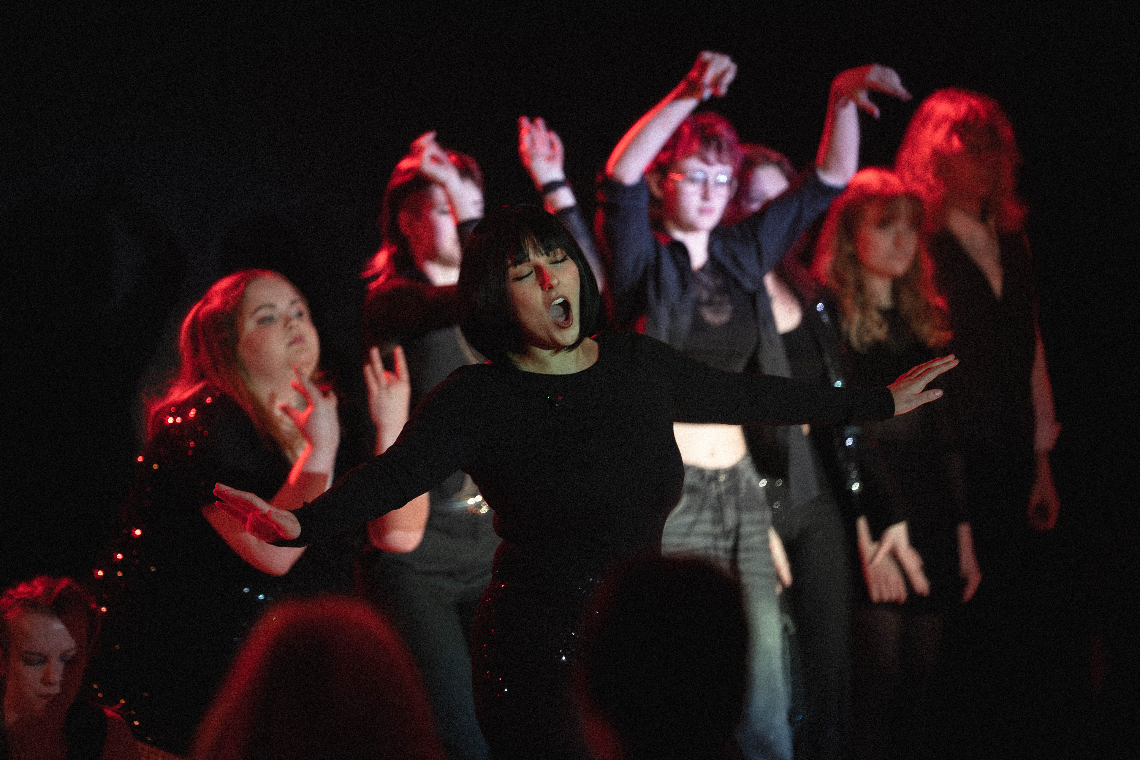
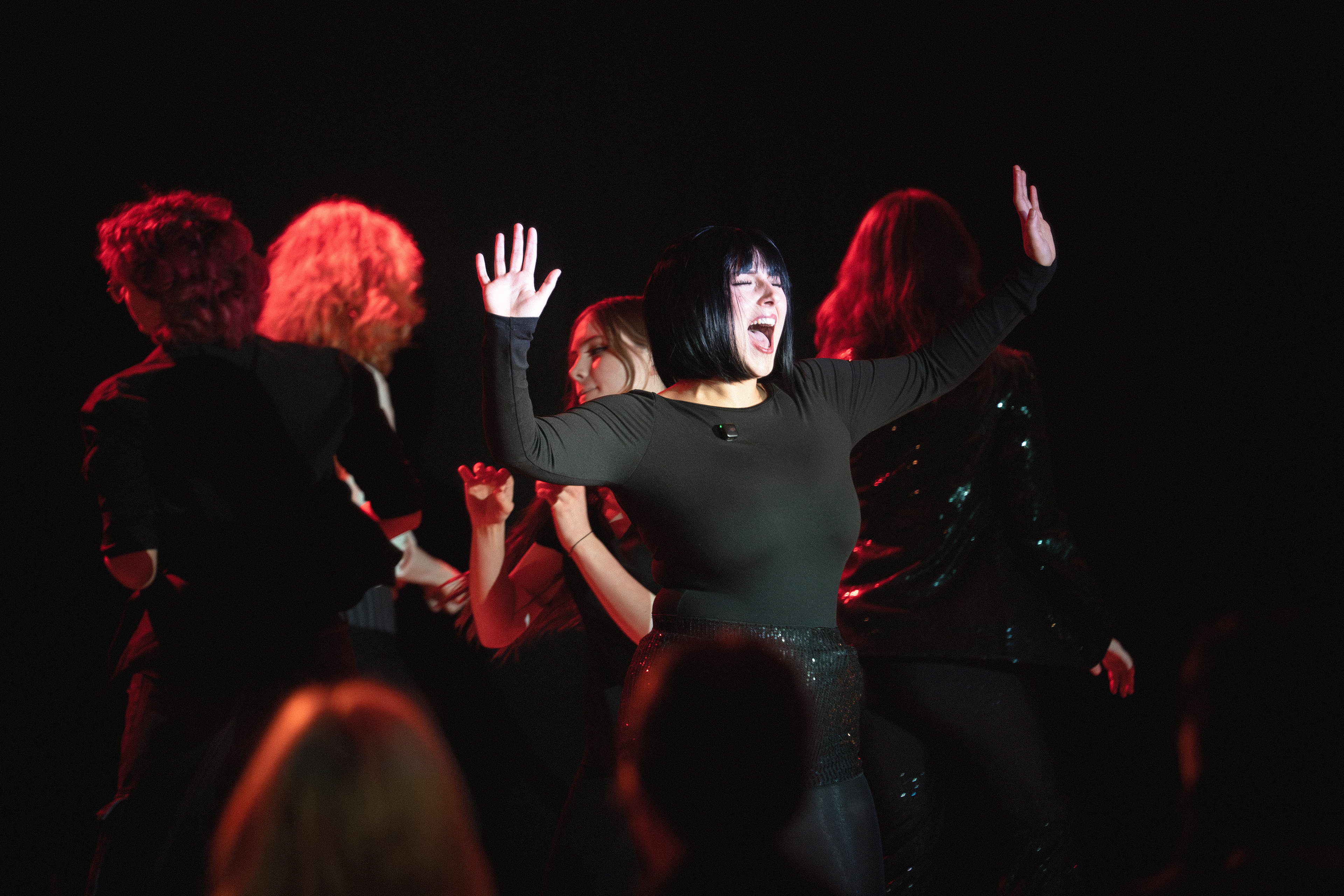
The final image was taken at 1/640, F2.8, Iso 4000 and shows a final moment of the show where the cast have their arms in the air and the main cast member is centre frame again letting out a final note with their arms raised up. the rest of the cast are also raising their arms which fills the frame and the member who was in the previous photo is raising their arms the other way to the rest which once again solidifies the fact that both members of the set are important. this image would be a lot better if the heads were not in frame as it should show a full unobstructed final of the set with the whole frame visible as it is a final moment of the show and should be seen as a moment for the subject, not those watching it.
I am happy with this set but I feel i could have raised the camera to a looking down angle or found areas where heads would not be an issue.
For editing I took all the photos from the set and put them into lightroom, i then went through and flagged all the images I wanted to edit and then applied an edit to one which I copied through to the rest of the flagged images as well as denoising. I then went through all of these images and tweaked the edit to where I wanted it to be and exported. editing settings are down below as well as raws, contact sheets, and all possible options for the set.

Edits
Editing/ sorting process
All edited


raws/ contact sheet from this section of the shoot.